
Adnaut. After-hours mission control lit by sodium lamps.
- Studio
- Dark theme
- 10 colors
- 3 typefaces
Adnaut operates in a nocturnal command-deck language: near-black canvas, confident yellow punctuation, and ultra-light display type that floats above a landscape of rounded, glassy cards and isometric 3D vignettes. Color is rationed — almost the entire surface is achromatic or a single carbonized dark, with #ffe900 as a reactive highlighter that draws the eye to nav, CTAs, and accent cards; #00ff1a flashes in once or twice per screen for editorial emphasis. The system feels weightless despite the dark base: cards are tall and lightly bordered, headlines whisper at weight 100-300, and components lean on radius rather than shadow to separate layers. Every interface element should feel like a control surface in a control room — restrained, precise, and lit from within by a single warm-yellow lamp.

Adnaut design system

Brand1
Primary CTA fills, active nav indicators, accent card backgrounds, logo wordmark, and the single chromatic punctuation across an otherwise monochrome system
Accent1
Editorial accent — one or two keyword words per page glow in this green to carry emphasis and keep the palette from feeling monochrome
Neutrals8
Page background canvas — the near-black with a barely-warm tint that anchors the entire system
Elevated card surfaces, outlined button borders, and the primary border tone for sections that need separation from the canvas
Deep accents within dark illustrations and subtle depth layers where pure black would feel too harsh
Secondary borders, divider lines, and inactive control outlines where a softer edge is needed
Muted helper text, metadata, and secondary link colors where legibility matters less than hierarchy
Primary body and UI text — the off-white that softens contrast against the carbon canvas and reduces eye strain across long reading passages
Headline and display text on dark surfaces — a step brighter than Frost, reserved for the largest type that needs extra punch
Text on yellow fills and inside bright accent cards; the only acceptable text color over Sodium Yellow
Try a pairing
Pick any two colors from the palette to check whether text stays readable on top.
Aa
Carbon on Sodium Yellow
13.70 : 1 contrast
- Body textPasses AA 4.5
- Large textPasses AA 3
- StrictPasses AAA 7
More DESIGN.md files. Same web, different personalities.

Basement Studio
Studio
Production Portugal
Studio
Active Theory
Studio
Agence K72
Studio
Akash Tyagi
Studio
Analogue
Studio
Athletics
Studio
BAM Photographers
Studio
Bareis + Nicolaus
Studio
Becklyn
Studio
Branding
Studio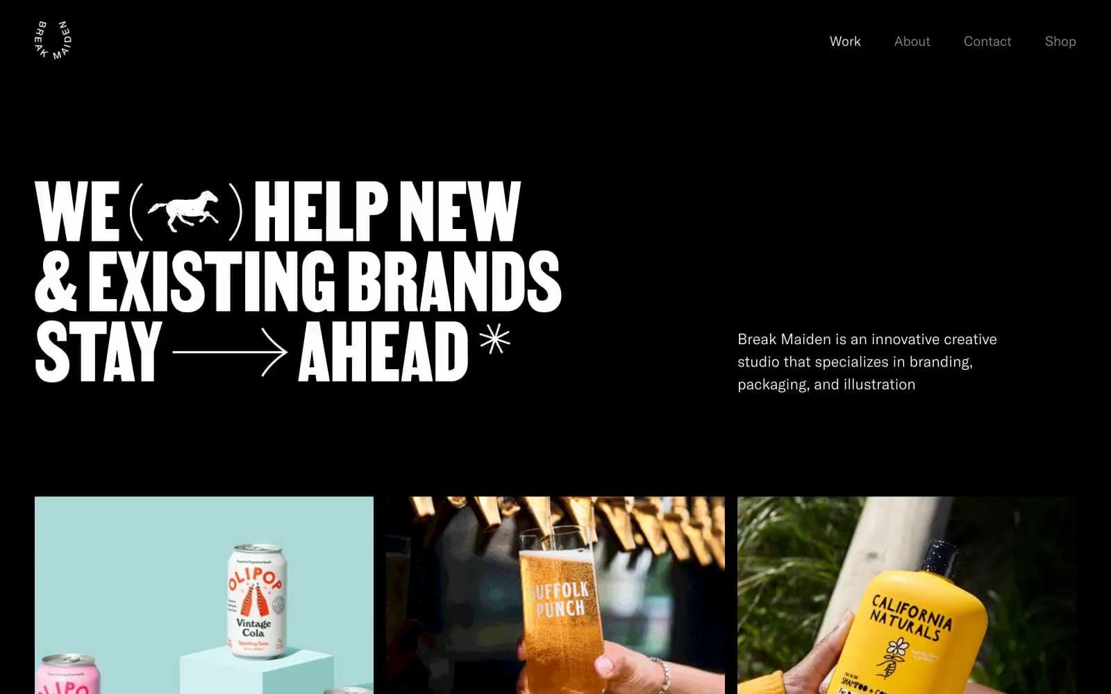
Break Maiden
Studio


