
Branding. Oversized white display type floats on a void-like dark canvas, interrupted by a single vivid red accent and dramatic ornamental display faces that feel like gallery signage rather than web UI.
- Studio
- Dark theme
- 12 colors
- 4 typefaces
SVZ operates in the visual register of a high-fashion editorial: pitch-black canvas, oversized display typography that dominates the viewport, and a single arterial red that appears like a wound in the monochrome. The interface is deliberately sparse — most surfaces carry no chrome at all, letting type, photographic collage, and oversized background shapes do the work. Text is primarily white on near-black, with an off-white (#f3efef) reserved for inverted bodies and footers. Hierarchy is achieved through scale (160px display stepping down to 10px labels) and weight contrast (300 whisper-thin body against 700 blocky caps), never through color or chrome. Every interactive element is ghost or hairline-bordered — the system refuses to shout with buttons, preferring arrows and discover-call links that feel like editorial pull-quotes.
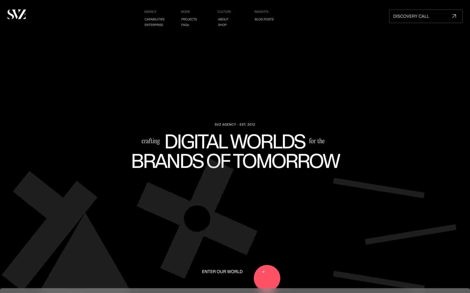
Branding design system

Brand2
Sole brand accent — card borders, cursor, hero dot, gradient terminator; the only saturated color and it is used like a heartbeat, not a coat of paint
Heading underline accent and decorative fill — a purer red for typographic emphasis only
Neutrals10
Deepest surface, decorative fills, icon strokes — the floor beneath the void
Primary page background; the base upon which all display type and floating shapes sit
Footer and inverted section backgrounds, slightly elevated off the base void
Secondary surface for content blocks and image treatments layered over the void
Subtle elevation surface and card background; the only visible shadow color
Link underlines, nav dividers, hairline separators on dark surfaces
Disabled borders, tertiary helper text, low-priority metadata
Muted secondary text, nav labels, subtle borders — the whispered voice between bone and graphite
Inverted body sections, off-white text on dark cards, soft warm-white content surfaces
Primary text, hairline borders, icon outlines — the dominant non-black color in the system
Try a pairing
Pick any two colors from the palette to check whether text stays readable on top.
Aa
Absolute Black on Arterial Red
5.45 : 1 contrast
- Body textPasses AA 4.5
- Large textPasses AA 3
- StrictFails AAA 7
More DESIGN.md files. Same web, different personalities.
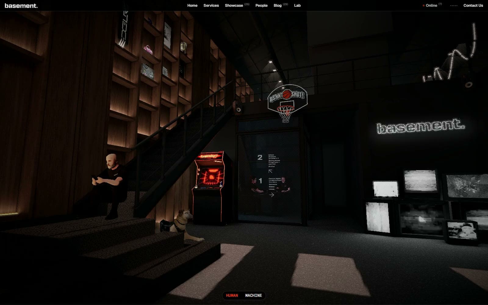
Basement Studio
Studio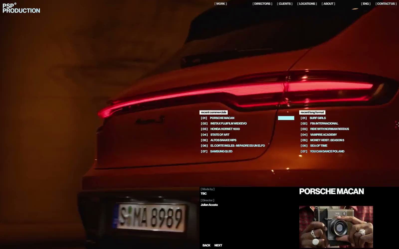
Production Portugal
Studio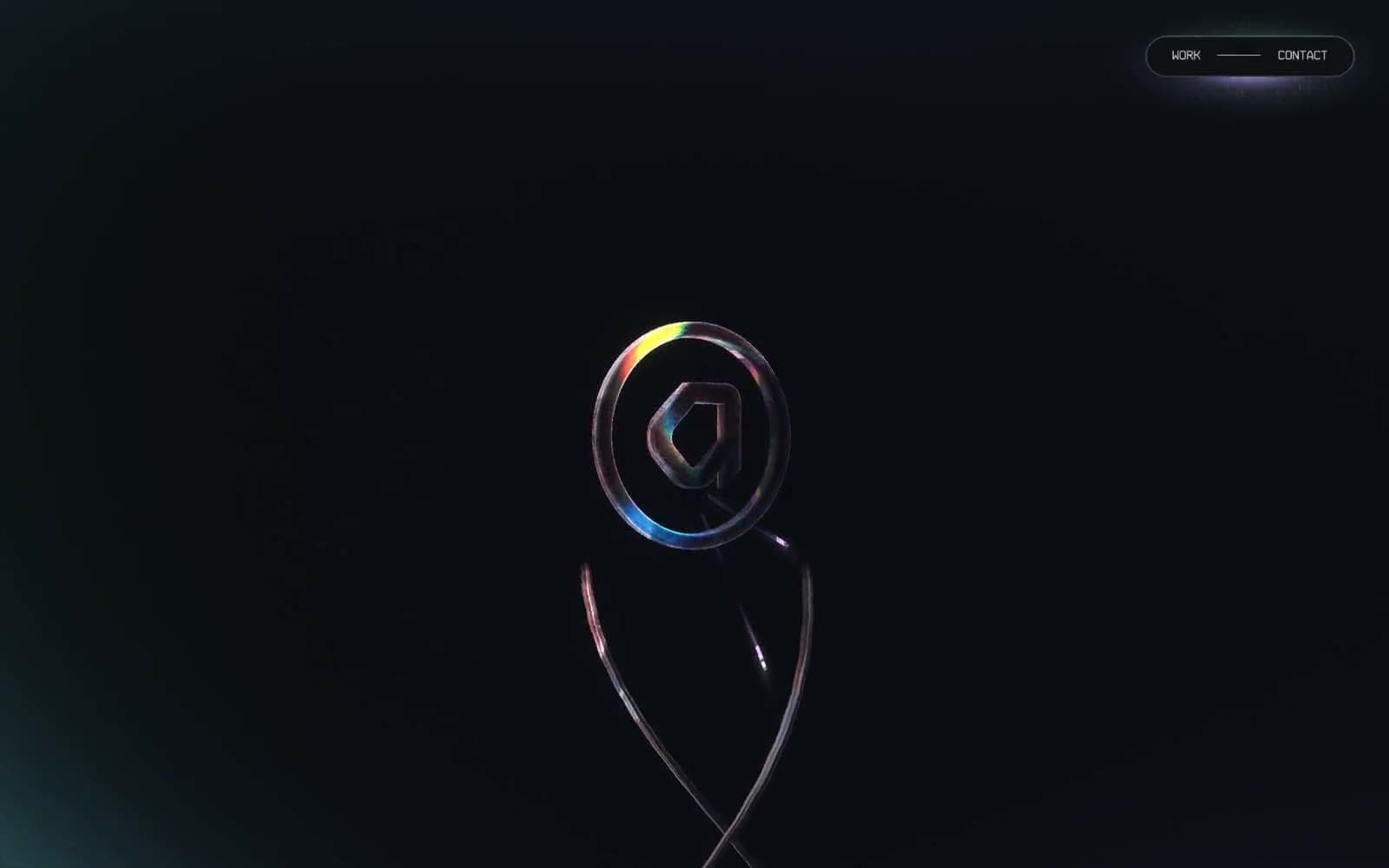
Active Theory
Studio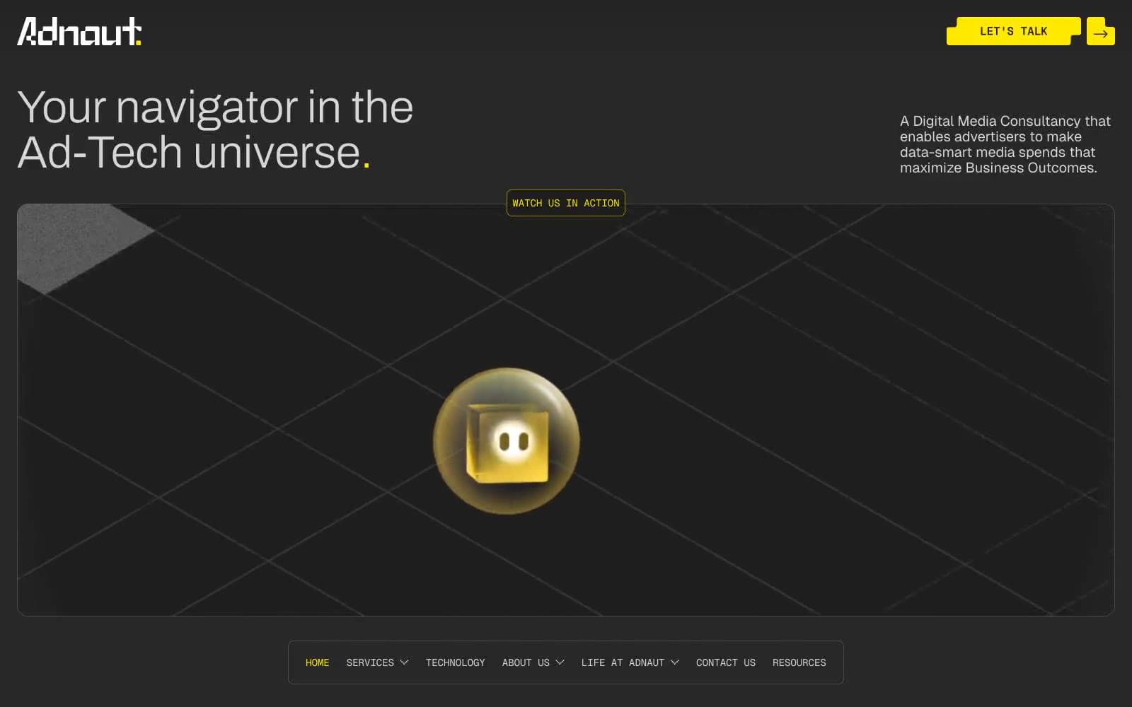
Adnaut
Studio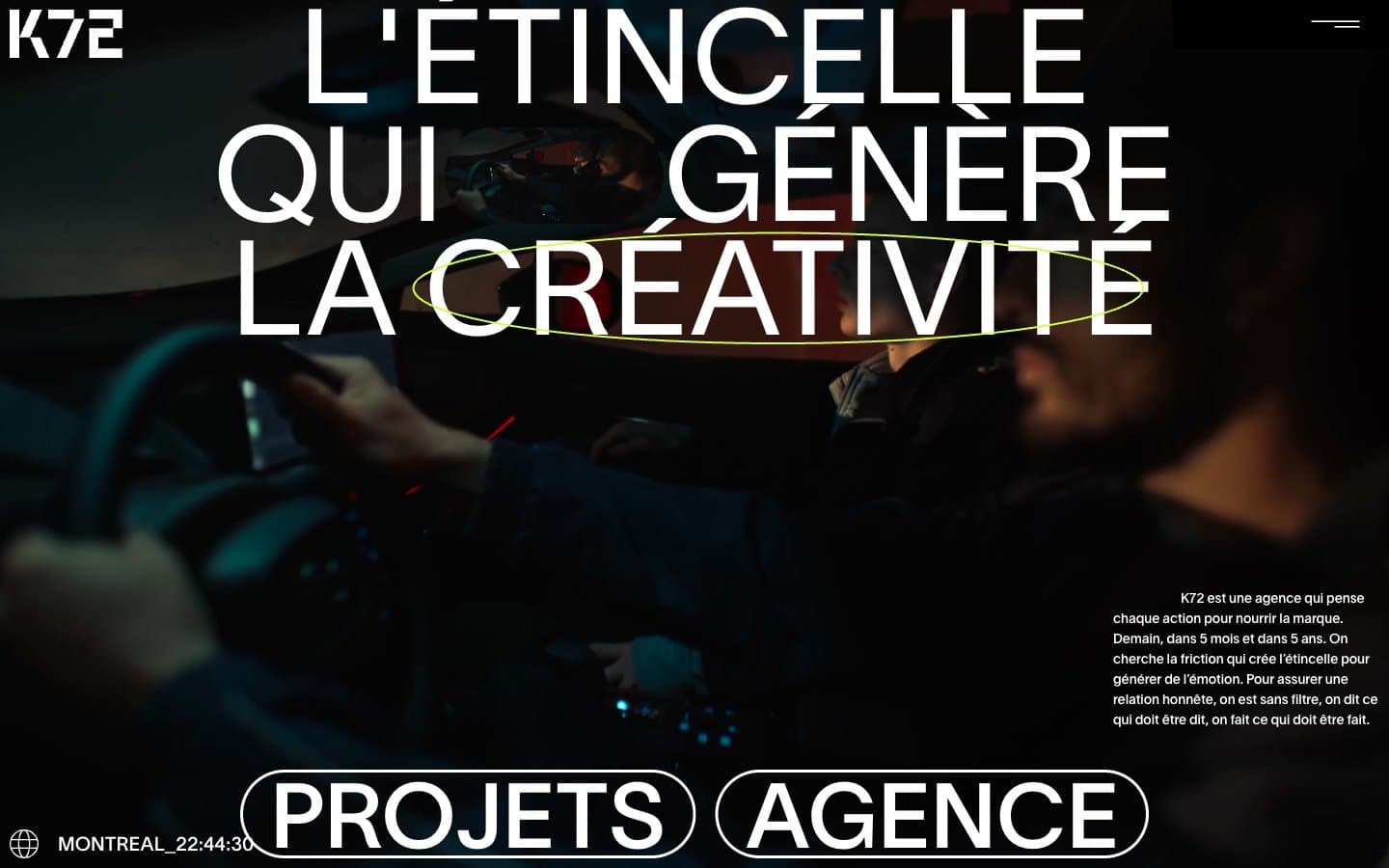
Agence K72
Studio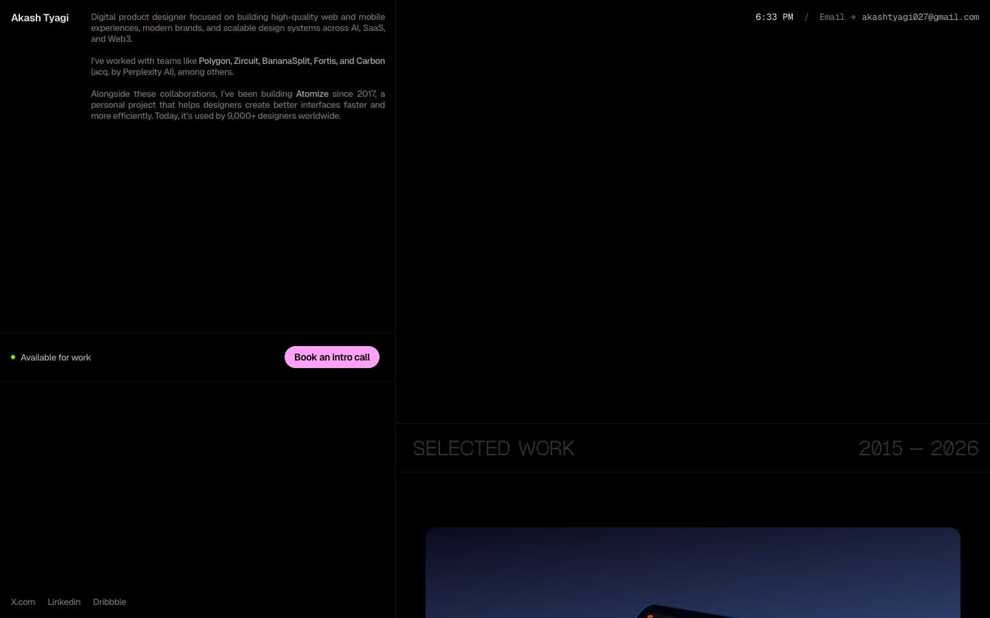
Akash Tyagi
Studio
Analogue
Studio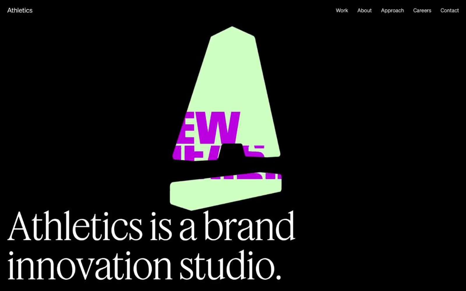
Athletics
Studio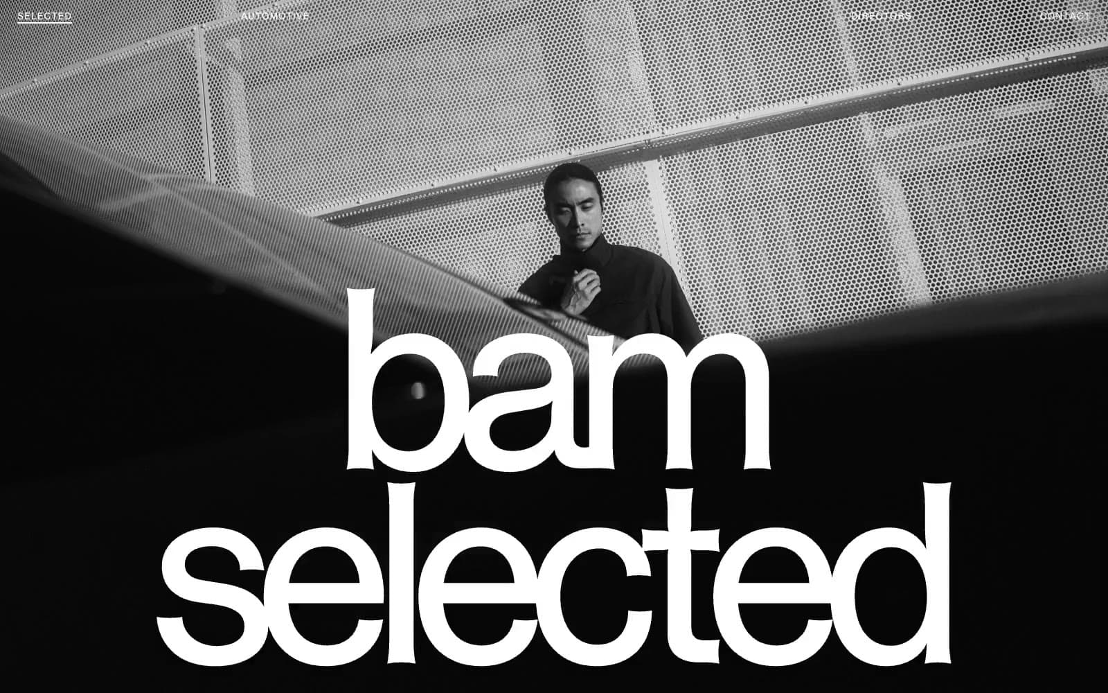
BAM Photographers
Studio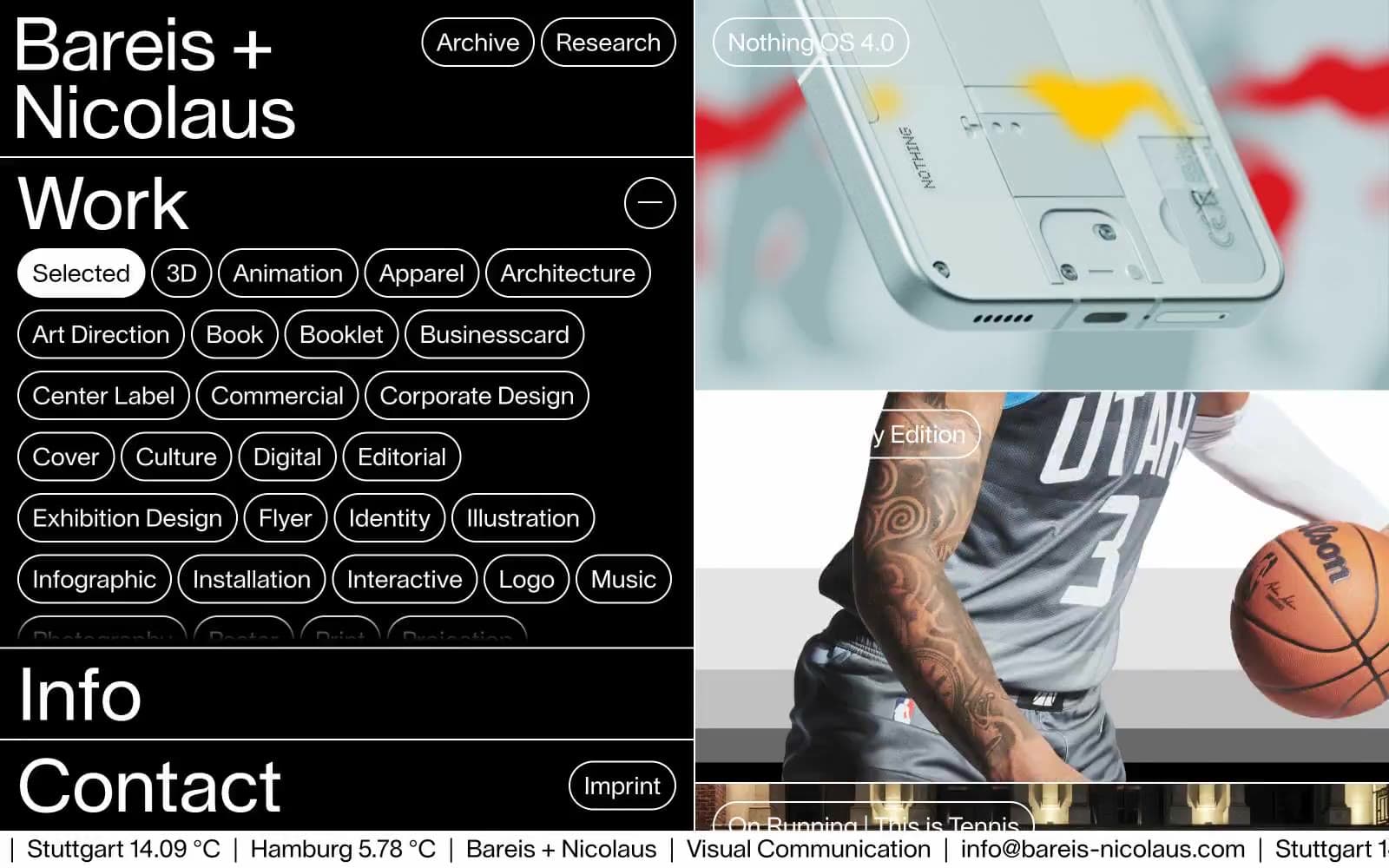
Bareis + Nicolaus
Studio
Becklyn
Studio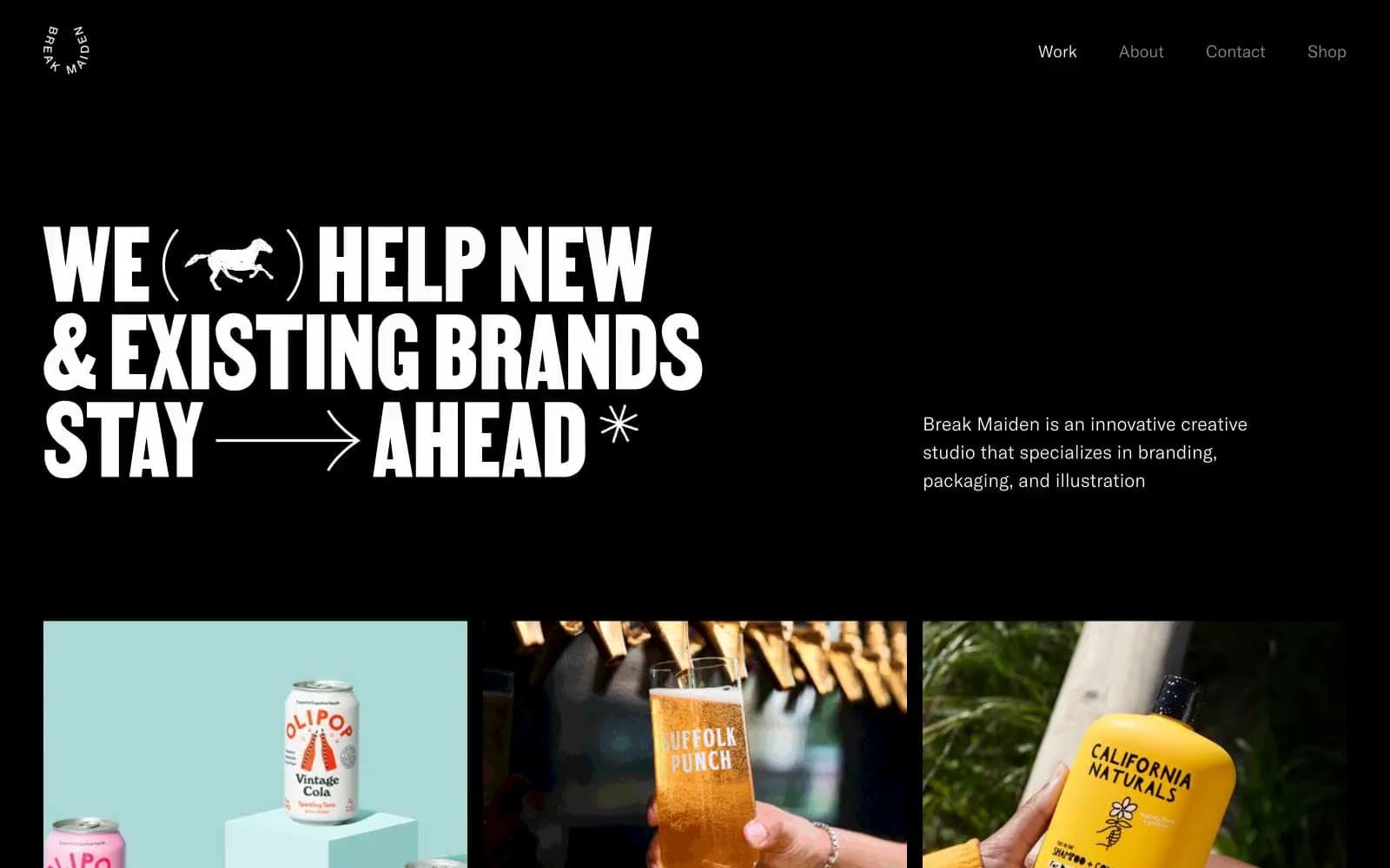
Break Maiden
Studio


