
Production Portugal. Molten magenta behind a black slate.
- Studio
- Dark theme
- 15 colors
- 2 typefaces
Production Portugal is a full-screen film-reel site for the PSP Production service company: every section is a pinned 1000px stage, opening on a black canvas with cycling commercial footage under a sparse grid of 12px bracketed labels. The rhythm swings from Ink #000000 to a blurred lava field of Lava Pink #ff0080, Molten Rose #ff126f and Deep Garnet #a3003f, through a grayscale halftone brands reel, to a Paper #ffffff contact footer. Type is two voices only: Neue Haas Grotesk Display 700, tracked to -3% and set in 96px caps at 0.85 line-height, and a single PP Eiko light-italic word dropped into each headline. Everything else is square-cornered, shadowless and tiny, so the footage carries the colour and the type carries the attitude.

Production Portugal design system

Brand1
The identity pink: the full-screen about stage and the halftone logo blob — the one saturated field that breaks the black reel
Accent8
Reel progress line along the hero bottom and the flat placeholder before project thumbnails load
Bright blob drifting under 80px blur inside the lava field, lifting hot spots out of the pink
Dark blurred blob that sinks shadow pools into the lava field so the pink reads as moving liquid
Wine-dark radial vignette over the lava stage that darkens its corners toward the frame edge
The 16px-high full-width bar carrying the X, Facebook and Instagram bracket links on the pink stage
Hover fill that wipes across the social strip from zero width — the only cool colour on the page
1px corner brackets of the camera-viewfinder cursor that frames whatever is hovered
Translucent white sweep behind the active project row and brand row, fading out before the row ends
Neutrals6
Page canvas, hero and brands stages, project credit panel, and all type on the white footer
Navigation and list labels on dark, tab-label fills, the contact footer stage and its contact card
Brand-list text and display caps on the halftone brands stage — a hair softer than Paper over video
The [ and ] marks around every nav and social label: Paper at 68% opacity, measured here on Ink
Bracketed credit captions such as [ Made by ] and [ Director ] in the hero project panel
The single 1px rgba(0, 0, 0, 0.1) rule under the footer's Our Location row on Paper
Try a pairing
Pick any two colors from the palette to check whether text stays readable on top.
Aa
Ink on Lava Pink
5.56 : 1 contrast
- Body textPasses AA 4.5
- Large textPasses AA 3
- StrictFails AAA 7
More DESIGN.md files. Same web, different personalities.

Basement Studio
Studio
Active Theory
Studio
Adnaut
Studio
Agence K72
Studio
Akash Tyagi
Studio
Analogue
Studio
Athletics
Studio
BAM Photographers
Studio
Bareis + Nicolaus
Studio
Becklyn
Studio
Branding
Studio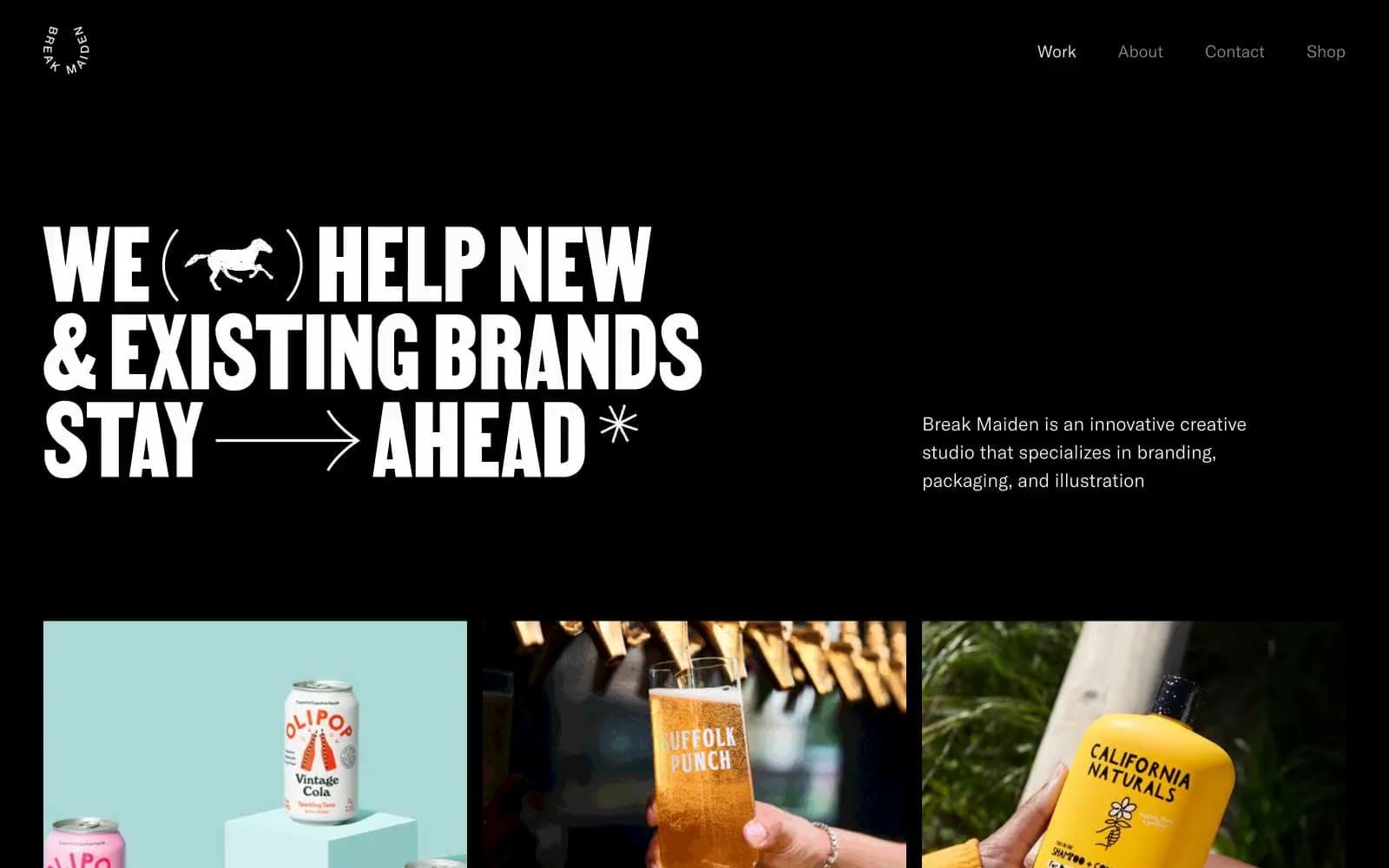
Break Maiden
Studio


