
Analogue. Light tunnel through void.
- Studio
- Dark theme
- 7 colors
- 3 typefaces
Analogue operates as a cinematic void with a single luminous focal point: white type against near-black depth, interrupted only by a blue-white photographic light burst. The system is strictly achromatic — no chromatic accents, no shadows, no decorative gradients — so every emotional beat must come from typography, photography, and negative space. Type sits at a compressed 11–18px body register with whisper-tight tracking (-0.05em at display) and cinematically tight line-heights (1.00–1.05 on 40–60px display), making headlines feel like film titles rather than web headings. The LCD dot font appears as a single rare accent — digital punctuation in an otherwise humanist system. Navigation is a floating translucent pill, buttons are achromatic outlines or ghosts, and the architecture of the page (borders, surfaces, dividers) is so flat it disappears, forcing the photography and the type to do all the work.

Analogue design system

Neutrals7
Pure black — the structural anchor, used for hairlines, border strokes, and the deepest surface layer beneath imagery
Primary text and dominant UI foreground — body copy, headings, and the off-black tone that softens pure black for large runs of type
Secondary text and subtle UI borders — metadata, timestamps, supporting copy, the mid-gray that bridges Graphite and Ash
Tertiary text and the quietest dividers — labels, tag text, anywhere type needs to recede into the surface
Tertiary surface and muted background fills — visible only as quiet backing for inactive states or low-emphasis blocks
Subtle surface wash for cards and elevated panels — the gentlest step off Paper, used where a panel needs to register without shouting
Primary page canvas and white card surfaces.
Try a pairing
Pick any two colors from the palette to check whether text stays readable on top.
Aa
Paper on Ink
21.00 : 1 contrast
- Body textPasses AA 4.5
- Large textPasses AA 3
- StrictPasses AAA 7
More DESIGN.md files. Same web, different personalities.

Basement Studio
Studio
Production Portugal
Studio
Active Theory
Studio
Adnaut
Studio
Agence K72
Studio
Akash Tyagi
Studio
Athletics
Studio
BAM Photographers
Studio
Bareis + Nicolaus
Studio
Becklyn
Studio
Branding
Studio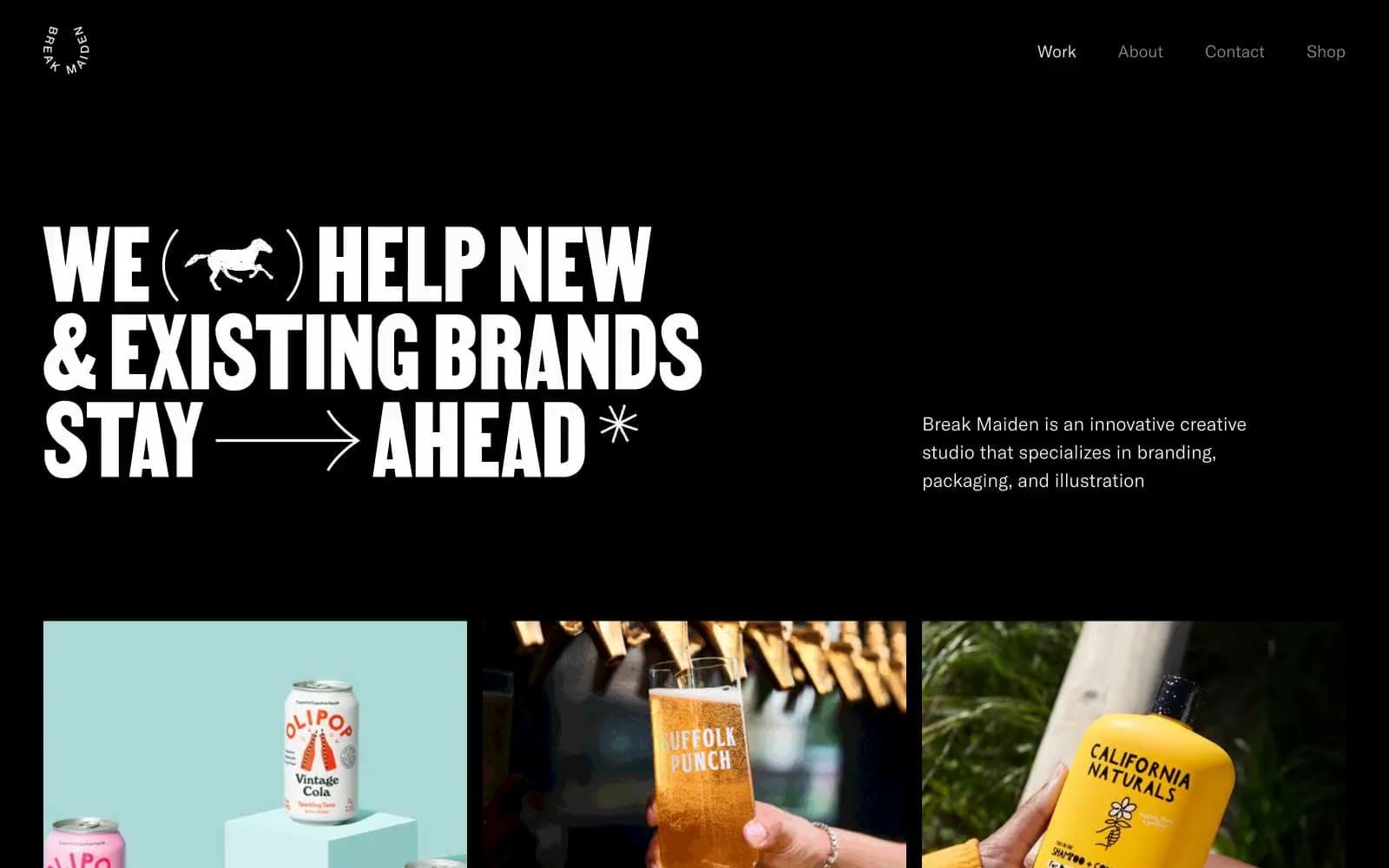
Break Maiden
Studio


