
Becklyn. A black-walled room where one serif sentence glows and everything else is silence.
- Studio
- Dark theme
- 5 colors
- 2 typefaces
Becklyn operates as a near-monochrome dark gallery: an obsidian canvas with a single spectrum beam of color used as identity punctuation. The interface is almost entirely achromatic — white type on near-black, a slightly lifted charcoal for cards, mid-gray for hairline rules and muted copy — so the typography carries the entire expressive load. Headlines lean on Cambon's italic serif cut at hero scale, paired against UniversalSans's quiet neutral geometry for body and UI. Components are deliberately thin: pill-shaped controls, hairline borders, no heavy elevation. A vivid blue-to-plum-to-crimson gradient surfaces only as a brand mark, not as a functional button or accent. The mood is editorial and restrained — closer to a print portfolio than a SaaS dashboard.

Becklyn design system

Brand1
Supporting palette color for small decorative accents when the core palette needs contrast. Do not promote it to the primary CTA color
Neutrals4
Page canvas, section backgrounds, inverse surface for pills and inputs. Never pure #000 — the slight warmth keeps the surface from feeling harsh
Card and elevated panel surfaces. One step lighter than the canvas, giving containment without resorting to shadows
Muted helper text, inactive nav labels, secondary dividers, tag outlines. Quiet enough to recede behind the white content layer
Primary text, icon strokes, hairline borders, inverted pill highlights. The single light color in the system — it does all the foreground work against the black canvas
Try a pairing
Pick any two colors from the palette to check whether text stays readable on top.
Aa
Bone White on Obsidian
17.40 : 1 contrast
- Body textPasses AA 4.5
- Large textPasses AA 3
- StrictPasses AAA 7
More DESIGN.md files. Same web, different personalities.

Basement Studio
Studio
Production Portugal
Studio
Active Theory
Studio
Adnaut
Studio
Agence K72
Studio
Akash Tyagi
Studio
Analogue
Studio
Athletics
Studio
BAM Photographers
Studio
Bareis + Nicolaus
Studio
Branding
Studio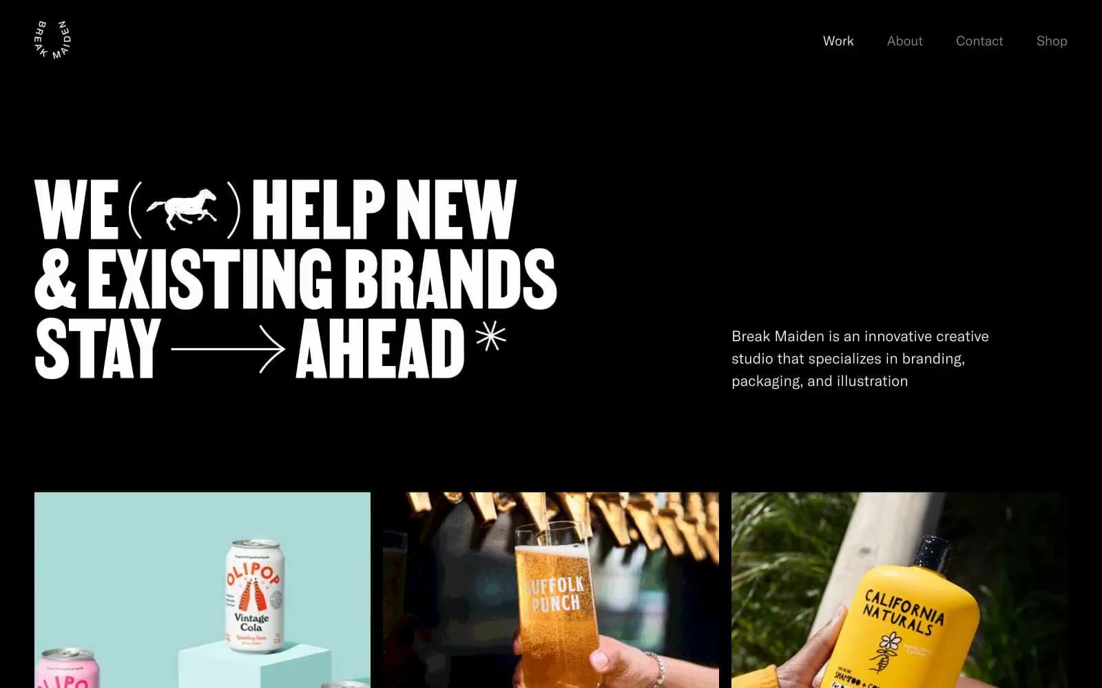
Break Maiden
Studio


