
Verse. Hairline cells on black, the work inside each cell carrying all the color.
- Studio
- Dark theme
- 4 colors
- 1 typeface
Verse operates as a monochrome terminal: a near-black canvas bisected by a two-column grid of light-bordered project tiles, with Commit Mono at 11–16px carrying every piece of information. Color is not part of the UI vocabulary — it lives only inside the media surfaces (3D renders, product photography, gradients) that each tile contains. Elevation, rounded corners, and shadows are absent; the light hairline grid line on black is the sole structural device, doing the work that color, depth, and scale do in conventional systems. The result is a developer-console aesthetic where the work inside each frame is loud and the chrome around it is deliberately silent.
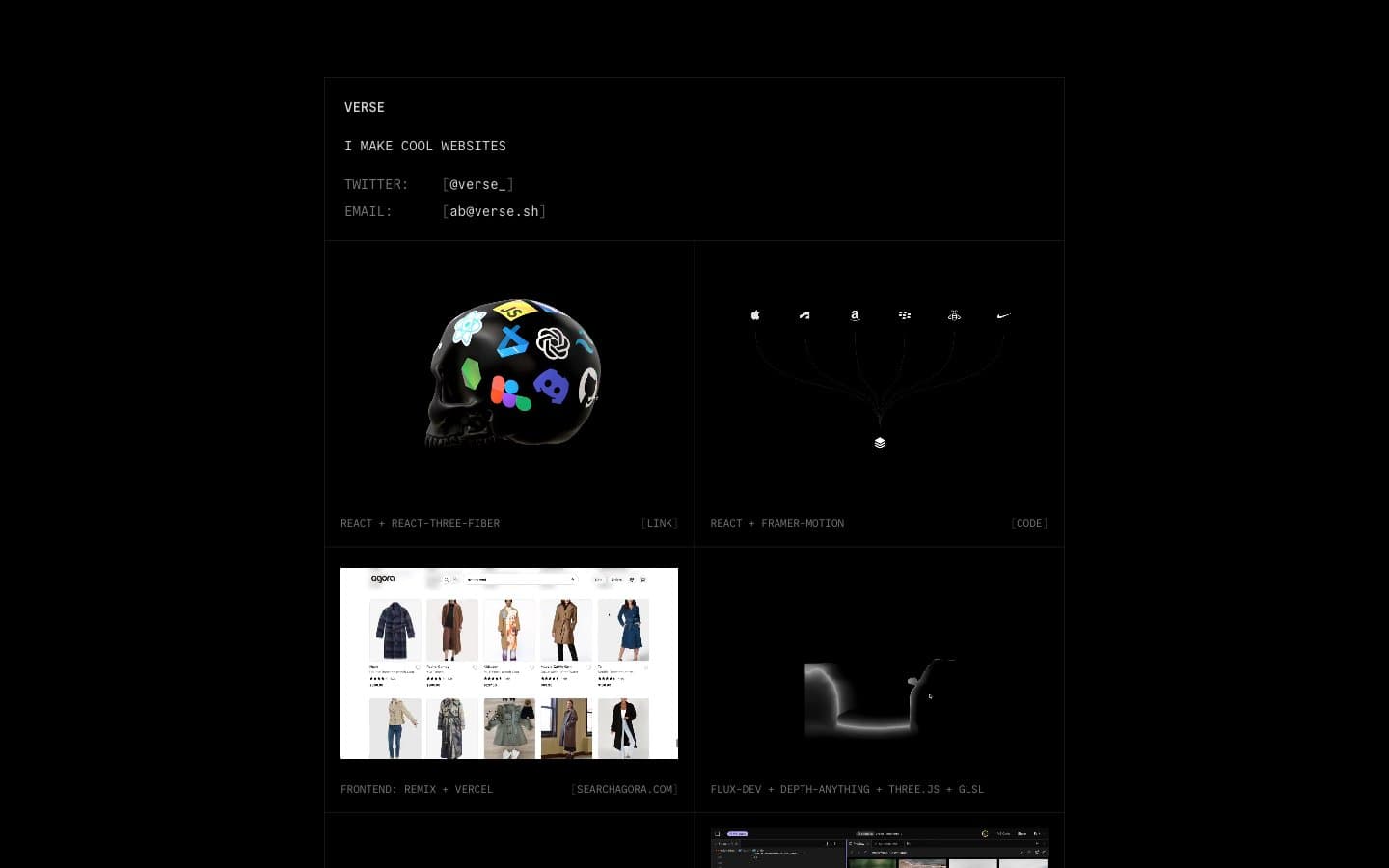
Verse design system

Neutrals4
Low-contrast internal dividers and edge treatments — barely visible against the page background, used where a hairline would be too loud
Secondary metadata, category tags, and the [link] indicator — recedes behind body text to create a two-tier reading hierarchy without changing weight
Primary readable text — project names, bio copy, metadata labels
Primary border between tiles and around media surfaces — the only structural divider in the system, doing the work of card outlines, section separators, and elevation simultaneously
Try a pairing
Pick any two colors from the palette to check whether text stays readable on top.
Aa
Grid Line on Subtle Divider
14.48 : 1 contrast
- Body textPasses AA 4.5
- Large textPasses AA 3
- StrictPasses AAA 7
More DESIGN.md files. Same web, different personalities.

Basement Studio
Studio
Production Portugal
Studio
Active Theory
Studio
Adnaut
Studio
Agence K72
Studio
Akash Tyagi
Studio
Analogue
Studio
Athletics
Studio
BAM Photographers
Studio
Bareis + Nicolaus
Studio
Becklyn
Studio
Branding
Studio


