
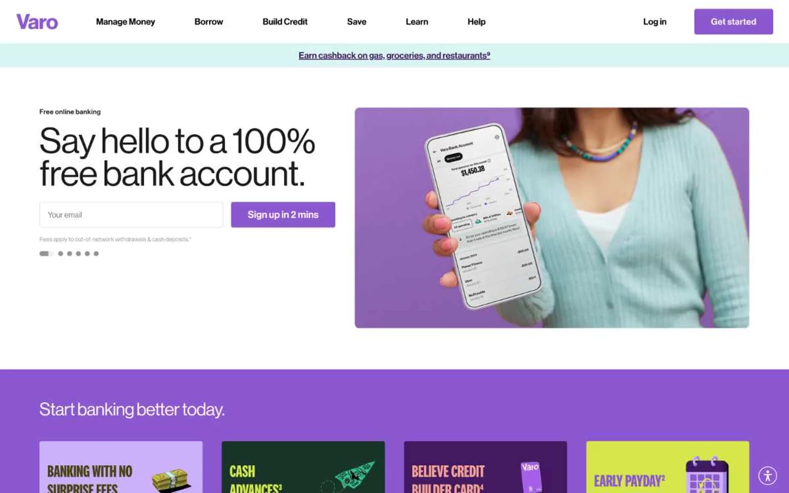
Varo Bank. Bold compressed type punched onto bright colored cardstock, held together by hairline black outlines.
- Finance
- Light theme
- 15 colors
- 5 typefaces
Varo Bank reads like a confident consumer-finance poster series printed on colored cardstock: pure white canvases interrupted by full-bleed bands of violet, lime, coral, and cream, each carrying chunky ultra-compressed display type. The visual system is deliberately loud — National 2 Compressed at 96–147px drives every headline with near-zero leading, making text behave like a graphic block rather than prose. A single saturated violet (#8c58d0) is the only true interactive color; everything else chromatic is decorative atmosphere, and the only neutrals that matter are true black and white. Borders are hairline and dark, radii are universally 4px, and shadows are absent — depth comes from flat color collision, not elevation. The whole product feels Gen-Z native: playful, financial-literacy-forward, and graphically assertive without feeling corporate.
Varo Bank design system

Brand3
Primary action buttons, active nav, brand logo — the single saturated mid-violet that powers all interactive states
Dark accent surfaces, bold text on light cards, full-bleed dark band backgrounds — almost-black with violet undertone
Soft violet fill for selected/secondary surface states, tag backgrounds
Accent7
Decorative section fills, icon highlights, dotted ticker text — warm chromatic punctuation that breaks up the violet dominance
Soft warm section background, muted coral — large-area color band that reads warm without screaming
Pale cream surface band — the gentlest warm neutral, used as an alternate section background to white
High-saturation yellow accent for card borders, feature callouts, ticker text — never a fill, always an outline or text
Vivid lime used in feature card backgrounds and outlined graphic elements — the most attention-grabbing decorative color
Deep green for dark feature card backgrounds and high-contrast text — rare but anchors green-themed cards
Muted olive text and border accent on yellow/cream surfaces — never used as a fill
Neutrals5
Primary text, hairline borders, icon strokes — the dominant structural color
Near-black secondary text and borders — barely distinguishable from Carbon but used for slightly softer contrast
Muted helper text, disabled states, secondary metadata
Cool light-gray surface, pressed-button background, input field fill on dark sections
Page canvas, card surfaces, button text on colored fills, inverted text on dark bands
Try a pairing
Pick any two colors from the palette to check whether text stays readable on top.
Aa
Paper White on Varo Violet
4.75 : 1 contrast
- Body textPasses AA 4.5
- Large textPasses AA 3
- StrictFails AAA 7
More DESIGN.md files. Same web, different personalities.
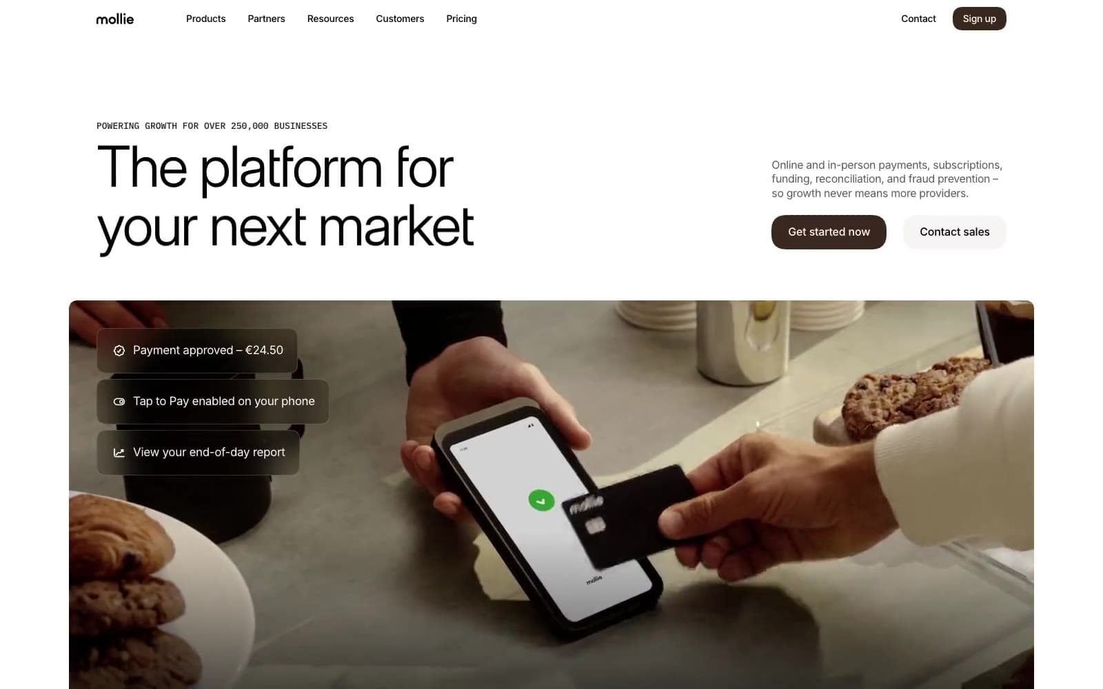
Mollie
Finance
a16z speedrun
Finance
Acctual
Finance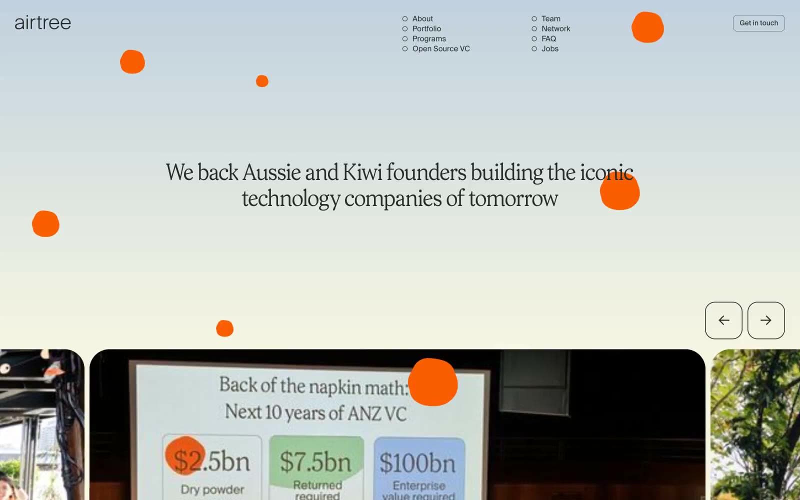
Airtree
Finance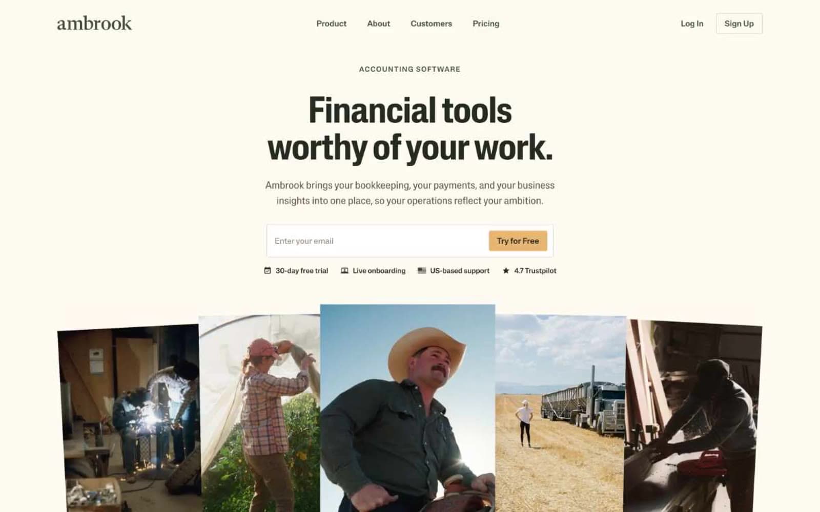
Ambrook
Finance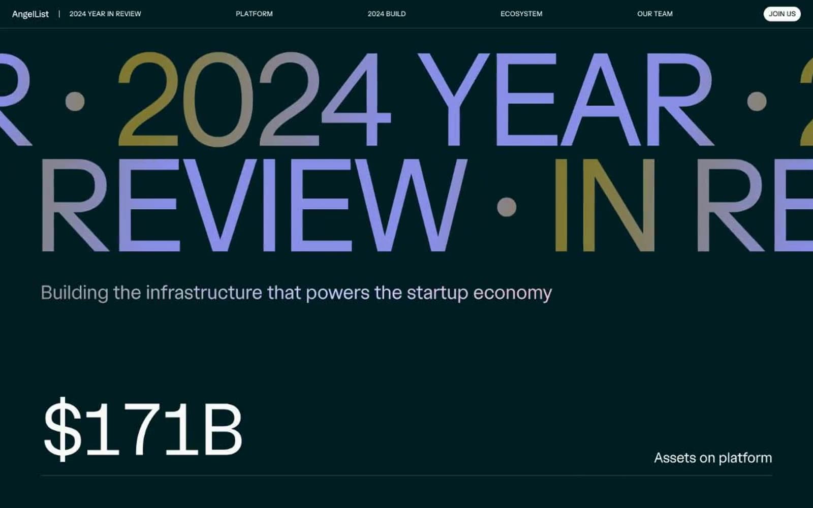
Angellist 2024
Finance
Apron
Finance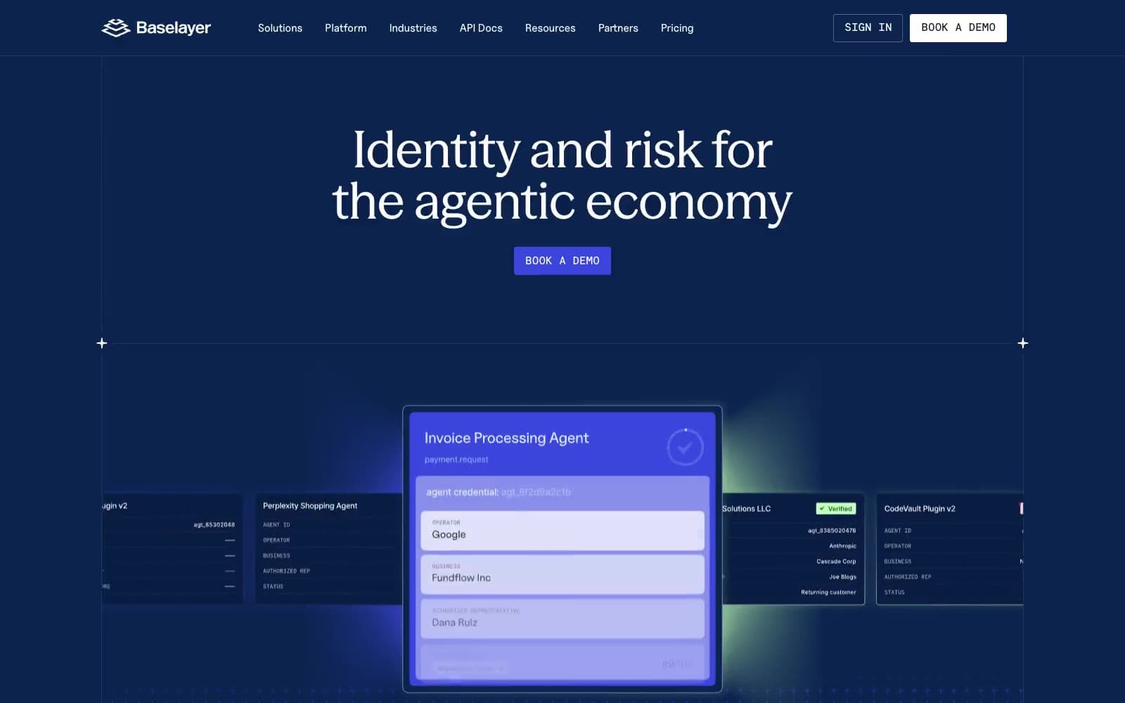
Baselayer
Finance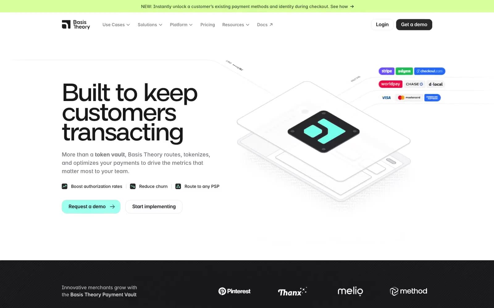
Basis Theory
Finance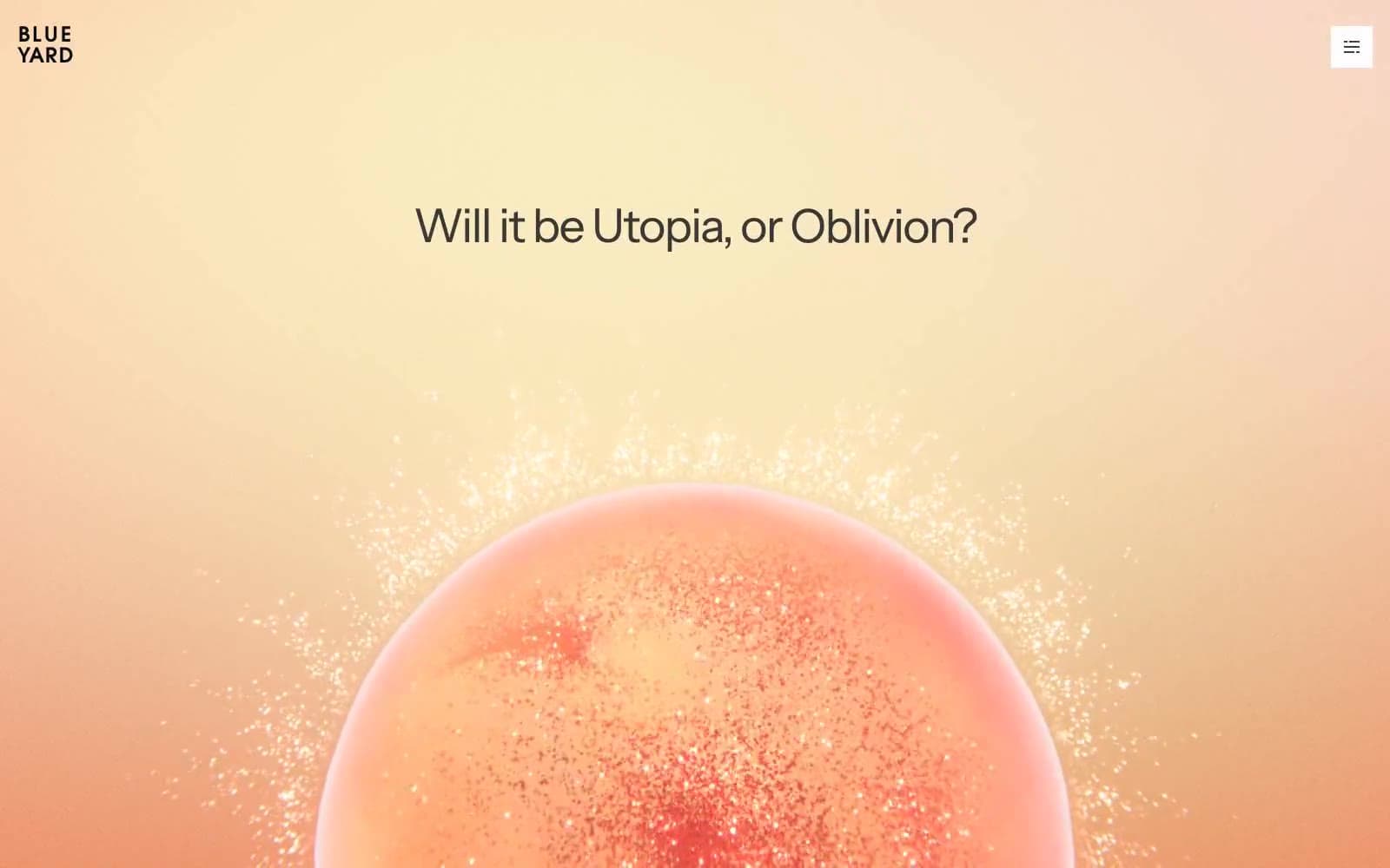
BlueYard Capital
Finance
Brex
Finance
Coda
Finance


