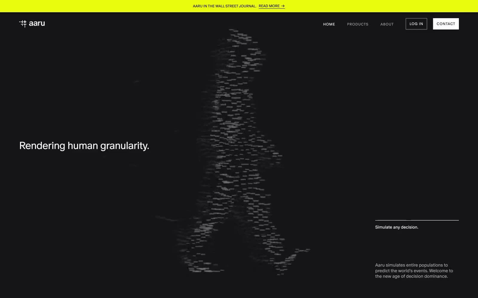
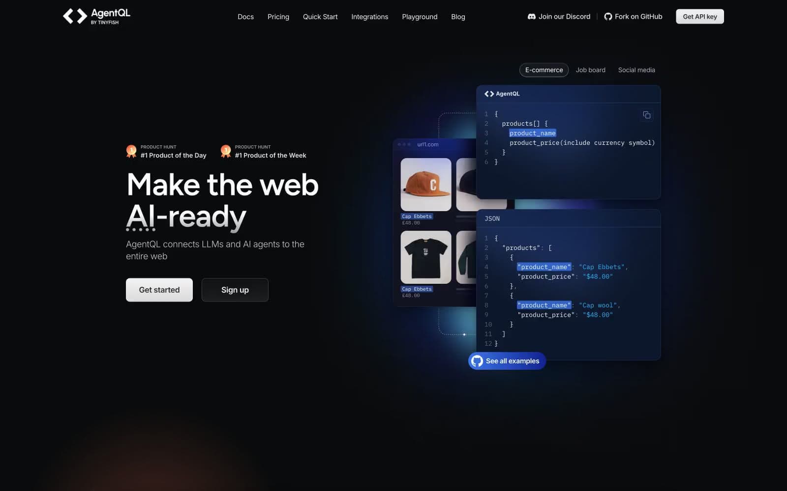
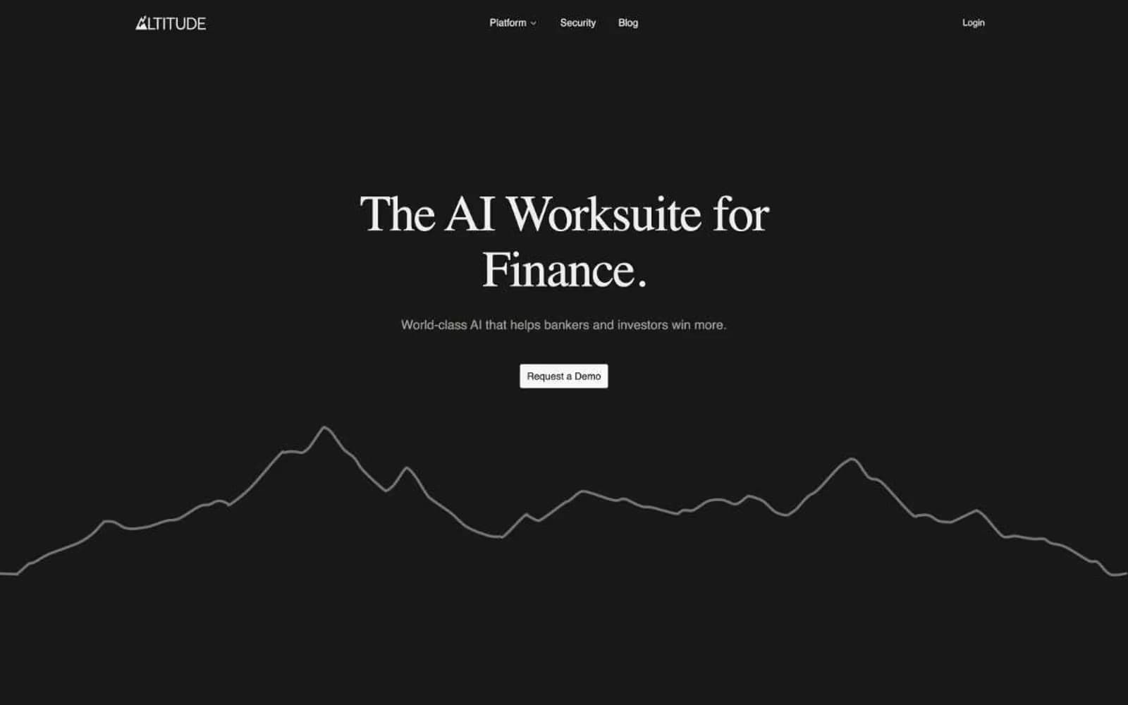
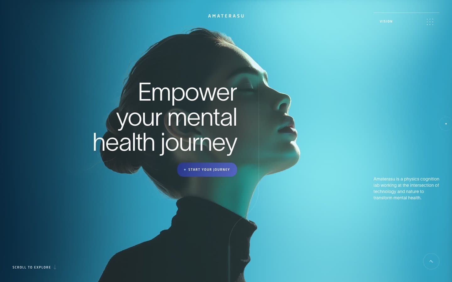
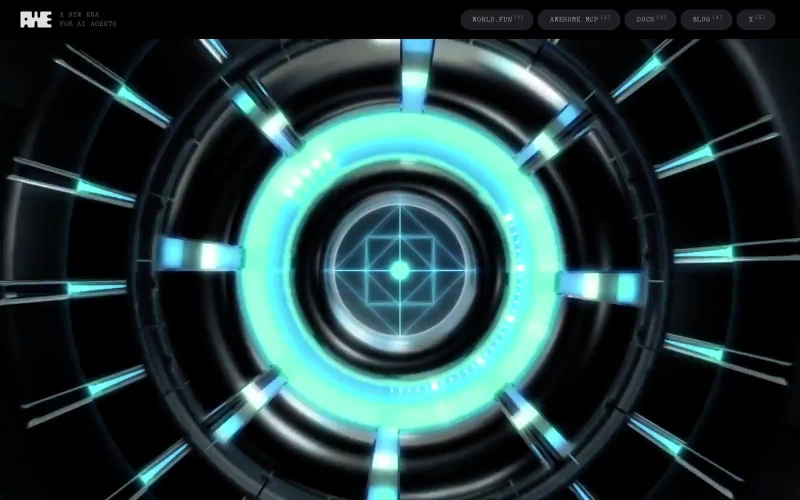
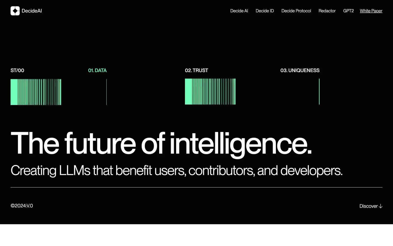
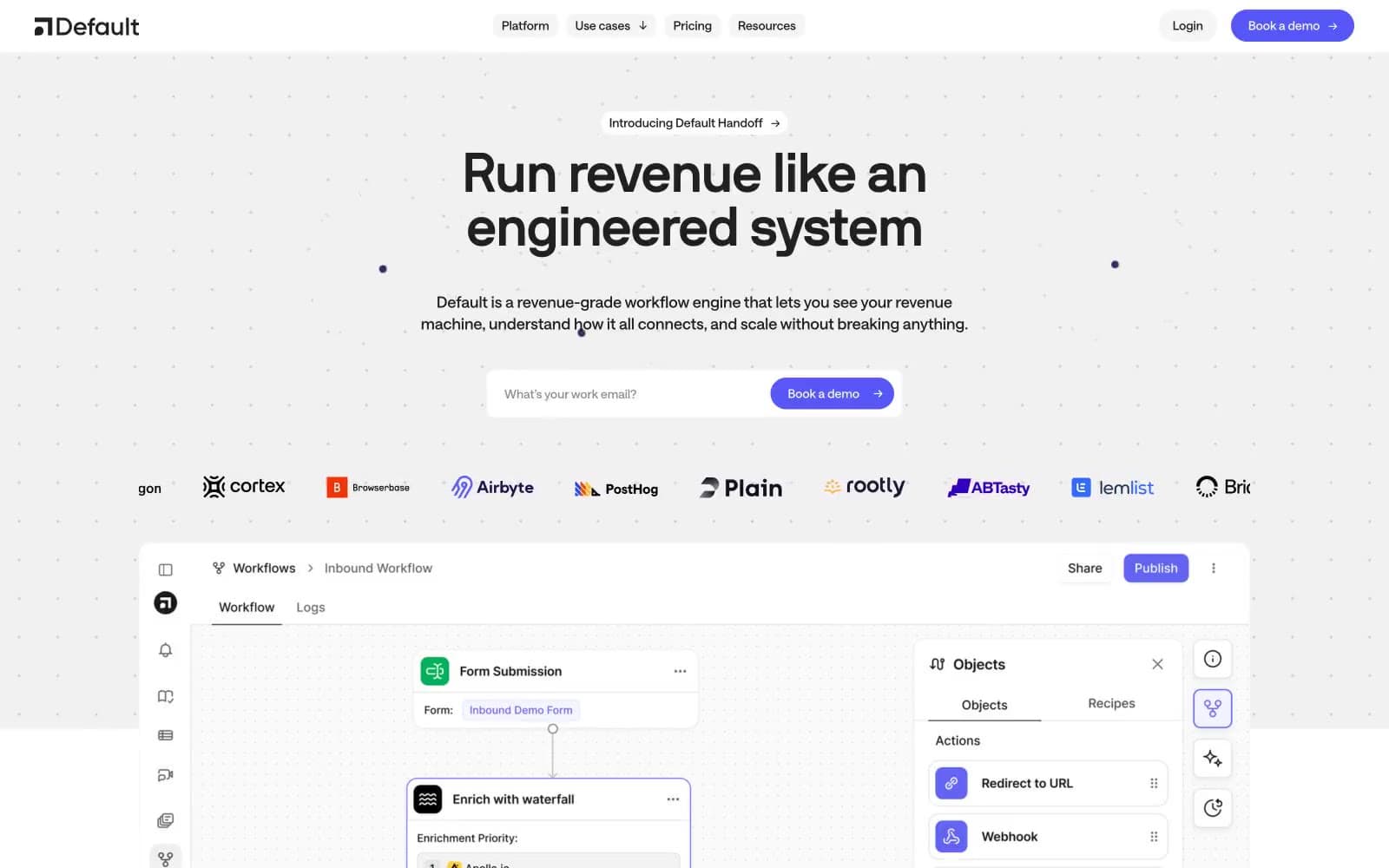
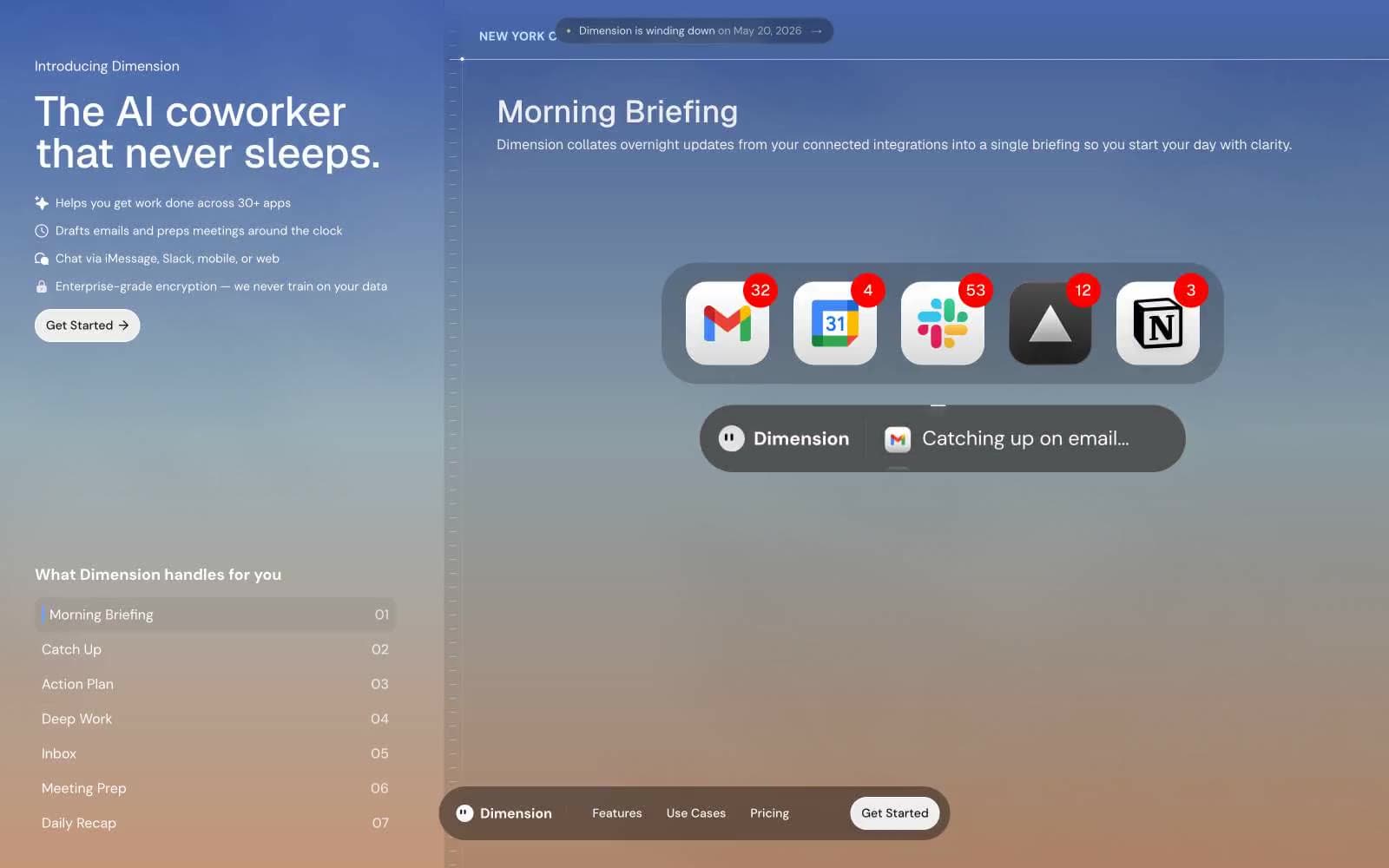
Vapi. Neon spectrogram across midnight concrete.
- AI
- Dark theme
- 17 colors
- 2 typefaces
Vapi operates as a developer-facing voice AI platform rendered in deep midnight with a single warm cream text color and two oppositional accent fills — burnt orange and mint green. The visual language is sparse and dark: headlines whisper at weight 300 in a custom neo-grotesque, corners stay unusually tight at ~5.6px (closer to a hard rectangle than a card), and color discipline is strict except in one signature moment — a horizontal audio-waveform graphic that explodes into six vivid hues (blue, pink, yellow, violet, green, orange) to evoke a voice spectrogram. Interfaces feel like a developer console: monospaced nav labels with wide tracking, thin hairline borders, no shadows, and pill-shaped action buttons that sit on the canvas without elevation.
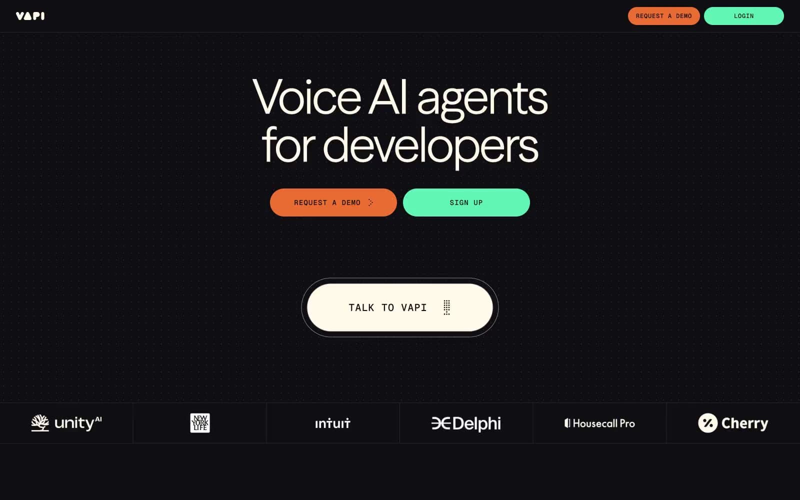
Vapi design system

Brand2
Primary filled CTA (Request a Demo) — warm burnt orange against cool dark creates urgency without the aggression of pure red
Secondary filled CTA (Sign Up / Login) — bright mint green pairs against Ember Orange as a complementary pair, the two action colors share the same pill geometry but never co-occupy the same surface
Accent4
Decorative waveform accent — appears only inside the hero audio visualization, never on UI elements
Decorative waveform accent — part of the six-color spectrogram palette in the hero
Decorative waveform accent — bright lemon dot in the hero waveform graphic
Decorative waveform accent — soft purple dot in the hero waveform graphic
Neutrals11
Card backgrounds, inset panels, and list items — one shade deeper than the canvas to create surface depth without elevation
Page background, primary canvas — near-black with a cool ink tint that lets the cream text feel hand-set rather than digital
Elevated surface layer, rarely visible — used only for small chips and modal-like overlays that need to sit above cards
Primary hairline border across lists, dividers, and card edges — appears 490+ times, it is the structural skeleton of the system
Dark borders and separators for elevated surfaces and inverted UI. Do not promote it to the primary CTA color
Muted body text, icon strokes, and disabled labels — the voice of secondary information
Tertiary text and meta-information — the lightest reading level above Zinc Mute
Light hairline border used inside nav bars and inverted surfaces — a near-white wire for dark containers
Cool-tinted light border for icons, links, and glassy outlined elements — adds a faint blue whisper to contrast with the warm Cream text
Secondary text and button labels — the cool counterpart to Cream, used when a label needs to feel more clinical than editorial
Primary heading and body text — warm off-white (not pure #fff) that reads softer on dark and unifies with the orange accent's warmth
Try a pairing
Pick any two colors from the palette to check whether text stays readable on top.
Aa
Carbon Surface on Ember Orange
6.27 : 1 contrast
- Body textPasses AA 4.5
- Large textPasses AA 3
- StrictFails AAA 7