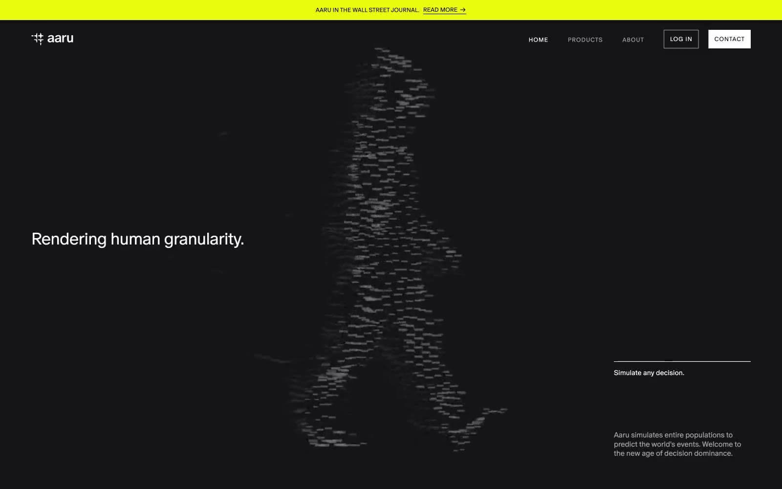
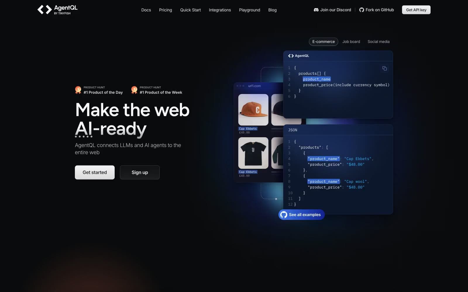
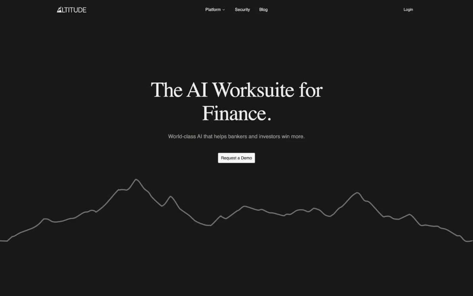
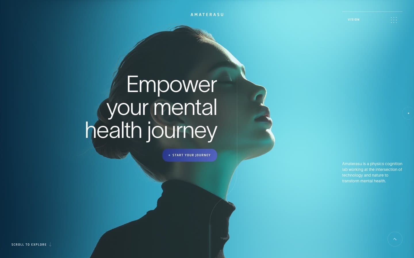
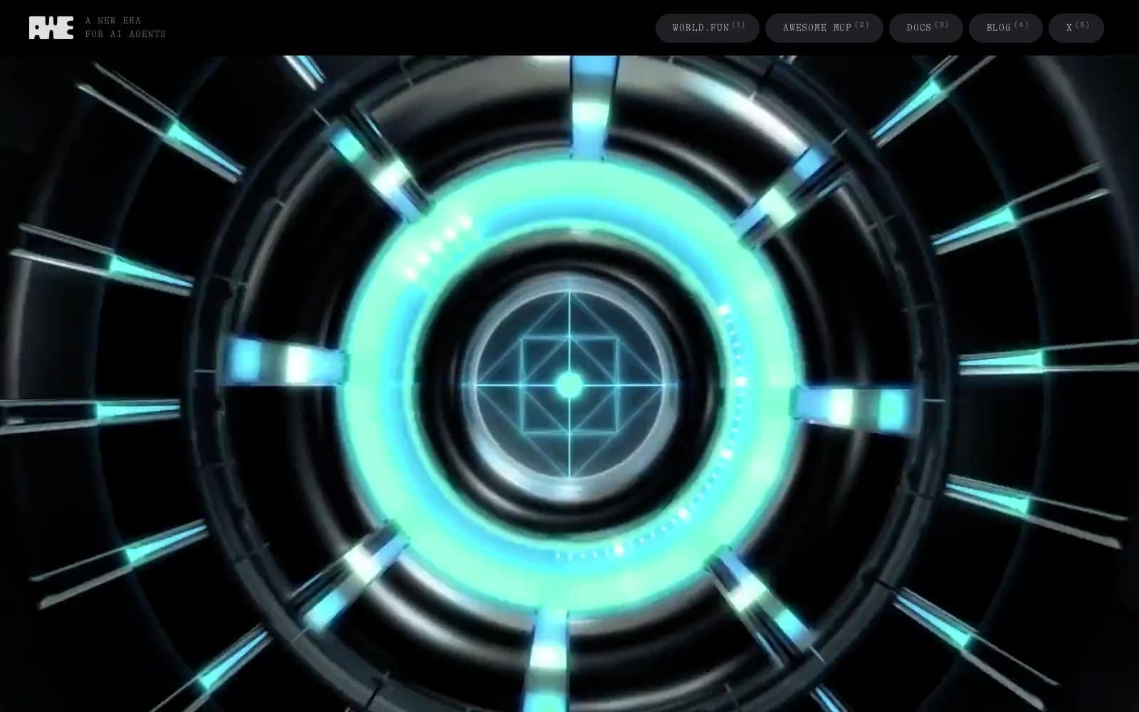
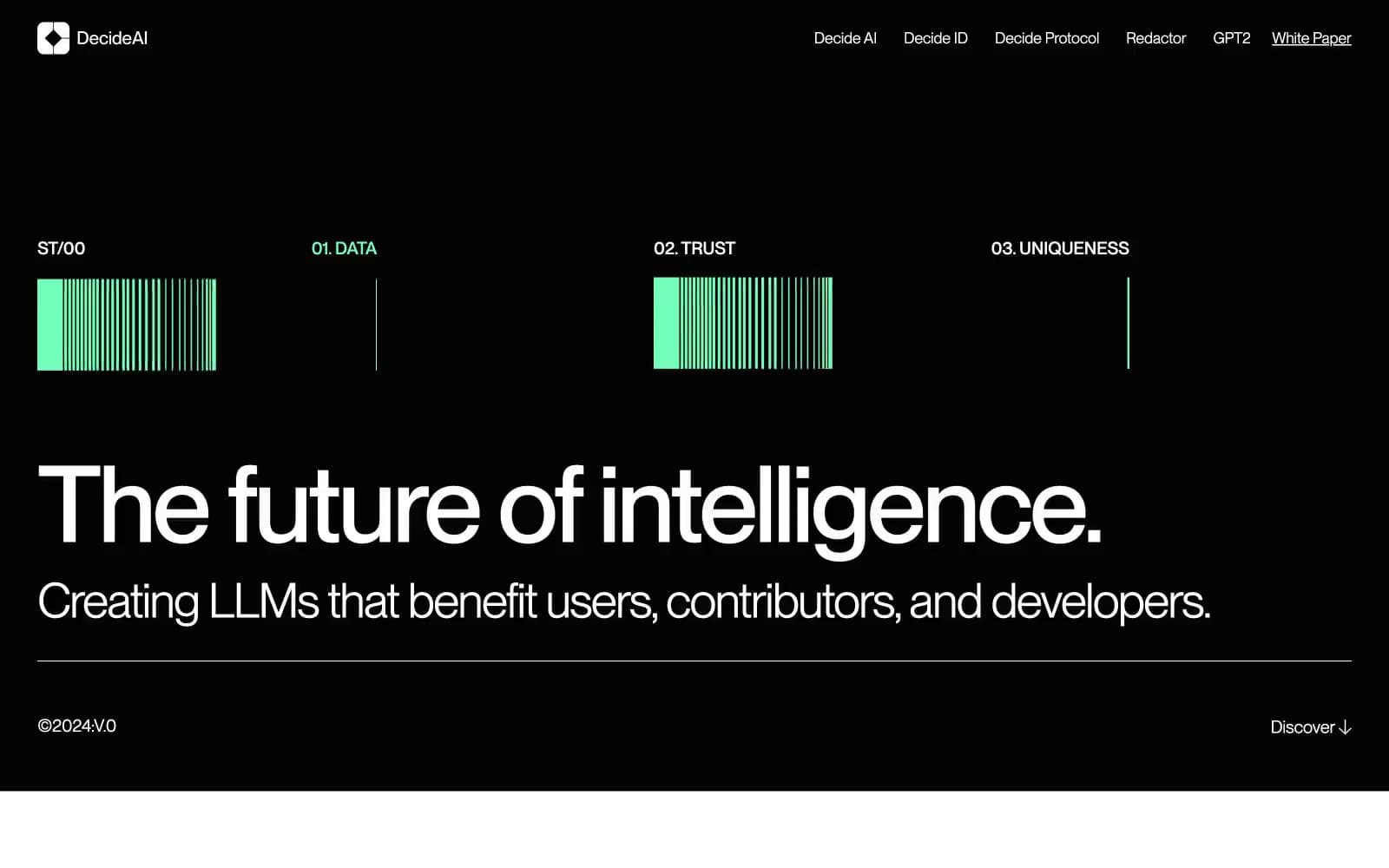
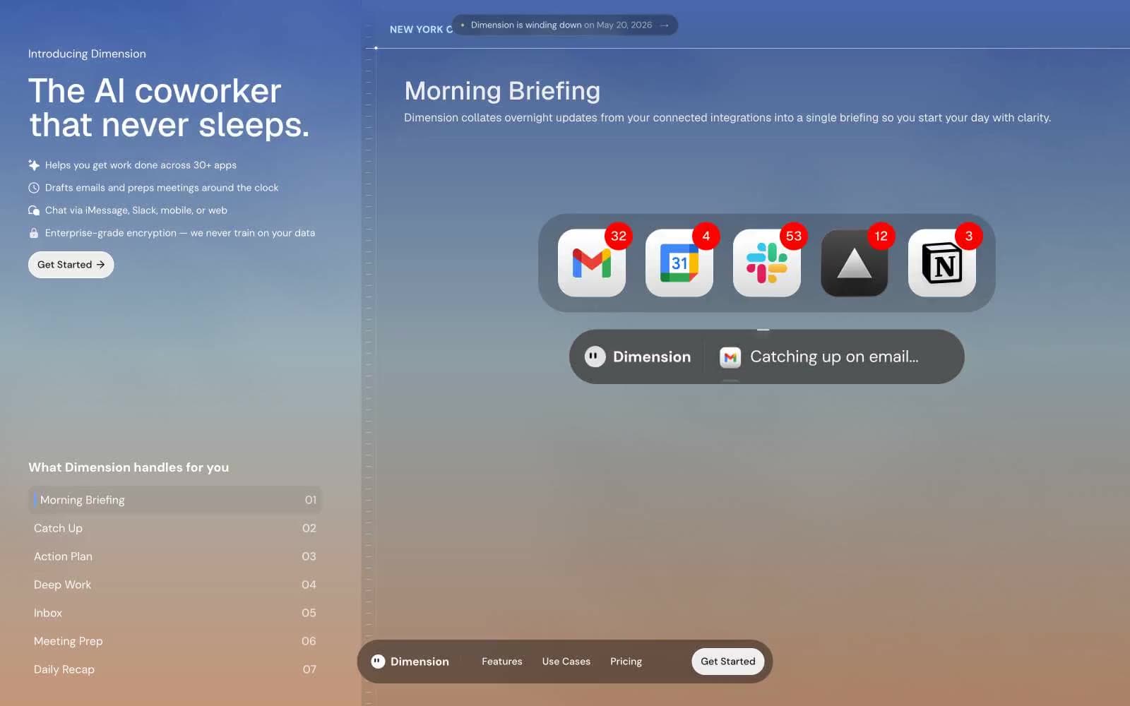
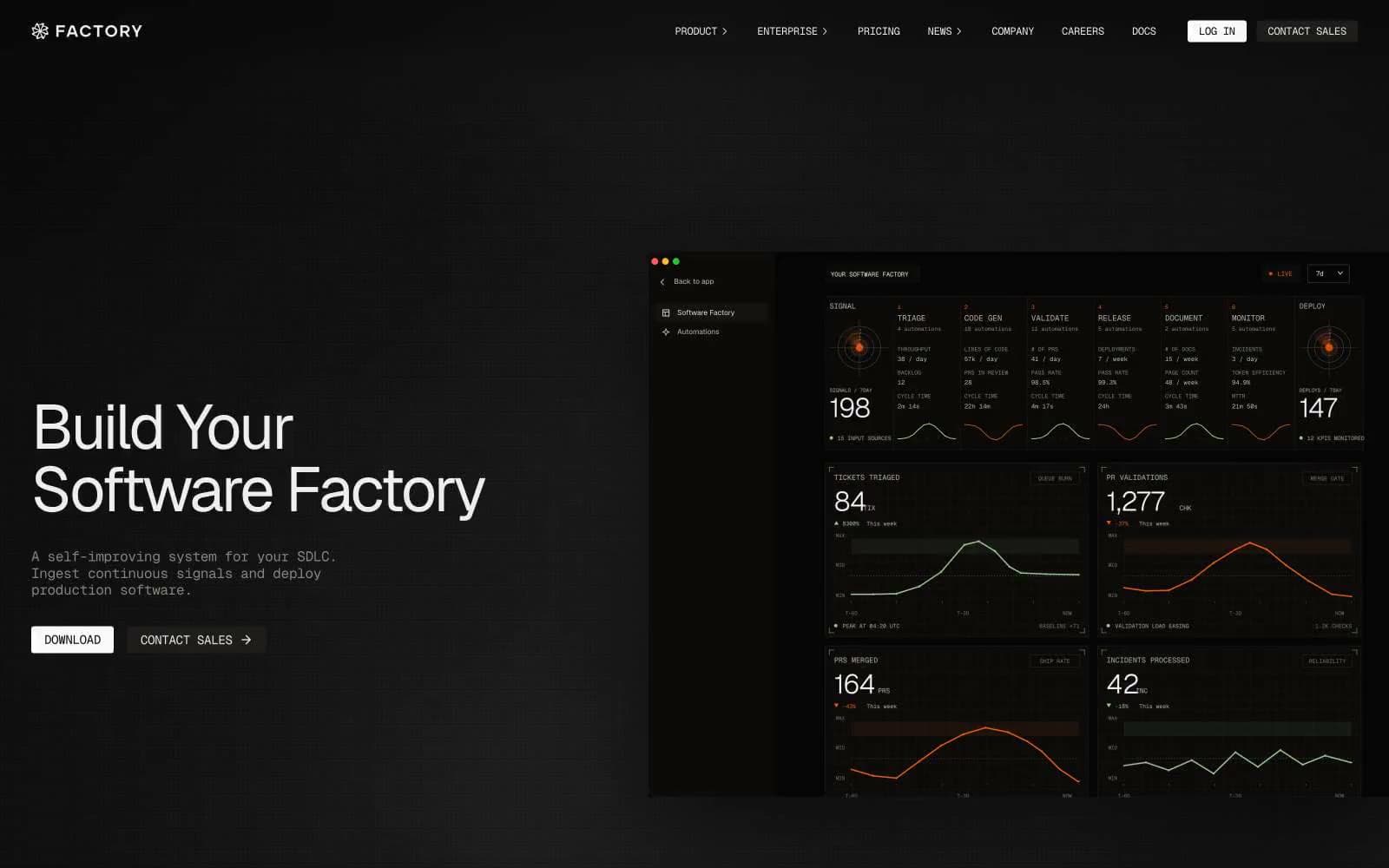
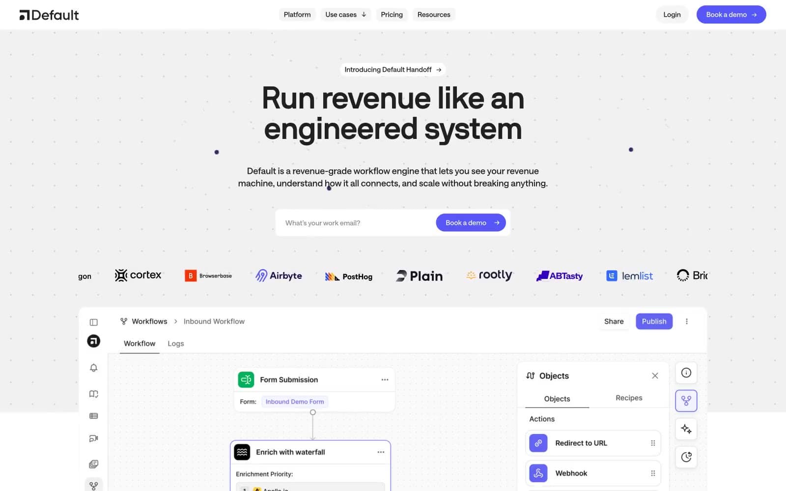
Default. Weight 400 headlines float over matte-black panels lit by thin blue ring-light accents.
- AI
- Dark theme
- 19 colors
- 1 typeface
Default operates in a dark control-room language: near-black canvas, hairline borders, and pill-shaped controls that feel calm rather than loud. Typography stays light — weight 400 at 52–64px — so headlines whisper against the matte background instead of shouting. Color is rationed: blue is the only true brand accent (links, active states, highlights, rings), green/red are reserved for success/destructive signals, and neutral fills (off-white #f2f2f2) do the work of primary CTAs. Surfaces stack in subtle elevation jumps (canvas → card → elevated panel) achieved mostly through 0.5px hairlines and inset 1px white-alpha highlights rather than drop shadows. Components are tight, compact, and information-dense — this is infrastructure software, not marketing spectacle.
Default design system

Brand3
Brand accent — active nav indicators, link highlights, icon fills, active card borders. The one true chromatic color; used 21 times as fills, borders, and background tints
Light blue text accent, informational highlights, node icons in workflow diagrams
Focus rings, active card outline borders, selection state outlines at low alpha
Accent5
Green outline accent for tags, dividers, and focused UI edges. Use as a supporting accent, not as a status color
Green wash for highlight backgrounds, decorative bands, and soft emphasis behind content. Use as a supporting accent, not as a status color
Red text accent for links, tags, and emphasized short phrases. Use as a supporting accent, not as a status color
Decorative icon accent — orange chromatic chip in product mockups
Brand chip background tint in embedded mockups and product screenshots
Neutrals11
Deepest page canvas, terminal background, behind everything
Primary card surface, panels, elevated containers, table rows
Secondary surface, borders, dividers, rail backgrounds
Secondary body text, navigation labels, and subdued headings. Do not promote it to the primary CTA color
Button borders, subtle separators
Muted body text, captions, helper text, dimmed labels
Secondary text, icon strokes, inactive nav items
Tertiary text, placeholder text, disabled states
Body text secondary, table cell text
Primary action button fill — off-white pill against dark creates the highest-contrast CTA without introducing a chromatic brand color
Primary headings, body text, icon fills, active states — the dominant ink at 413 occurrences
Try a pairing
Pick any two colors from the palette to check whether text stays readable on top.
Aa
Void on Signal Blue
5.32 : 1 contrast
- Body textPasses AA 4.5
- Large textPasses AA 3
- StrictFails AAA 7