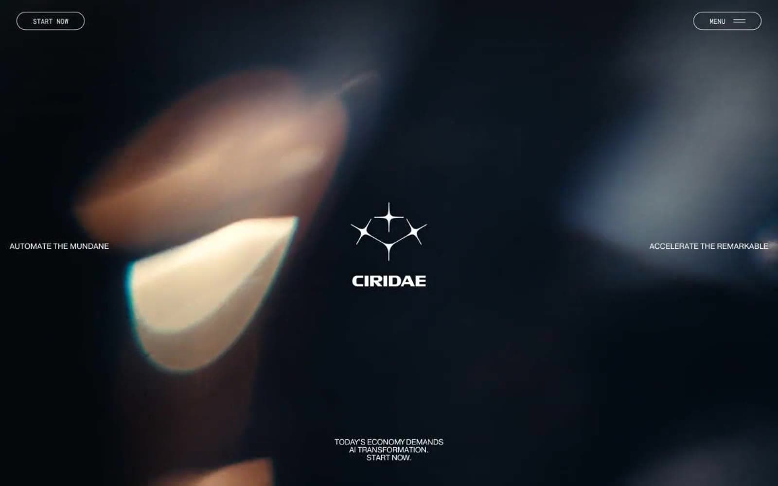
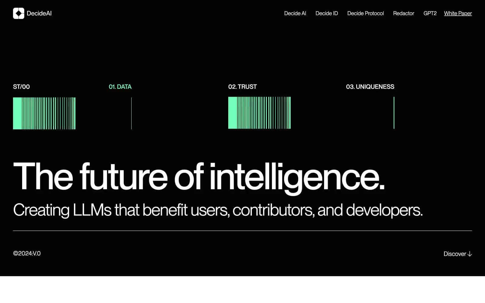
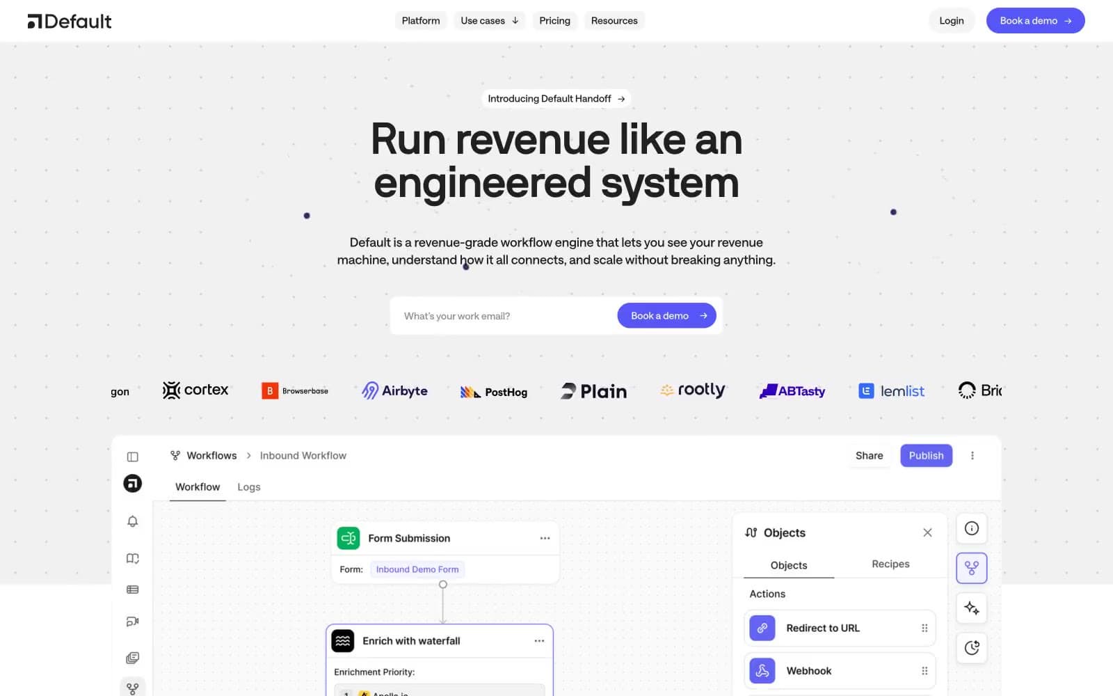
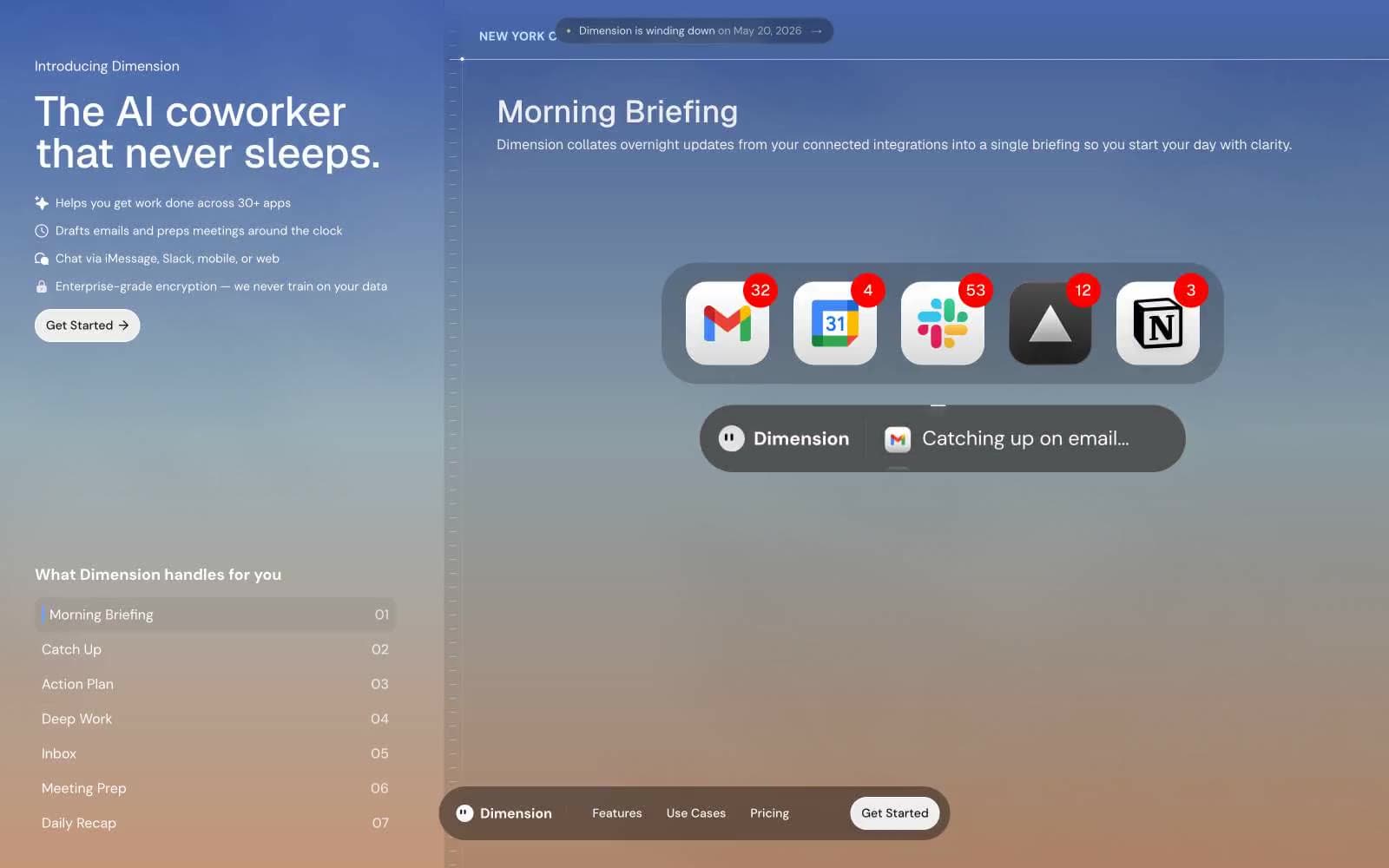
Henry. Measured, restrained, photograph-centric.
- AI
- Dark theme
- 9 colors
- 7 typefaces
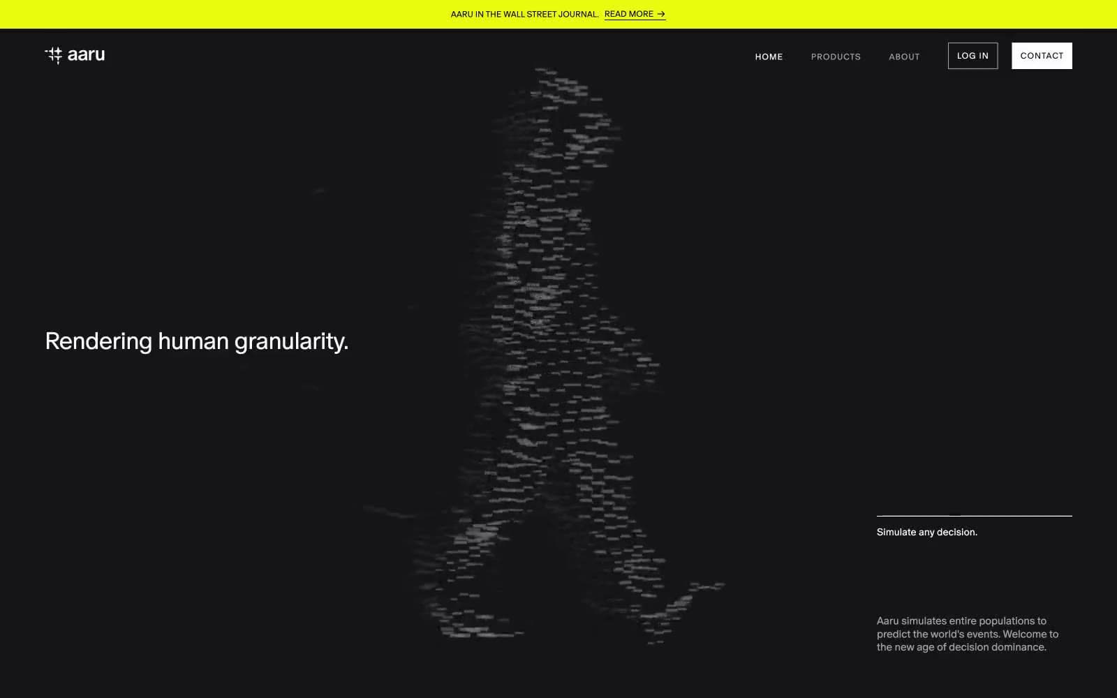
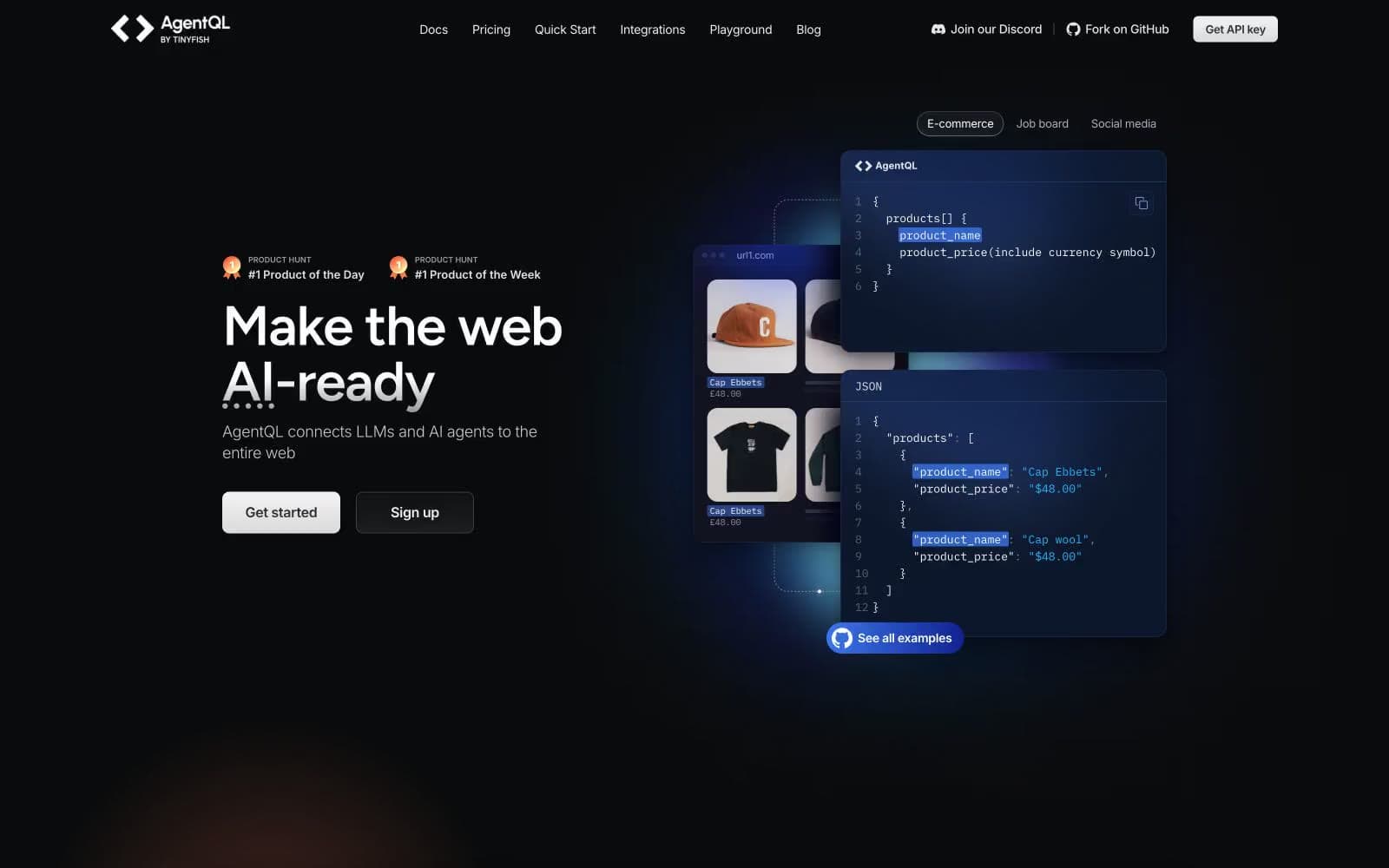
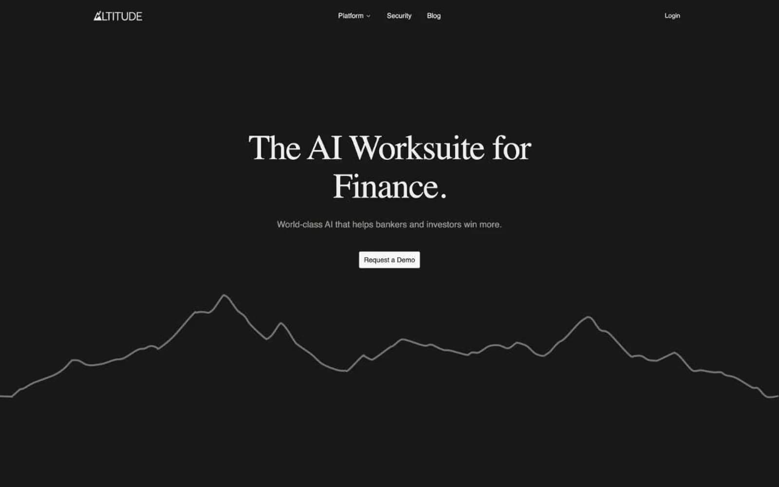
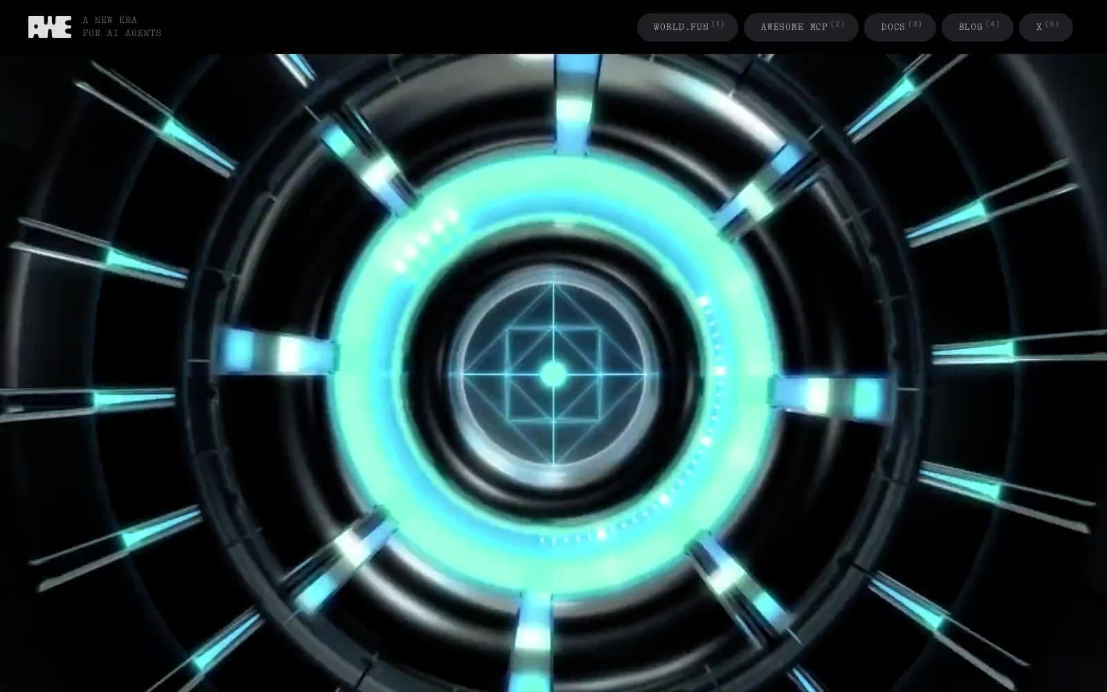
Henry operates in a near-monochrome dark world: a coal-black canvas interrupted by a single dramatic landscape photograph in the hero, and absolutely nothing else competing for attention. Typography does the heavy lifting — NB International Pro at whisper-light 300 weight for headlines (including a staggering 204px display) creates editorial confidence that monochrome palettes usually can't achieve, while tight -0.02em tracking keeps even the giant display sizes from feeling loose. The interface language is deliberately quiet: pill-shaped white CTA against black, hairline warm-gray borders (the #d4d0c9 family is the only chromatic deviation from pure neutral), translucent dark surfaces stacked in barely-perceptible layers. Color is rationed — appearing only as small functional punctuation in stat numbers and product UI cards. Components are flat, border-driven, and dense rather than spacious. The whole system feels like a high-end editorial magazine that happens to sell enterprise software.

Henry design system

Neutrals9
Primary canvas, page background, base borders — the absolute ground zero of the visual system
Deep surface fill for nested elements, icon containers — sits between canvas and card
Card and elevated surface background, subtle border tint — the first lift off pure black
Tertiary borders, disabled states, link underlines in rest position — the lowest visible neutral
Muted body text, secondary headings, low-emphasis borders — warm mid-gray companion to Bone
Supporting text and icon borders, mid-weight border emphasis
Light neutral action fill for buttons on dark surfaces.
Cool-toned secondary text, icon fills on hover, light surface highlights
Hairline borders, dividers, input outlines, and card edges on light surfaces. Do not promote it to the primary CTA color
Try a pairing
Pick any two colors from the palette to check whether text stays readable on top.
Aa
Chalk on Obsidian
21.00 : 1 contrast
- Body textPasses AA 4.5
- Large textPasses AA 3
- StrictPasses AAA 7