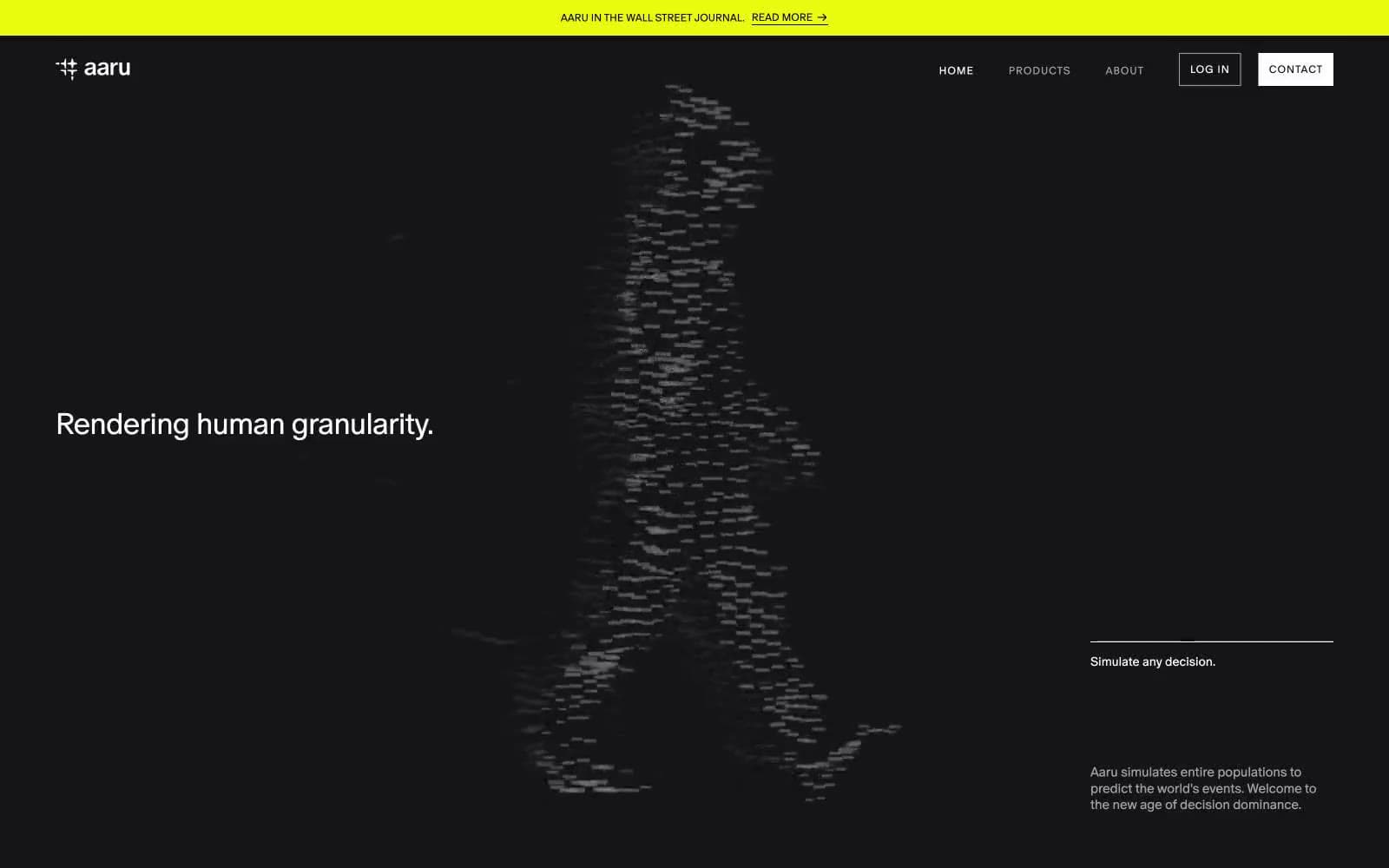
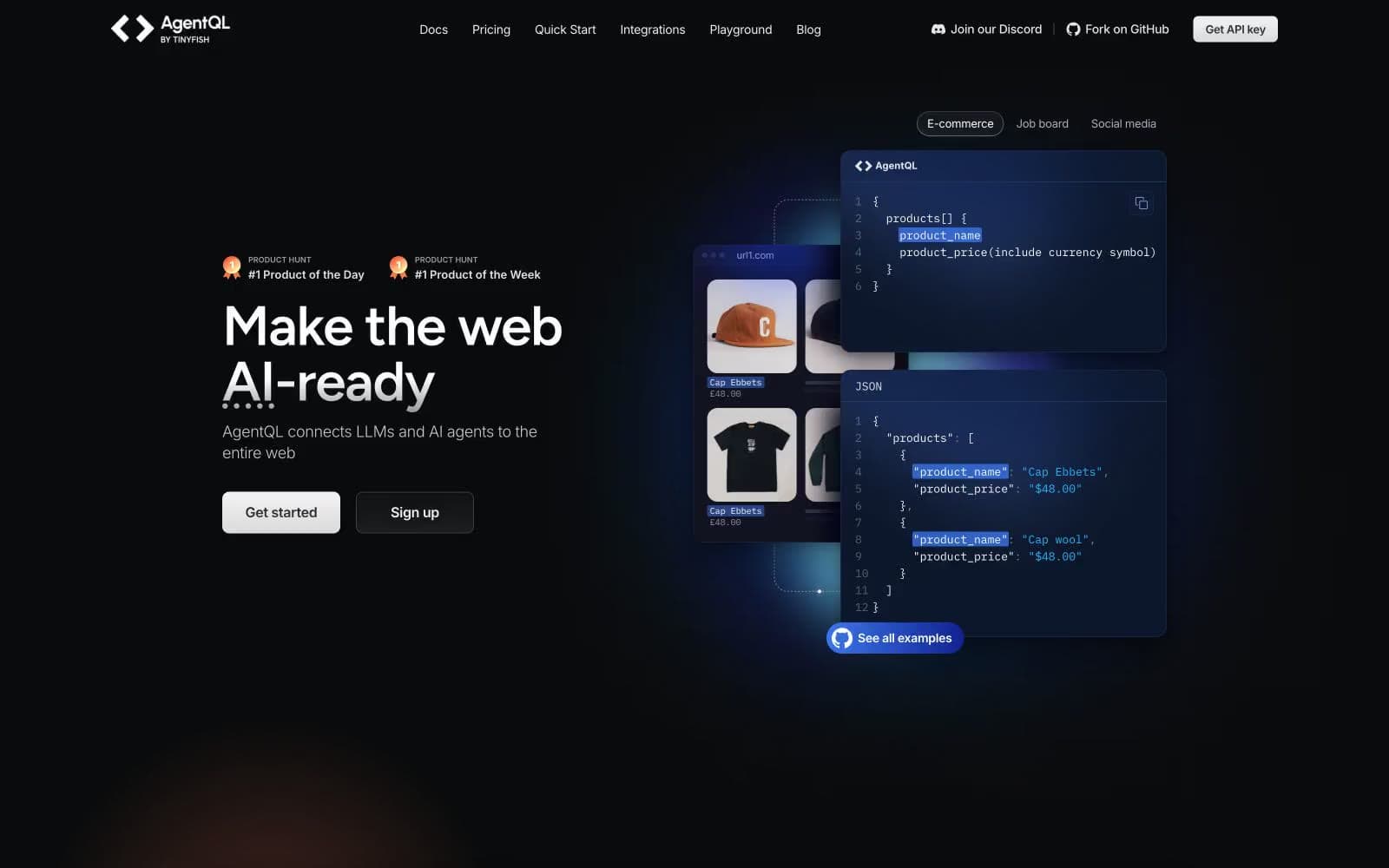
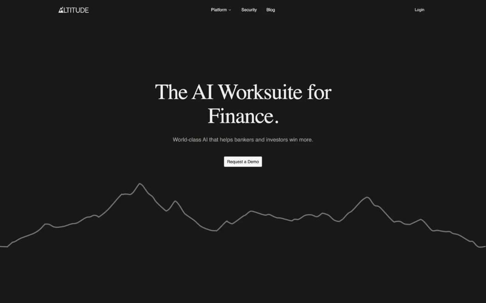
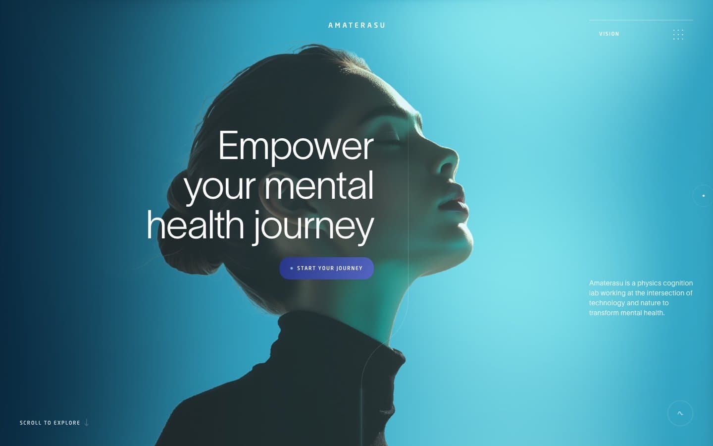
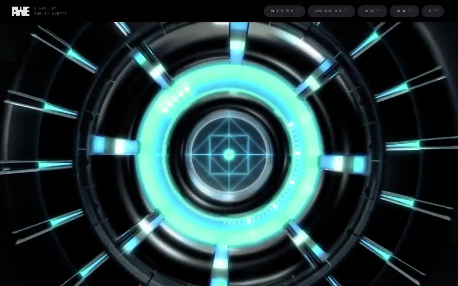
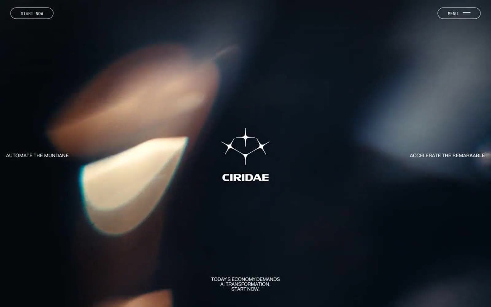
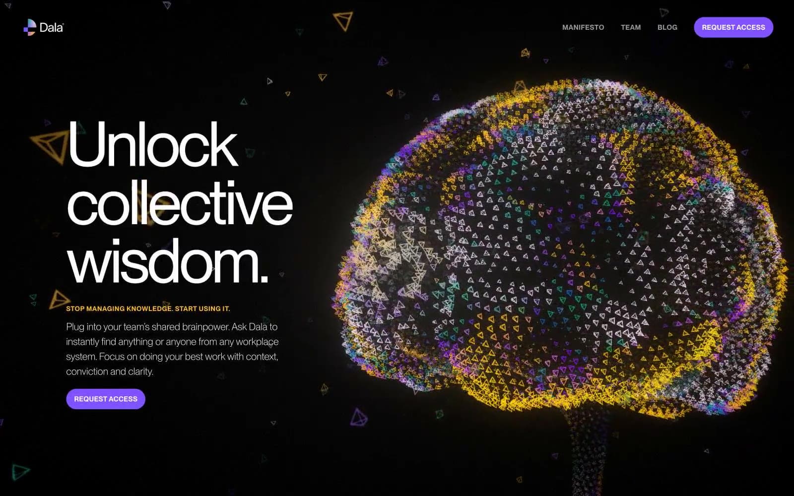
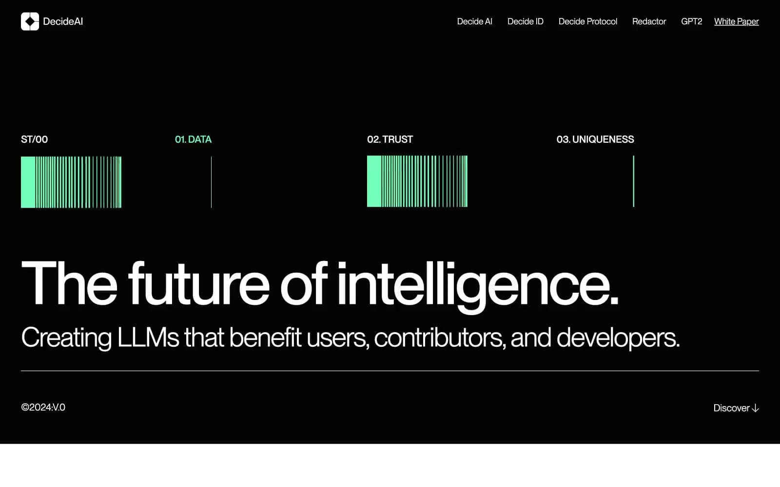
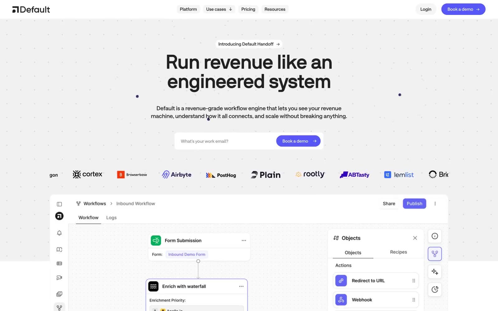
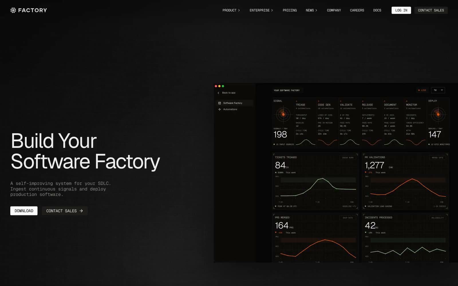
Dimension. Dusk-lit workspace with frosted glass panels.
- AI
- Dark theme
- 11 colors
- 3 typefaces
Dimension operates as a dusk-lit AI workspace: deep matte-black canvases (#0a0a0a) carry frosted-glass panels, pill-shaped controls, and whisper-weight headlines that lean on medium weights (500) rather than bold statements. The system is almost entirely achromatic — white and warm grays do all the talking — punctuated by a signature gradient hero that transitions from warm amber through to cobalt blue, evoking a sunset bleeding into a product UI. Components are lightweight and round: 9999px pill buttons, 10px UI radii, 24px card radii, with hairline 1px borders rather than heavy shadows. The visual rhythm is quiet, controlled, and editorial — every element feels placed rather than dropped, with generous breathing room and a single violet glow (#6b62f2 at 0.565 alpha) as the only chromatic accent, used sparingly in linear gradient washes.
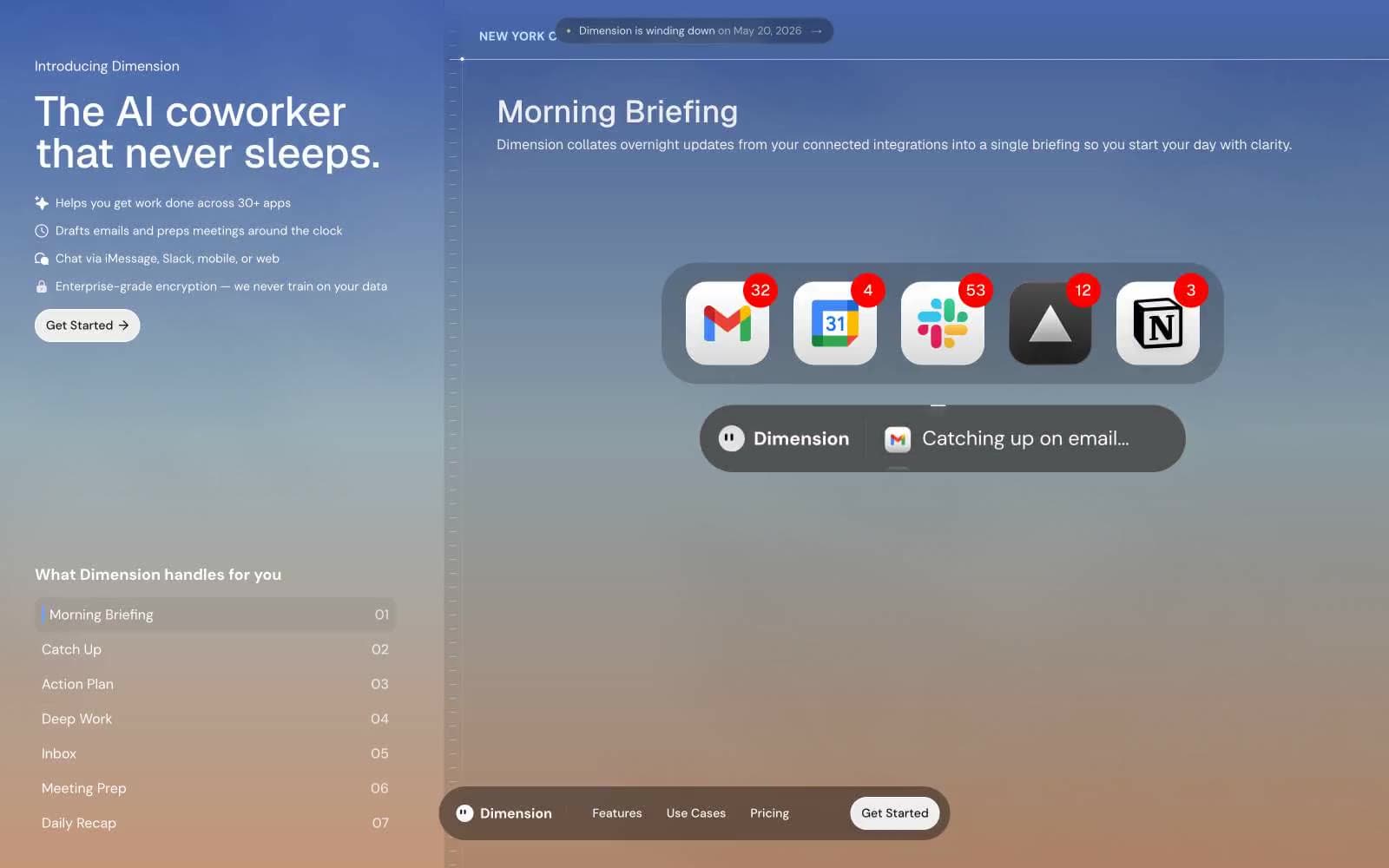
Dimension design system

Accent1
The only chromatic accent — used at 0.565 alpha in a horizontal gradient wash to add a single pulse of color to the dark UI; Radial glow accent — concentrated violet center fading to white, used as spotlight or product reveal moment
Neutrals10
Icon strokes, SVG fill, deep contrast elements on light surfaces
Primary page background, base surface for the dark UI shell
Elevated surface for floating panels, pill nav bar, modal bodies — one step above canvas
Muted text, link text, tertiary metadata, timestamp-style labels
Disabled or idle button text, integration label text in ghost controls
Secondary body text, helper copy, de-emphasized labels
Translucent panel fill at 10% opacity over dark surfaces — creates the frosted overlay look on the floating nav and feature cards
1px borders on dark-surface controls — appears as a light edge against the dark canvas, creating definition without weight
Primary readable text on dark surfaces — slightly warmer than pure white, reduces glare
Primary CTA fill, headline text on dark surfaces, card backgrounds — the inverted counterweight to the dark canvas
Try a pairing
Pick any two colors from the palette to check whether text stays readable on top.
Aa
Snow White on Ink Black
21.00 : 1 contrast
- Body textPasses AA 4.5
- Large textPasses AA 3
- StrictPasses AAA 7