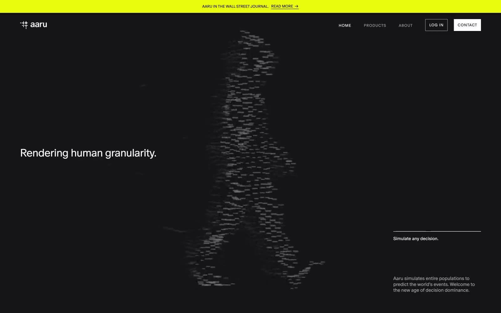
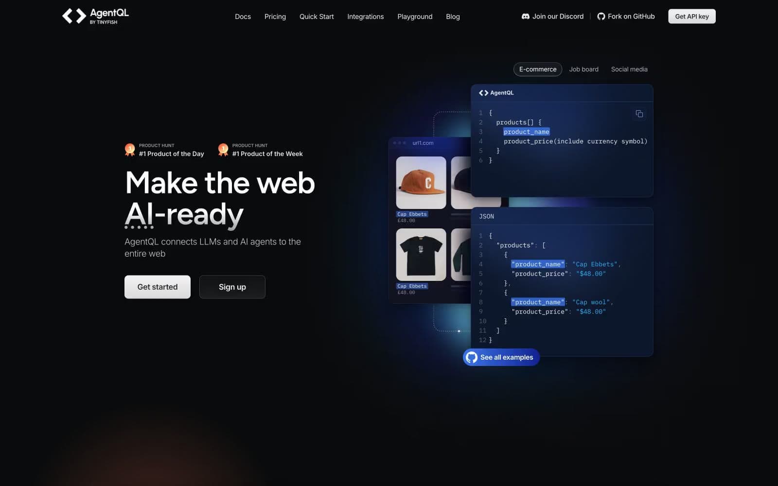
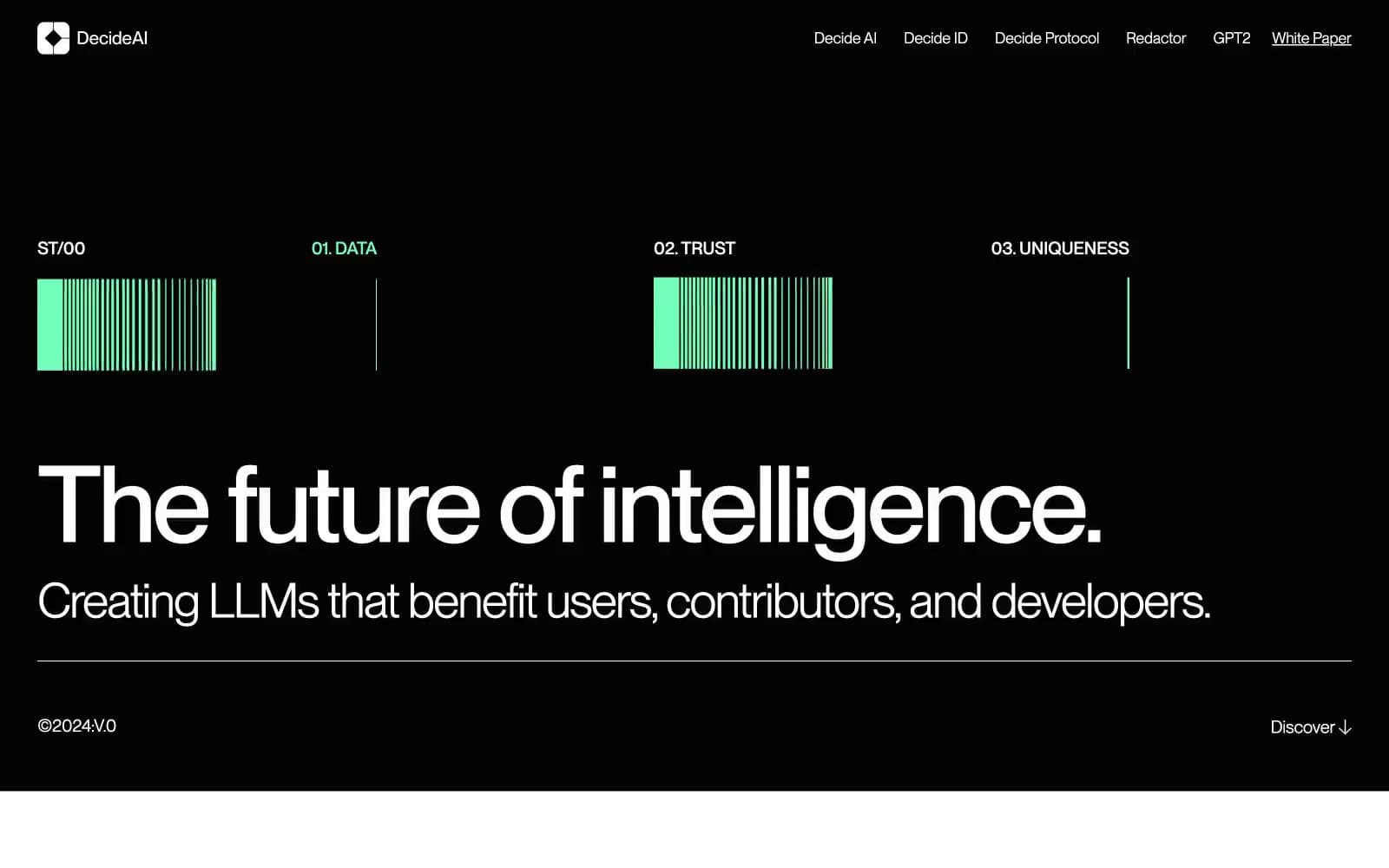
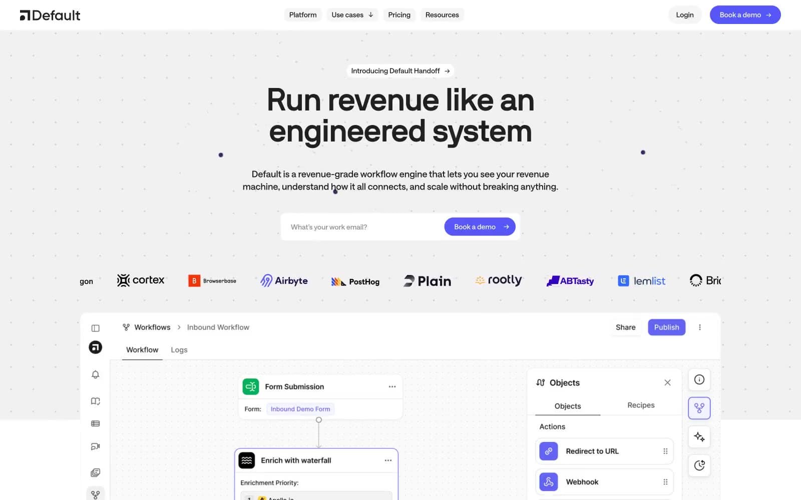
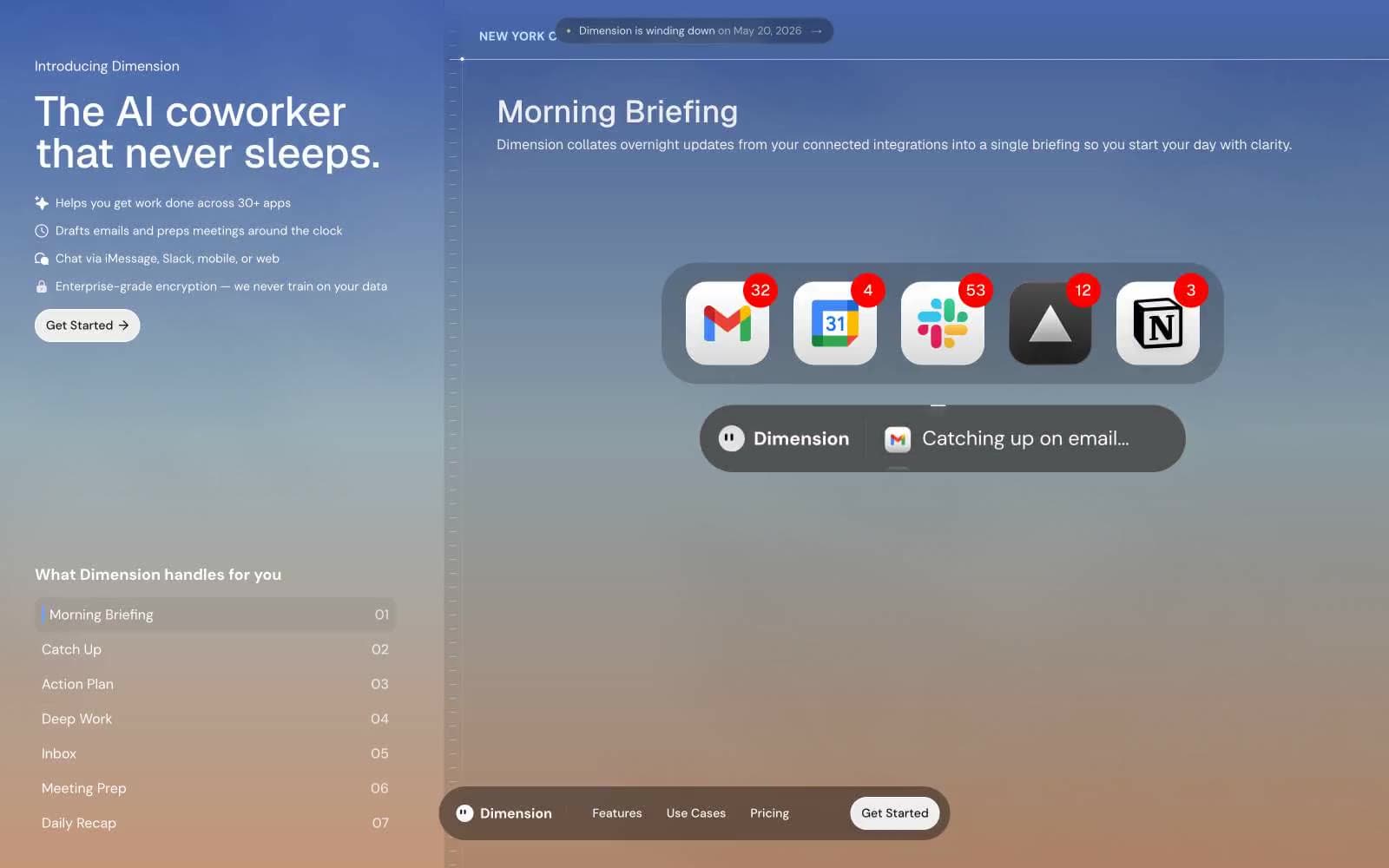
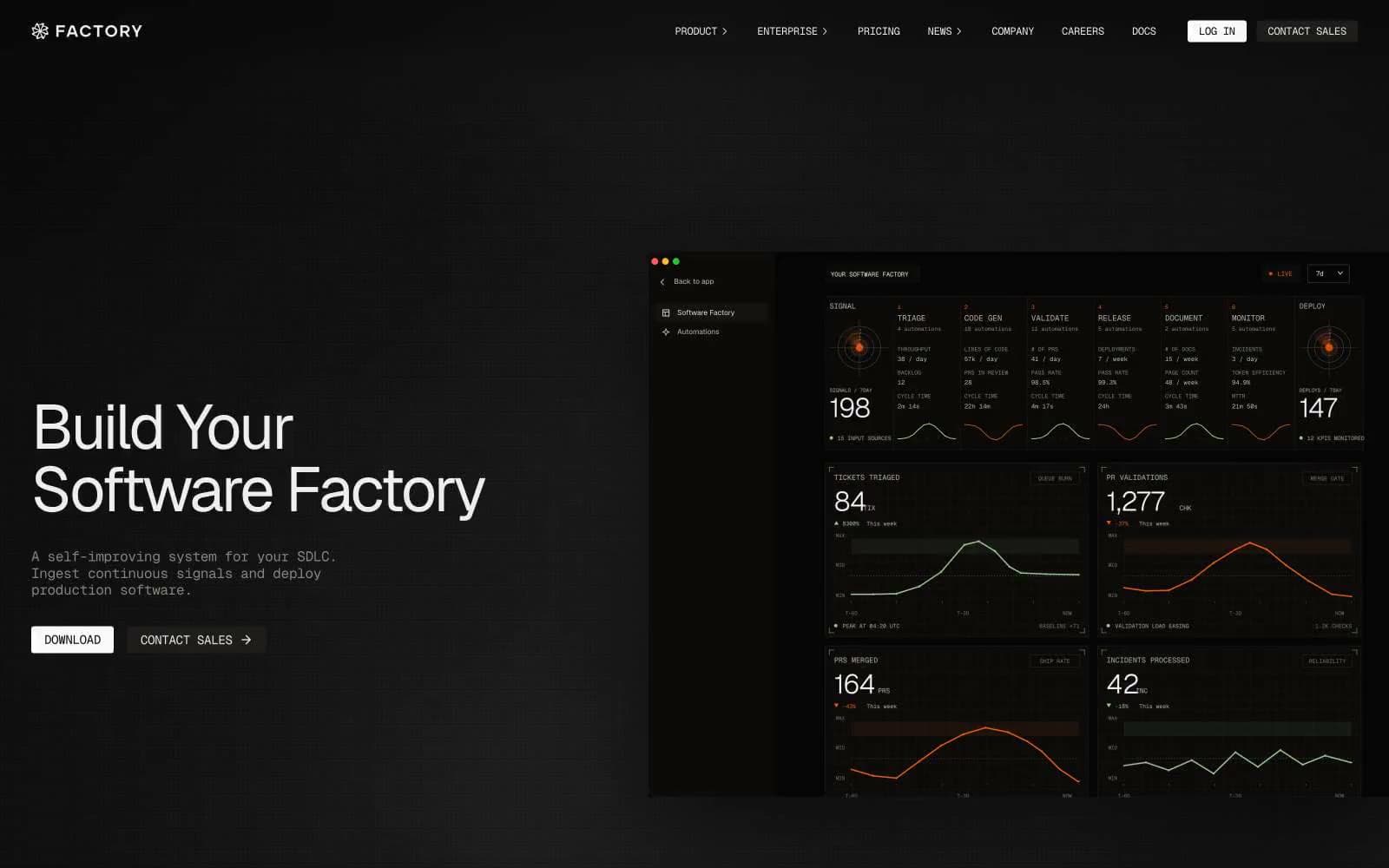
Altitude. A darkened trading floor printed on bone-white serif stock, lit only by thin borders and a single blue accent.
- AI
- Dark theme
- 13 colors
- 3 typefaces
Altitude operates in a midnight editorial register: near-black canvas, off-white serif headlines (Libre Baskerville), and razor-thin secondary type (Inter). The serif-on-dark pairing is the signature — most AI finance tools lean on geometric sans-serifs; Altitude borrows from financial print (WSJ, FT) to signal authority and discretion. Mountain ridge linework and painterly landscape photography replace the usual gradient meshes and 3D renders, grounding the AI product in a sense of summit and scale. Surfaces are stratified by barely-perceptible gray steps (#111 → #181 → #1f → #26 → #32), with hairline borders doing the structural work that shadows do elsewhere. Color is almost entirely absent from the interface — when it appears, it reads as functional punctuation rather than decoration. Components are tight, rectangular (4–8px radii), and content-forward.
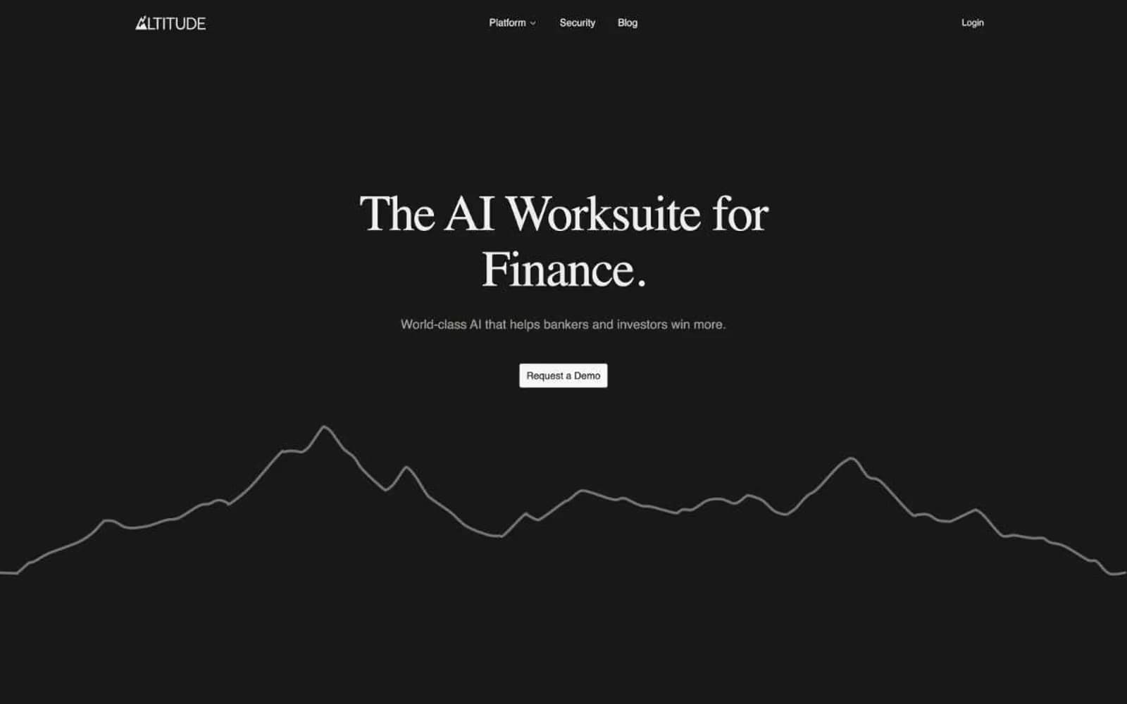
Altitude design system

Brand1
Decorative deep-blue tone used in heading borders and subtle heading tints — adds depth without breaking the monochromatic discipline
Accent1
Sole chromatic accent — inline link highlights, selection, active state within data-dense terminal views; appears as the only color in an otherwise achromatic system
Neutrals11
Deepest layer — footer, contrast blocks, shadow wells
Primary page background; the foundational dark surface that all sections sit on
Card and input surfaces lifted one step above canvas
Elevated surfaces — table rows, hover states, secondary panels
Highest surface tier — dropdowns, popovers, selected list items
Deep borders, table separators
Subtle dividers, badge backgrounds, low-emphasis text
Muted helper text, icon strokes, disabled labels
Secondary borders and card outlines
Primary text and hairline borders — the dominant foreground tone
Icon glyphs, card backgrounds for light-section contrast blocks, max-emphasis text
Try a pairing
Pick any two colors from the palette to check whether text stays readable on top.
Aa
Pure White on Mid Navy
12.14 : 1 contrast
- Body textPasses AA 4.5
- Large textPasses AA 3
- StrictPasses AAA 7