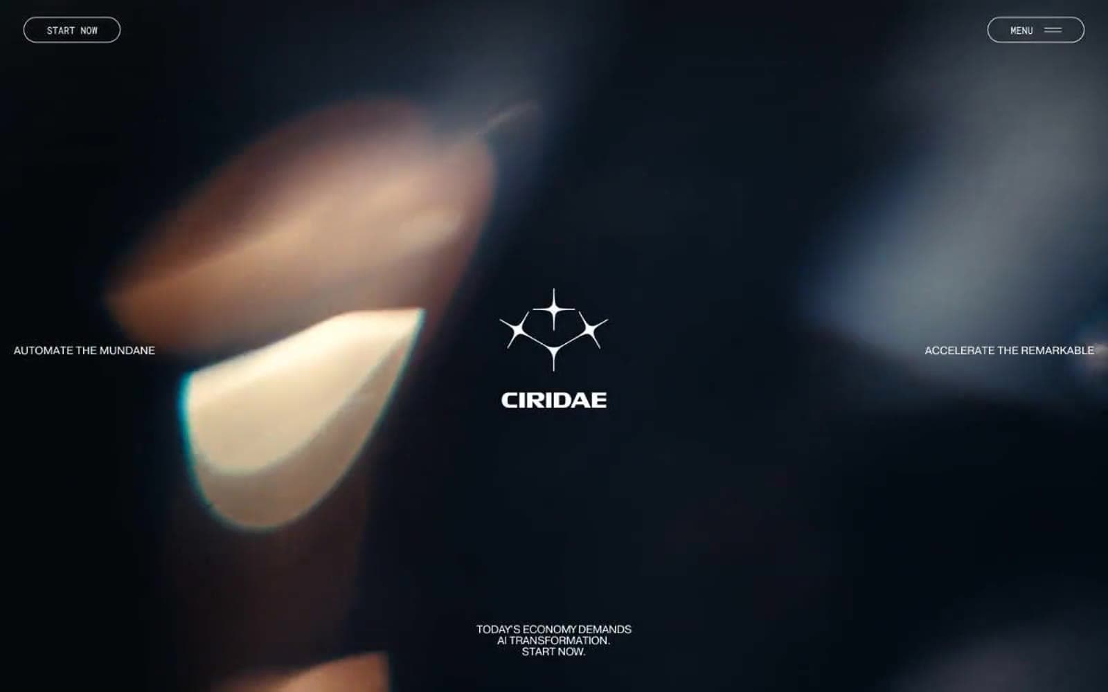
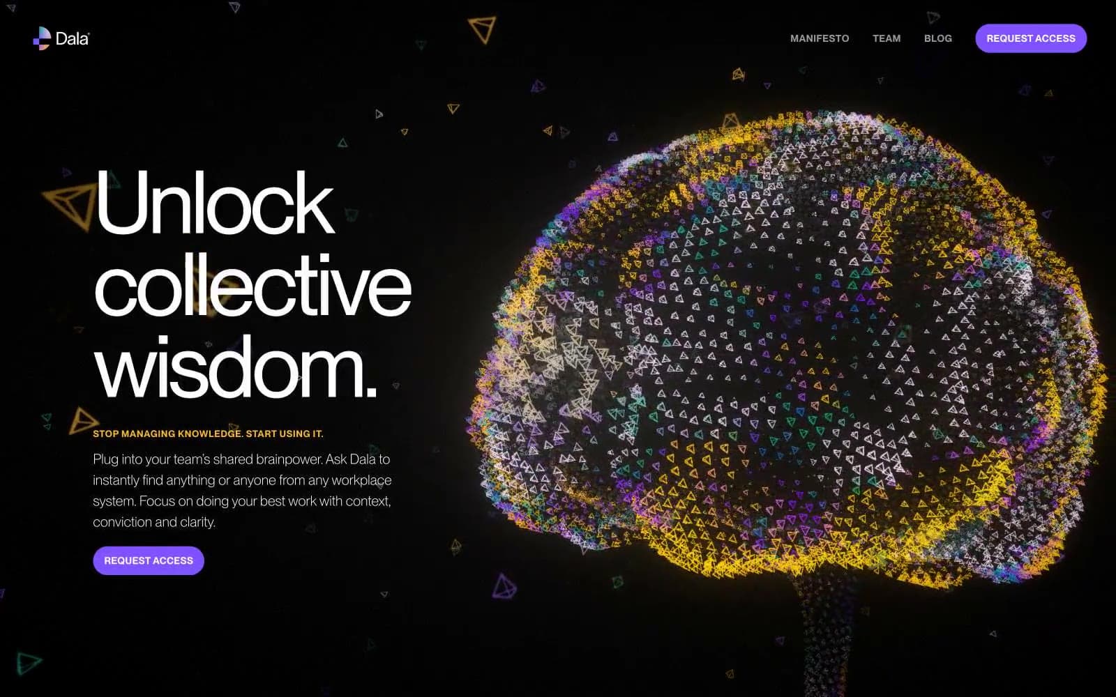
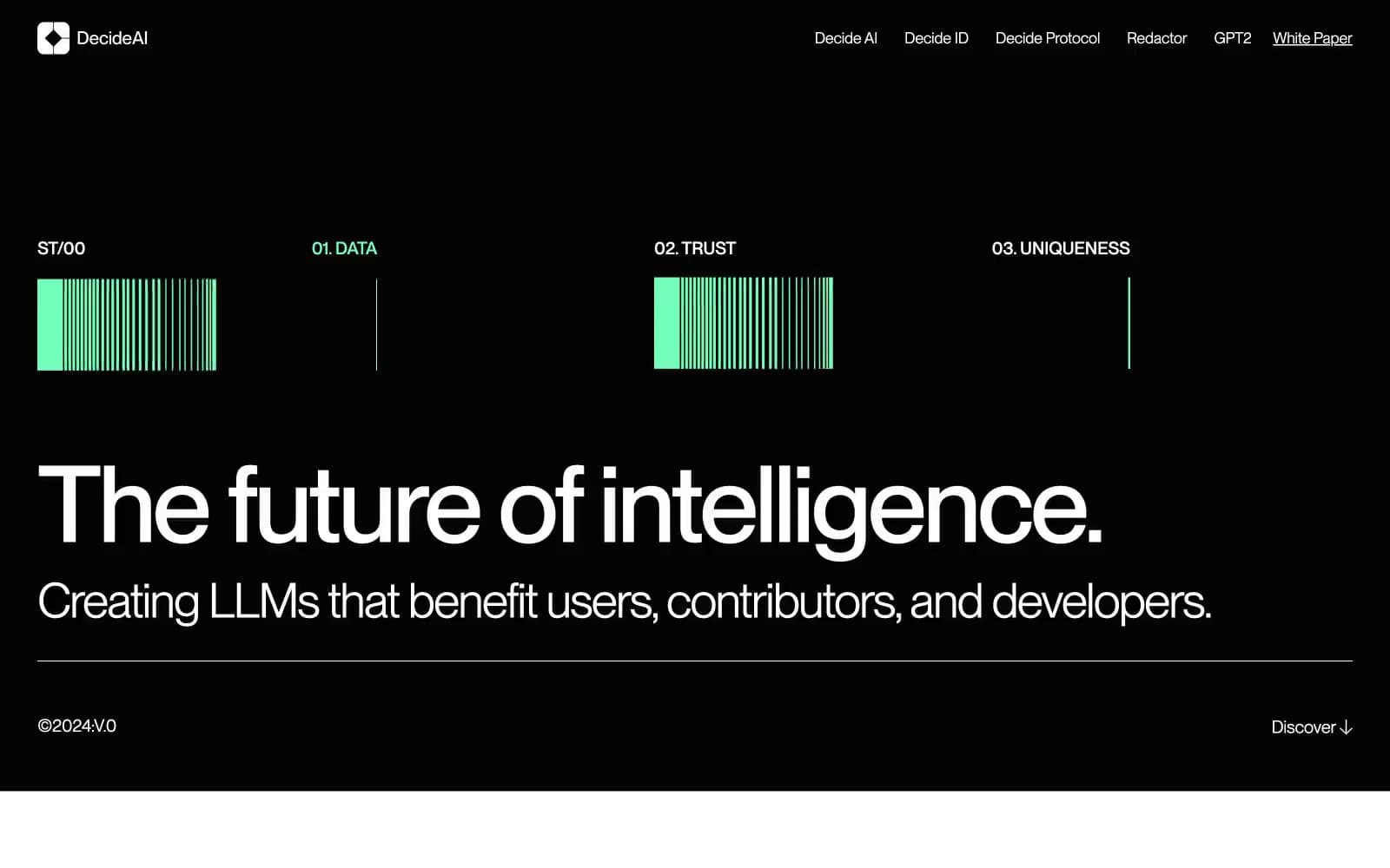
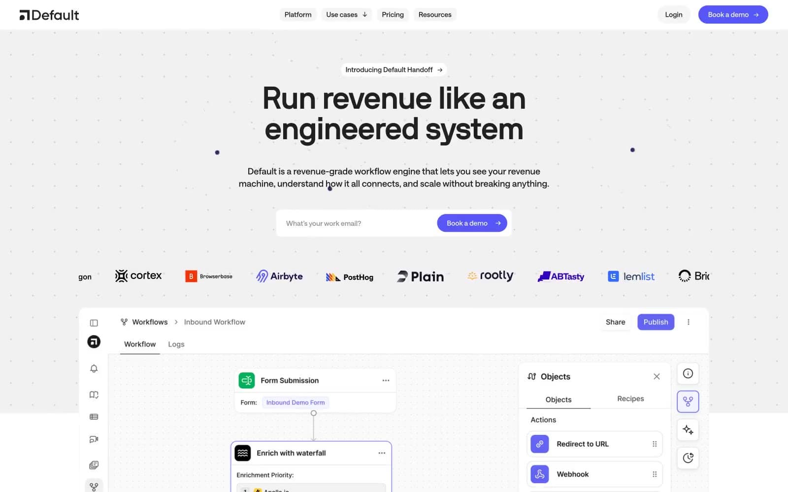
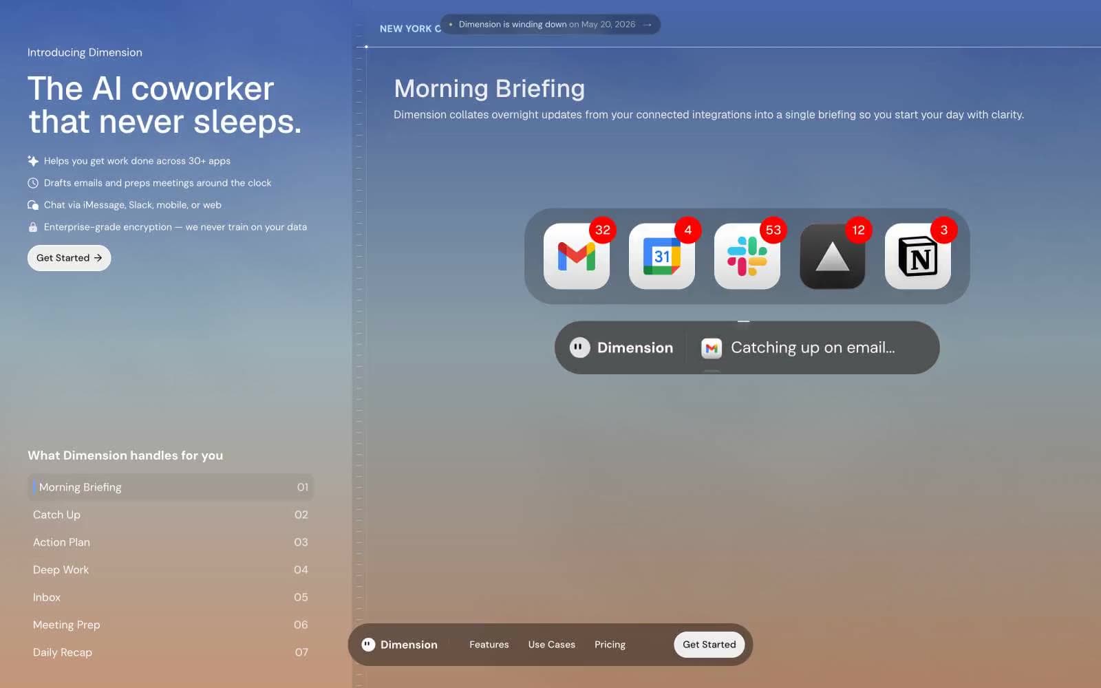
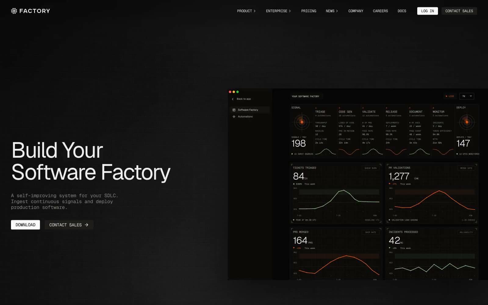
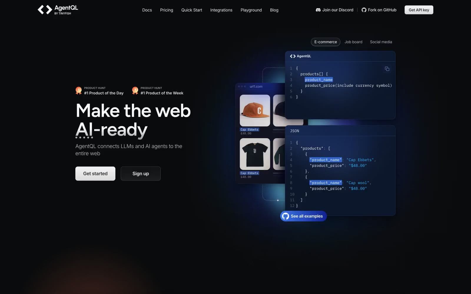
AgentQL. Aurora glow over a midnight terminal.
- AI
- Dark theme
- 16 colors
- 3 typefaces
AgentQL operates in a deep-space command-center register: near-black canvas, tightly letter-spaced Figtree display headlines, and a single pair of violet aurora glows (purple + pink radial gradients) that bleed from the hero into the background. The interface is overwhelmingly achromatic — white type, cool-gray secondary text, hairline borders in dark navy — with color reserved for two specific jobs: product surface highlights (a few cards lift into a slightly violet-tinted dark) and accent CTAs (a single blue→violet gradient pill). Components sit on flat dark surfaces with generous padding, rounded to 12px, and rely on heavy dark drop shadows rather than glow for depth. The overall feel is closer to a dark IDE theme than a marketing site — Inter carries the UI, IBM Plex Mono owns code blocks, and Figtree whispers the headlines at weight 500 with tight tracking.
AgentQL design system

Brand4
Highlighted card surface for feature spotlights; a violet-tinted lift that breaks the monochrome rhythm without becoming decorative
Violet wash for highlight backgrounds, decorative bands, and soft emphasis behind content. Do not promote it to the primary CTA color
Vivid blue link and accent text — the sharp chromatic punctuation against all the dark navy
Mid-saturation violet-blue used in code-syntax blocks and gradient stops
Accent2
Supporting palette color for small decorative accents when the core palette needs contrast. Do not promote it to the primary CTA color
Secondary hero glow bleeding from bottom-right — warm counterpoint to the aurora purple
Neutrals10
Deepest surface layer, page base under hero — the floor of the dark stack
Primary page canvas and most card backgrounds; cool blue-black anchors the whole system
Elevated card surface — sits one step above the canvas, used for feature and pricing cards
Subtle card borders, slightly lighter than Obsidian Edge for inner nesting
Primary border color on cards and buttons — defines component outlines against the dark canvas
Lighter violet-tinted border for dividers and section separators
Muted borders and disabled state outlines
Secondary text and subtle hairline borders — the most-used neutral after white
Tertiary text, muted descriptions, helper copy
Primary text and primary CTA fill — high-contrast white against the dark canvas
Try a pairing
Pick any two colors from the palette to check whether text stays readable on top.
Aa
Quartz on Cobalt Panel
15.10 : 1 contrast
- Body textPasses AA 4.5
- Large textPasses AA 3
- StrictPasses AAA 7