Amaterasu. Celestial teal sanctuary.
- AI
- Dark theme
- 10 colors
- 4 typefaces
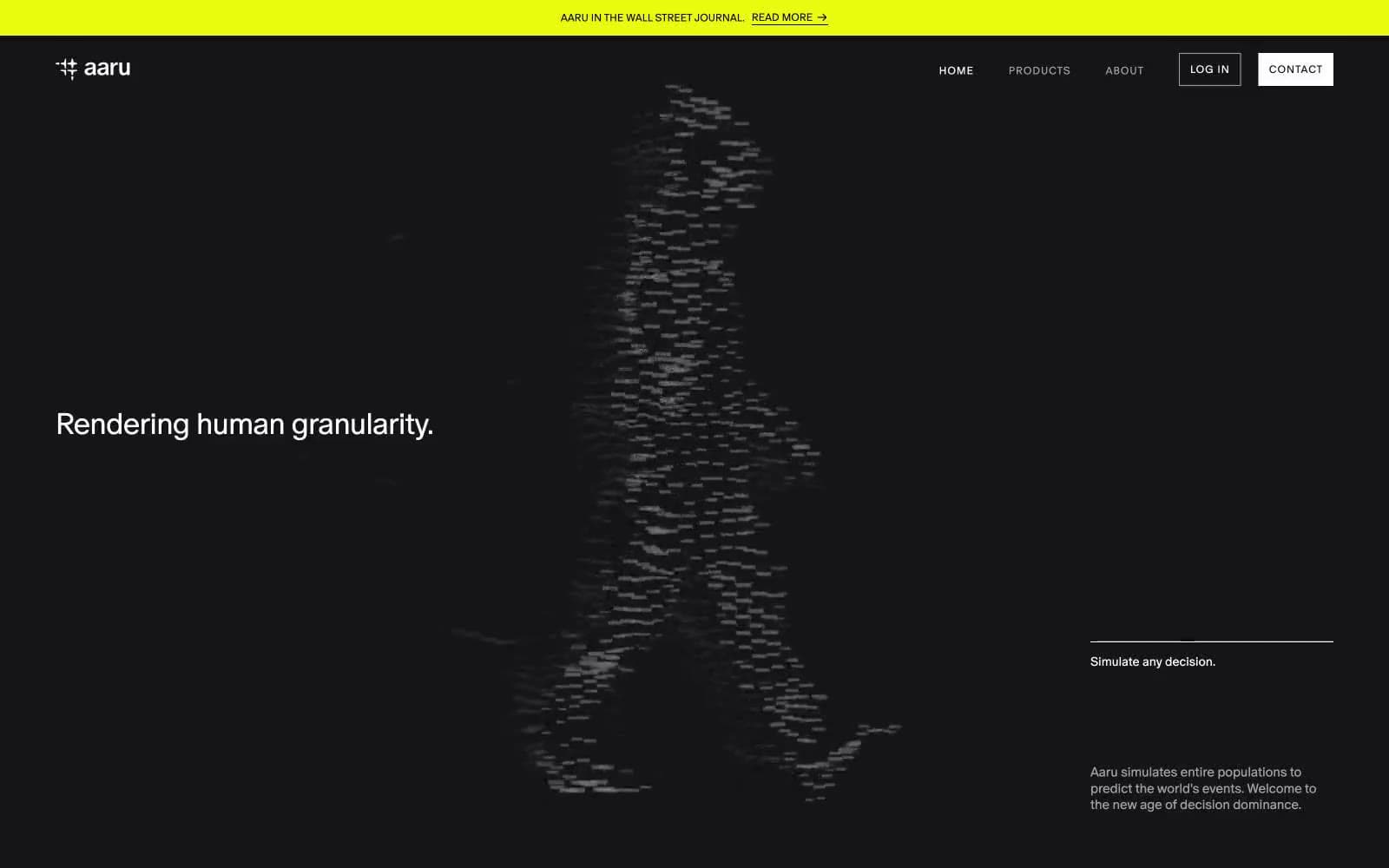
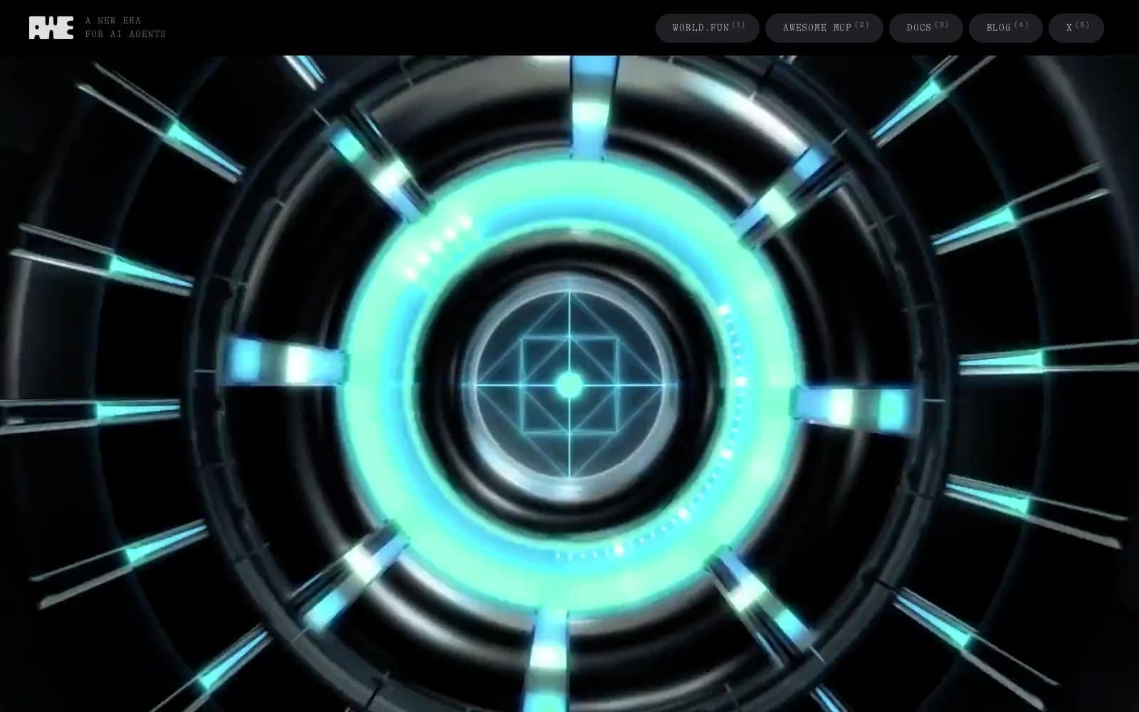
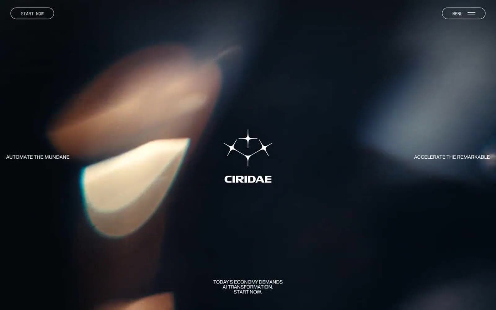
Amaterasu lives inside a cinematic dark photograph: a full-bleed teal-lit profile portrait washes the viewport in deep cyan atmosphere, and a single deep cosmic violet (#1b2978) is the only structural ink in the system. Typography splits into two contrasting registers — a whisper-weight display face (TWKLausanne-200) locks headlines tight against the dark at 50–80px with aggressive negative tracking (-0.040em to -0.025em), while a wide-tracked all-caps label face (NeoSansPro-Medium) floats small nav and scroll cues at 10–12px with extreme +0.16em to +0.32em letter-spacing. Components stay deliberately thin: 20px-radius pill controls with violet hairline outlines instead of heavy filled blocks, white text floating in 40–60px negative space, and zero box-shadow elevation. The palette is a disciplined two-ink system (Polar White + Cosmic Violet) with teal appearing only as atmospheric photographic light and gradient washes — never as a UI surface, button, or text color.

Amaterasu design system

Brand5
Primary brand ink — outlined button borders, heading text on light surfaces, the only chromatic voice in the UI
Deeper violet for secondary borders and gradient origins — bridges Cosmic Violet into the atmospheric range
Atmospheric teal pulled from the hero photography — background washes and the emotional color of the brand
Terminal stop of the radial atmospheric gradients — recreates the directional key light of the hero at smaller scales; Decorative radial gradient that recreates the hero's directional teal light in section panels
Decorative violet gradient for atmospheric panels
Accent2
Decorative SVG stroke for iconography and illustration accents
Muted blue used for link focus-ring shadows and hover glows
Neutrals3
Text on light surfaces and deepest contrast points
Near-gray stroke color for subtle decorative lines and secondary UI elements
Primary text on the dark hero, light section surfaces, card backgrounds, button text on violet
Try a pairing
Pick any two colors from the palette to check whether text stays readable on top.
Aa
Polar White on Cosmic Violet
12.84 : 1 contrast
- Body textPasses AA 4.5
- Large textPasses AA 3
- StrictPasses AAA 7