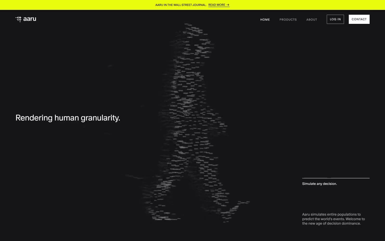
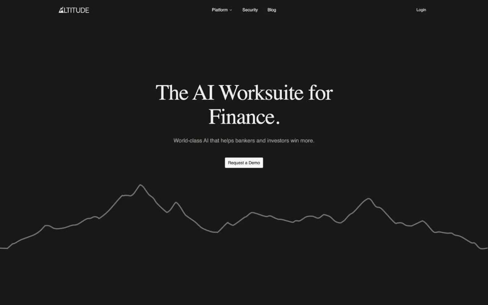
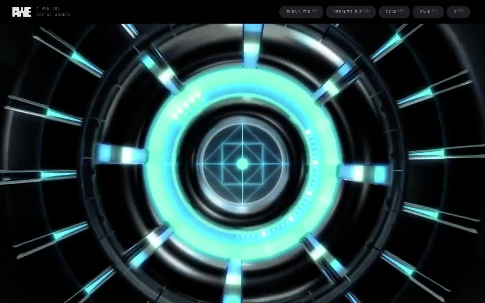
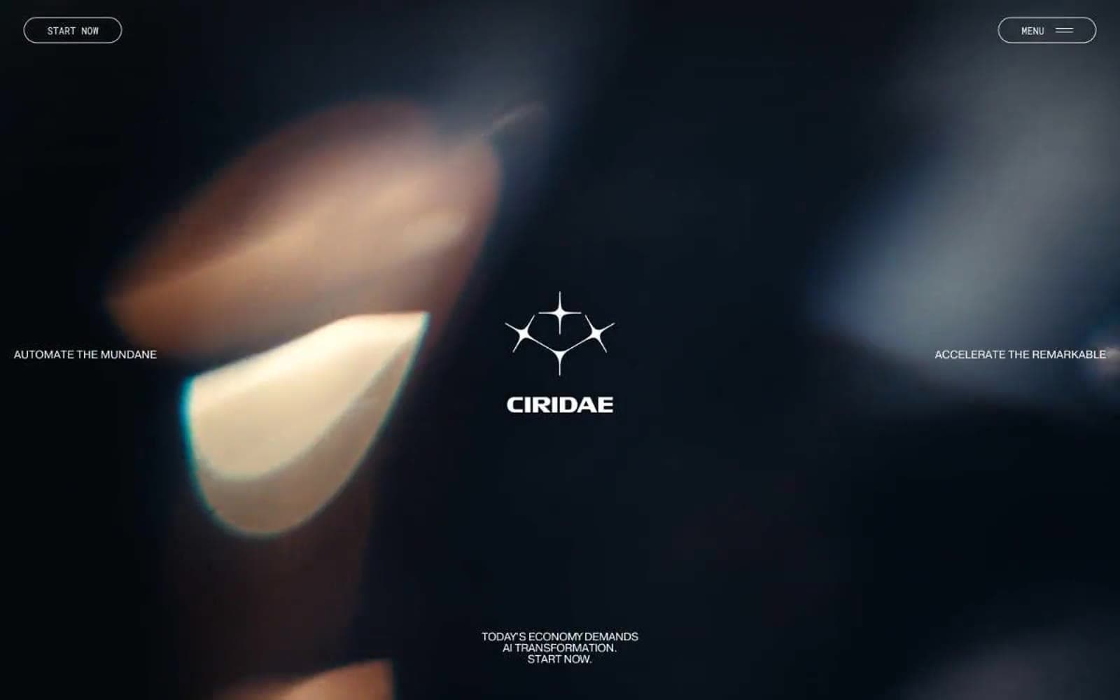
Valo. Weight-300 typography floats on pure black while a single teal-violet gradient passes through like a laser line across the room.
- AI
- Dark theme
- 7 colors
- 1 typeface
Valo runs on a noir observatory aesthetic: deep-black canvas, a single custom serif-less voice at whisper weight (300), and one luminous blue-teal-violet gradient used as deliberate punctuation rather than decoration. Typography does the heavy lifting — 100px display headlines with tight negative tracking feel like illuminated ink on obsidian, while the rest of the interface stays nearly invisible. The gradient appears in exactly three roles: a single accent word inside a headline, a thin floating ring/torus visual, and a wash at the page foot — never as a button fill or panel background. Components are flat, hairline-bordered, and borderless where possible; interaction is signaled by circular arrow buttons and numbered sequencing, not by color or shadow. Every screen should feel like a page torn from a dark scientific monograph: quiet, confident, with one moment of light.

Valo design system

Brand1
Hero accent gradient — applied to a single headline word and the floating torus visual. Cool blue midpoint of the signature violet→blue→teal→lavender ramp
Accent2
Footer band gradient origin — near-black indigo transitioning into brand blue. Defines the bottom-of-page atmospheric shift
Secondary gradient — blue-to-mint wash used in supporting visuals and transitional bands. Cooler, more subdued than the hero spectrum
Neutrals4
Page canvas, hero background, all primary surface area. Sets the dark-stage tone for every screen
Subtle nav borders and disabled/inactive state lines. Sits between Void and Bone for low-emphasis structural lines
Hairline borders, dividers, and muted secondary text. The workhorse neutral that defines edges without adding visual weight
Primary headings, body text, nav links, and icon strokes. Maximum contrast against Void for clear information hierarchy
Try a pairing
Pick any two colors from the palette to check whether text stays readable on top.
Aa
Paper on Void
21.00 : 1 contrast
- Body textPasses AA 4.5
- Large textPasses AA 3
- StrictPasses AAA 7