
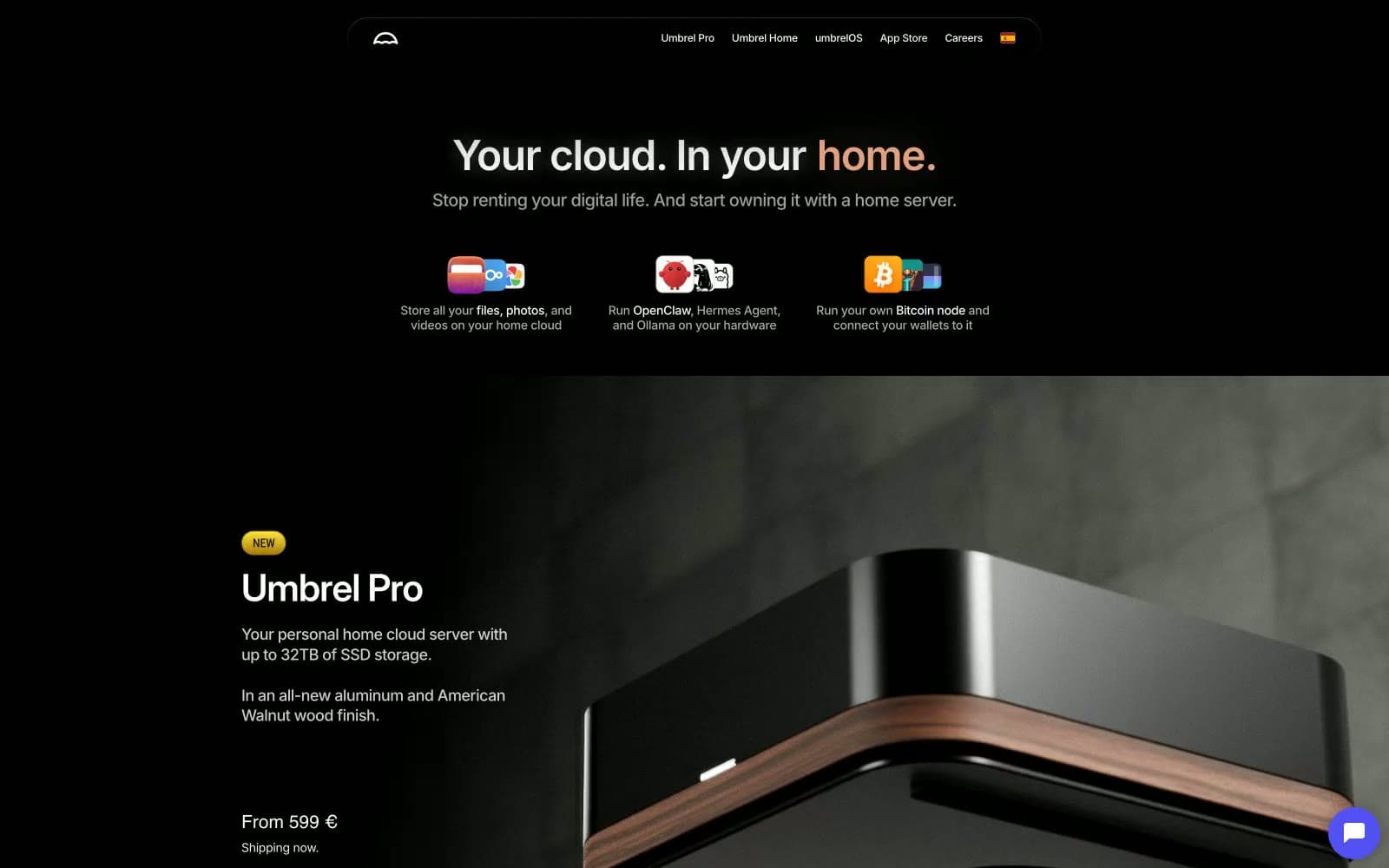
Umbrel. A black room where a single peach glow marks what matters.
- Developer tools
- Dark theme
- 15 colors
- 8 typefaces
Umbrel reads as a premium consumer-hardware brand rendered in near-total darkness: a black canvas, white sans-serif type, and a single warm peach accent that glows like an ember in the void. The floating glass-pill navigation, oversized product photography on dark stone, and pill-shaped ghost buttons all signal a hardware-first identity that borrows from the language of high-end consumer electronics. Color is rationed: ninety-eight percent of the interface is monochrome, with the warm accent used only for emotionally loaded words like 'home' and a cool violet reserved for purchase actions. Cards float on near-black surfaces with large, soft radii; gradients appear only as atmospheric backdrops or as vibrant app-store tiles, never as interface chrome.
Umbrel design system

Brand1
Violet supporting accent for decorative details and low-frequency emphasis. Do not promote it to the primary CTA color
Accent5
Orange supporting accent for decorative details and low-frequency emphasis.
Terminal stop of the blue-to-gold linear gradient on app-store and feature cards
Terminal stop of the violet-to-orange linear gradient on rotating feature tiles
Terminal stop of the deep-red feature tile gradient used on the OpenClaw card
Atmospheric radial gradient base for the closing app-store section — a near-black blue-violet that signals the transition into the app ecosystem
Neutrals9
Page canvas, hero backgrounds, section bands, image mattes — the absolute black that swallows the viewport and lets the product photography and peach accent feel lit
Supporting neutral for secondary UI, dividers, and muted labels.
Inset fills, shadow tones beneath floating elements, and the inner depth on product showcase cards
Secondary surface tone for button hover states, tertiary card layers, and the borders that separate a card from canvas
Desaturated warm-gray for divider lines, muted metadata, and the border tone that gives the dark UI a slight olive cast rather than going cold blue
Muted body copy and the cool-tinted gray used for sub-labels and pricing context — the only neutra with a cool cast, used sparingly
Tertiary helper text, caption metadata, and placeholder labels in inputs
Secondary text, subheadings under large titles, and icon strokes that need to recede from primary content
Light supporting surface for subtle backgrounds and section separation. Do not promote it to the primary CTA color
Try a pairing
Pick any two colors from the palette to check whether text stays readable on top.
Aa
Paper White on Twilight Violet
5.47 : 1 contrast
- Body textPasses AA 4.5
- Large textPasses AA 3
- StrictFails AAA 7
More DESIGN.md files. Same web, different personalities.

Railway
Developer tools
Nuxt
Developer tools
Astro
Developer tools
Authkit
Developer tools
Axiom
Developer tools
BaseHub
Developer tools
Better Stack
Developer tools
Bun
Developer tools
Checkly
Developer tools
ClickHouse
Developer tools
Depot
Developer tools
dope.security
Developer tools


