
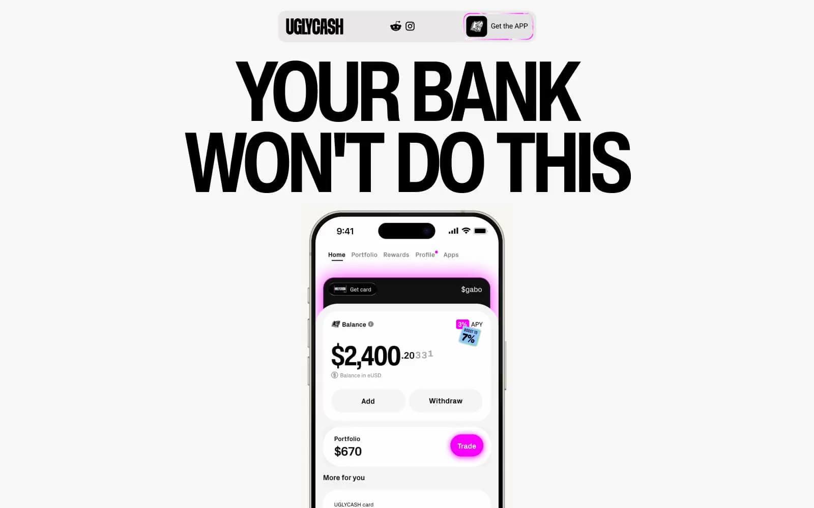
UGLYCASH. A vibe of irreverent, maximalist fintech that wears its chaos proudly.
- Finance
- Light theme
- 11 colors
- 4 typefaces
UGLYCASH runs a sticker-bombed Gen-Z finance language: warm light canvas, oversized black display type, and a riot of vivid accent panels (hot pink, electric cyan, toxic lime, dusty khaki) splashed across mostly achromatic layouts. The signature move is a heavy black hairline (1px) that traces every surface — cards, phone frames, buttons, illustrations — giving the impression of printed stickers peeled onto a page. Radii are exaggerated (16px for controls, 38–46px for hero cards) to amplify the soft, toy-like feel, while the palette stays disciplined: one neutral canvas, one neutral surface, and three or four saturated brand colors used as full-bleed card fills rather than thin accents. Headlines shout at 85–164px with negative tracking; body text retreats to 14–18px Inter. Everything reads as fast, loud, and deliberately unpolished.
UGLYCASH design system

Brand3
Saturated card fills, sticker backgrounds, hero callouts — the loudest voice in the accent set
Saturated card fills and feature panel backgrounds — secondary brand voice, often paired with phone mockup screenshots
Green action color for filled buttons, selected navigation states, and focused conversion moments
Accent1
Card and panel fills — dusty olive-cream that reads as vintage paper against the white canvas
Neutrals7
Text, borders, icon strokes, button outlines — the structural ink that outlines every sticker-like surface and carries all body and heading type
Near-black phone-frame and hardware fills (visually indistinguishable from #000000, used on device mockups)
Dark card and panel fills for inverted sections
Muted body text and secondary borders
Helper text, disabled-state type, and low-priority metadata
Page canvas, body backgrounds, and soft section fills
Elevated card surfaces and inverse text on dark panels
Try a pairing
Pick any two colors from the palette to check whether text stays readable on top.
Aa
Static Black on Riot Pink
6.51 : 1 contrast
- Body textPasses AA 4.5
- Large textPasses AA 3
- StrictFails AAA 7
More DESIGN.md files. Same web, different personalities.

Mollie
Finance
a16z speedrun
Finance
Acctual
Finance
Airtree
Finance
Ambrook
Finance
Angellist 2024
Finance
Apron
Finance
Baselayer
Finance
Basis Theory
Finance
BlueYard Capital
Finance
Brex
Finance
Coda
Finance


