
Uber. Black-and-white transit kiosk.
- Brand
- Light theme
- 9 colors
- 2 typefaces
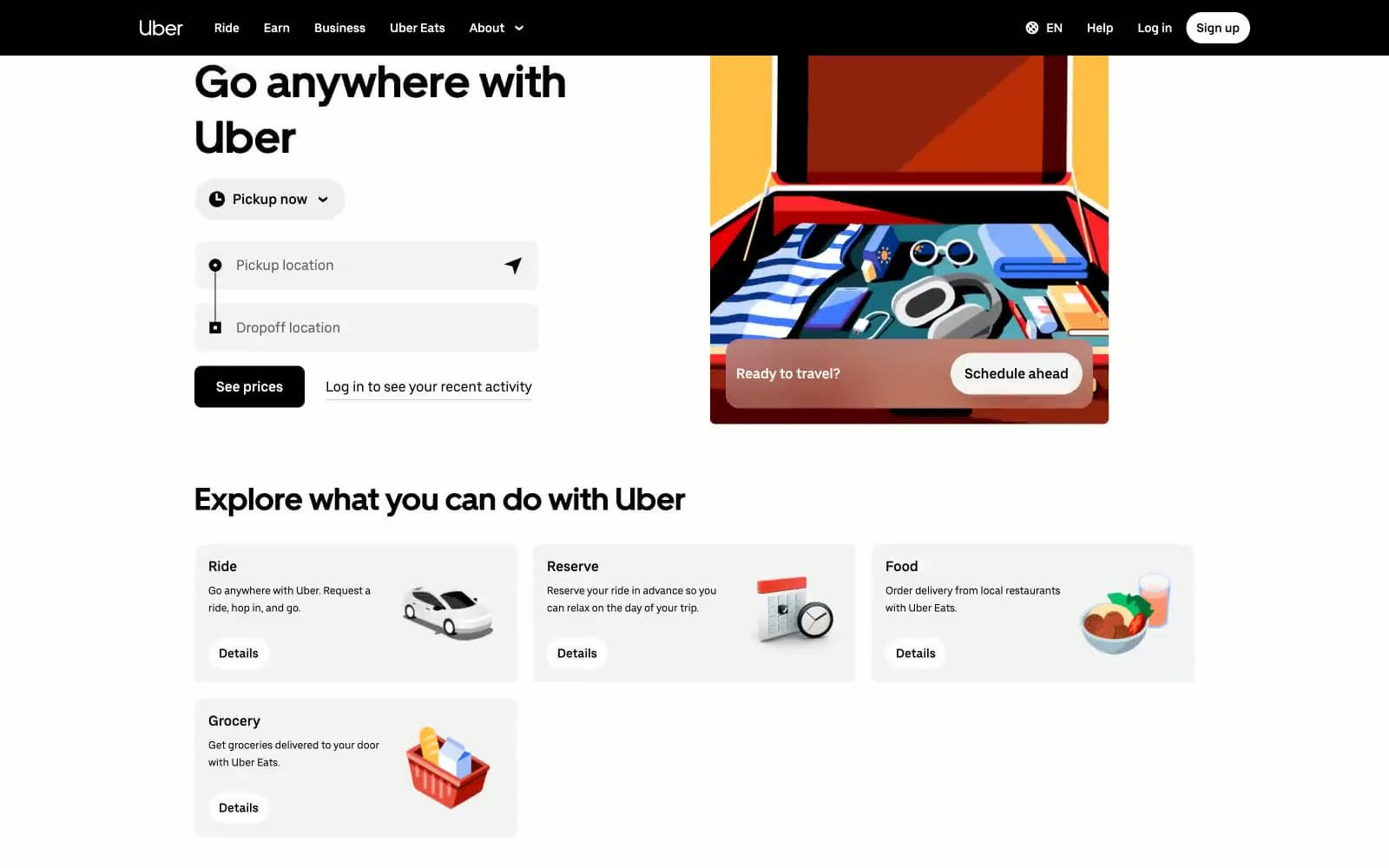
Uber's interface is a disciplined black-on-white transit kiosk: every screen is a white canvas anchored by a single black navigation bar, a black footer, and solid black controls, with zero chromatic UI color. All color in the system lives inside flat editorial illustrations — a packed suitcase, two riders in a car, a bowl of food — that float beside the form rather than within it. Typography is custom and confident: UberMove at 52px for headlines with tight 1.22 line-height, UberMoveText at 14–18px for everything else, and a single weight (400) does the work that other systems spread across three. Components are flat, borders are 1px hairline grays, and radii are binary — 8px for cards, inputs, and standard buttons, or a full 999px pill for nav CTAs and toggles. The only structural rhythm break is the sticky black 'See prices' bar that follows scroll, a persistent commitment to the next conversion.
Uber design system

Accent1
Blue supporting accent for decorative details and low-frequency emphasis.
Neutrals8
Headings, body text, top navigation bar, footer background, filled controls, sticky bottom bar, location pin icons — the achromatic anchor that gives the white canvas its structure
Secondary headings, footer column titles, darker body text variant — used when pure black feels too heavy on dense surfaces
Supporting neutral for secondary UI, dividers, and muted labels. Do not promote it to the primary CTA color
Body text on light surfaces where full black would feel aggressive, secondary paragraph copy
Input field borders, divider lines, placeholder-adjacent borders — the workhorse hairline color
Muted helper text, disabled-link text, secondary metadata in body copy — disappears by design
Suggestion card backgrounds, subtle section washes, input field fills, nav hover states — a single step off white that creates depth without contrast
Page background, card surfaces, text on dark bars, input fields — the dominant canvas that every other element sits on
Try a pairing
Pick any two colors from the palette to check whether text stays readable on top.
Aa
Jet Black on Faded Teal
12.14 : 1 contrast
- Body textPasses AA 4.5
- Large textPasses AA 3
- StrictPasses AAA 7
More DESIGN.md files. Same web, different personalities.

Airbnb
Brand
Aker
Brand
Alison Roman
Brand
Alpine Bio
Brand
Alveos One
Brand
Amrit Palace
Brand
André Cândido
Brand
Anna Jóna
Brand
Apollo
Brand
Apple
Brand
Arva
Brand
Ashton Bespoke
Brand


