
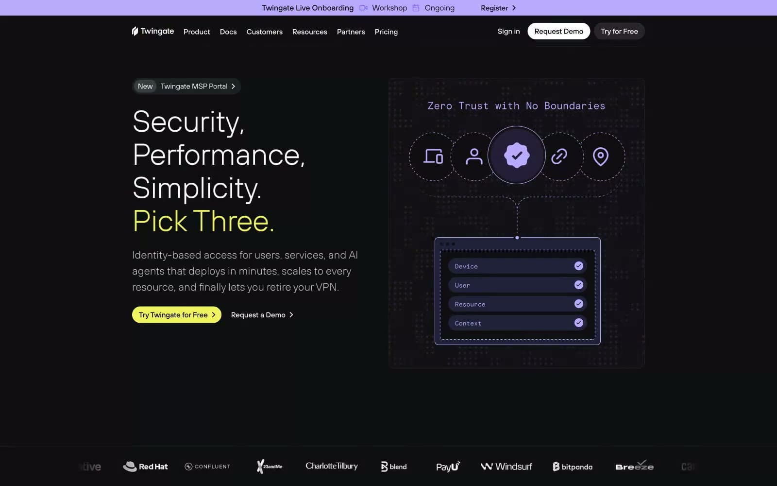
Twingate. Midnight control room with violet and chartreuse signal lights.
- Developer tools
- Dark theme
- 16 colors
- 5 typefaces
Twingate operates as a midnight command center: an almost pure-black canvas layered with charcoal surfaces, where electric violet and chartreuse act as live-signal accents rather than decoration. The system speaks in quiet, light-weight typography — large headlines sit at TT Hoves Light with tight negative tracking, body text at TT Hoves Regular — letting the type architecture carry the weight while color is used as functional punctuation. Components feel instrument-panel: pill buttons, hairline-inset highlights replacing drop shadows, and rounded-but-not-soft 8–12px radii that read as engineered hardware rather than soft material. The result is a dark, security-grade interface that feels more like a control surface than a marketing page: every chromatic moment earns its screen real estate.
Twingate design system

Brand2
Brand accent — highlighted phrases, feature body text, link emphasis, inline brand moments
Green supporting accent for decorative details and low-frequency emphasis. Do not promote it to the primary CTA color
Accent1
Decorative icon and illustration accent — network node strokes, lock/connection diagrams, graphic highlights
Neutrals13
Page canvas, hero backgrounds, full-bleed sections
Card surfaces, elevated panels, content containers above the page
Secondary surface layer, input fields, nested containers
Supporting neutral for secondary UI, dividers, and muted labels. Do not promote it to the primary CTA color
Subtle violet-tinted surface for spotlight/featured cards
Hairline borders and dividers, very low-contrast separation
Slightly stronger borders, subtle outer shadow tint
Muted helper text, disabled labels, low-priority metadata
Secondary icons, inactive navigation items, tertiary text
Captions, fine print, decorative text
Body text secondary, link text in resting state, icon strokes
Body text default, paragraph copy, description text
Primary headings, button text on dark fills, high-emphasis text
Try a pairing
Pick any two colors from the palette to check whether text stays readable on top.
Aa
Void Black on Signal Violet
10.26 : 1 contrast
- Body textPasses AA 4.5
- Large textPasses AA 3
- StrictPasses AAA 7
More DESIGN.md files. Same web, different personalities.

Railway
Developer tools
Nuxt
Developer tools
Astro
Developer tools
Authkit
Developer tools
Axiom
Developer tools
BaseHub
Developer tools
Better Stack
Developer tools
Bun
Developer tools
Checkly
Developer tools
ClickHouse
Developer tools
Depot
Developer tools
dope.security
Developer tools


