
Trigger.dev. Charging terminal on slate.
- Developer tools
- Dark theme
- 16 colors
- 3 typefaces
Trigger.dev's visual system is a dark-mode developer terminal transplanted into a marketing surface: matte charcoal canvas, Geist's quiet technical voice for body and UI, and Satoshi's geometric precision stretched to display scale with generous tracking. A single electric lime (#a8ff53) carries the brand's signal — it lives in the logo glyph, the primary nav button, and feature pills, giving the whole interface a charging-light quality against the dark. The rest of the chromatic vocabulary is a syntax-highlighting palette (pinks, violets, soft greens) borrowed from code editors, applied to feature icons and inline code so the site visually rhymes with the TypeScript it asks you to write. Surfaces stay flat and low-contrast; depth comes from 1px hairlines and the gradient stack, not from drop shadows.
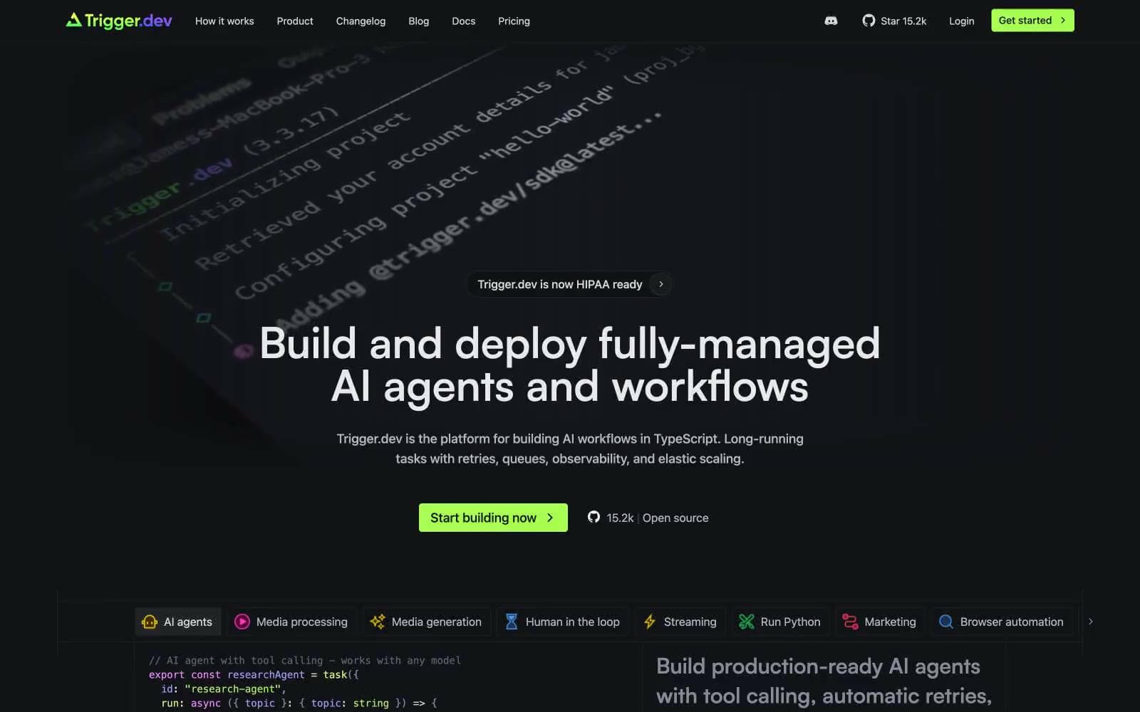
Trigger.dev design system

Brand1
Green supporting accent for decorative details and low-frequency emphasis. Do not promote it to the primary CTA color
Accent7
Code syntax highlighting (functions, keywords), media generation feature icon — the most-used chromatic color after lime, giving the code blocks their editor feel
Code syntax (strings, special tokens), media processing feature icon — hot accent used sparingly for code punctuation
Headline highlight words, streaming feature icon, decorative gradient accent — slightly deeper violet for larger surfaces
Code syntax (types, booleans), inline emphasis text — softer green that sits between Signal Lime and Ash, used inside code contexts
Code syntax (variables, parameters) — the lightest green, reads almost yellow against dark, used for code identifiers
Code syntax (property names, tags) — gentle pink for object keys and JSX attributes
Red supporting accent for decorative details and low-frequency emphasis. Use as a supporting accent, not as a status color
Neutrals8
Deepest surface — code block backgrounds, terminal panes, inset containers that need to feel recessed below the canvas
Primary page background, hero canvas, card surface base — the workspace floor everything sits on
Slightly darker hairline for nested containers and secondary borders where Graphite feels too bright
Subtle borders, divider lines, card edges — barely visible separators that let density carry the visual structure
Secondary body text, metadata, icon strokes — the most-used neutral text color, reading as a soft graphite on slate
Tertiary text, captions, muted helper copy — text that should be readable but not competing with headlines
Secondary headings, button text, emphasized body — one step below full white, used where pure white would feel harsh
Primary text, headlines, high-contrast labels — the dominant foreground color against the slate canvas
Try a pairing
Pick any two colors from the palette to check whether text stays readable on top.
Aa
Ink Well on Signal Lime
15.11 : 1 contrast
- Body textPasses AA 4.5
- Large textPasses AA 3
- StrictPasses AAA 7
More DESIGN.md files. Same web, different personalities.

Railway
Developer tools
Nuxt
Developer tools
Astro
Developer tools
Authkit
Developer tools
Axiom
Developer tools
BaseHub
Developer tools
Better Stack
Developer tools
Bun
Developer tools
Checkly
Developer tools
ClickHouse
Developer tools
Depot
Developer tools
dope.security
Developer tools


