
ToDesktop. Cosmic command deck transitioning into a bright spec sheet.
- Developer tools
- Mixed theme
- 12 colors
- 3 typefaces
ToDesktop operates as a dual-environment system: a deep space-grade dark hero with gradient atmosphere that transitions into a bright, document-like feature surface. The dark zone uses a sweeping white-to-near-black gradient to position the product against a cosmic backdrop, while the light zone feels like a clean product spec sheet. The single saturated #0036ff blue/violet is the only chromatic moment — used exclusively on primary action buttons — making every CTA feel like switching on a spotlight. Components are flat and confident: pill navigation, hairline 1px borders, generous 14-24px card radii, and almost no elevation shadow. The type system pairs Aeonik Pro's geometric character at display sizes with Inter's neutrality for UI, while Geist Mono marks developer-facing elements. The overall attitude is premium developer tool — the visual language of a tool that respects your attention.
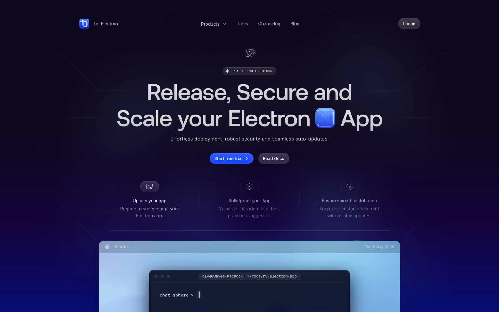
ToDesktop design system

Brand1
Primary CTA fill, active nav indicators — the only saturated hue on the entire page, it functions as a switch-on moment against an otherwise achromatic or deep-blue canvas
Accent1
Blue state accent for badges, validation surfaces, and short status labels. Do not promote it to the primary CTA color
Neutrals10
Card surface within dark sections, box-shadow tone on dark cards — near-black with a violet undertone matching the hero gradient
Primary heading and body text on light surfaces, dark button labels
Dark button fill, high-contrast interactive surface
Secondary body text, muted descriptions, icon fill
Card surface tint in dark sections, subtle shadow base
Secondary surface fill, muted card backgrounds
Default 1px borders, table dividers, icon strokes, card outlines — the structural line color that defines component edges
Subtle blue-tinted surface wash for accent cards
Cool green-tinted surface accent
Primary page canvas, card surface, button text on dark fills
Try a pairing
Pick any two colors from the palette to check whether text stays readable on top.
Aa
Pure White on Electric Iris
7.07 : 1 contrast
- Body textPasses AA 4.5
- Large textPasses AA 3
- StrictPasses AAA 7
More DESIGN.md files. Same web, different personalities.

Apollographql
Developer tools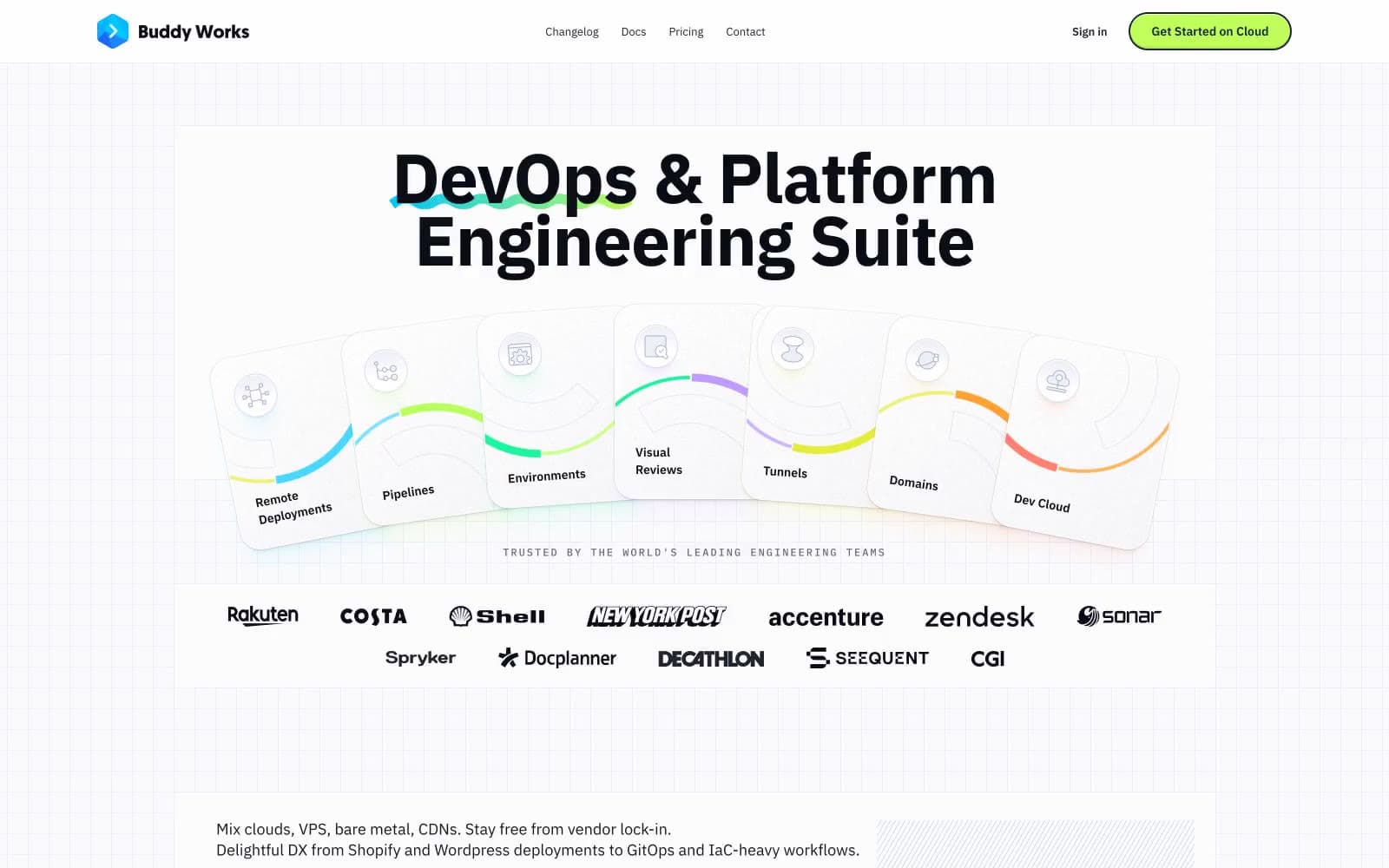
Buddy
Developer tools
Clerk
Developer tools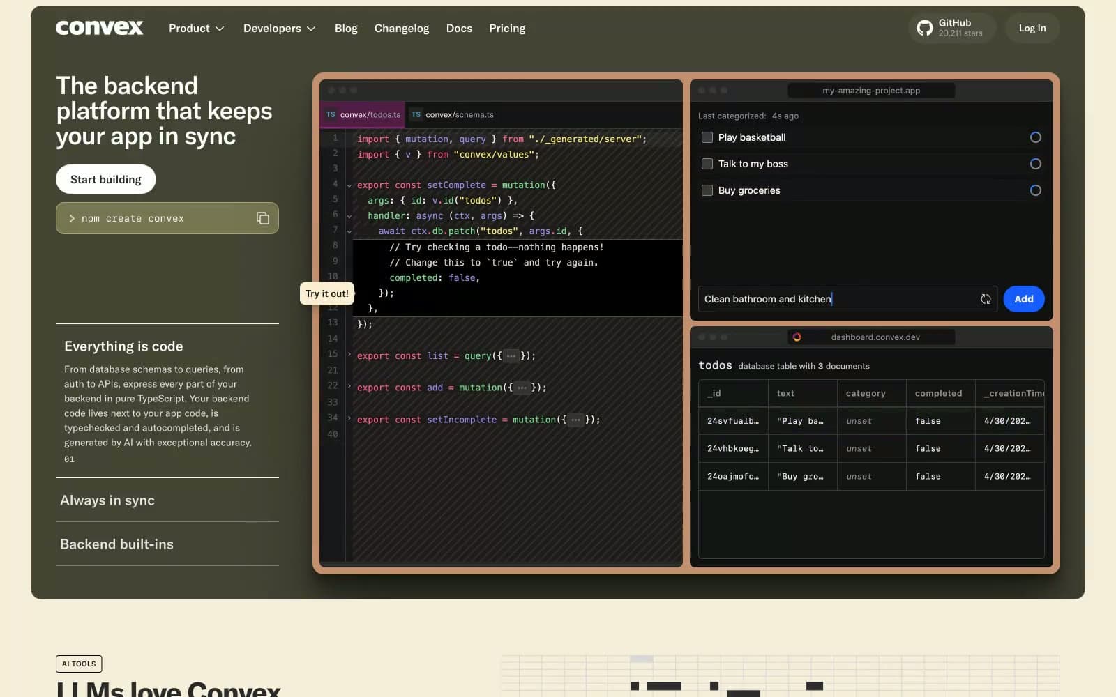
Convex
Developer tools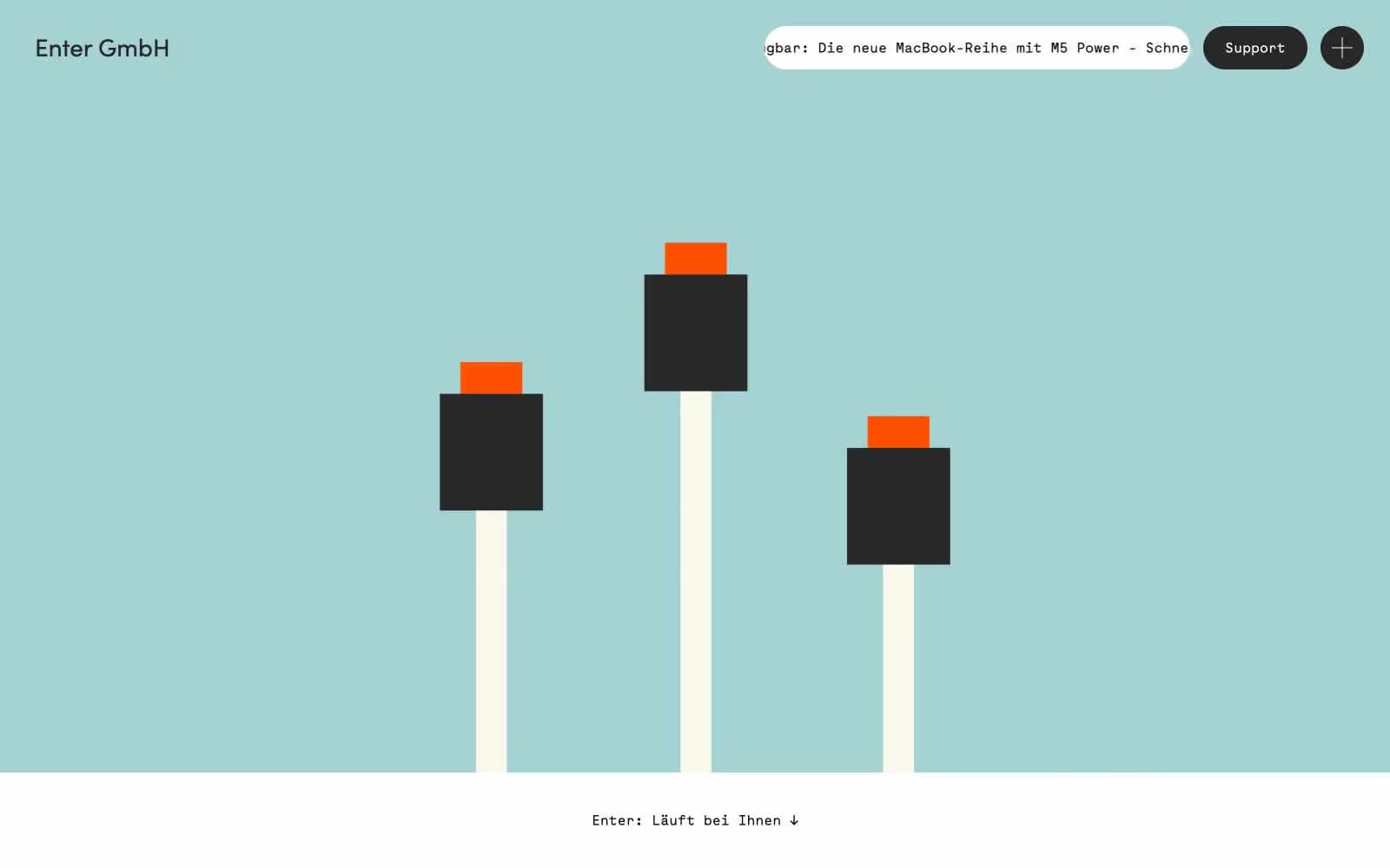
Enter GmbH
Developer tools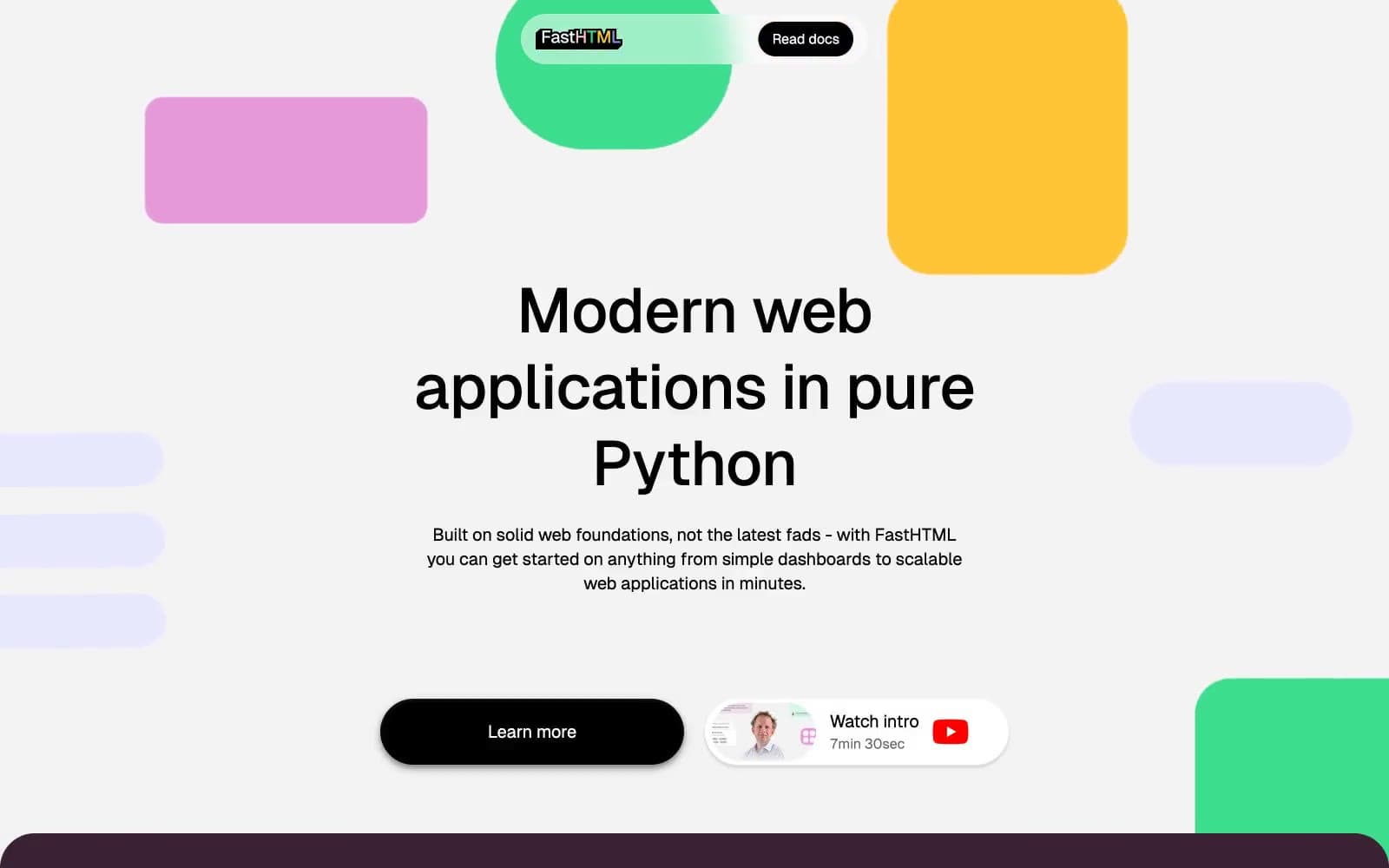
fastht.ml
Developer tools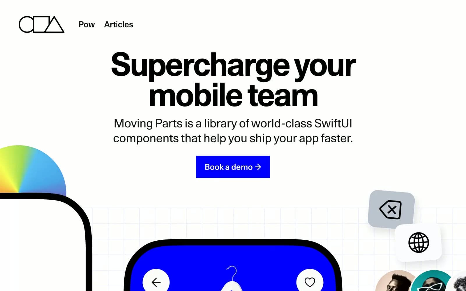
Moving Parts
Developer tools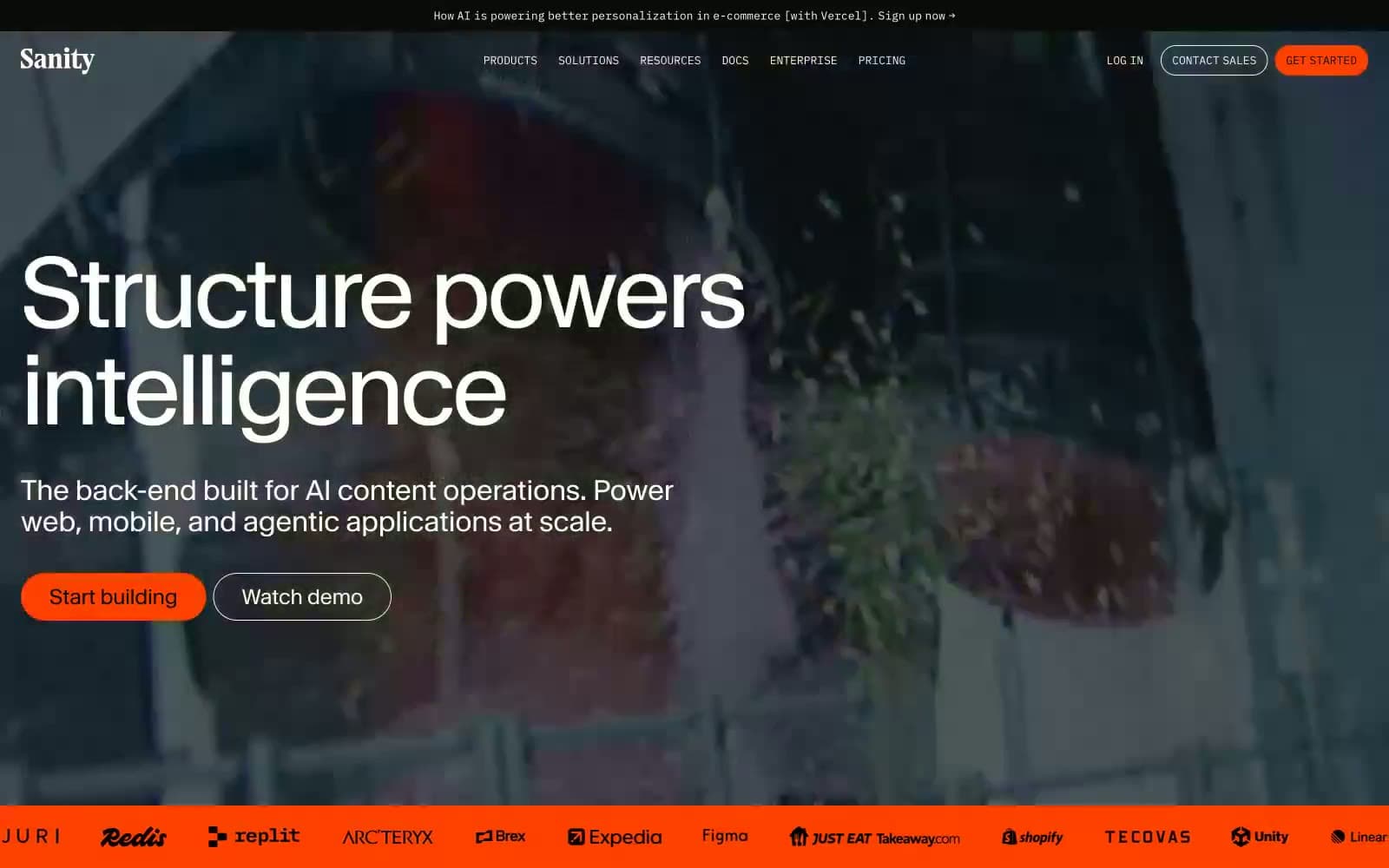
Sanity.io
Developer tools
Cuberto
Studio
Nothing
Commerce
Empower
Finance
10X HUB
Design tools


