
Clerk. Surfaces feel like a live IDE preview: dark product cards floating inside a light documentation shell, with one electric violet pulse marking the path forward.
- Developer tools
- Mixed theme
- 14 colors
- 5 typefaces
Clerk uses a split-personality canvas: the marketing shell is near-white (#f7f7f8) with barely-there borders and generous whitespace, while product demo surfaces drop into near-black (#212126) dark cards that showcase UI components in context. The single brand color — a mid-range violet (#6c47ff) — appears with surgical restraint: only on primary CTAs and the occasional heading accent, making every appearance feel deliberate. Typography defaults to Geist, a custom numeric-optimized face at tight negative tracking (-0.035em), giving headlines a technical density that signals developer-first thinking without heavy weight. The gradient system layers violet with stray yellow (#fff963) and cyan (#5de3ff) halos at low opacity, creating an atmospheric shimmer behind hero content rather than decorative noise.
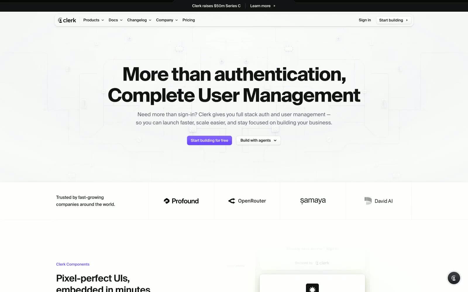
Clerk design system

Brand2
Primary CTA button fill, active heading accents — the single chromatic action color; its mid-spectrum violet reads developer-brand without borrowing blue from infrastructure tools; Atmospheric hero background gradient blending violet and yellow; Brand gradient for decorative text highlights and horizontal accent rules
Decorative list and tag backgrounds, subtle brand surface tints
Accent1
Heading accent text inside dark sections, code string highlights, decorative icon glow
Neutrals11
Primary text, headings, and high-contrast body copy across light surfaces
Dark product demo card backgrounds in mixed-mode sections
Elevated dark panel backgrounds, code block surfaces
Secondary body text, muted labels, icon fills on light surfaces
Mid-tone icon fills and body copy inside dark card contexts
Tertiary text, nav punctuation, disabled state text
Placeholder text, code comments, muted helper copy
Borders, dividers, input outlines, table rules
Subtle section dividers, link icon backgrounds, hover wash backgrounds
Page canvas and light section backgrounds
Card surfaces, modal backgrounds, form inputs on light sections
Try a pairing
Pick any two colors from the palette to check whether text stays readable on top.
Aa
Pure White on Violet Soft
4.81 : 1 contrast
- Body textPasses AA 4.5
- Large textPasses AA 3
- StrictFails AAA 7
More DESIGN.md files. Same web, different personalities.
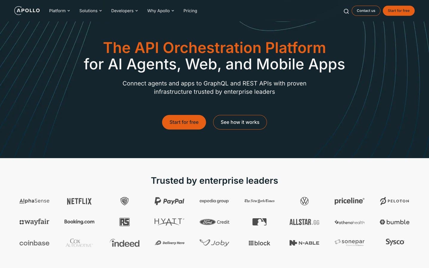
Apollographql
Developer tools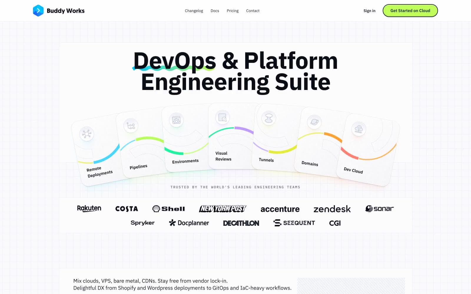
Buddy
Developer tools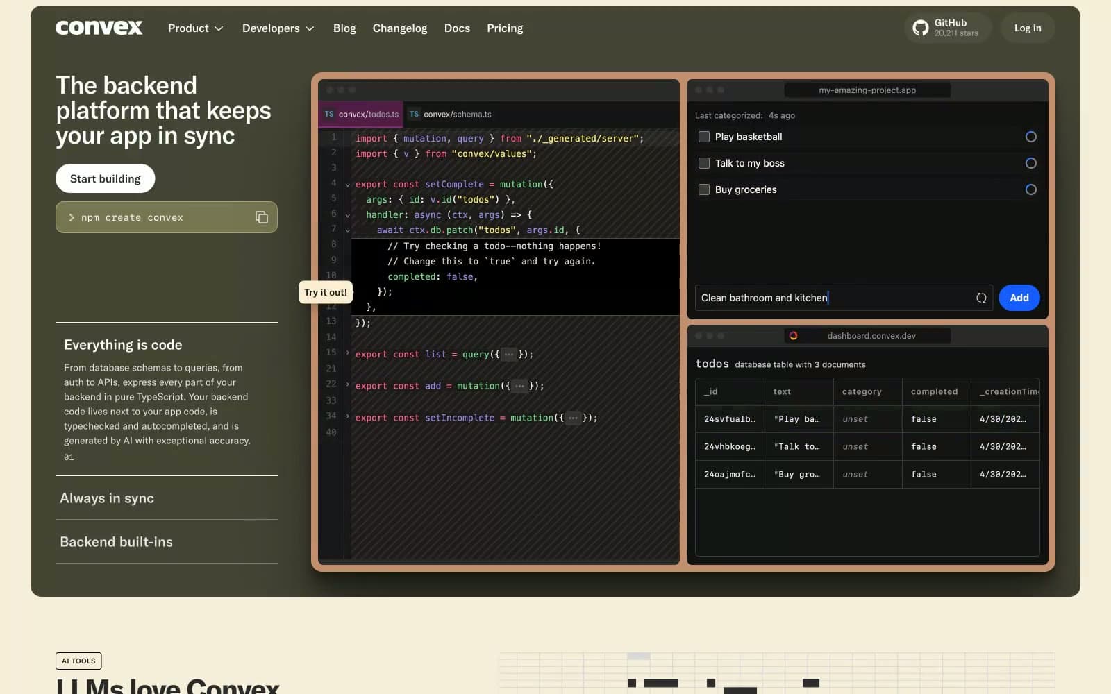
Convex
Developer tools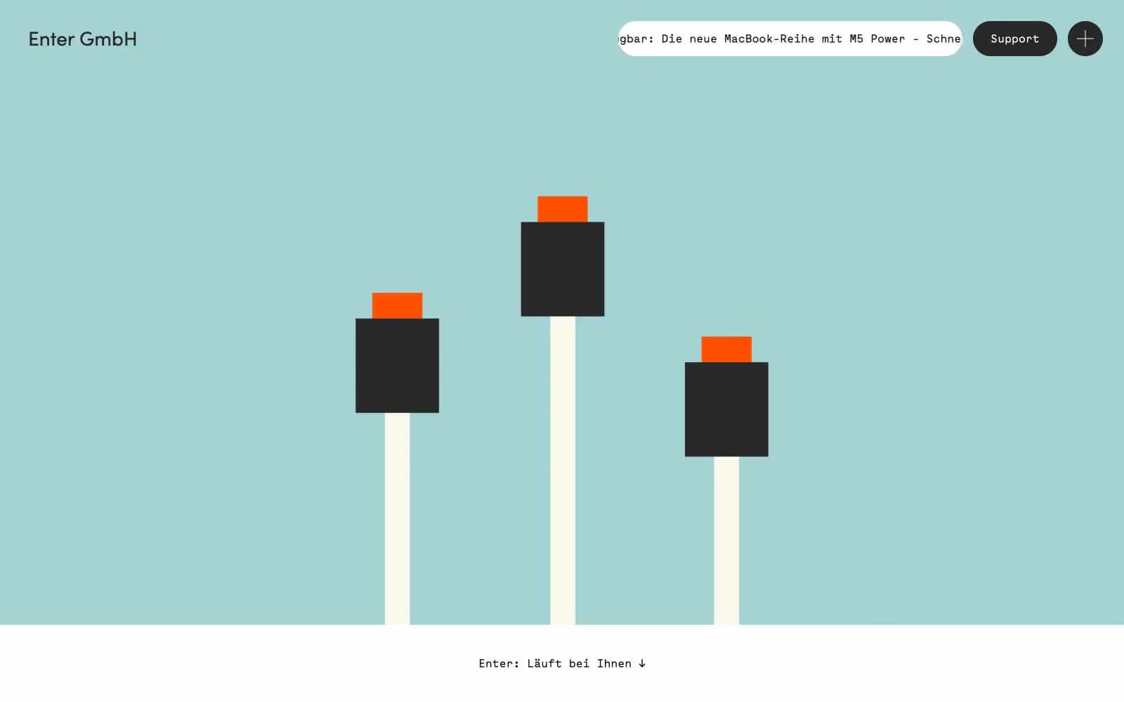
Enter GmbH
Developer tools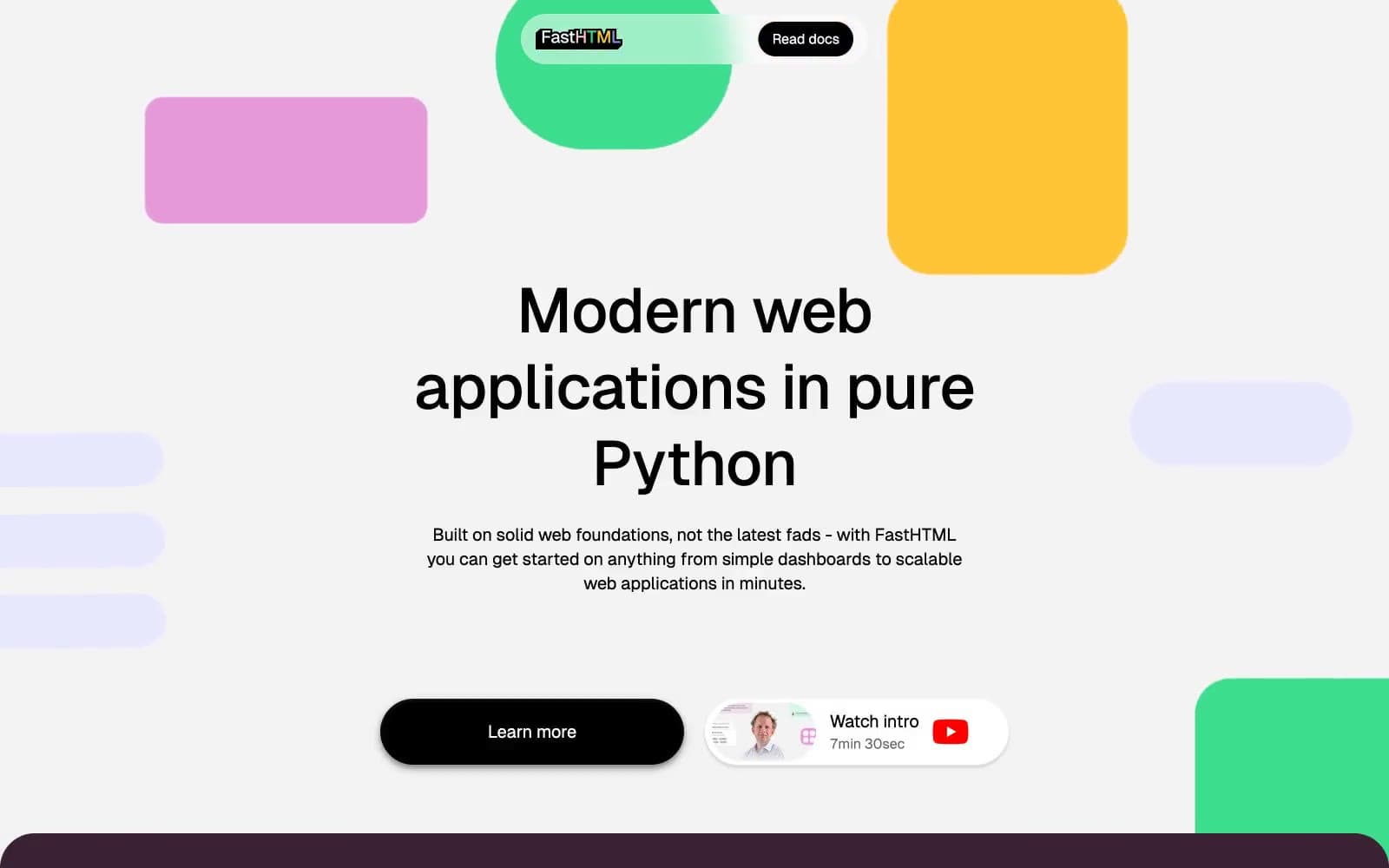
fastht.ml
Developer tools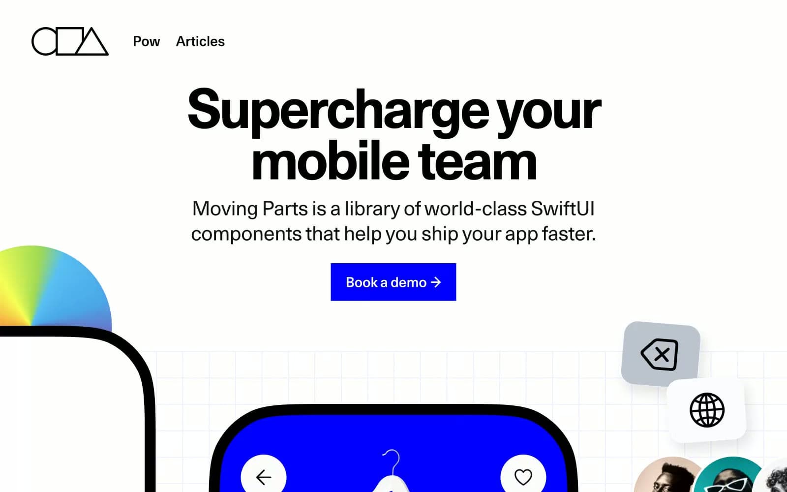
Moving Parts
Developer tools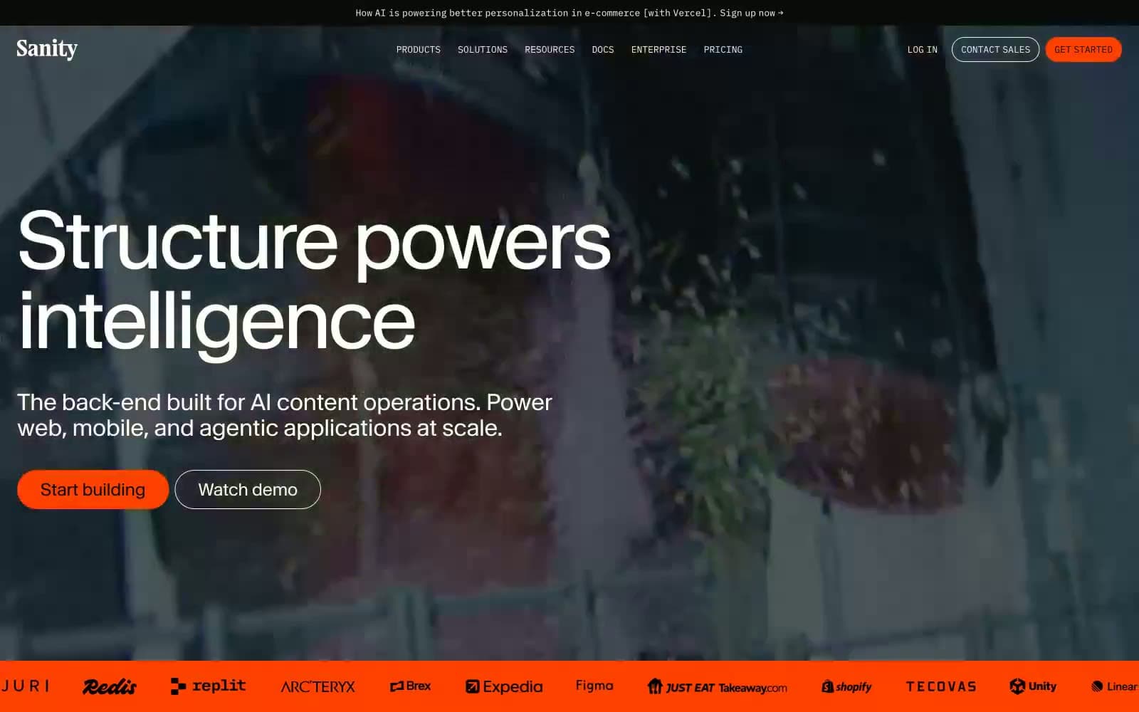
Sanity.io
Developer tools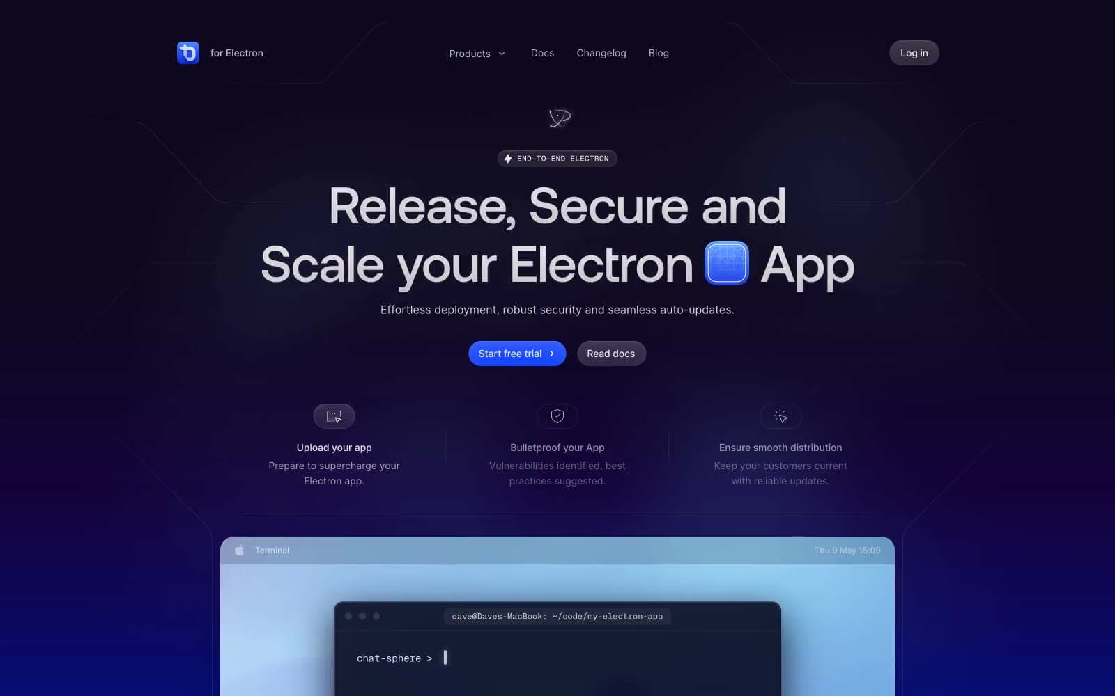
ToDesktop
Developer tools
Cuberto
Studio
Nothing
Commerce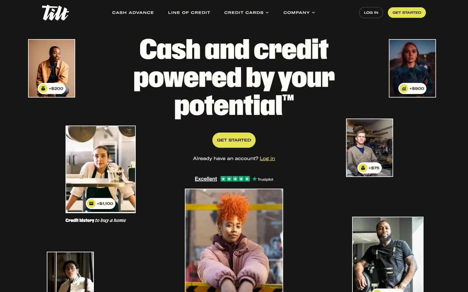
Empower
Finance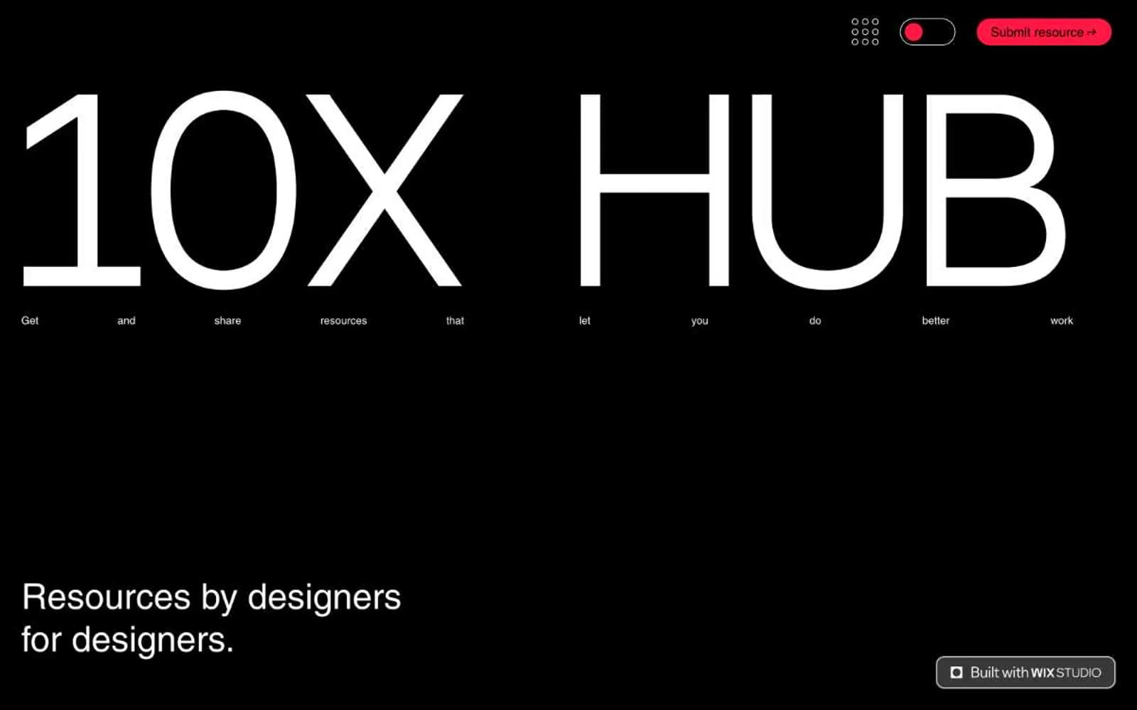
10X HUB
Design tools


