
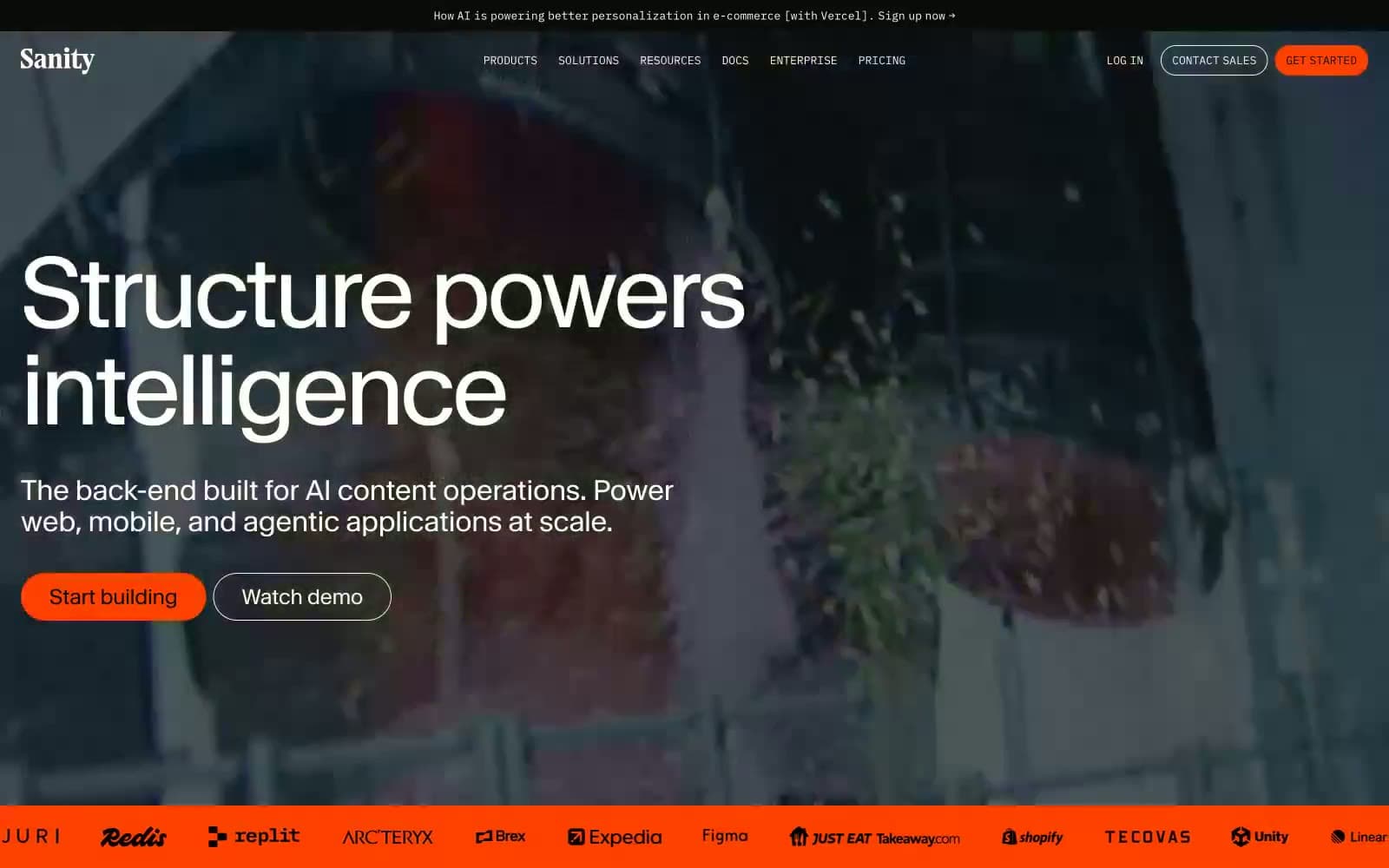
Sanity.io. Geological monolith with orange ignition.
- Developer tools
- Mixed theme
- 15 colors
- 2 typefaces
Sanity.io speaks with the confident restraint of an editorial design system: vast dark hero sections anchored by full-bleed organic photography, then a clean white grid where large Waldenburg headlines do the heavy lifting. Orange (#ff4100) functions as the only chromatic punctuation on a near-monochrome stage — it appears on the logo dot, the Get Started button, and occasional tags, never as decoration. Numbered sections (01–05) evoke a Swiss editorial layout, and the Waldenburg typeface's tight tracking at display sizes (–4.48px at 112px) creates a compressed, architectural rhythm. The UI is a content platform that treats its own product as the hero — Studio screenshots, code editors, and structured content forms appear in the marketing surface itself, blurring the line between product and pitch.
Sanity.io design system

Brand2
Orange supporting accent for decorative details and low-frequency emphasis. Do not promote it to the primary CTA color
Links, secondary highlights, focus rings, decorative code accents — cool counterpoint to the warm orange, used sparingly
Accent4
Green supporting accent for decorative details and low-frequency emphasis. Use as a supporting accent, not as a status color
Decorative code syntax highlight, studio editor token — appears only within code/editor contexts, not general UI
Code syntax token — restricted to developer-facing surfaces like the terminal and JSON editor
Code syntax token, inline link variants in editorial copy — secondary to Signal Blue
Neutrals9
Primary text, dark hero backgrounds, dark product surface panels, button text on light fills
Elevated dark surface (cards on dark backgrounds), input borders on dark sections
Deepest elevated surface, code editor background, terminal panel
Tertiary text, icon outlines on light surfaces
Secondary text, helper text, metadata, low-emphasis icons
Borders, dividers, disabled text, muted icon strokes, placeholder text
Subtle borders on cards, input field outlines in light mode
Hover backgrounds, subtle row separators, very light surface tint
Page background, card surfaces, text on dark sections, input fields
Try a pairing
Pick any two colors from the palette to check whether text stays readable on top.
Aa
Onyx on Ember Orange
5.63 : 1 contrast
- Body textPasses AA 4.5
- Large textPasses AA 3
- StrictFails AAA 7
More DESIGN.md files. Same web, different personalities.

Apollographql
Developer tools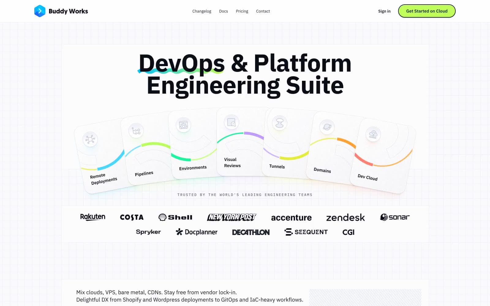
Buddy
Developer tools
Clerk
Developer tools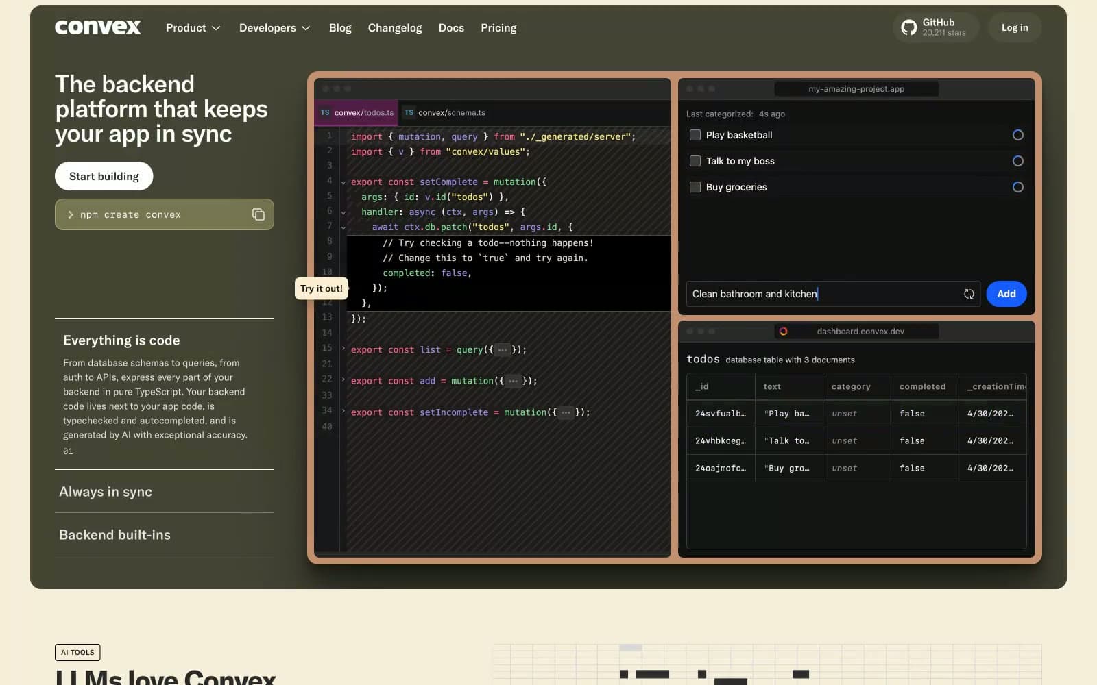
Convex
Developer tools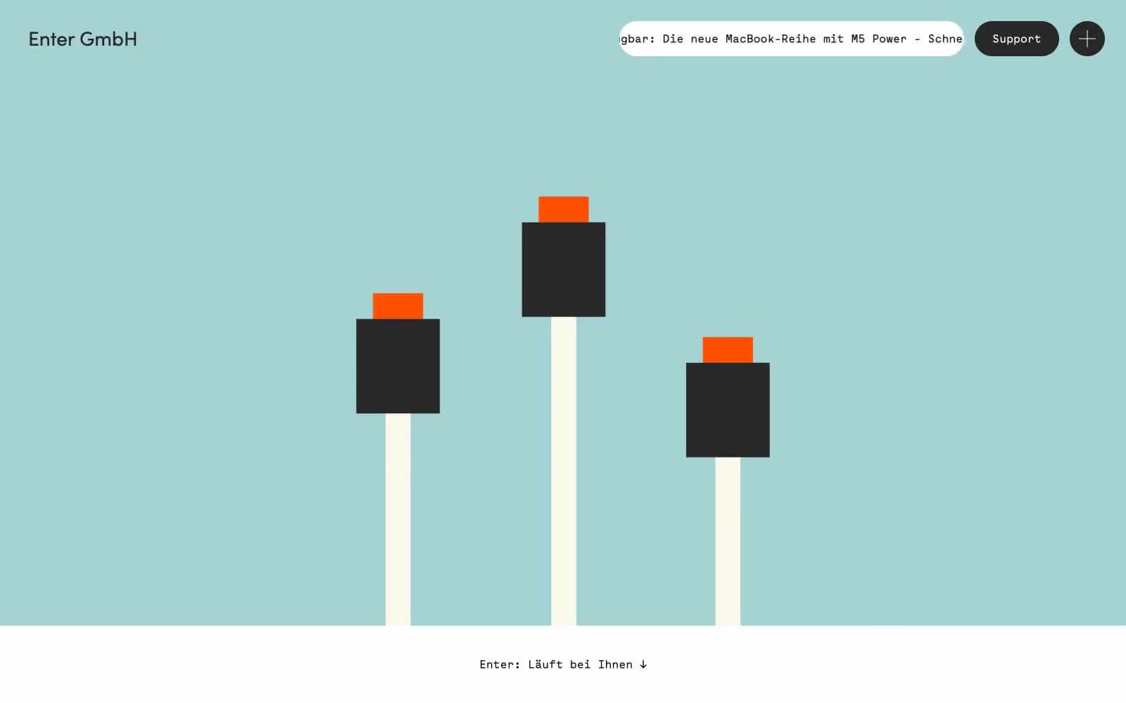
Enter GmbH
Developer tools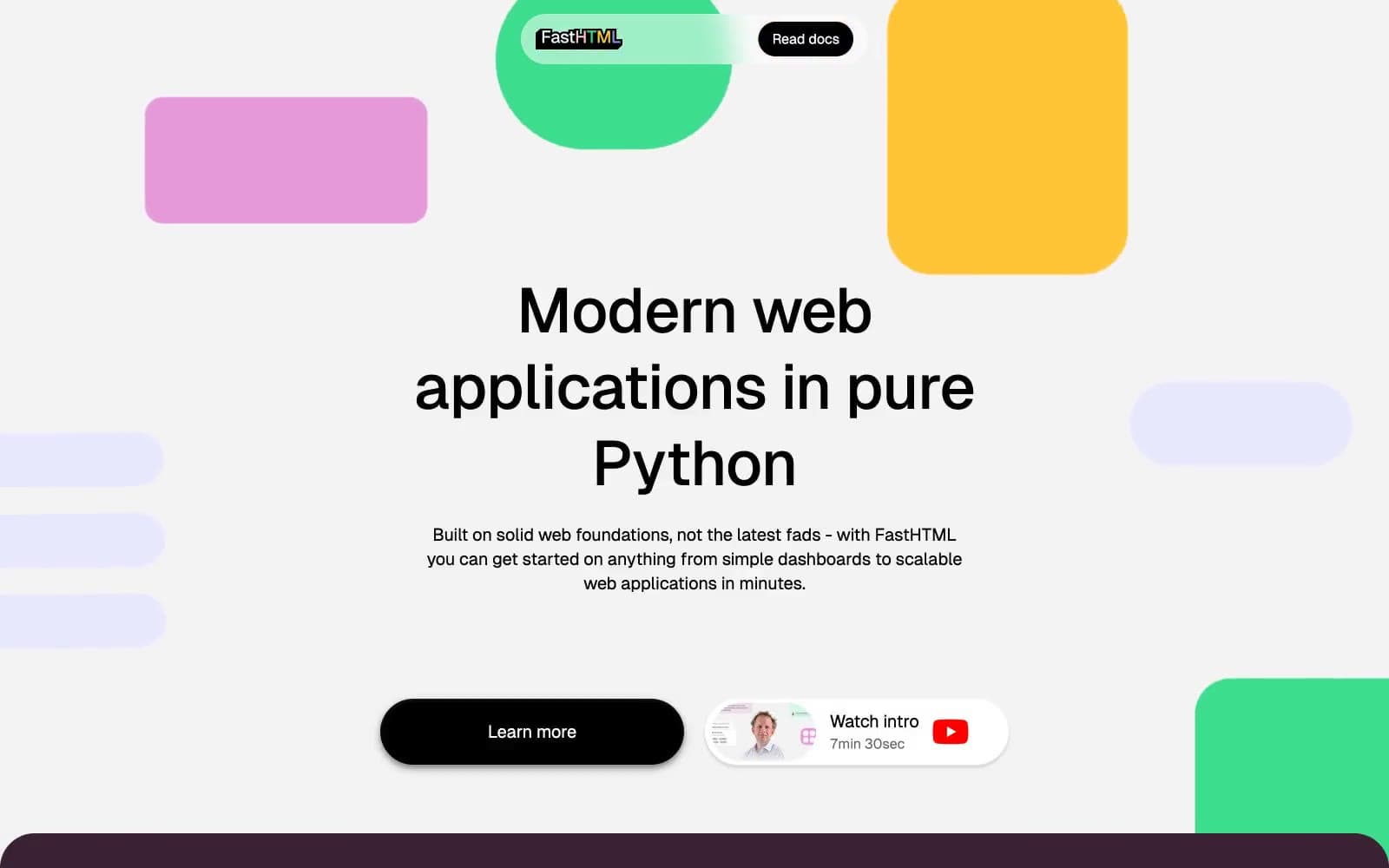
fastht.ml
Developer tools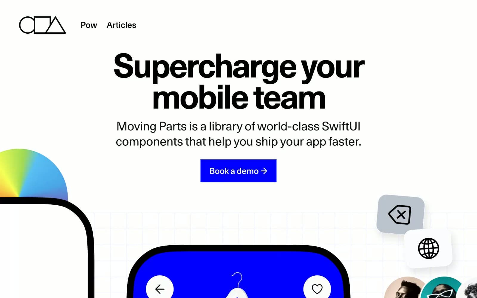
Moving Parts
Developer tools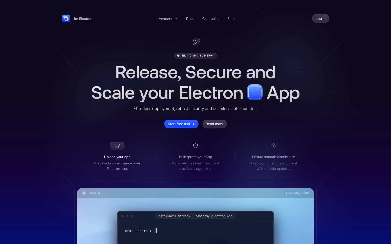
ToDesktop
Developer tools
Cuberto
Studio
Nothing
Commerce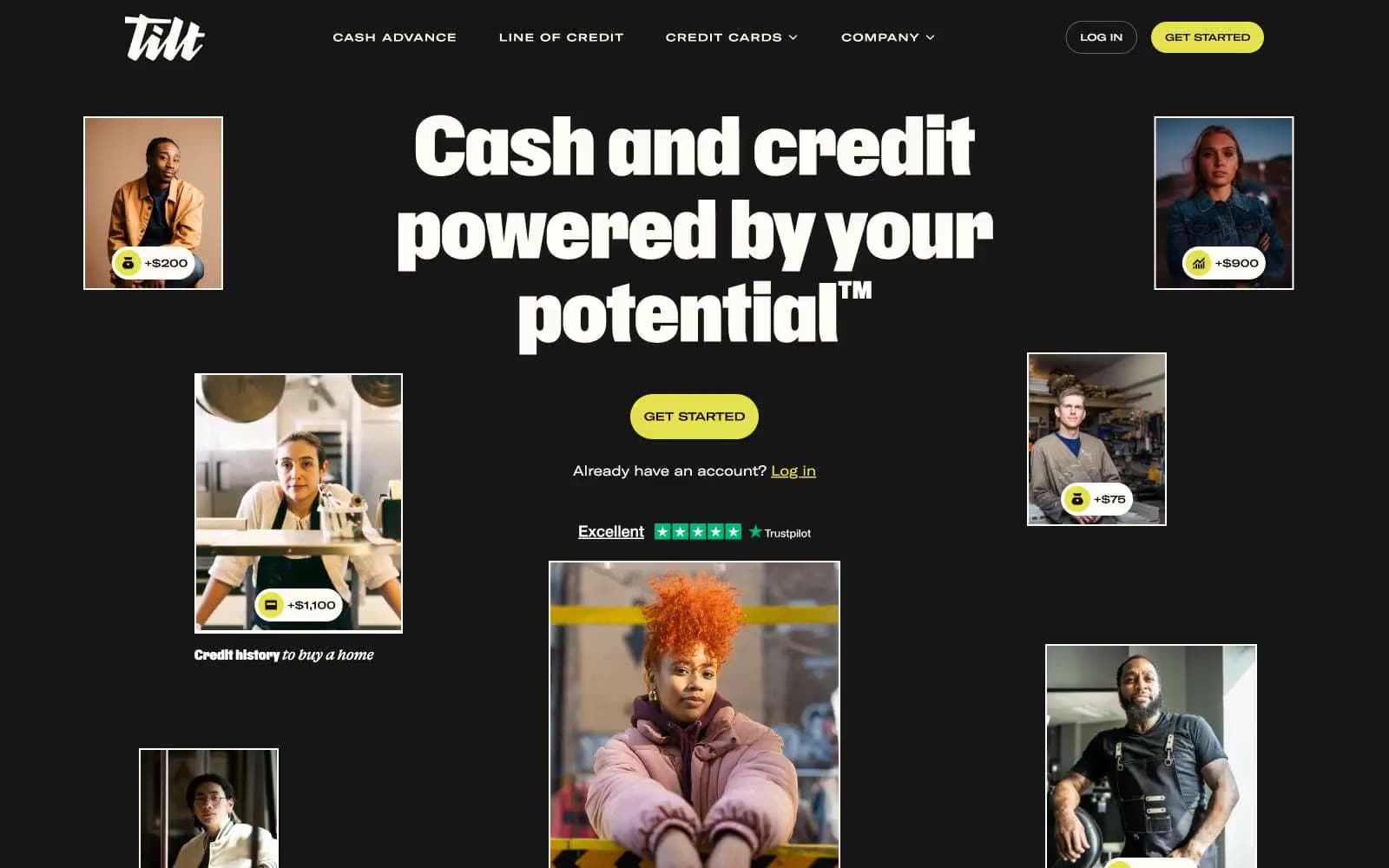
Empower
Finance
10X HUB
Design tools


