
Buddy. Engineering blueprint on graph paper.
- Developer tools
- Mixed theme
- 18 colors
- 2 typefaces
Buddy Works renders as a clean engineering workspace drawn on graph paper — a near-white canvas overlaid with a subtle blueprint grid, deeply saturated near-black ink for type, and one unmistakable lime-green CTA that snaps every action into focus. Color is rationed: 95% of the interface stays achromatic with a navy-ink text system, while vivid chromatic energy is reserved for a lime button, cobalt link accent, and the rainbow radial-gradient swooshes that underline headlines and trace the edges of feature cards. Surfaces are whisper-soft — white cards, hairline slate borders, layered translucent shadows tinted with brand hues — and the only heavy shadows are cast by product screenshots and elevated testimonial cards. Typography is IBM Plex Sans at comfortable sizes with aggressive negative tracking on the display sizes, giving headlines a tightened, engineering-specimen feel rather than a marketing-brochure feel. Component geometry is built on two pillars: 56px-radius pill buttons and 24px-radius cards, with a few 14px-radius inner cards for tighter clusters. The result is a system that reads as drafted, measured, and instrumented — a tool surface, not a landing page.
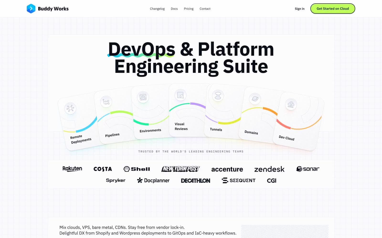
Buddy design system

Brand2
Primary action fill — CTA buttons, active tab pill, high-visibility highlights. Chartreuse against near-white creates immediate focus without the aggression of red or blue
Link color, brand logo mark, nav active indicator. The only saturated blue in the system; used sparingly to mark interactivity in text and icon contexts
Accent7
Subdued heading and accent text on tinted surfaces — a darkened shade of the lime family used when the lime itself would be too loud
Decorative gradient accent on feature cards and colored card glow shadows. Part of the multicolor stroke palette that traces the curved card top edges
Decorative gradient accent on feature cards and the card-glow color variant that pairs with green-themed cards
Decorative gradient accent on feature cards — the yellow-green stroke that runs across pipeline and environment cards
Decorative gradient accent on feature cards — the pink-magenta stroke on visual-review cards
Decorative gradient fill for testimonial cards and warm accent stroke on tunnel/domain cards
Soft surface highlight wash — pale mint-tinted fills for highlighted zones and subtle background washes near lime accents
Neutrals9
Headline text and high-contrast fills. Reserved for display type and dark-section backgrounds where maximum ink weight is required
Body text color, dense list text. Slightly darker than Midnight Ink; the workhorse reading color
Primary text and nav text, dominant border tone, icon strokes. A warm-tinted near-black that reads softer than pure #000 at body sizes
Secondary body text where Midnight Ink would be too heavy; caption-tier reading text
Subdued helper text, secondary labels, muted borders on darker sections
Subtle fill on dark-mode elements and muted card backgrounds. Cool-tinted neutral for non-white surface variations
Card borders, shadow contributor, icon strokes on white. Sits one step darker than Mist Gray to give cards a defined perimeter without weight
Light dividers, list separators, subtle fill washes. The hairline-border neutral — appears on almost every section boundary
Page canvas, card surface base, input background, button text on lime. The system neutral; everything else floats on this
Try a pairing
Pick any two colors from the palette to check whether text stays readable on top.
Aa
Obsidian on Lime Spark
16.33 : 1 contrast
- Body textPasses AA 4.5
- Large textPasses AA 3
- StrictPasses AAA 7
More DESIGN.md files. Same web, different personalities.

Apollographql
Developer tools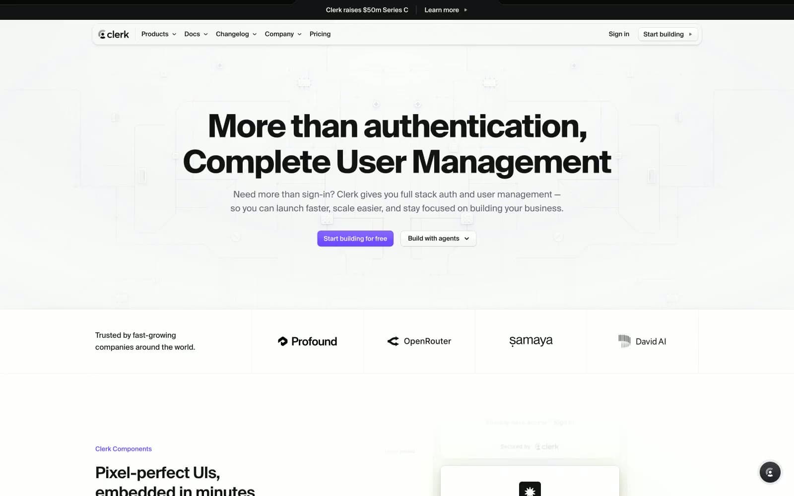
Clerk
Developer tools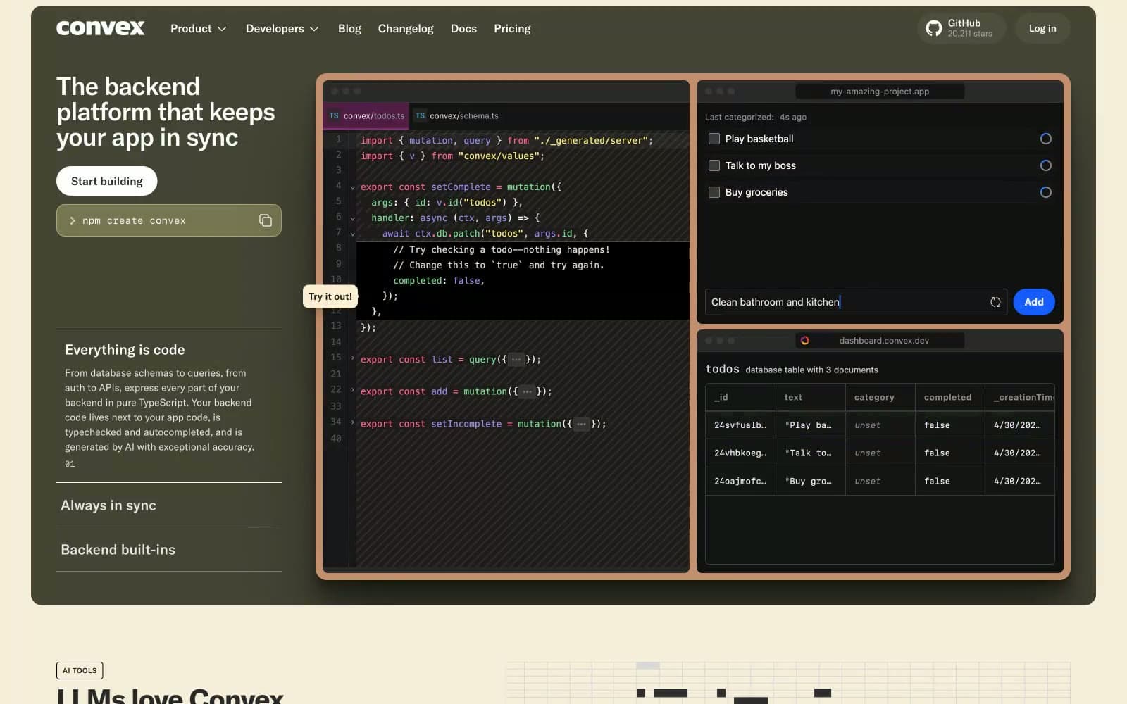
Convex
Developer tools
Enter GmbH
Developer tools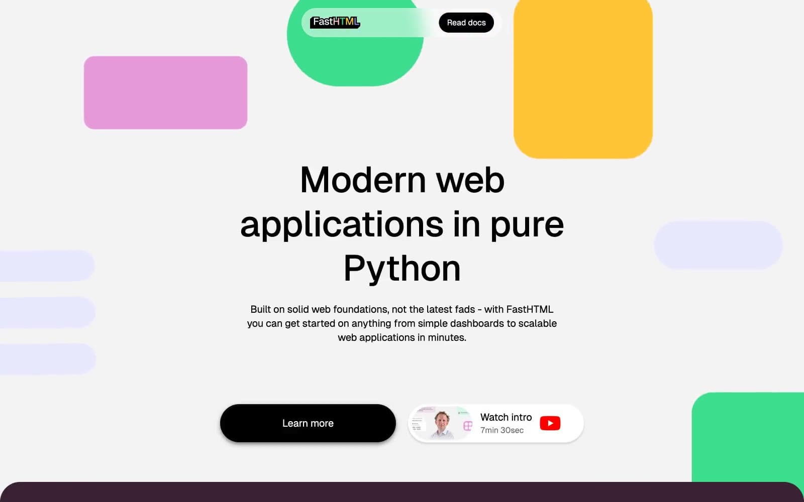
fastht.ml
Developer tools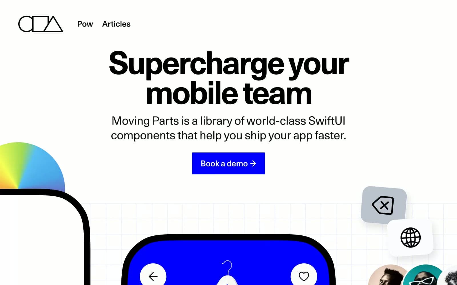
Moving Parts
Developer tools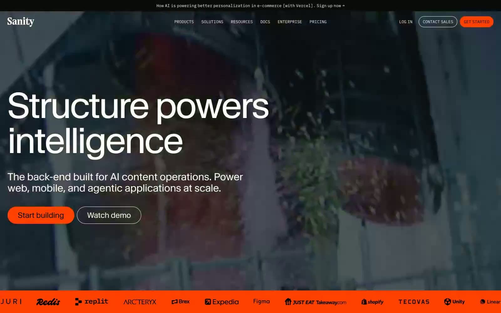
Sanity.io
Developer tools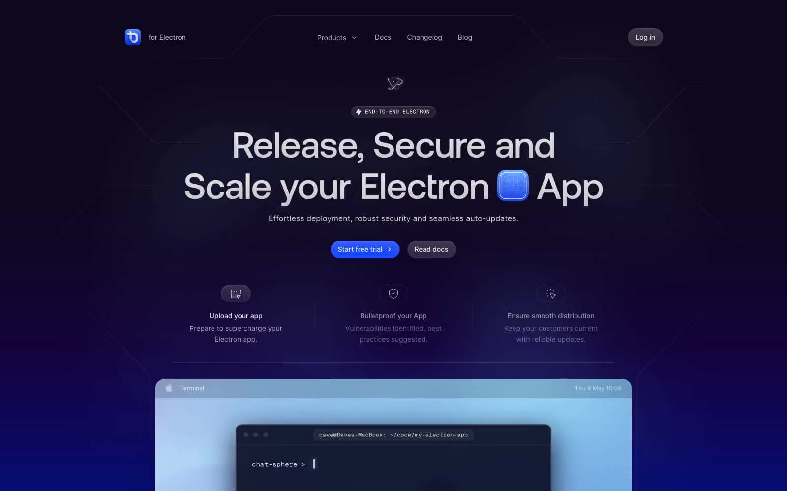
ToDesktop
Developer tools
Cuberto
Studio
Nothing
Commerce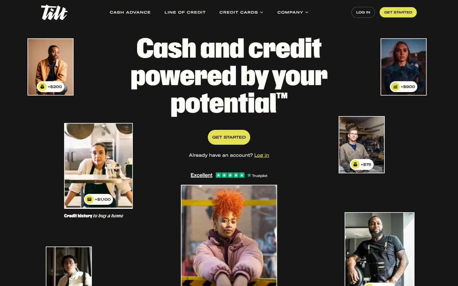
Empower
Finance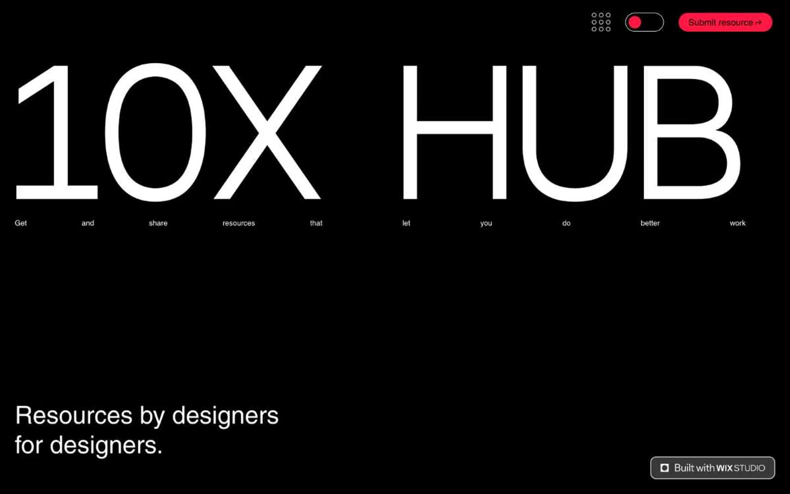
10X HUB
Design tools


