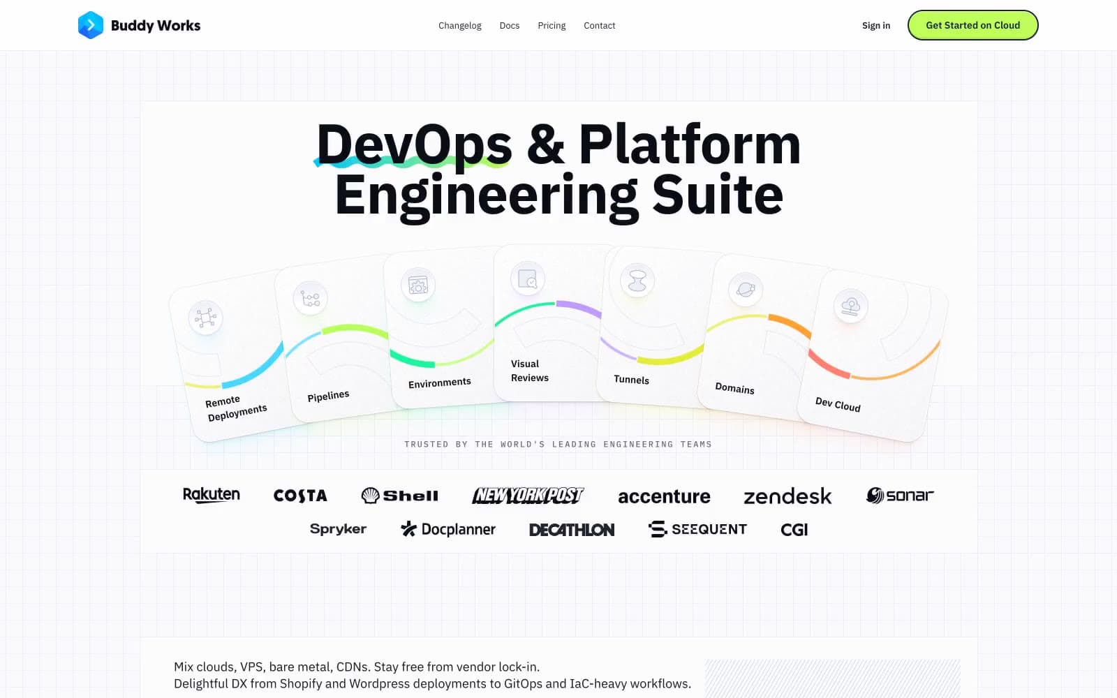
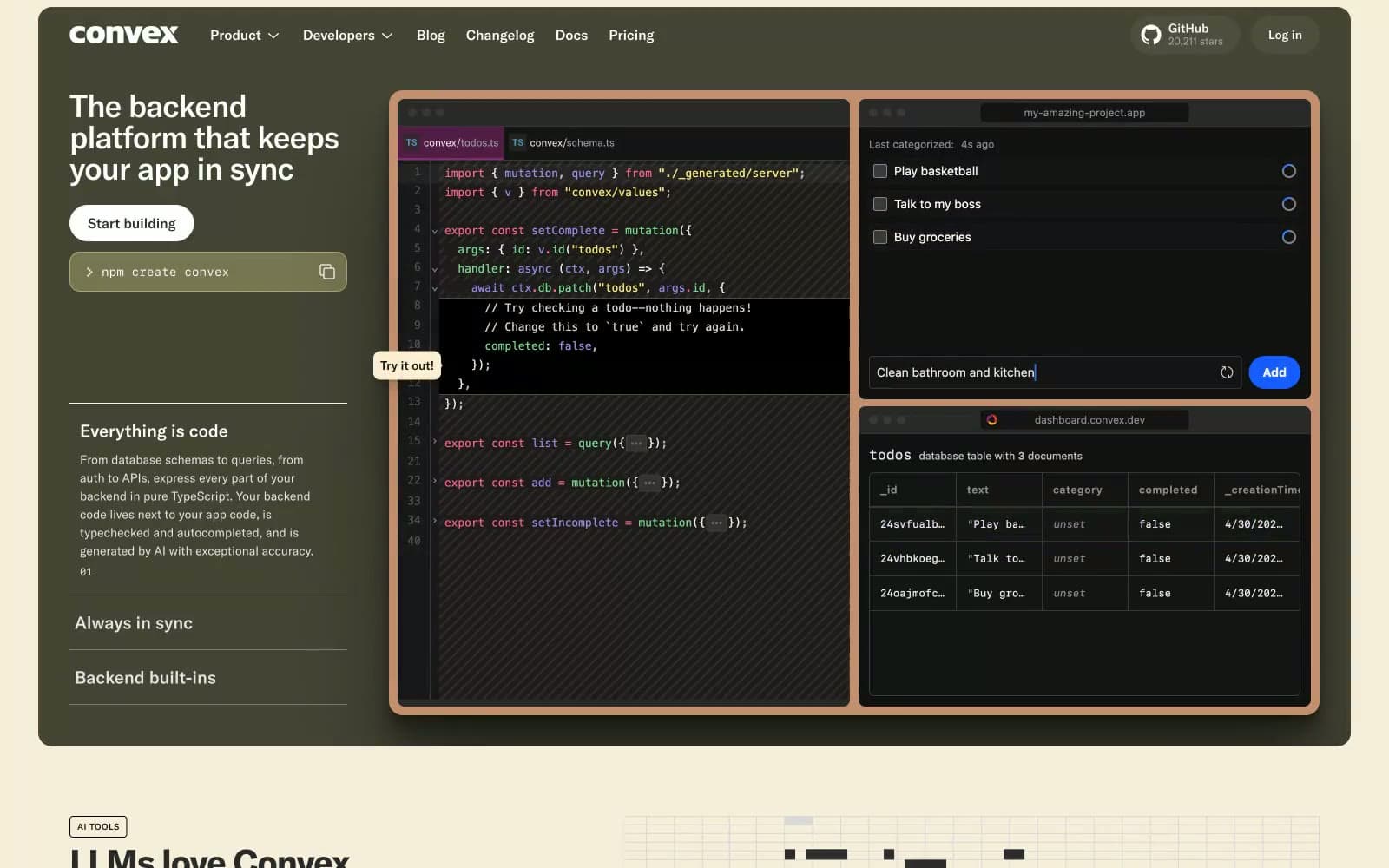
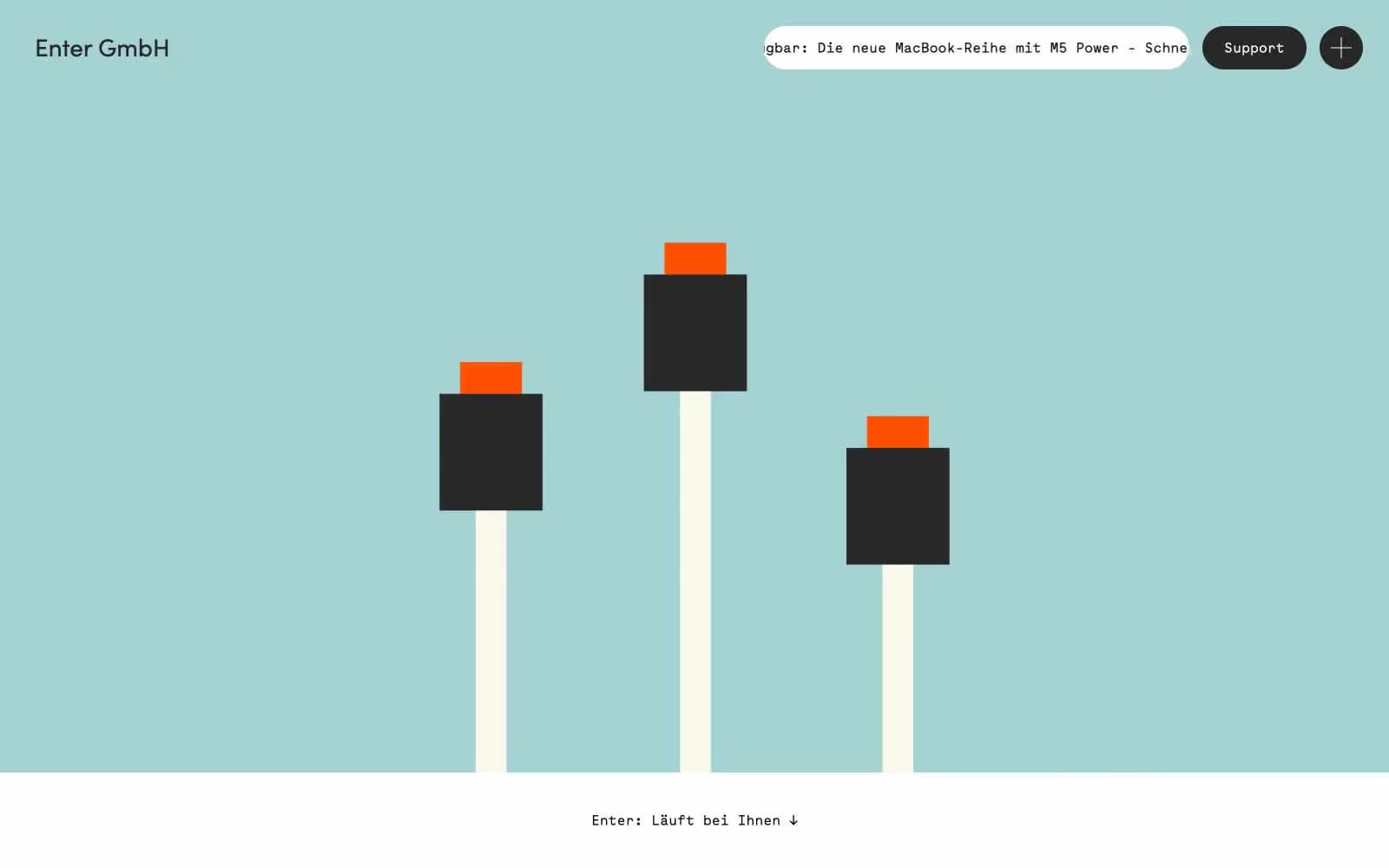
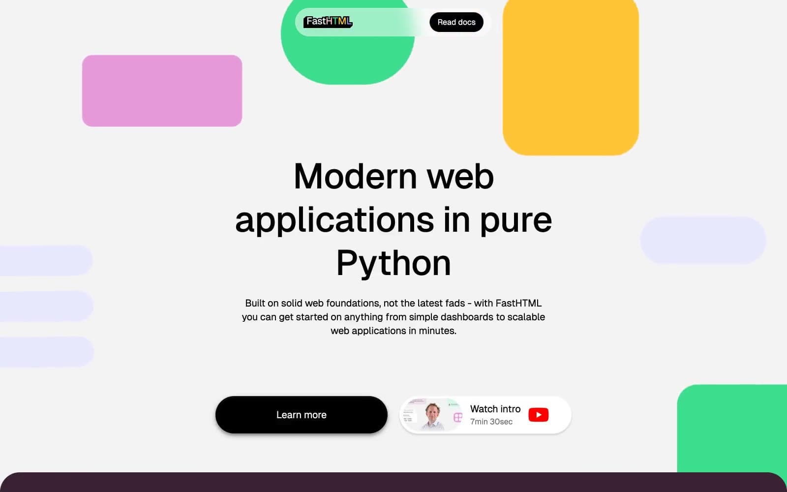
Moving Parts. A monochrome architect's sheet that learned to glow blue.
- Developer tools
- Mixed theme
- 12 colors
- 10 typefaces
Moving Parts is a high-contrast tool for builders: matte white canvas, pure black ink, and one electric blue (#0000ff) that does all the chromatic work — filled buttons, borders, active states, and the product surfaces themselves. The type system is deliberately polyglot: Unica77 carries the voice everywhere (with eight stylistic alternates engaged), Whyte Semi-Mono handles UI chrome and labels, and display moments pivot to extreme display faces like Druk XXCondensed at 195–248px and Fraunces serifs at 100-weight thin. Hierarchy comes from font selection and weight, not size alone. Cards float with very large radii (76–106px), shadows are rare and heavy (rgba(0,0,0,0.3) 15px 20px 30px), and yellow (#fffc52) appears as a flat accent surface to break sections — never as text or decorative gradient. A single conic-gradient sphere anchors the hero as the only ornamental flourish; everything else stays industrial and quiet.

Moving Parts design system

Brand1
Primary CTA fill, active nav, product surface backgrounds, chromatic borders — the only saturated color that carries meaning
Accent2
Green wash for highlight backgrounds, decorative bands, and soft emphasis behind content
Accent panel surface, spotlight callout, tag fill — never text or border
Neutrals9
Body text, headings, hairline borders, icon strokes — the dominant ink color
Dark-section background, deep UI surfaces, high-contrast text on light
Elevated dark surface inside dark sections, card on near-black
Muted helper text, low-emphasis borders, placeholder color
Quiet borders, disabled text, secondary icon strokes
Divider lines, subtle card borders, input resting state
Section band, soft surface fill behind cards
Alternate section background, subtle grouping fill
Page canvas, card surface, button text, dark-section contrast text
Try a pairing
Pick any two colors from the palette to check whether text stays readable on top.
Aa
Pure on Electric Ink
8.59 : 1 contrast
- Body textPasses AA 4.5
- Large textPasses AA 3
- StrictPasses AAA 7