
Titan. Warm-toned monochrome archive.
- Finance
- Light theme
- 9 colors
- 2 typefaces
Titan is a warm-toned monochrome editorial system: generous whitespace, a near-black ink color against soft cream surfaces, and pill-shaped geometry that softens what would otherwise feel like a strict financial product. Color is deliberately absent from the interface — all visual hierarchy comes from typography, spacing, and the warm/cool gray duality between structural borders (#e9eaeb) and surface tones (#f3efeb). Headlines carry authority through weight 500 at large sizes with tight -0.03em tracking rather than through bold weight or accent color. Components feel tactile but flat: no shadows, no gradients, no elevation — depth comes purely from the warm cream card surface (#f3efeb) sitting on the white canvas. The only dark element is the footer (#1e1e1d), creating a single inversion moment at the page bottom. Monospaced Geist Mono is reserved for large numerical stats ($1.2B, 10,000+, 2017), giving data a distinctive editorial quality that mirrors print financial journalism.
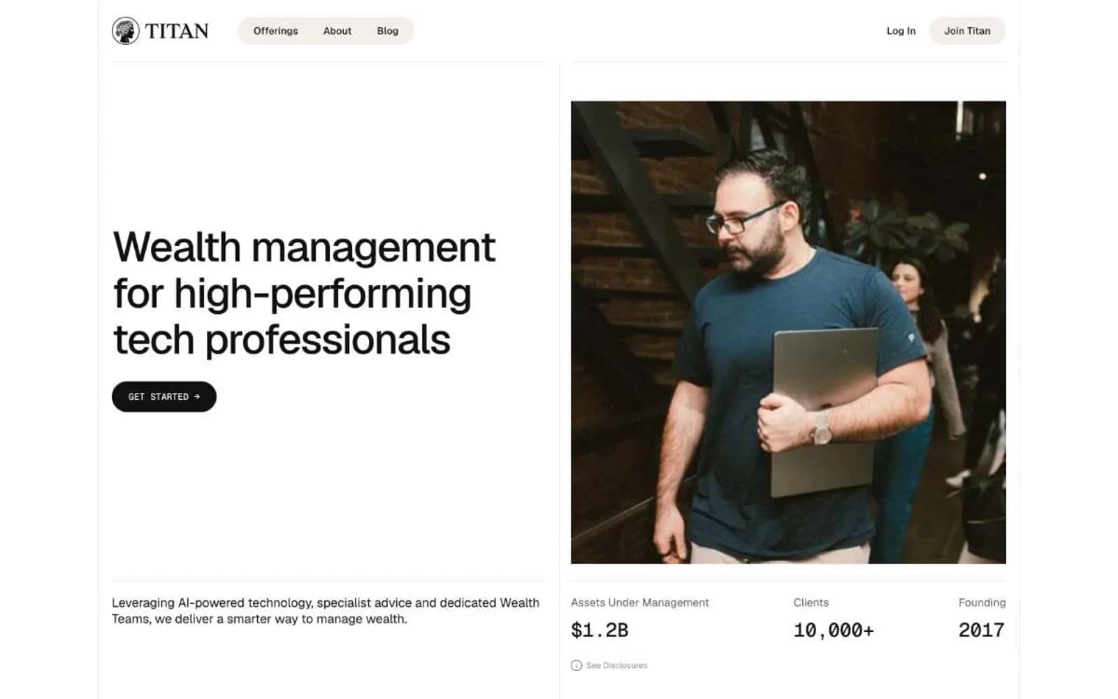
Titan design system

Neutrals9
Rare SVG fills and graphic accents — used sparingly where absolute black is required
Primary text, filled button background, icon strokes — near-black ink that carries the entire brand identity. The slight softness vs pure #000 keeps it from feeling sterile
Footer background, dark section inversions — the only dark surface in the system, creating a terminal moment at page bottom
Muted helper text, secondary copy — warm gray that recedes on cream surfaces while staying readable on white
Tertiary text and disabled states — only when even Warm Subtle is too prominent
Secondary borders on warm surfaces, subtle background washes — extends the cream warmth into the border layer
Primary hairline borders, nav pill background, structural dividers — cool gray that defines edges and containers without competing with content
Warm card and section surfaces — the warm signature tone that gives the system its editorial, paper-like quality against the cool white canvas
Page canvas, card surfaces, button text — the dominant light field the entire interface sits on
Try a pairing
Pick any two colors from the palette to check whether text stays readable on top.
Aa
Pure White on Pure Black
21.00 : 1 contrast
- Body textPasses AA 4.5
- Large textPasses AA 3
- StrictPasses AAA 7
More DESIGN.md files. Same web, different personalities.

Mollie
Finance
a16z speedrun
Finance
Acctual
Finance
Airtree
Finance
Ambrook
Finance
Angellist 2024
Finance
Apron
Finance
Baselayer
Finance
Basis Theory
Finance
BlueYard Capital
Finance
Brex
Finance
Coda
Finance


