
TinyFaces NFT. Printed collector's catalog on warm paper.
- Crypto
- Light theme
- 9 colors
- 3 typefaces
TinyFaces presents a curated editorial aesthetic for an NFT collection: cream-paper canvas, oversized serif display type in Migra, and pastel-saturated feature cards that feel lifted from a printed collector's catalog. The 3D character renders are the stars — each one a tactile, toy-like portrait shot against muted, painterly backdrops (sage, periwinkle, blush, cream). The chrome stays disciplined and dark — charcoal text, hairline borders, pill buttons — so the colorful artwork and pastel cards can carry the energy. Accent orange-red (#ed4a29) is reserved for the wordmark, decorative borders, and as a thin callout underline, never as a dominant button fill. Headlines lean on italic emphasis within otherwise upright serif to add cadence without shouting. Spacing is compact and dense like a magazine spread, with 10px card radii that feel like printed page edges rather than glassmorphic panels.
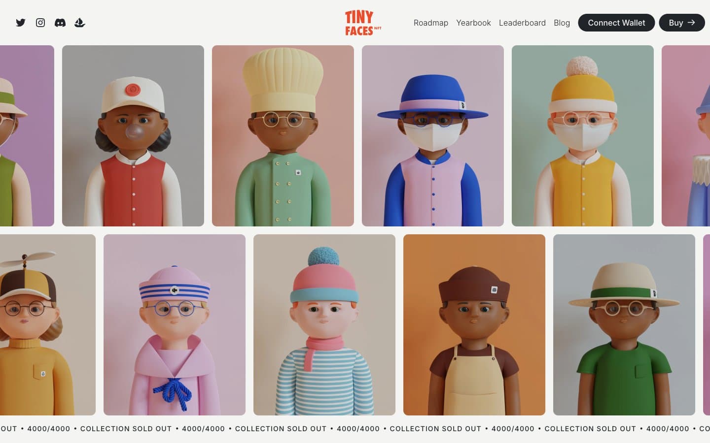
TinyFaces NFT design system

Brand1
Orange accent for outlined action borders, linked labels, and lightweight interactive emphasis. Do not promote it to the primary CTA color
Accent4
Feature card background — muted olive-green panel for storytelling sections like environmental impact
Feature card background — dusty blue panel for collection-overview sections
Feature card background — soft lilac-pink panel for rarity/utility sections
Accent on display headlines, decorative borders within heading contexts — warm cream tint that sits between the ink and the pastel cards
Neutrals4
Primary text, body copy, filled buttons, hairline borders — the dominant ink of the system
Hairline dividers, subtle structural borders between dense sections
Page canvas, secondary surface fill behind content sections
Card surfaces, white-space inside pastel cards, icon contrast against dark fills
Try a pairing
Pick any two colors from the palette to check whether text stays readable on top.
Aa
#111111 on Vermillion Mark
5.05 : 1 contrast
- Body textPasses AA 4.5
- Large textPasses AA 3
- StrictFails AAA 7
More DESIGN.md files. Same web, different personalities.
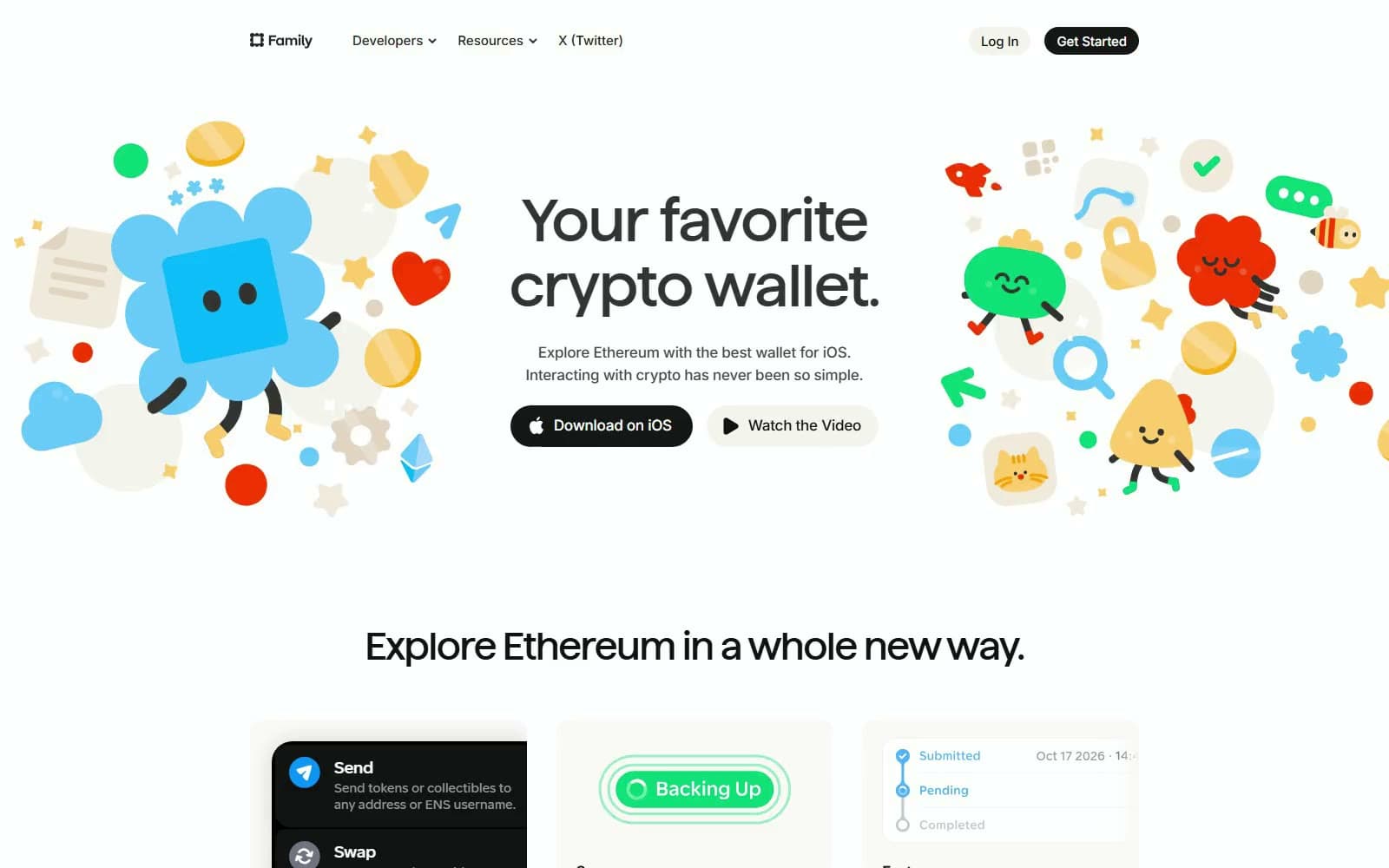
Family
Crypto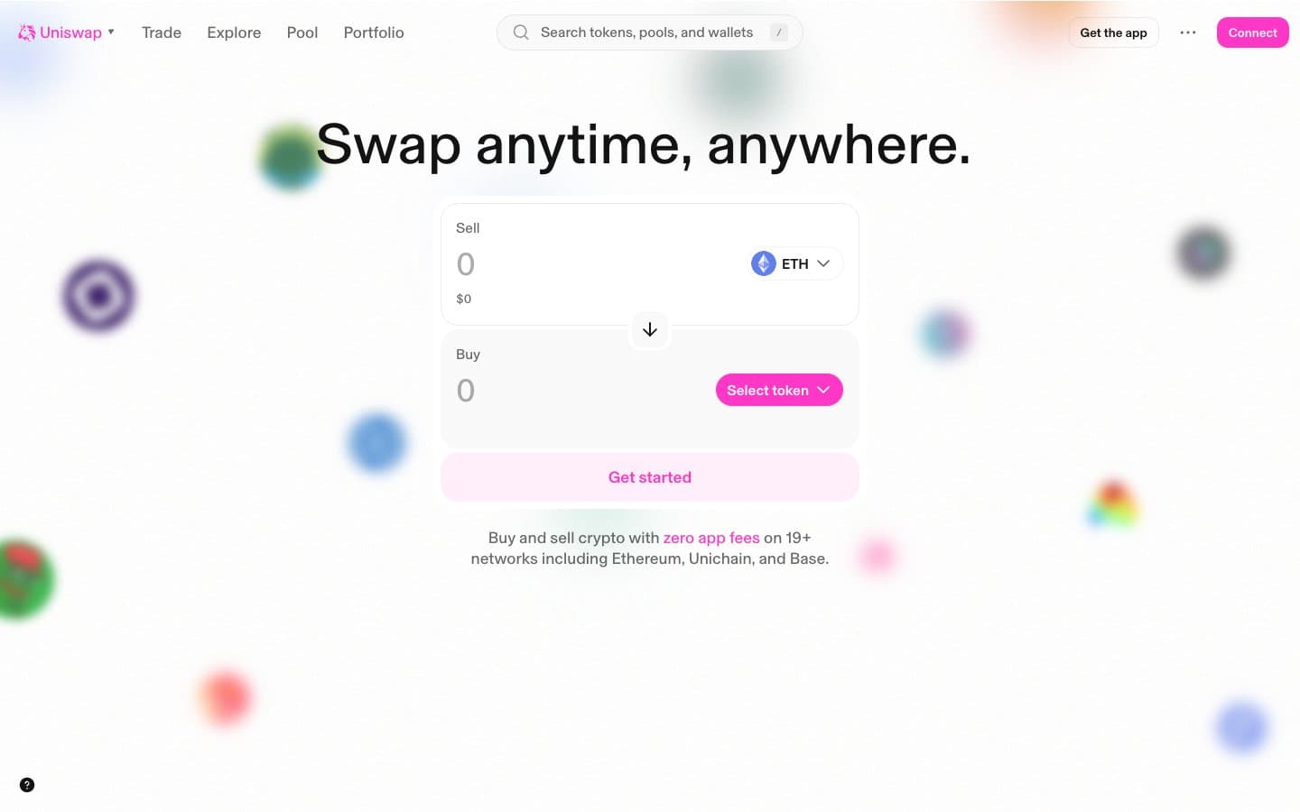
Uniswap
Crypto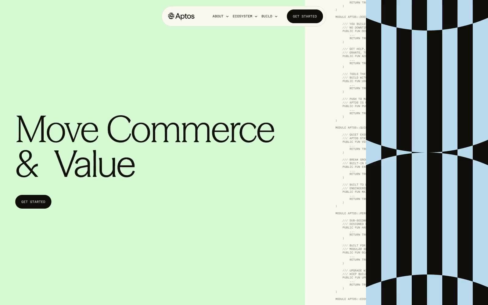
Aptos Network
Crypto
Base
Crypto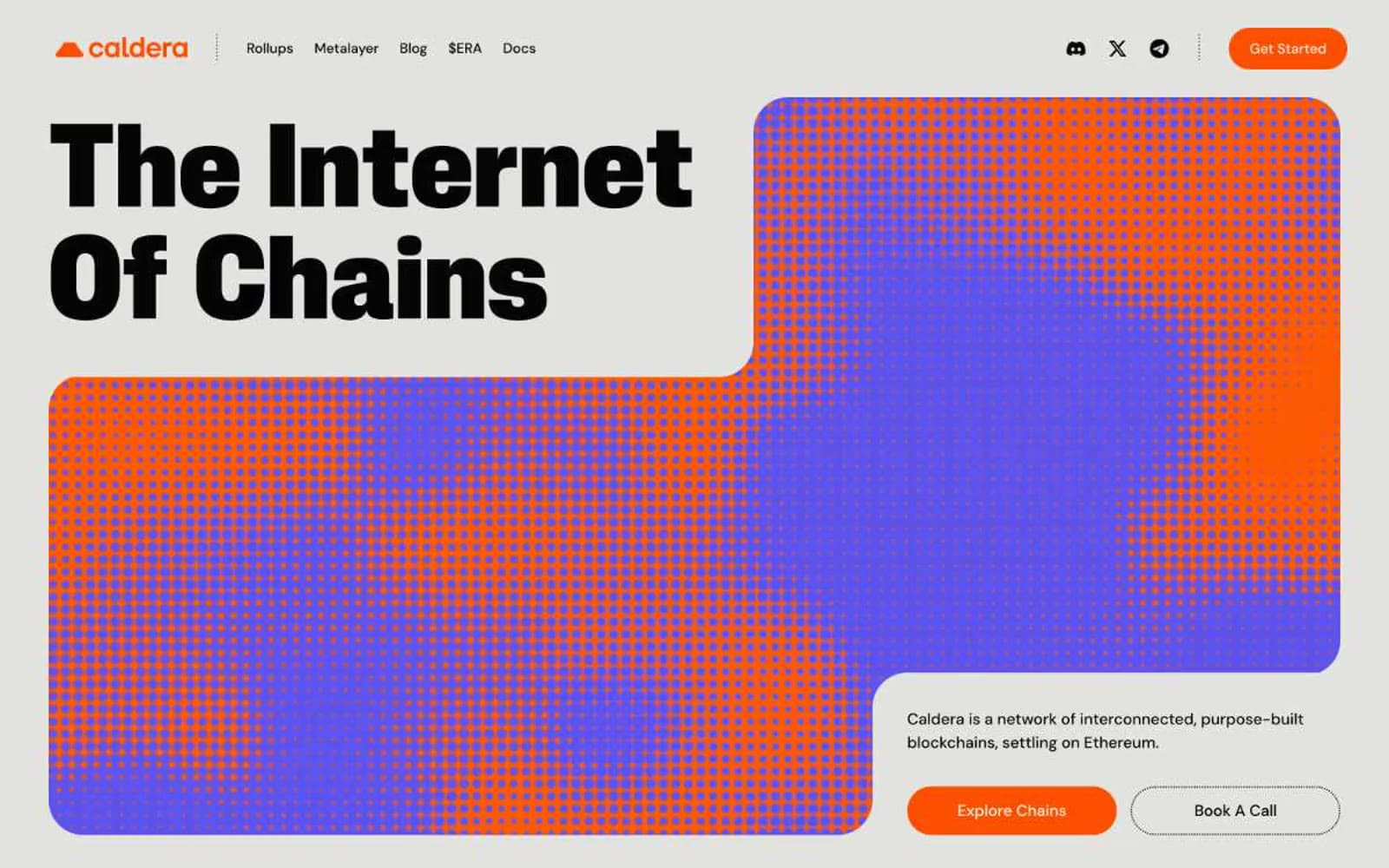
Caldera
Crypto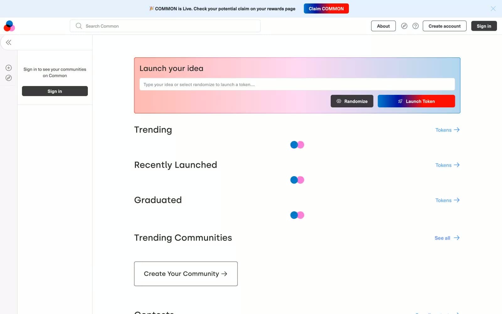
Common
Crypto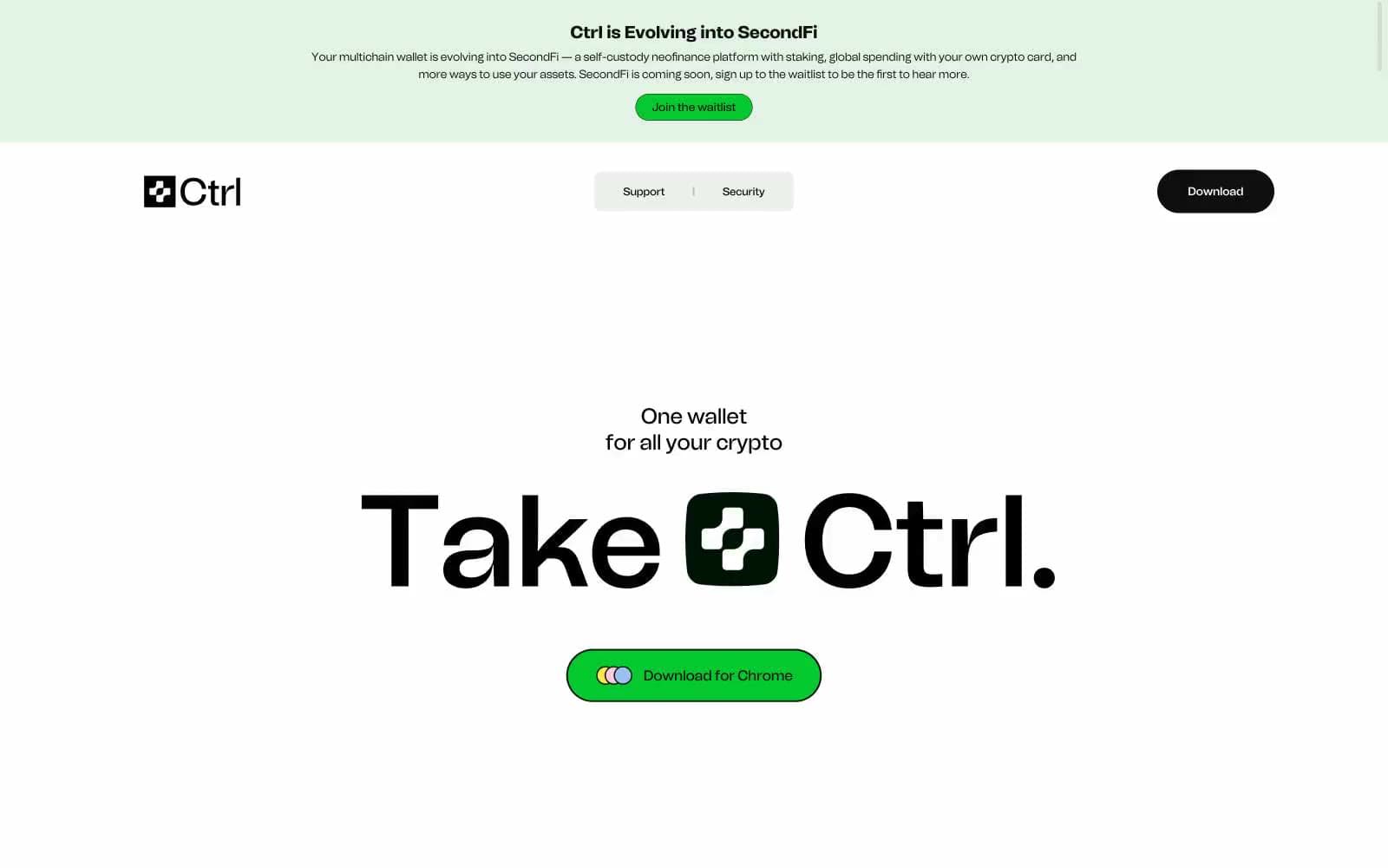
Ctrl Wallet
Crypto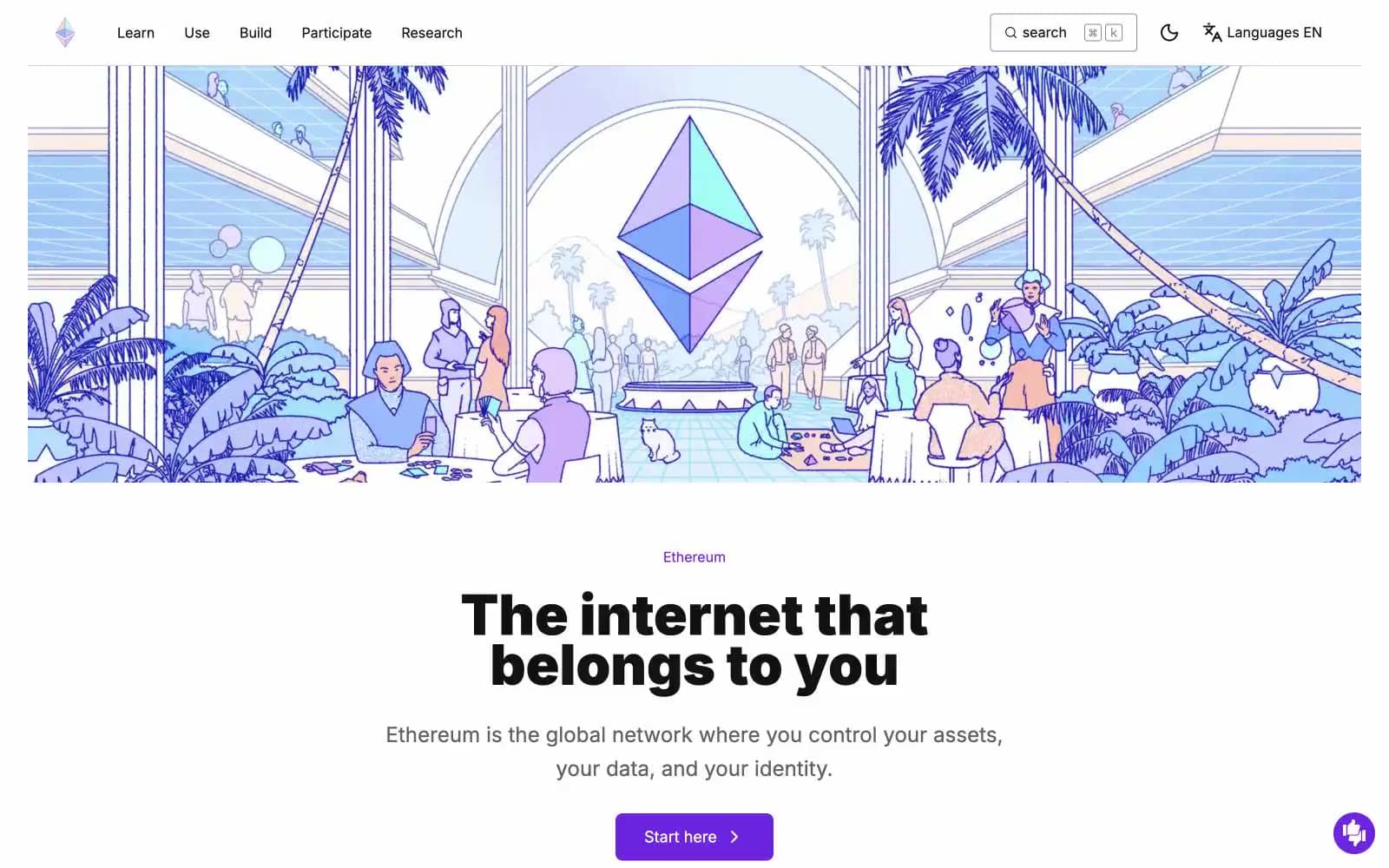
ethereum.org
Crypto
Gamma
Crypto
Glow
Crypto
Kraken
Crypto
Lens
Crypto


