
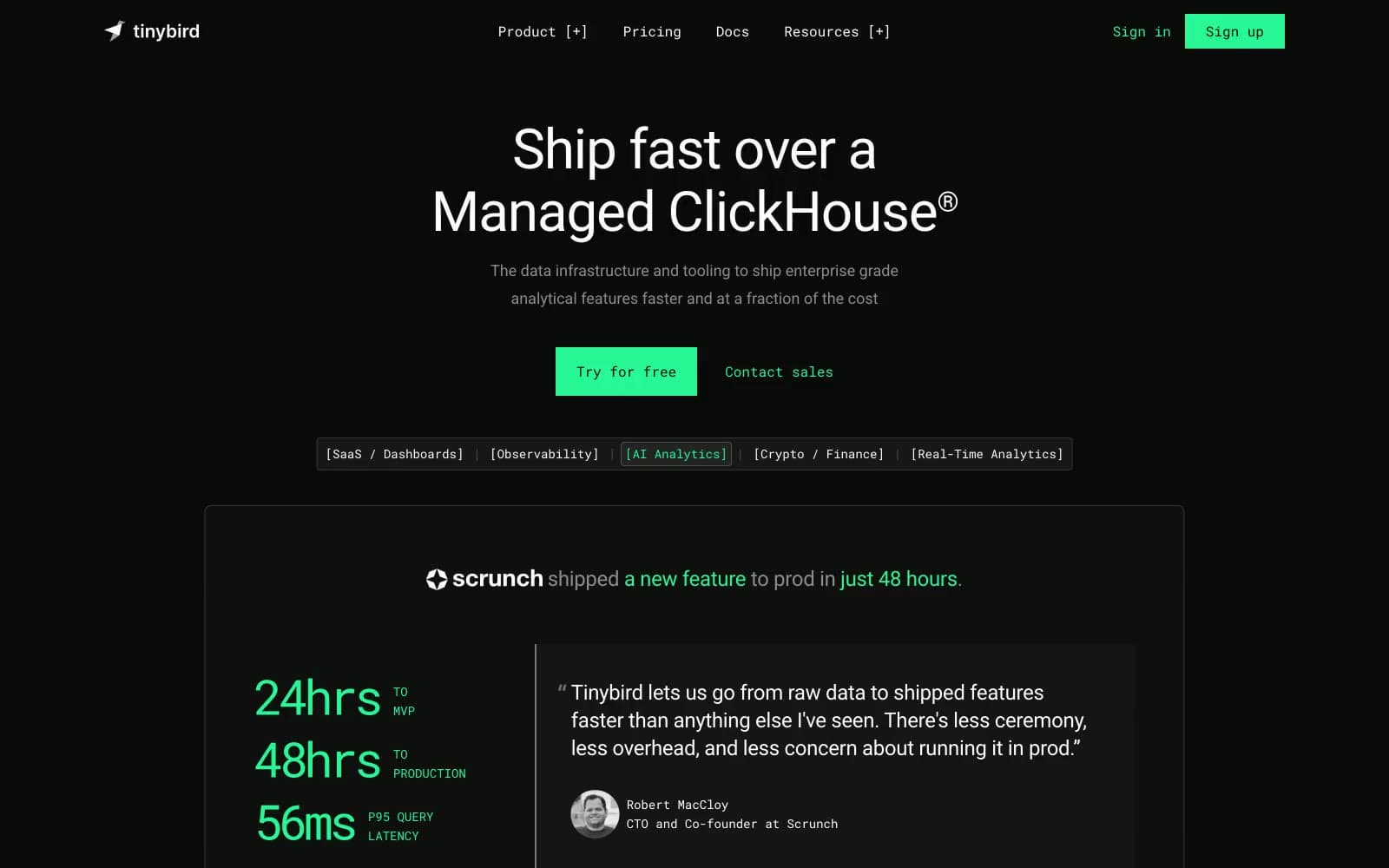
Tinybird. Black void, one electric green cursor, monospace whispers.
- Developer tools
- Dark theme
- 12 colors
- 2 typefaces
Tinybird is a dark-mode developer console aesthetic: near-black canvas, one electric green accent that acts as the only chromatic voice on screen, and a strict division between humanist Roboto for prose and monospaced Roboto Mono for tags, labels, and code. The interface reads as terminal-grade — monospace badges sit inside square brackets like log entries, and the green accent behaves like a blinking cursor rather than a brand color, used sparingly for CTAs, links, and the occasional inline highlight. Surfaces are flat, borders are hairline, and elevation is achieved through subtle dark-to-darker layering rather than shadows. The result is a product page that feels engineered rather than marketed, confident in its restraint.
Tinybird design system

Brand2
Green supporting accent for decorative details and low-frequency emphasis. Do not promote it to the primary CTA color
Green supporting accent for decorative details and low-frequency emphasis. Do not promote it to the primary CTA color
Accent1
Red supporting accent for decorative details and low-frequency emphasis. Use as a supporting accent, not as a status color
Neutrals9
Deepest surface layer for hero backgrounds and video poster frames, one step darker than the page canvas
Primary page canvas — the dominant background of every screen. A hair above true black to soften OLED contrast
First elevated surface — used for embedded media frames and video containers that need to sit above the page canvas
Testimonial and content card backgrounds. Two steps above the canvas, enough lift to separate without casting shadow
Hairline borders, input fields, and dividers. Defines component edges without competing with content
Secondary body text, descriptions, and sub-labels — the voice for anything supporting but not starring in the hierarchy
Tertiary text and disabled-state labels. The faintest human voice before falling into silence
Bright border accent used on emphasized outlined elements like the active workflow step
Primary text and headlines. Maximum contrast against the near-black canvas for immediate legibility
Try a pairing
Pick any two colors from the palette to check whether text stays readable on top.
Aa
Void Black on Cursor Green
14.82 : 1 contrast
- Body textPasses AA 4.5
- Large textPasses AA 3
- StrictPasses AAA 7
More DESIGN.md files. Same web, different personalities.

Railway
Developer tools
Nuxt
Developer tools
Astro
Developer tools
Authkit
Developer tools
Axiom
Developer tools
BaseHub
Developer tools
Better Stack
Developer tools
Bun
Developer tools
Checkly
Developer tools
ClickHouse
Developer tools
Depot
Developer tools
dope.security
Developer tools


