
The1. Building-scale typography on painted concrete.
- Brand
- Light theme
- 7 colors
- 2 typefaces
The1 is a typographic architecture system: a neutral concrete canvas (d9d9d9) beneath display type so large it becomes wall structure. The brand speaks through KH Teka set at architectural scale with crushed line-heights of 0.70–0.80 and negative tracking down to -0.06em, so letters collide vertically and horizontally to form facades rather than sentences. Four vivid paint colors — Green, Pink, Yellow, Red — function as a place-identity system, each one assigned to a property or moment and deployed as full-bleed color blocks behind contained photography. The interface is ruthlessly flat: no shadows, no gradients, no elevation, no decorative chrome. Navigation is a wordmark, a text line, and a single dark pill. Hairline near-black borders do the structural work that cards and shadows do elsewhere. A designer rebuilding this system should treat type as the primary surface, color as wayfinding, and the canvas as an empty gallery wall the type inhabits.
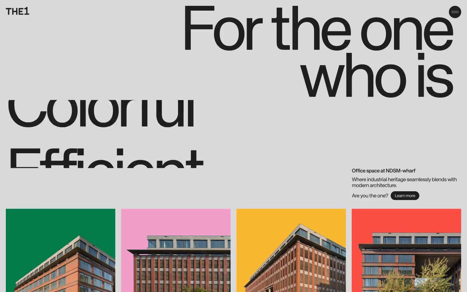
The1 design system

Brand4
Full-bleed identity block for The Green property and any place or section it owns — deep forest green reads as architectural paint, not decoration
Red wash for highlight backgrounds, decorative bands, and soft emphasis behind content
Full-bleed identity block and dramatic section background — vermillion red carries the most visual weight and anchors expanded menu states and signature moments
Yellow wash for highlight backgrounds, decorative bands, and soft emphasis behind content
Neutrals3
Hairline borders, icon strokes, and occasional deep accents where maximum bite is needed against the colored blocks
Primary text, pill button fills, and most structural borders — near-black rather than pure black, softer on the concrete canvas while keeping max contrast
Page canvas and primary surface — the light gray ground every screen sits on, treated as a material (concrete, drywall) rather than a neutral
Try a pairing
Pick any two colors from the palette to check whether text stays readable on top.
Aa
#fafafa on The Green
5.12 : 1 contrast
- Body textPasses AA 4.5
- Large textPasses AA 3
- StrictFails AAA 7
More DESIGN.md files. Same web, different personalities.

Airbnb
Brand
Aker
Brand
Alison Roman
Brand
Alpine Bio
Brand
Alveos One
Brand
Amrit Palace
Brand
André Cândido
Brand
Anna Jóna
Brand
Apollo
Brand
Apple
Brand
Arva
Brand
Ashton Bespoke
Brand


