
Telepathic Instruments. Obsidian screens, warm cream paper, one tungsten bulb.
- Brand
- Light theme
- 9 colors
- 2 typefaces
Telepathic Instruments operates in a studio-dark, broadcast-crisp visual register: full-bleed atmospheric photography gives way to white product surfaces and pill-shaped controls, with a single vivid orange as the only chromatic punctuation in an otherwise monochrome world. Typography is the brand's loudest instrument — Suisse Intl set at near-display sizes with aggressive negative tracking (up to -0.03em) creates headlines that read as engineering specimens rather than marketing copy. The aesthetic borrows from audio hardware UIs and Bauhaus signage: hairline borders, flat surfaces, one functional accent, generous negative space. Components stay low-weight and gestural — pill buttons, ghost links, soft 24px card radii — letting product imagery and music equipment screenshots carry visual weight.
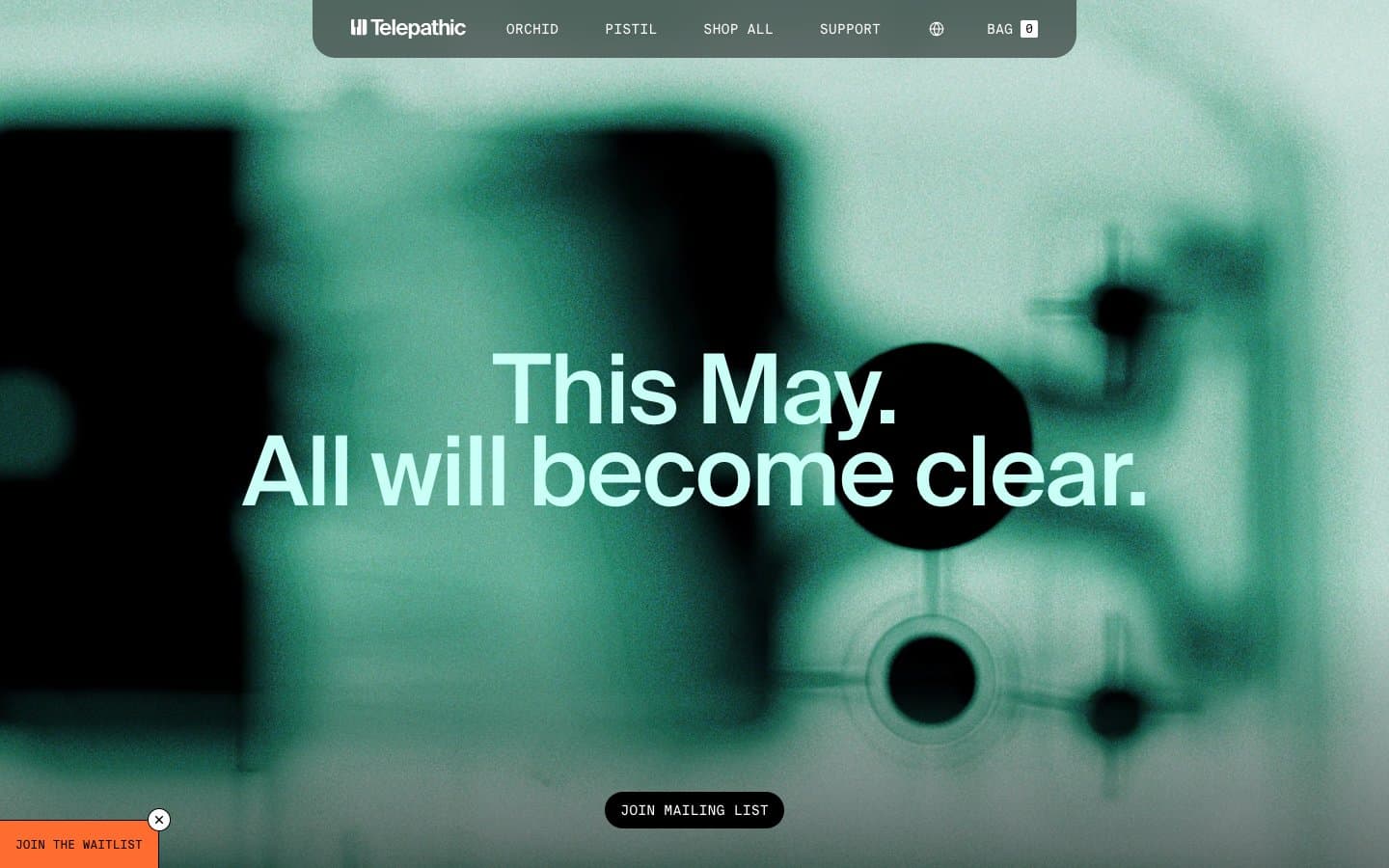
Telepathic Instruments design system

Brand1
Primary action background, call-to-action pills, featured product highlight — the single chromatic accent that makes interactive elements feel switched on against the otherwise neutral canvas
Accent1
Warm beige wash — soft highlight surfaces and muted decorative fills that keep the palette from feeling clinical
Neutrals7
Primary text, filled button backgrounds, high-contrast borders, icon fills — the authority tone for headlines and structural elements
Near-black surface for the floating nav pill, dark overlay panels, and any near-pure-black surface that needs slightly less harshness than pure black
Muted helper text, secondary nav labels, icon strokes at rest, footer meta — the quiet voice for non-primary content
Muted surface fills, secondary panel backgrounds, disabled states
Tertiary surface tint — subtle elevation step between canvas and card
Page canvas, hairline borders, nav separators, input borders — the dominant neutral providing the structural baseline across the entire interface
Card surfaces, content backgrounds, reversed text on dark fills — the clean base layer where product photography sits
Try a pairing
Pick any two colors from the palette to check whether text stays readable on top.
Aa
Carbon Black on Solder Orange
7.44 : 1 contrast
- Body textPasses AA 4.5
- Large textPasses AA 3
- StrictPasses AAA 7
More DESIGN.md files. Same web, different personalities.
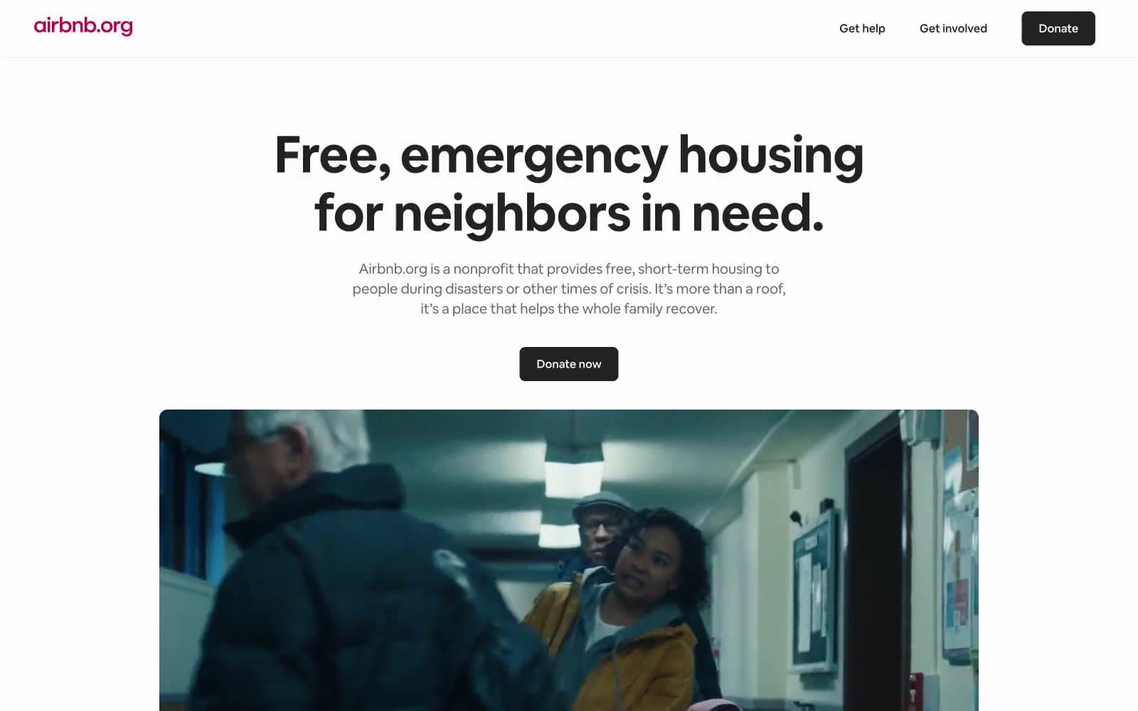
Airbnb
Brand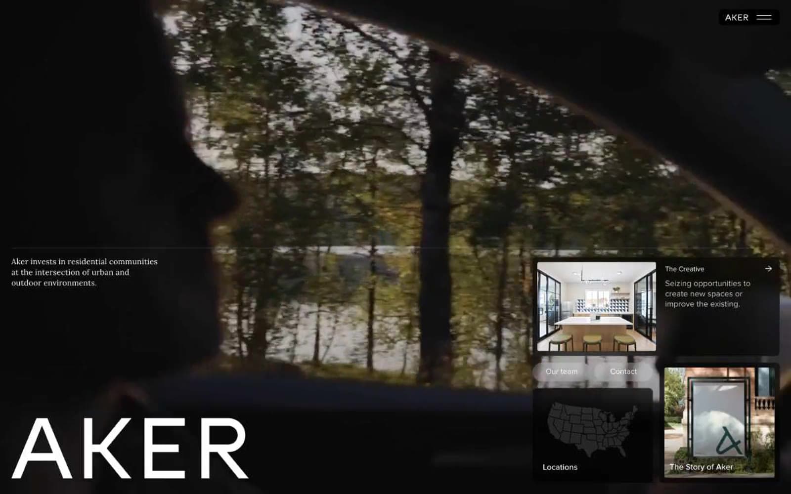
Aker
Brand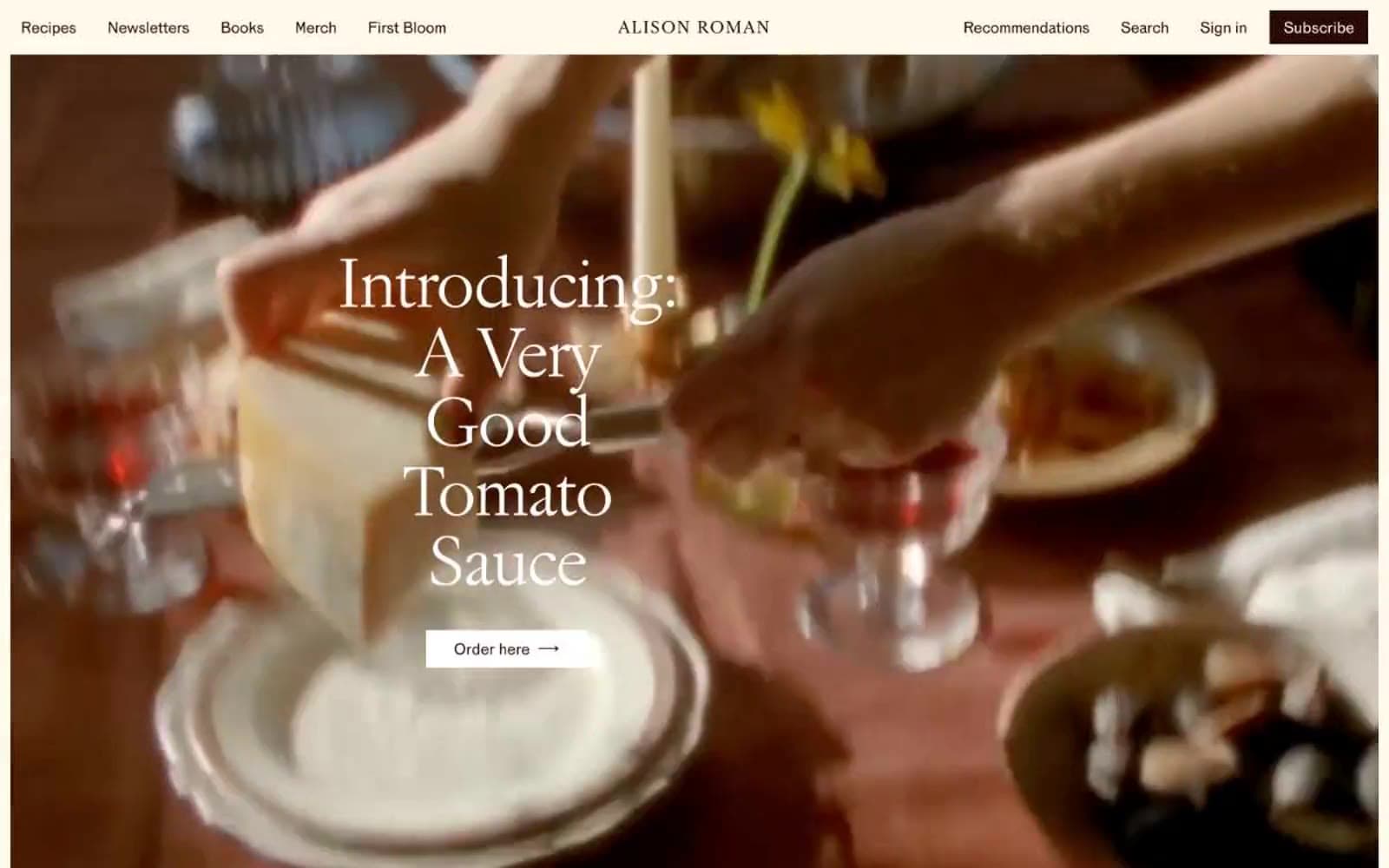
Alison Roman
Brand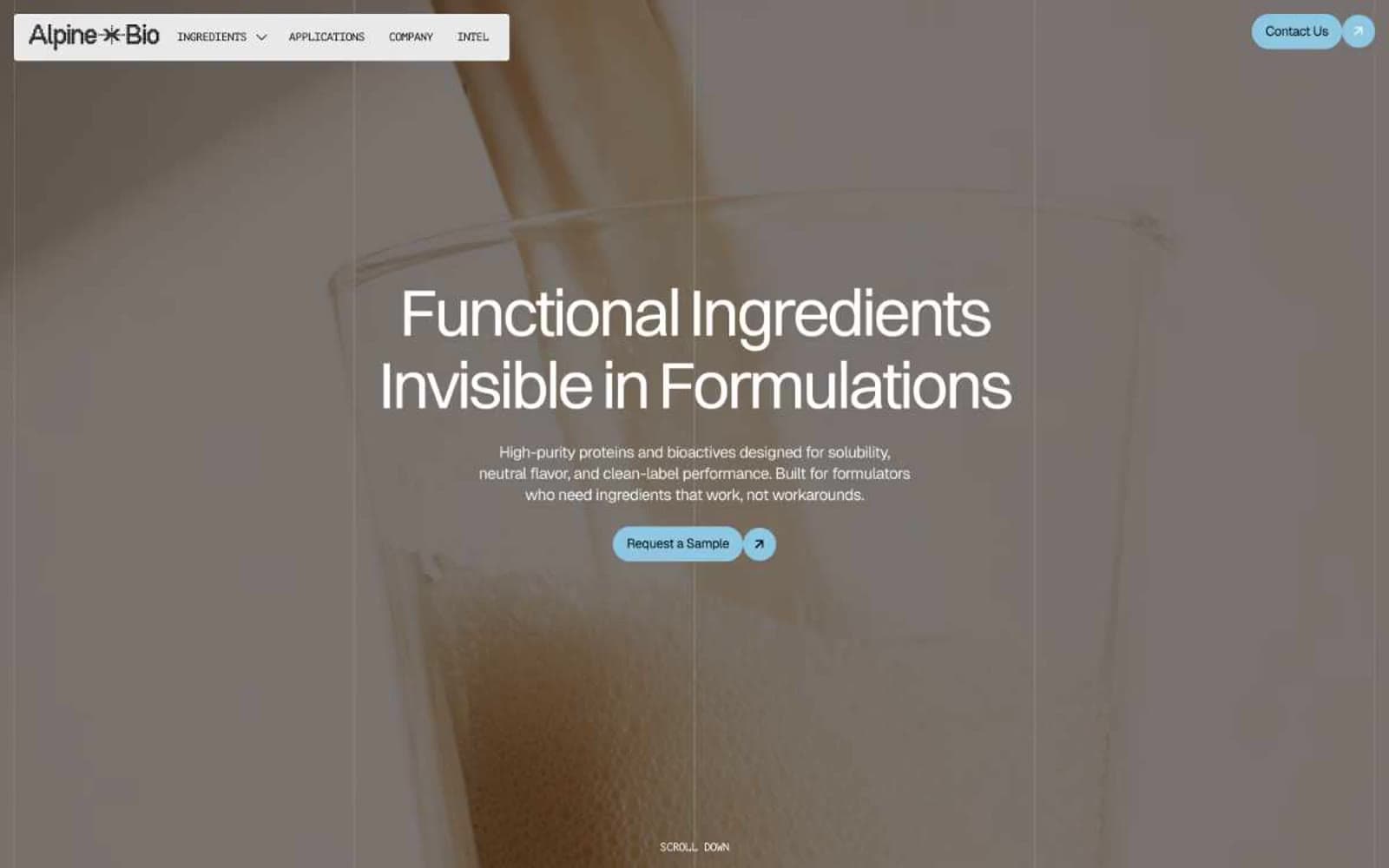
Alpine Bio
Brand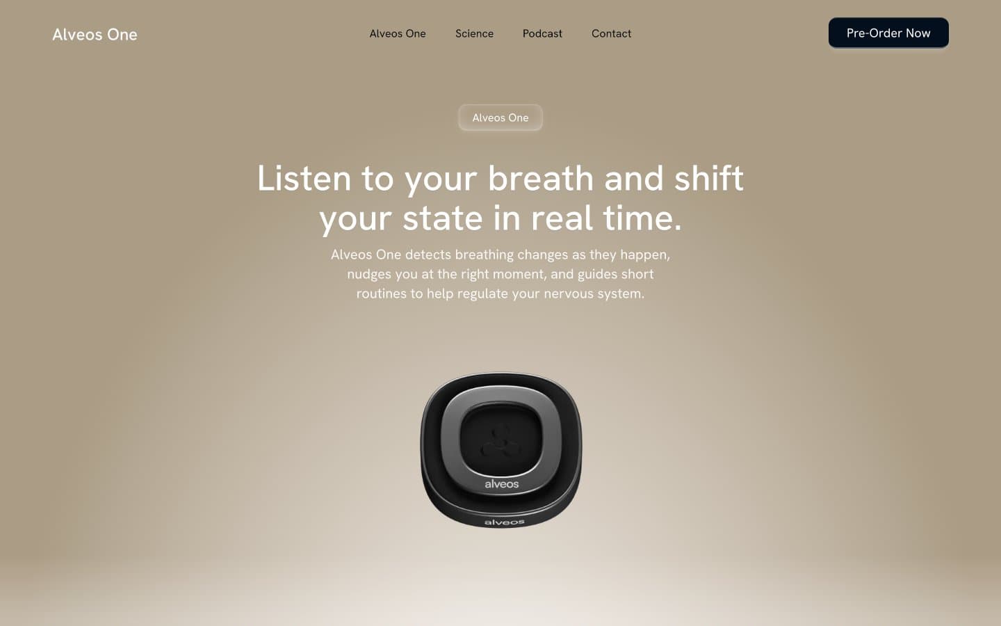
Alveos One
Brand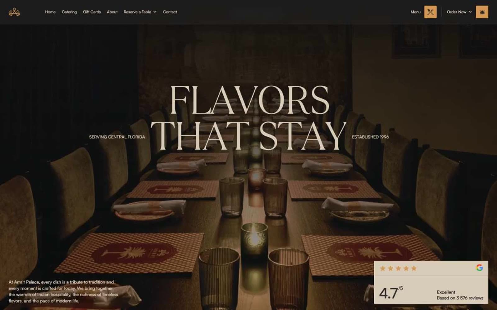
Amrit Palace
Brand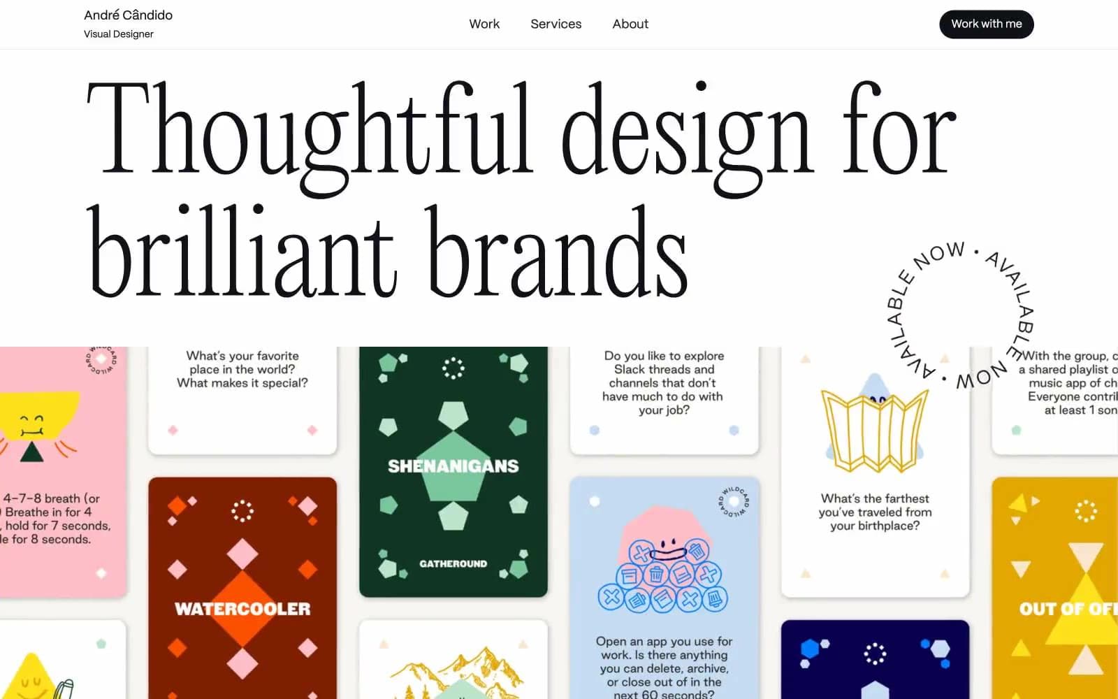
André Cândido
Brand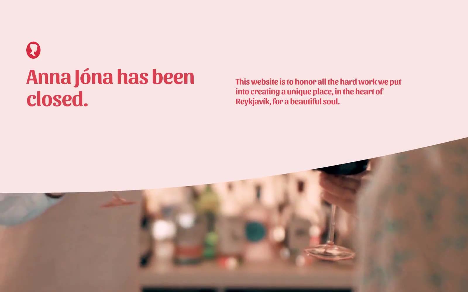
Anna Jóna
Brand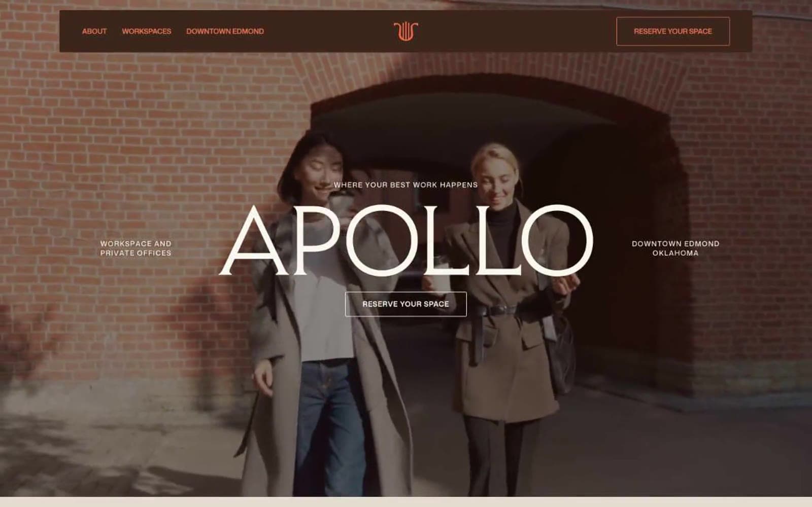
Apollo
Brand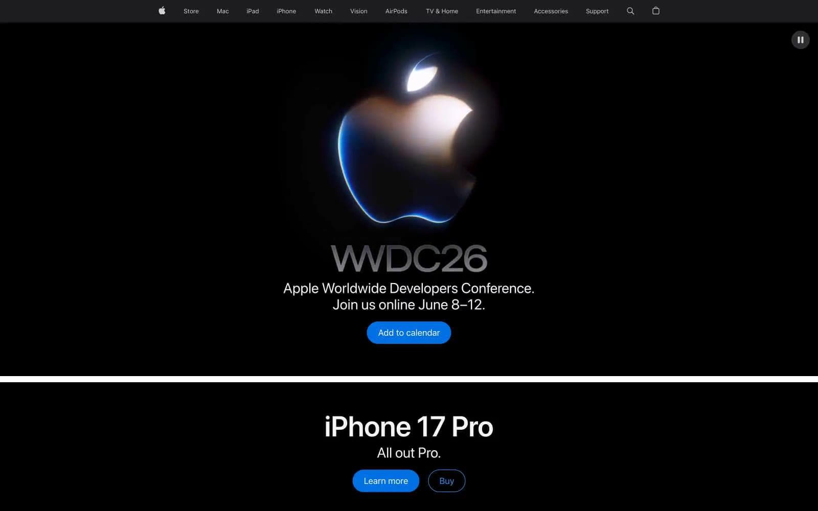
Apple
Brand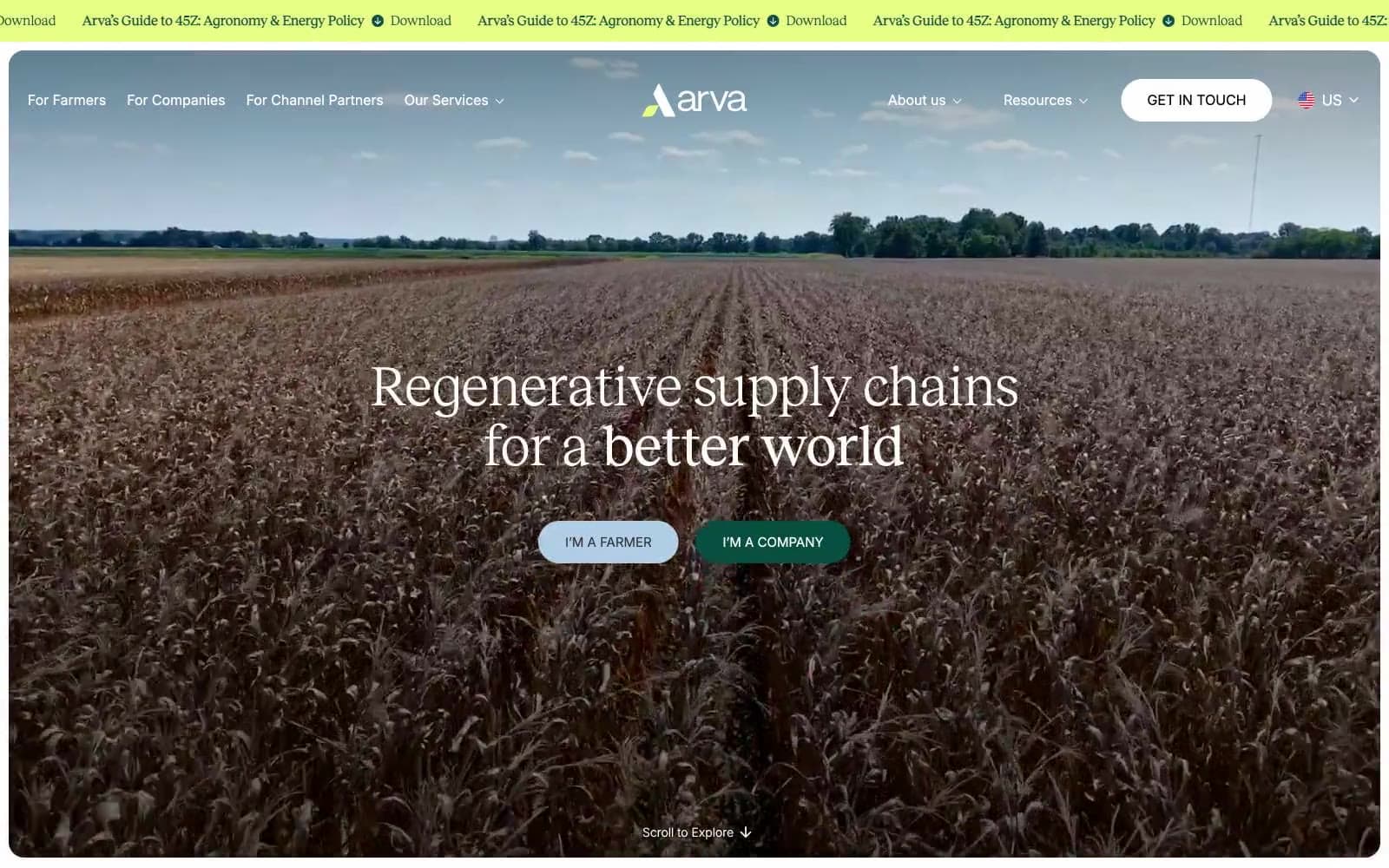
Arva
Brand
Ashton Bespoke
Brand


