
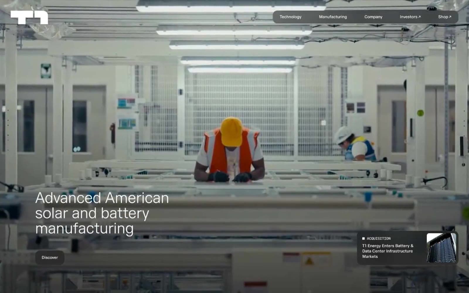
T1 Energy. A quiet, monochromatic stage where industrial scale and whisper-light typography carry the entire brand.
- Brand
- Light theme
- 6 colors
- 1 typeface
T1 Energy speaks the visual language of precision manufacturing: a warm cream canvas, charcoal typography rendered in whisper-light weight, and rounded geometry that softens industrial subject matter. The interface is nearly colorless by design — every element earns its presence through scale, spacing, and shape rather than hue. Navigation floats as a dark pill against the pale surface, imagery uses dramatically rounded 80px corners that echo engineered curves, and content sections breathe with generous 48px gaps. The overall feel is that of a technical specification sheet rendered as a website — precise, confident, and unadorned.
T1 Energy design system

Neutrals6
SVG icon fills, monochrome graphic elements only — never used for text or backgrounds
Footer surface, deepest elevation layer, darkest UI containers
Dark borders and separators for elevated surfaces and inverted UI. Do not promote it to the primary CTA color
Muted secondary text, disabled states, subtle surface layering
Page canvas, section backgrounds — the warm off-white that defines the entire surface treatment
Hairline borders, dividers, input outlines, and card edges on light surfaces. Do not promote it to the primary CTA color
Try a pairing
Pick any two colors from the palette to check whether text stays readable on top.
Aa
Paper White on Pure Black
21.00 : 1 contrast
- Body textPasses AA 4.5
- Large textPasses AA 3
- StrictPasses AAA 7
More DESIGN.md files. Same web, different personalities.

Airbnb
Brand
Aker
Brand
Alison Roman
Brand
Alpine Bio
Brand
Alveos One
Brand
Amrit Palace
Brand
André Cândido
Brand
Anna Jóna
Brand
Apollo
Brand
Apple
Brand
Arva
Brand
Ashton Bespoke
Brand


