
Swoosh. Black floor, one electric lime, and tournament-scale typography screaming from the walls.
- Commerce
- Dark theme
- 9 colors
- 2 typefaces
Swoosh operates as a midnight arena console: nearly all-black canvas (#111111), a single electric lime accent (#b7ff2c) that carries every interaction, and oversized compressed display type (110px at 0.85 line-height) that functions like tournament signage rather than web copy. The system is intentionally austere — only one chromatic hue exists, and it appears exclusively on filled CTA buttons and as thin chromatic action borders, so lime reads as 'switched on' against the dark. Photography is full-bleed and moody, often overlaid with white or near-white cards that float on the image, creating a poster-like layering where editorial typography and photography alternate. The custom Font Roobert carries the voice at every scale — its compressed display weights are signature, while a 6px radius across buttons, cards, nav, and image containers gives the system a uniform sharpness that feels engineered, not soft.
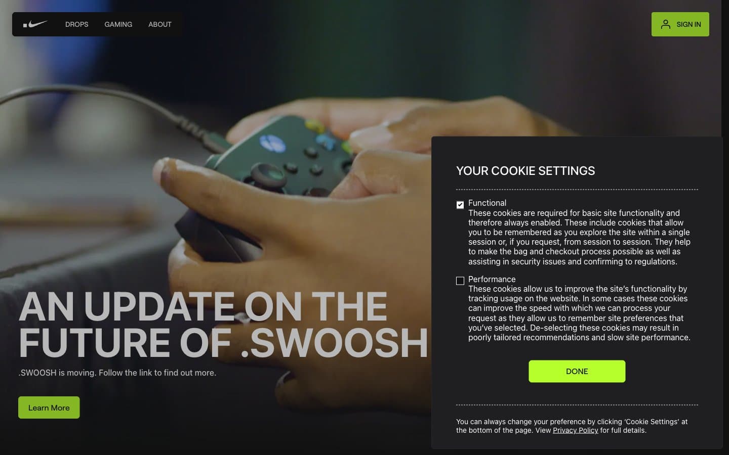
Swoosh design system

Brand1
Green action color for filled buttons, selected navigation states, and focused conversion moments
Neutrals8
Primary headings, body text, and icon fills on light surfaces. Do not promote it to the primary CTA color
Page background, hero canvas, nav surface, body base — the structural floor everything else sits on
Elevated card surface, modal background, panel base — one step above Midnight Canvas for layered containers
Card perimeter borders — a barely-visible outline that defines containers without breaking the monochrome
Footer top border, structural dividers between page regions
Card outline borders, image frame edges — medium-contrast neutral for visible-but-quiet separation
Light-mode hairline borders, text/heading underline rules, icon strokes — appears in inverted contexts (white cards, light surfaces)
Light text on dark surfaces, inverse labels, and high-contrast captions. Do not promote it to the primary CTA color
Try a pairing
Pick any two colors from the palette to check whether text stays readable on top.
Aa
Carbon Black on Lime Pulse
17.35 : 1 contrast
- Body textPasses AA 4.5
- Large textPasses AA 3
- StrictPasses AAA 7
More DESIGN.md files. Same web, different personalities.
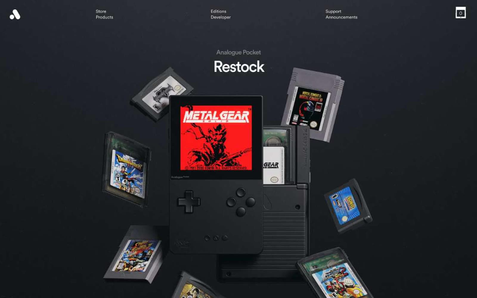
Analogue
Commerce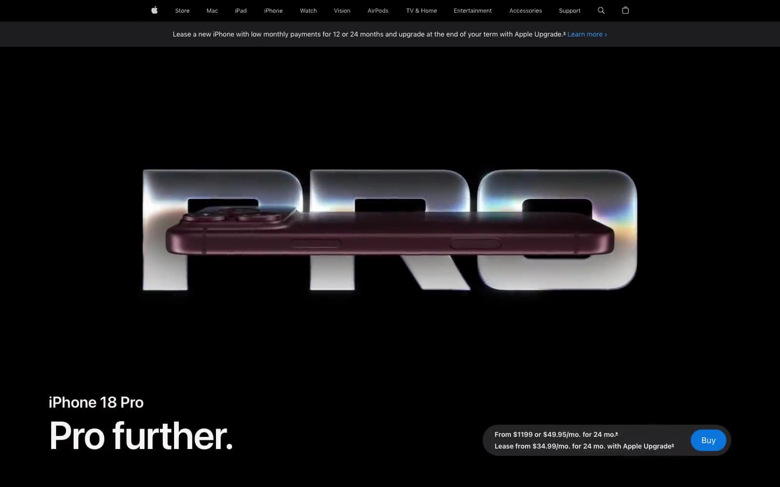
Apple iPhone 18 Pro
Commerce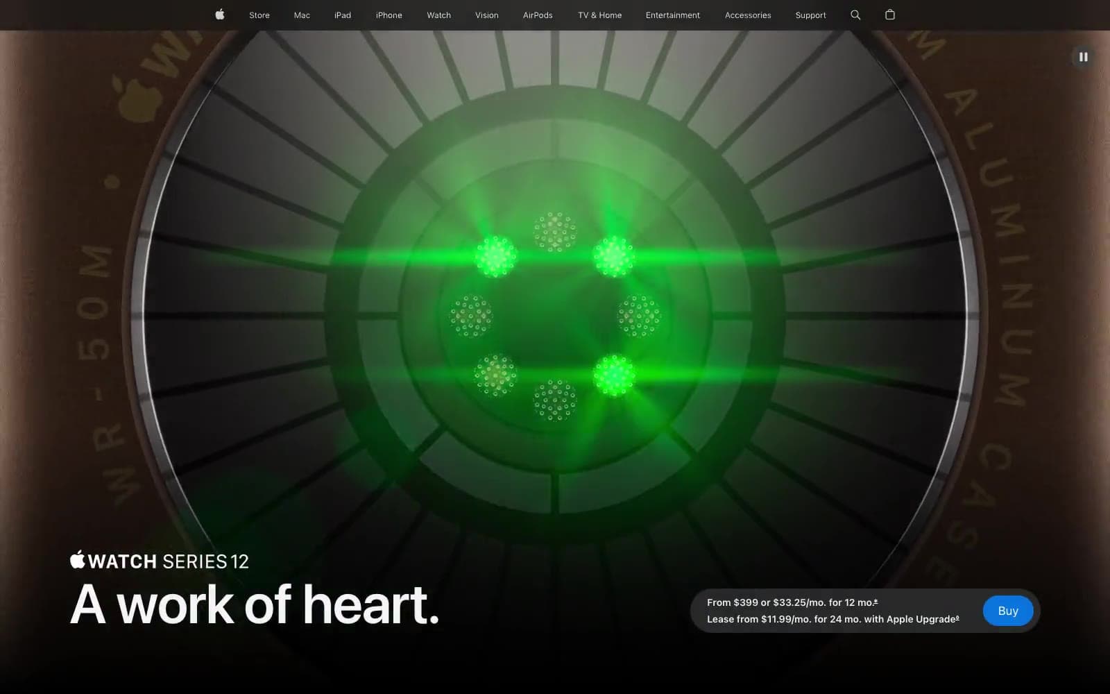
Apple Watch Series 12
Commerce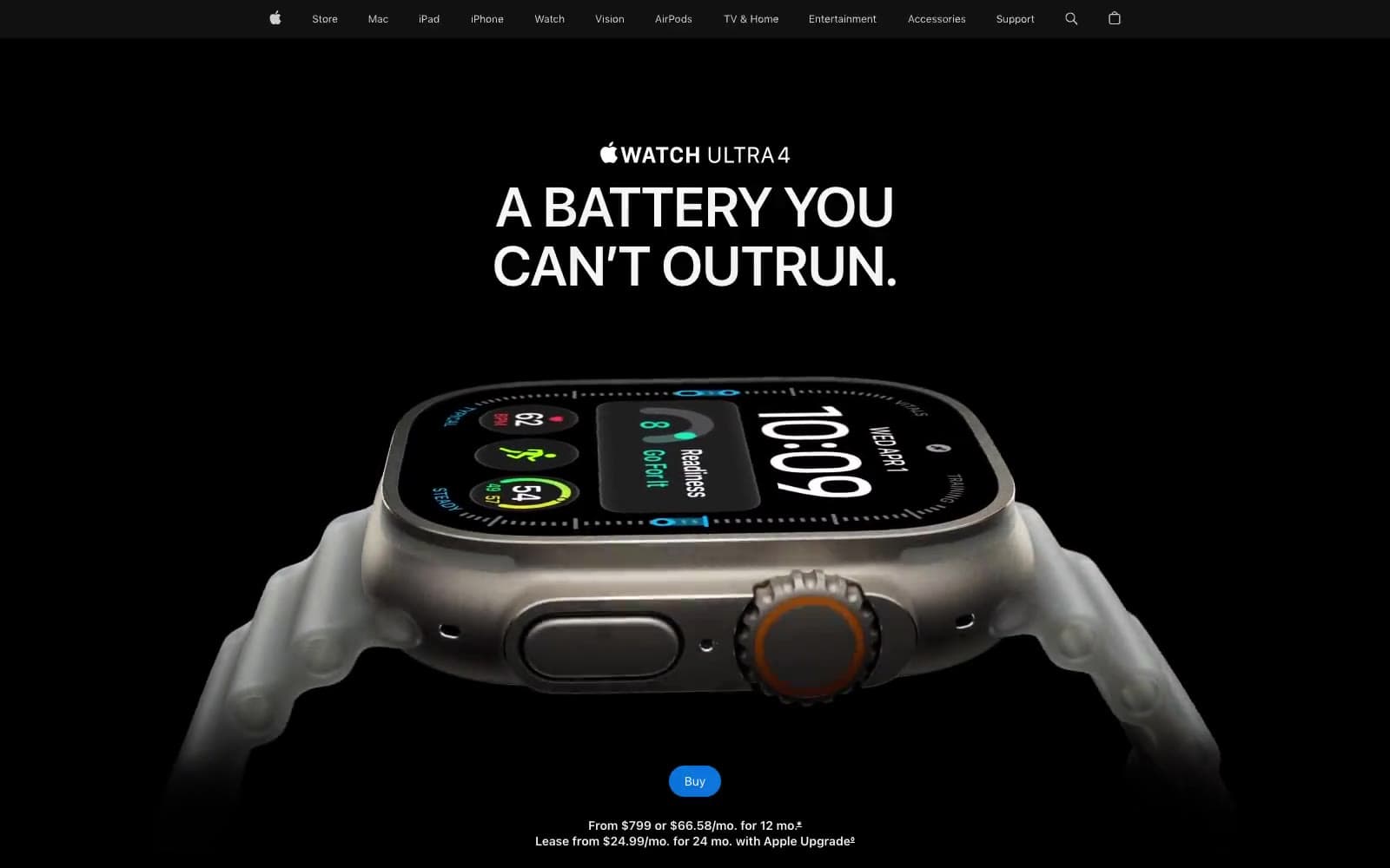
Apple Watch Ultra 4
Commerce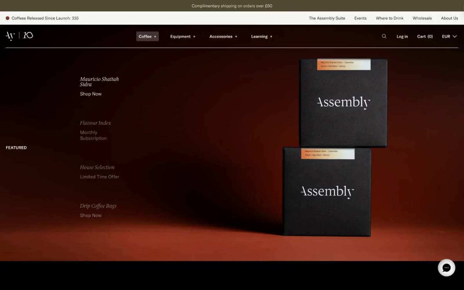
Assembly Coffee London
Commerce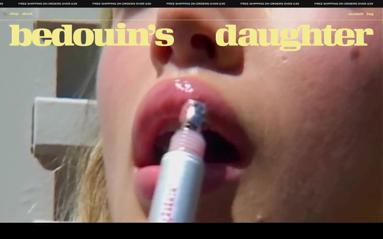
Bedouin's Daughter
Commerce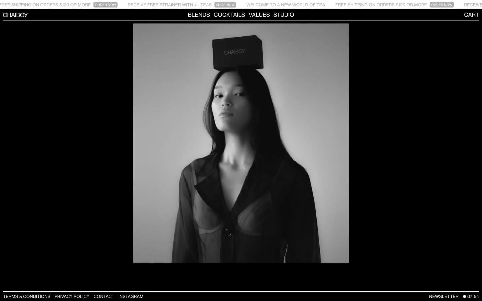
CHAIBOY
Commerce
Dollar Shave Club
Commerce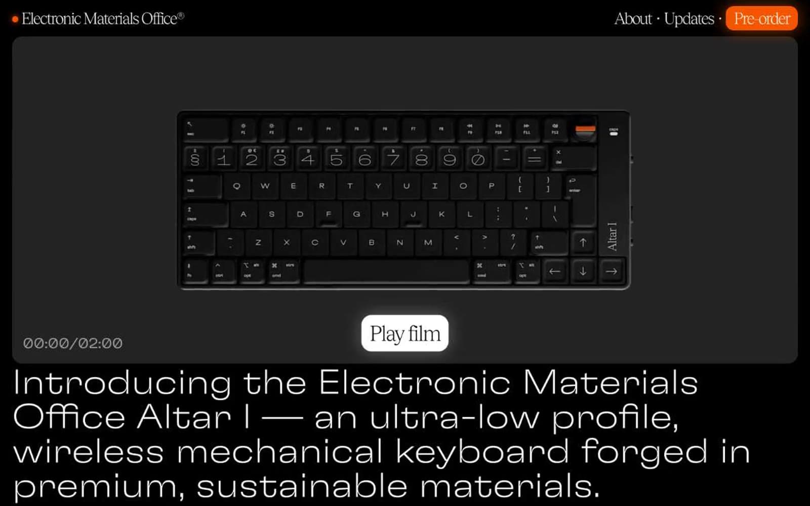
Electronic Materials Office®
Commerce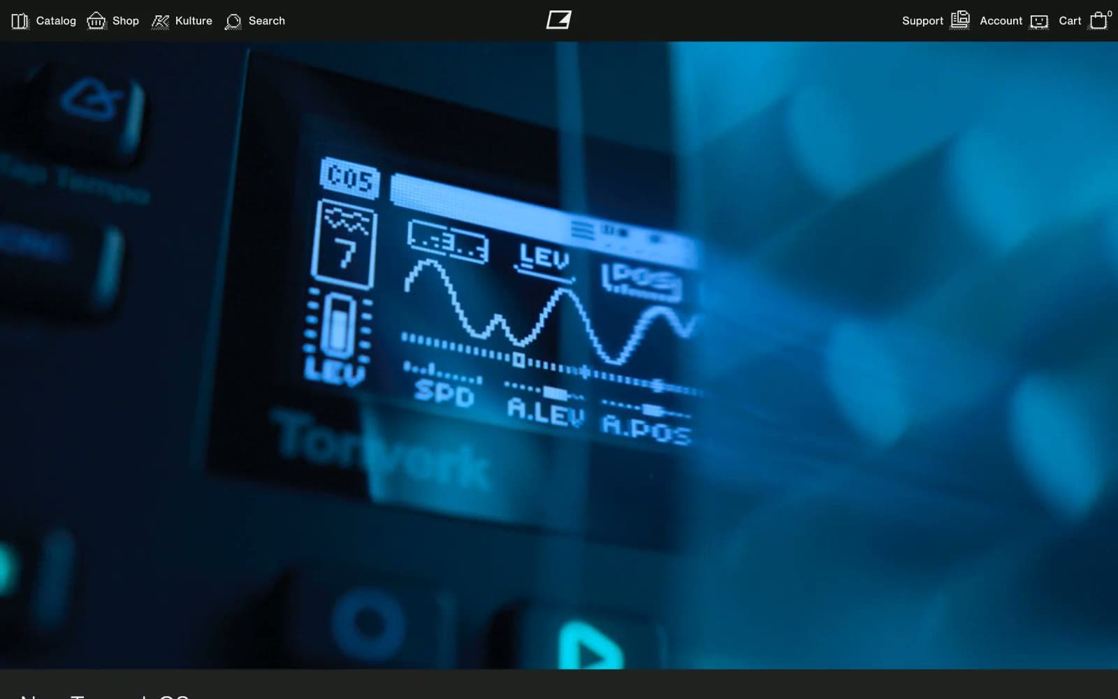
Elektron
Commerce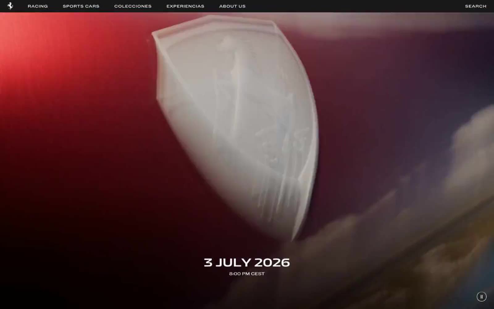
Ferrari
Commerce
Holiday 100
Commerce


