
Ferrari. Cavallino rampante on black marble.
- Commerce
- Dark theme
- 11 colors
- 2 typefaces
Ferrari.com speaks in a restrained editorial whisper over cinematic darkness: a predominantly black canvas broken by full-bleed photography and a single signal red that interrupts only when something demands attention. Typography is set in uppercase with wide tracking, small sizes, and tight weights — the type behaves as captions and labels, never as decoration. Layout favors negative space, centered compositions, and vertical scrolling over chrome — the cars and content breathe in full-viewport panels while navigation sits flat and borderless, signaled by color shifts rather than rules. Every element is reduced to its essential geometry: square corners, hairline dividers, flat surfaces, no rounded buttons.
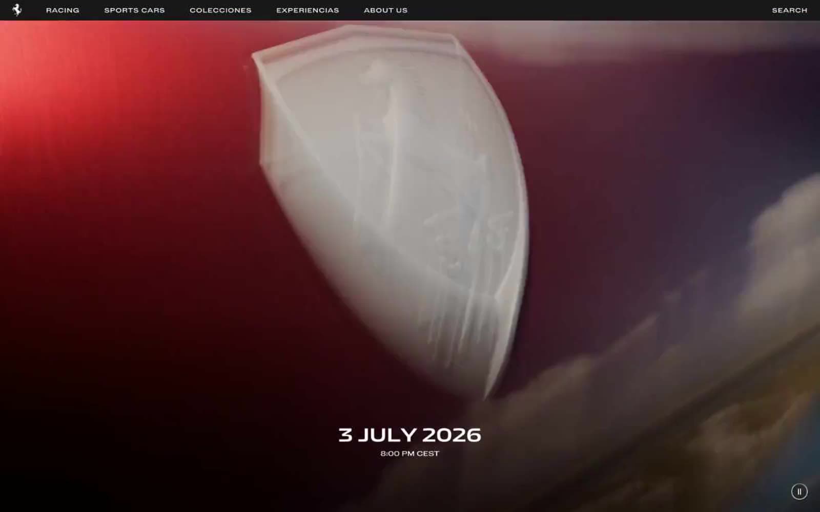
Ferrari design system

Brand2
Supporting palette color for small decorative accents when the core palette needs contrast. Do not promote it to the primary CTA color
Supporting palette color for small decorative accents when the core palette needs contrast. Do not promote it to the primary CTA color
Neutrals9
Full-bleed dark backgrounds, hero panels, and overlay surfaces — creates the cinematic void behind photography
Footer and secondary dark surfaces — one step softer than pure black to break the infinite void
Borders, dividers, and muted surface treatments — thin structural separation between dark layers
Supporting body text and quieter label treatments
Muted body text, caption labels, and secondary metadata on light surfaces
Light surface dividers and disabled borders on white backgrounds
Section backgrounds on light areas — the only chromatic step in the white canvas
Lightest surface wash — subtle background tonal shifts on white sections
Canvas, primary text on dark surfaces, iconography, and link color — the dominant tone across the entire interface
Try a pairing
Pick any two colors from the palette to check whether text stays readable on top.
Aa
Bianco Ferrari on Rosso Corsa
4.87 : 1 contrast
- Body textPasses AA 4.5
- Large textPasses AA 3
- StrictFails AAA 7
More DESIGN.md files. Same web, different personalities.
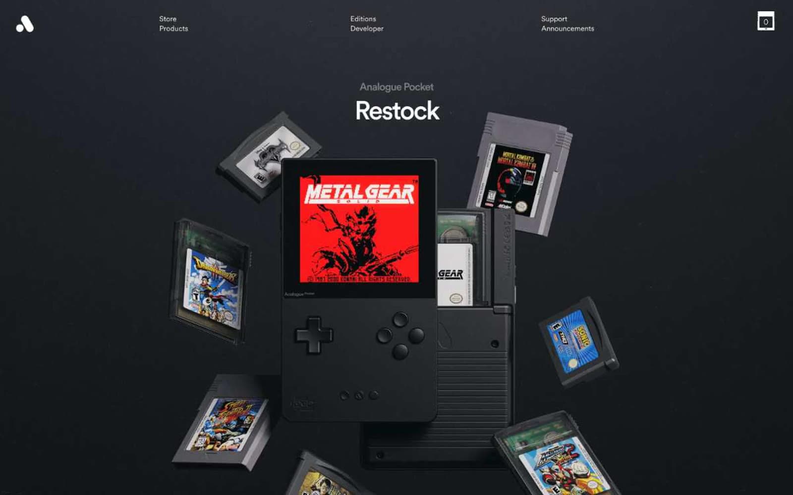
Analogue
Commerce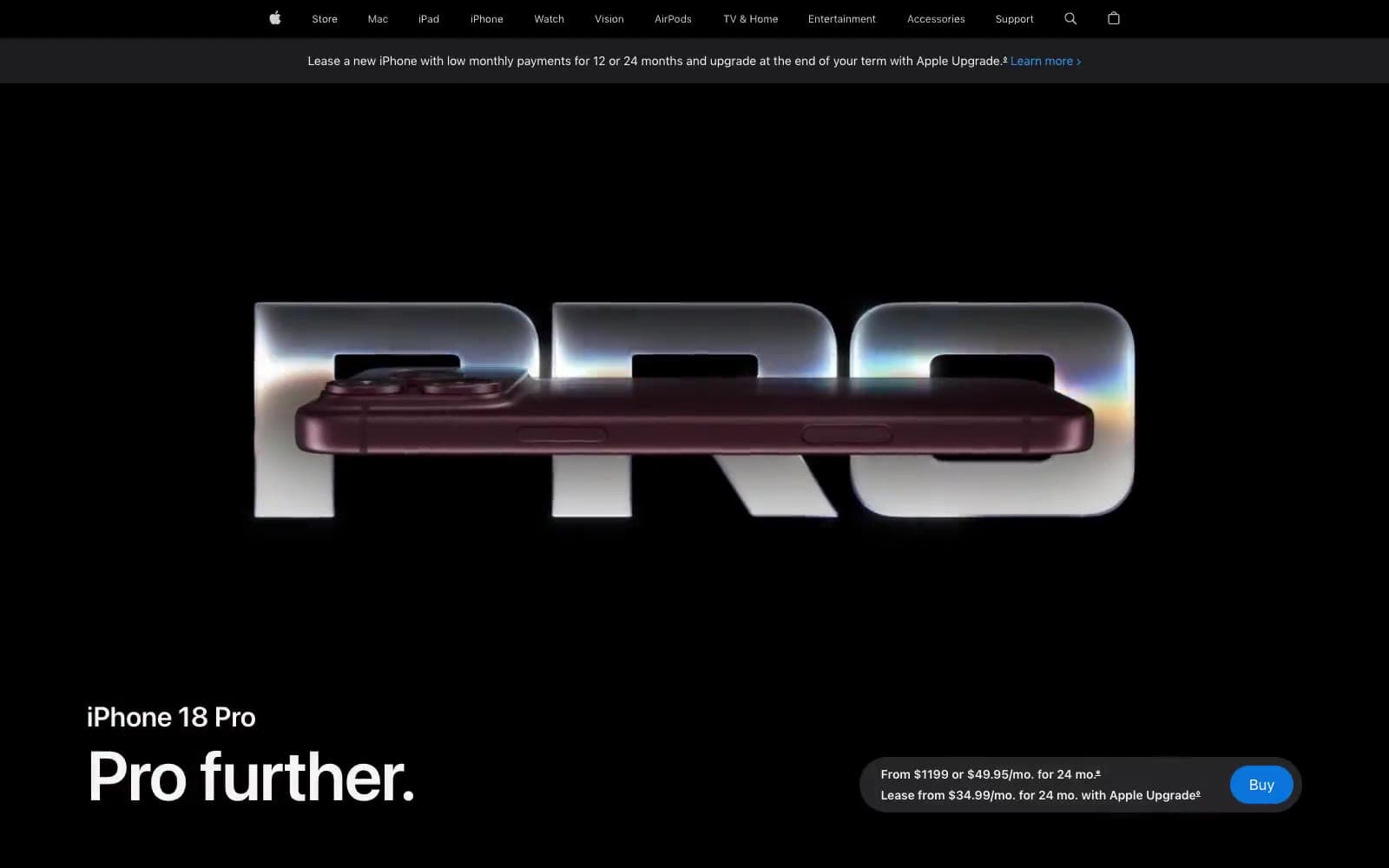
Apple iPhone 18 Pro
Commerce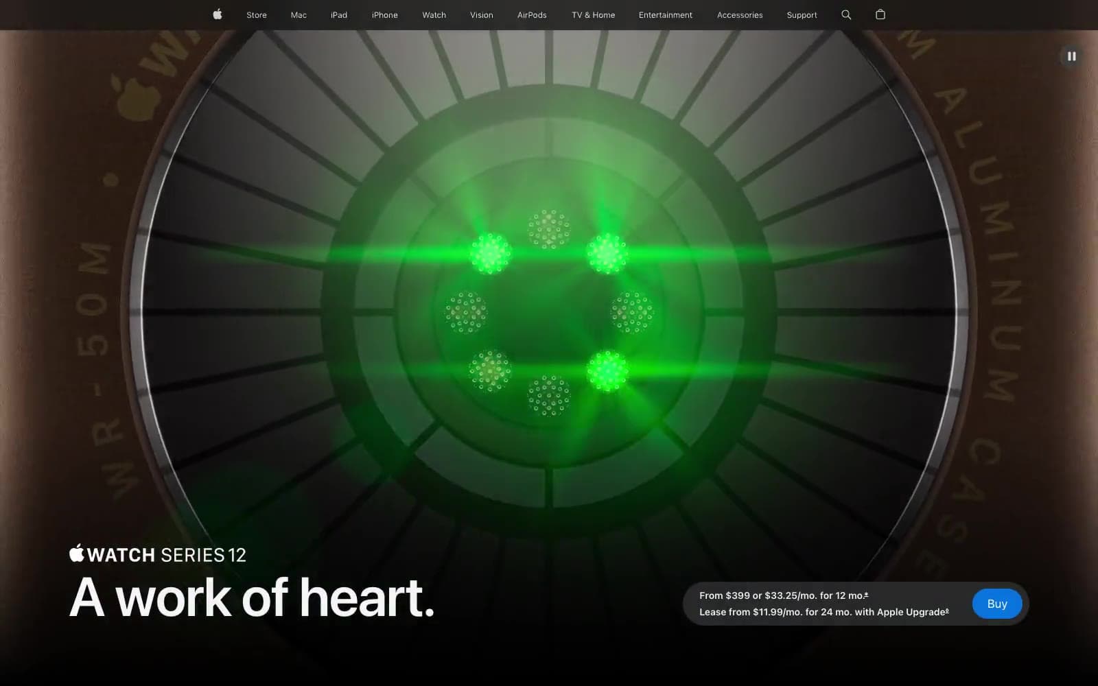
Apple Watch Series 12
Commerce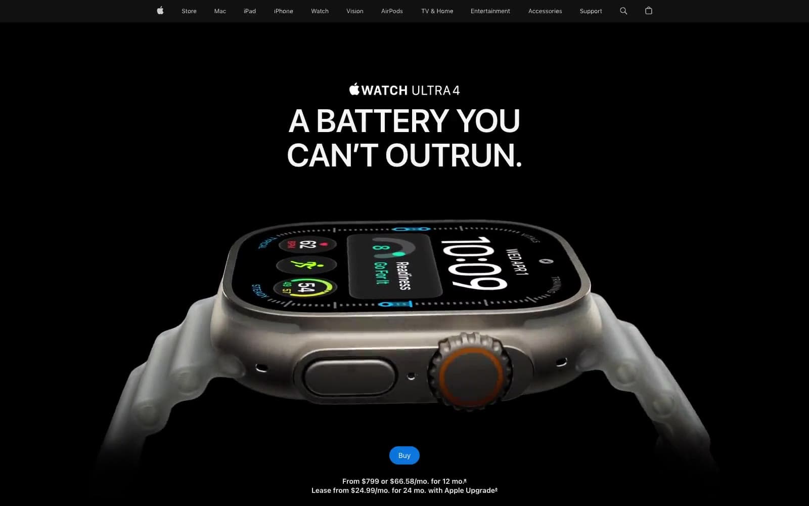
Apple Watch Ultra 4
Commerce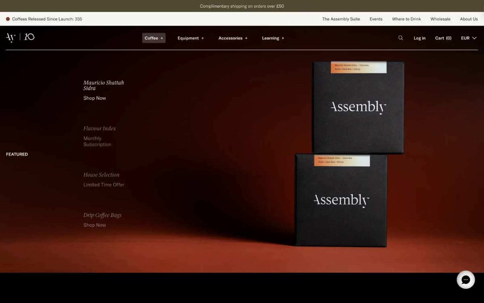
Assembly Coffee London
Commerce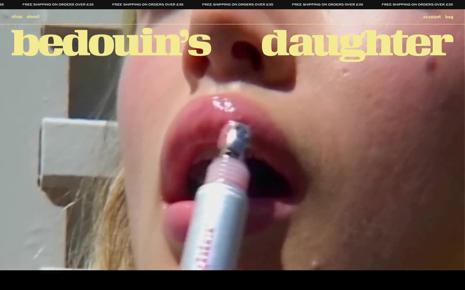
Bedouin's Daughter
Commerce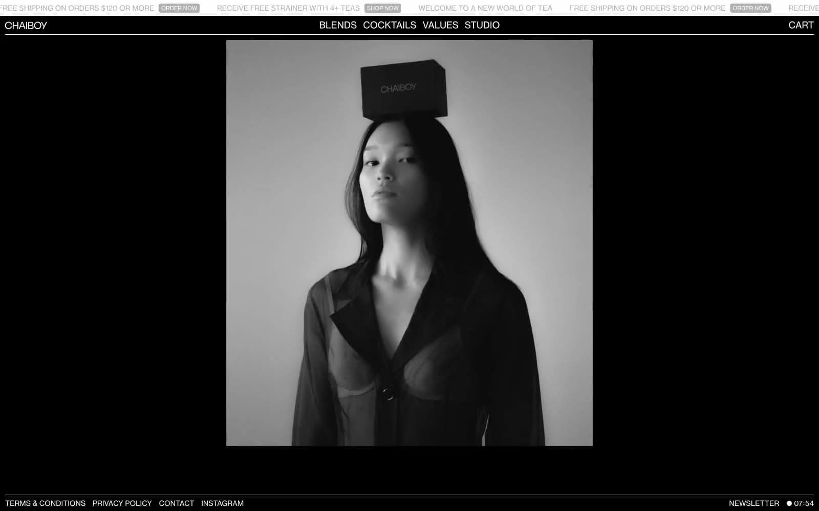
CHAIBOY
Commerce
Dollar Shave Club
Commerce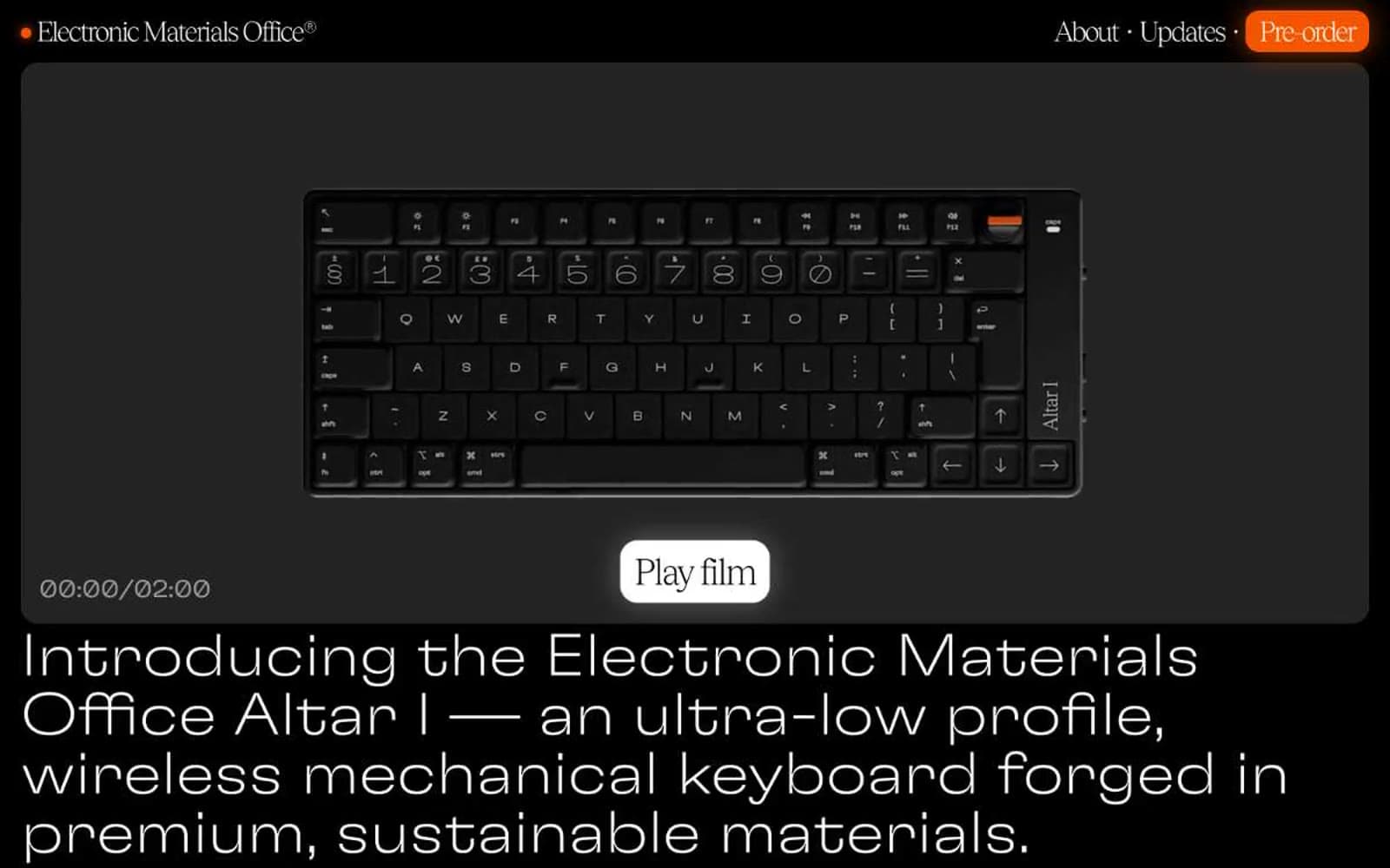
Electronic Materials Office®
Commerce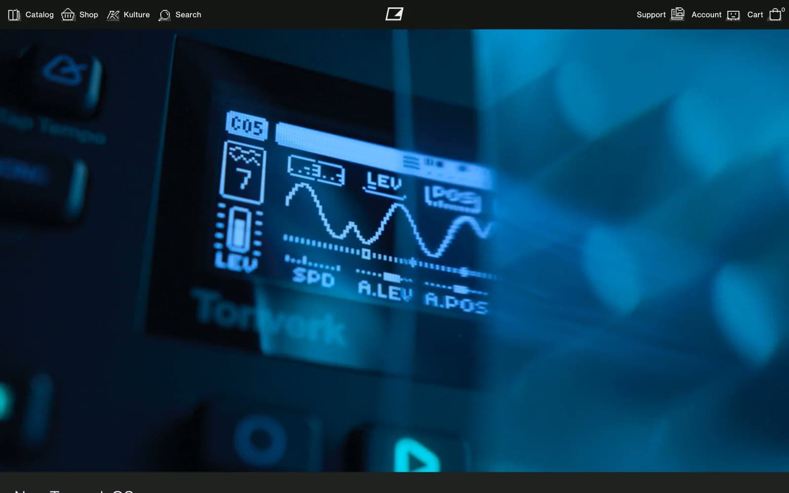
Elektron
Commerce
Holiday 100
Commerce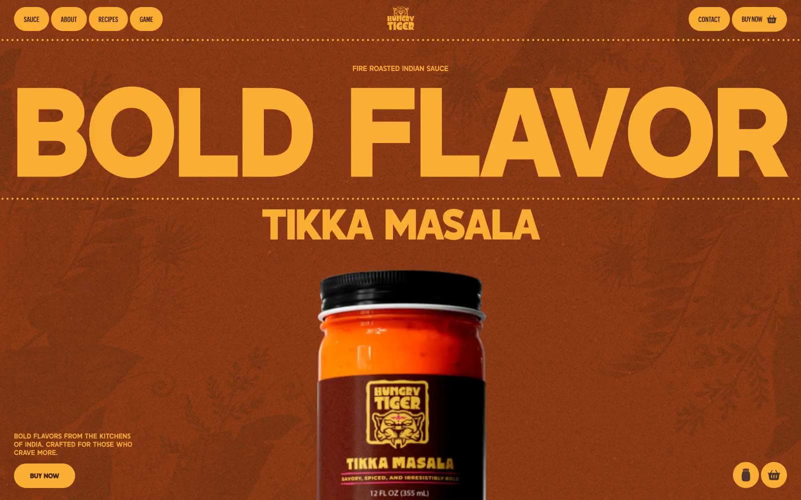
Hungry Tiger
Commerce


