
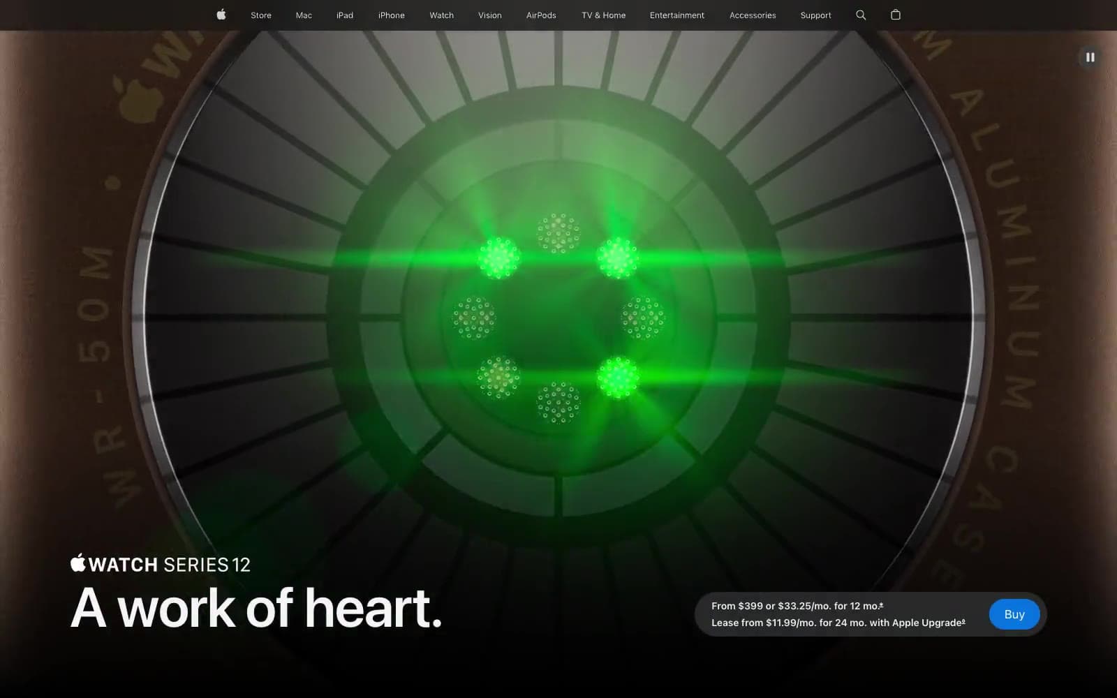
Apple Watch Series 12. Bronze sensor in darkness.
- Commerce
- Dark theme
- 16 colors
- 2 typefaces
Apple Watch Series 12 uses a cinematic black field interrupted by contained white merchandising panels and large, softly rounded product modules. Monumental SF Pro Display headlines sit directly against product imagery, while small SF Pro Text labels, pricing, and navigation stay tightly tracked and subdued. Saturated blue is reserved for purchase controls and deep links; red and luminous green belong to health metrics inside product demonstrations rather than general interface chrome.
Apple Watch Series 12 design system

Brand2
Filled purchase buttons and focus treatment — the single vivid purchase signal within the monochrome stage
Inline product links and informational navigation
Accent2
Heart-rate numerals and health-performance emphasis inside watch content
Battery-duration metrics and glowing health-sensor readouts
Neutrals9
Full-bleed hero backgrounds, black media cards, product-stage canvas
Dark section backgrounds and contained comparison modules
Primary text on white surfaces, dark control text
Dark translucent-looking utility control fills and navigation details
Muted helper text and 1px input outlines
Secondary copy, subdued control fills, inactive interface details
Light neutral fills for quiet supporting surfaces
Primary text on dark surfaces, pale alternate section fill
White merchandising surfaces, card fills, bright button and text treatment
semantic3
Availability-status badge text
Compact new-item badge text on light contexts
Dark orange availability badge background behind Signal Orange
Try a pairing
Pick any two colors from the palette to check whether text stays readable on top.
Aa
Paper on Apple Blue
4.70 : 1 contrast
- Body textPasses AA 4.5
- Large textPasses AA 3
- StrictFails AAA 7
More DESIGN.md files. Same web, different personalities.
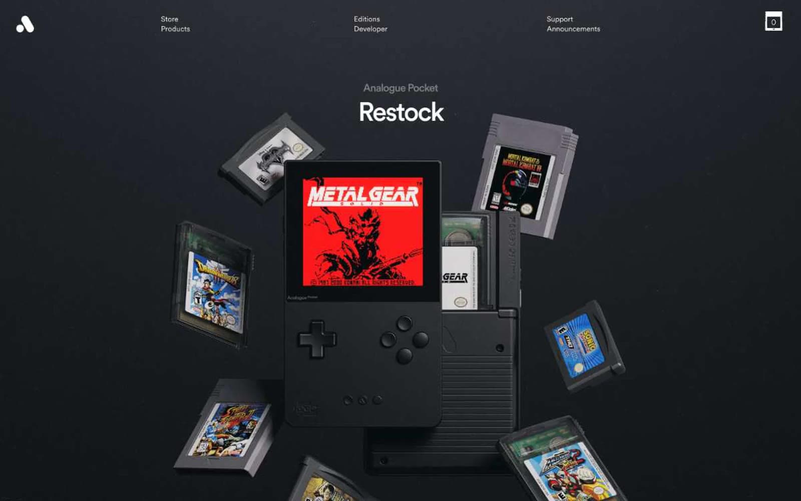
Analogue
Commerce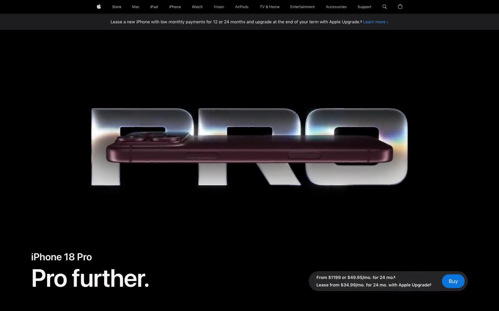
Apple iPhone 18 Pro
Commerce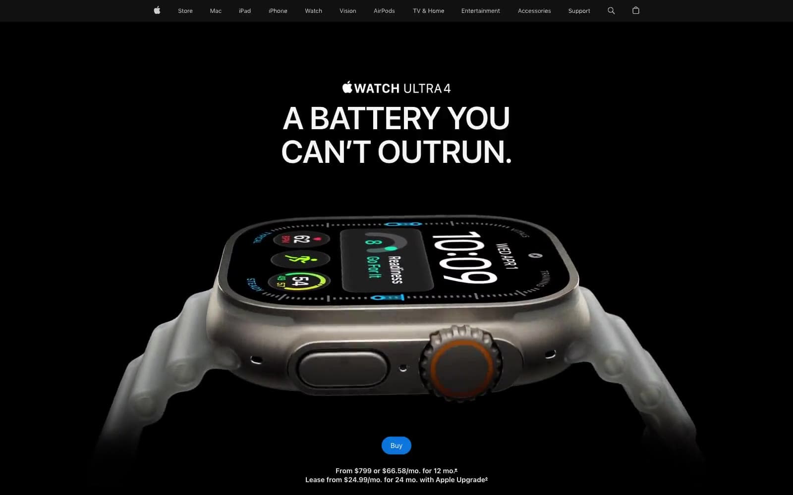
Apple Watch Ultra 4
Commerce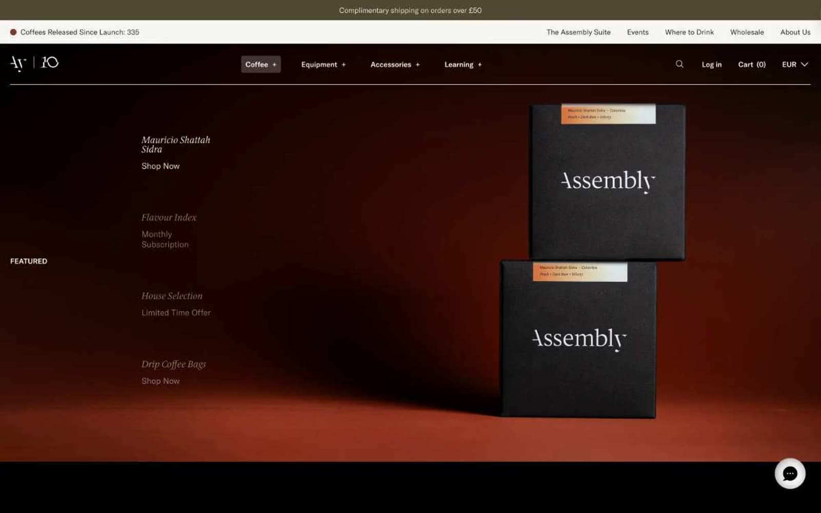
Assembly Coffee London
Commerce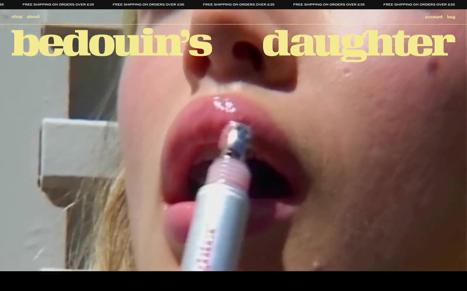
Bedouin's Daughter
Commerce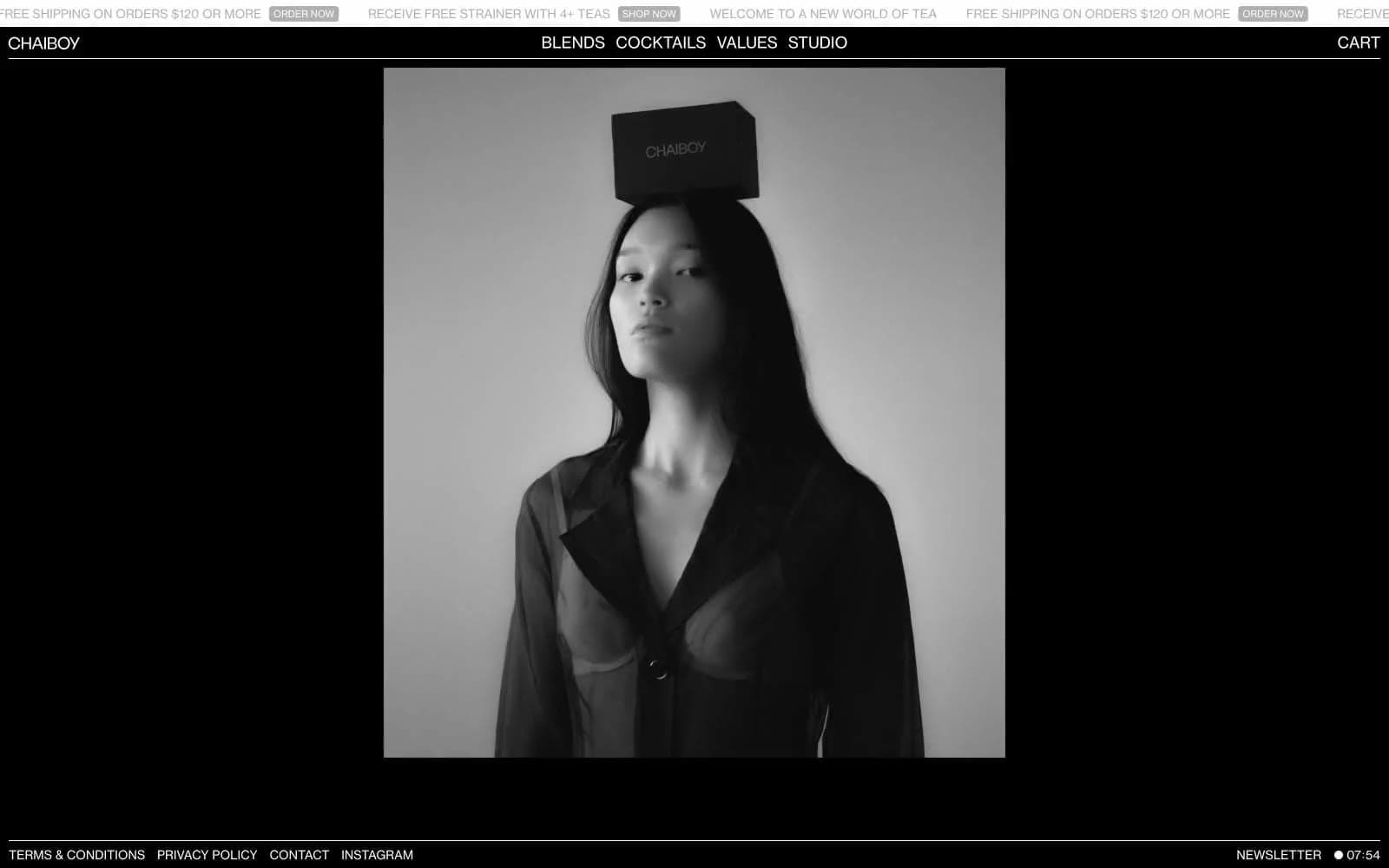
CHAIBOY
Commerce
Dollar Shave Club
Commerce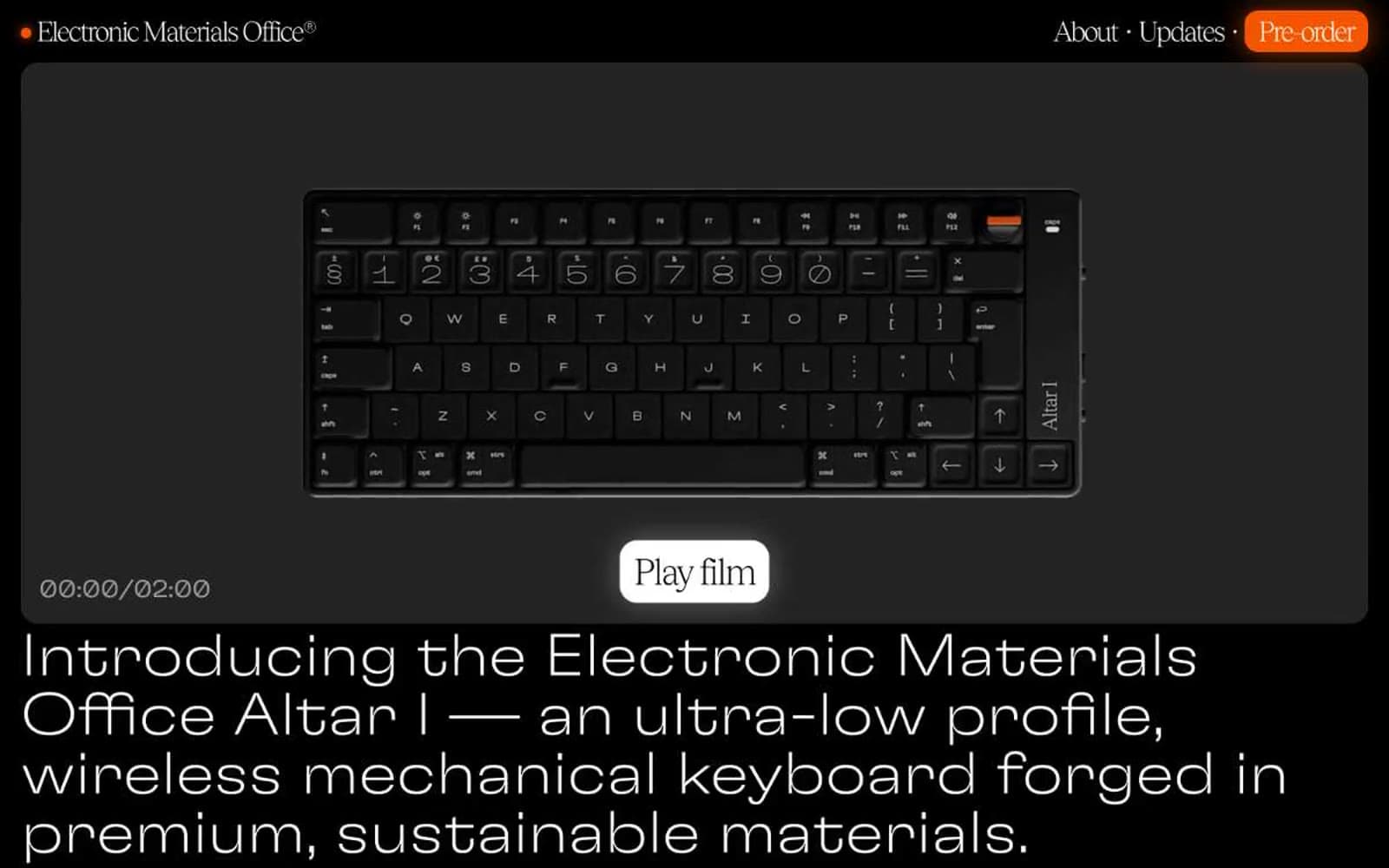
Electronic Materials Office®
Commerce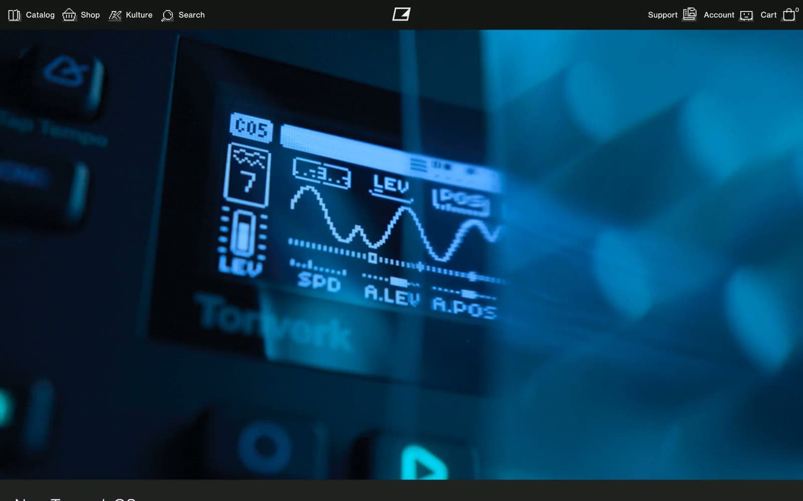
Elektron
Commerce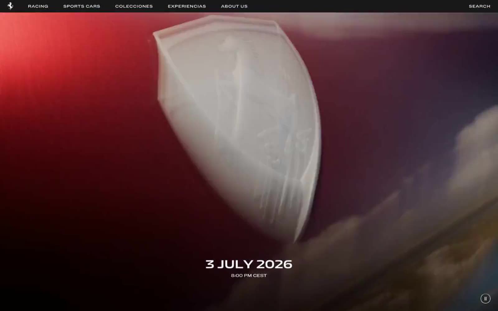
Ferrari
Commerce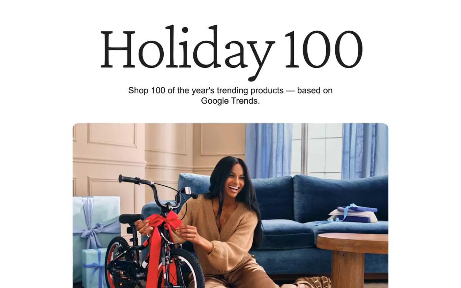
Holiday 100
Commerce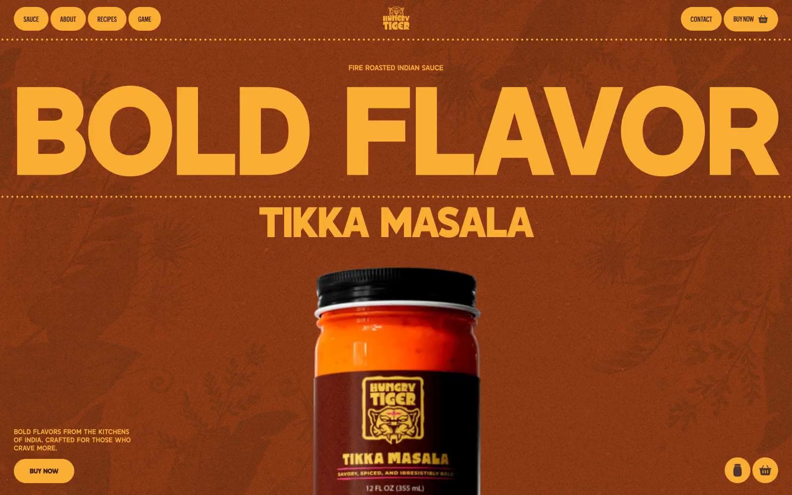
Hungry Tiger
Commerce


