
Elektron. A near-black canvas where product photography glows and the interface stays almost invisible.
- Commerce
- Dark theme
- 7 colors
- 5 typefaces
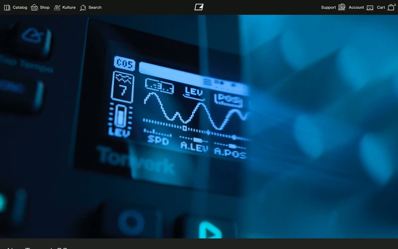
Elektron's interface is essentially a darkroom for showcasing hardware: a #222222 canvas with #151515 surfaces and #eeeef2 type, where the product photography — cinematic, near-black close-ups of synthesizers with blue LCD glow — does all the emotional work. The UI itself is brutally compact (4px base unit, 7px input radius, 0px everywhere else) and refuses every soft modern signal: no gradients, no shadows, no rounded buttons, no colored accents in chrome. Typography is a single custom geometric grotesque (Neue Haas Grotesk) in weight 400 only for body, with a display cut at 450/500 for headlines; a secondary dot-matrix face echoes the LCD readouts on the products themselves. All body text carries positive tracking (0.013–0.042em) that reads as industrial specification-sheet rather than marketing. The whole system feels like the printed silkscreen on a Eurorack module: monochrome, functional, hardware-obsessed.
Elektron design system

Neutrals7
Deepest layer — button cores, icon fills, the negative space inside navigation controls
Dark supporting neutral for text, icons, and strong contrast. Do not promote it to the primary CTA color
Page background, full-bleed canvas behind all product imagery and content bands
Input field surface — one subtle step above canvas for form wells
Input placeholder and helper text — low-contrast gray on the dark input field
Primary text, icons, link body, badges, footer text — the only light-on-dark workhorse
Selected link states, rare icon contrast points on dark surfaces
Try a pairing
Pick any two colors from the palette to check whether text stays readable on top.
Aa
Pure White on Void
21.00 : 1 contrast
- Body textPasses AA 4.5
- Large textPasses AA 3
- StrictPasses AAA 7
More DESIGN.md files. Same web, different personalities.
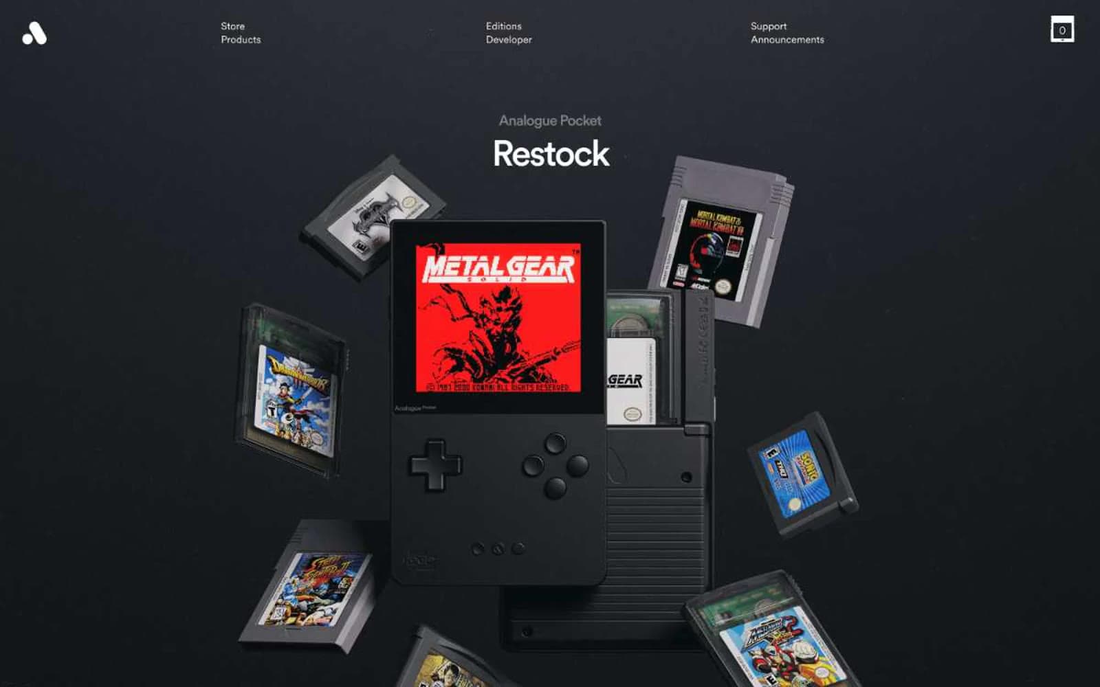
Analogue
Commerce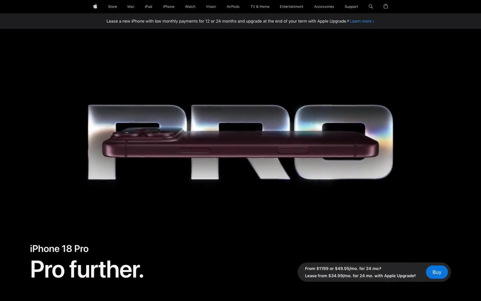
Apple iPhone 18 Pro
Commerce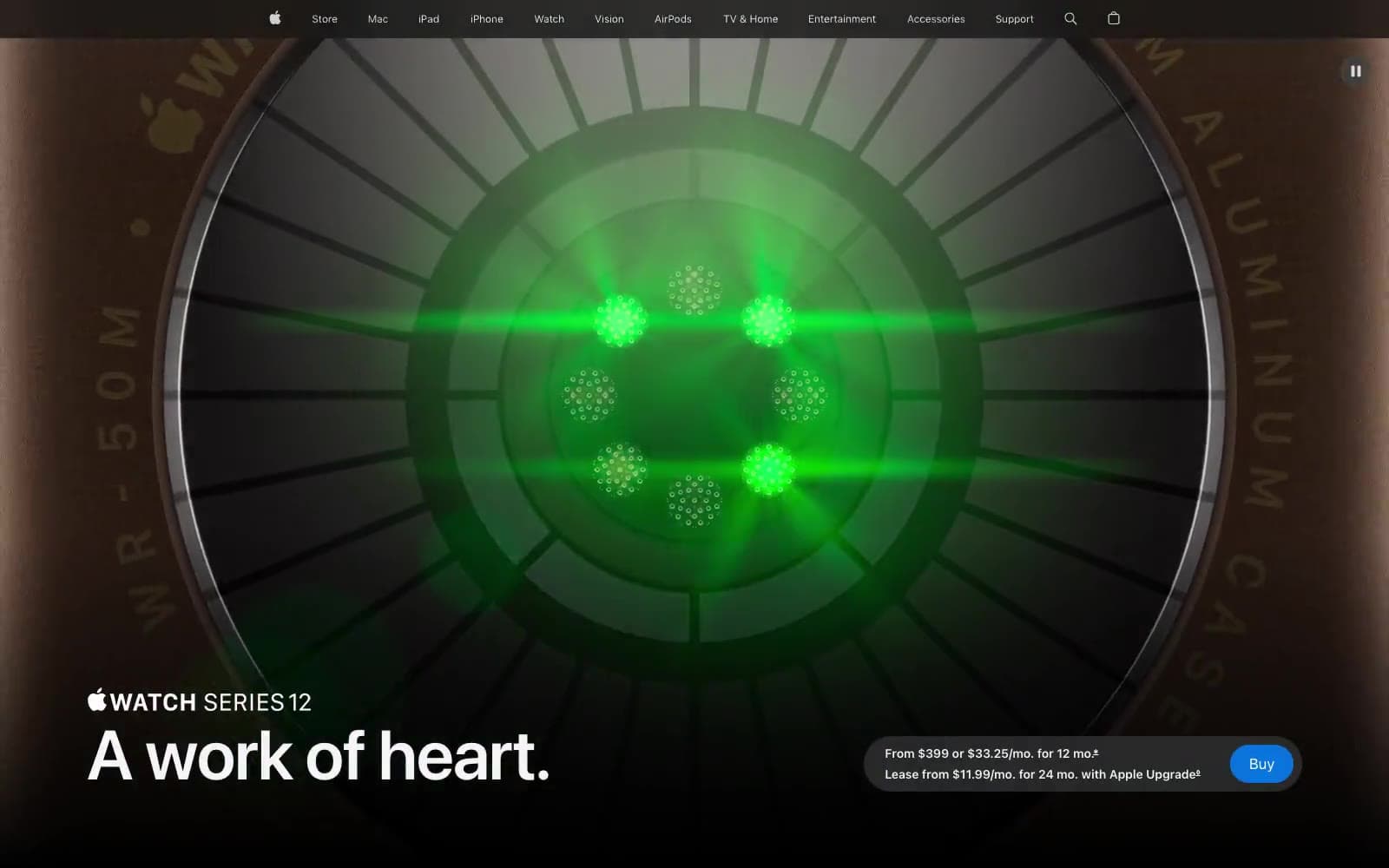
Apple Watch Series 12
Commerce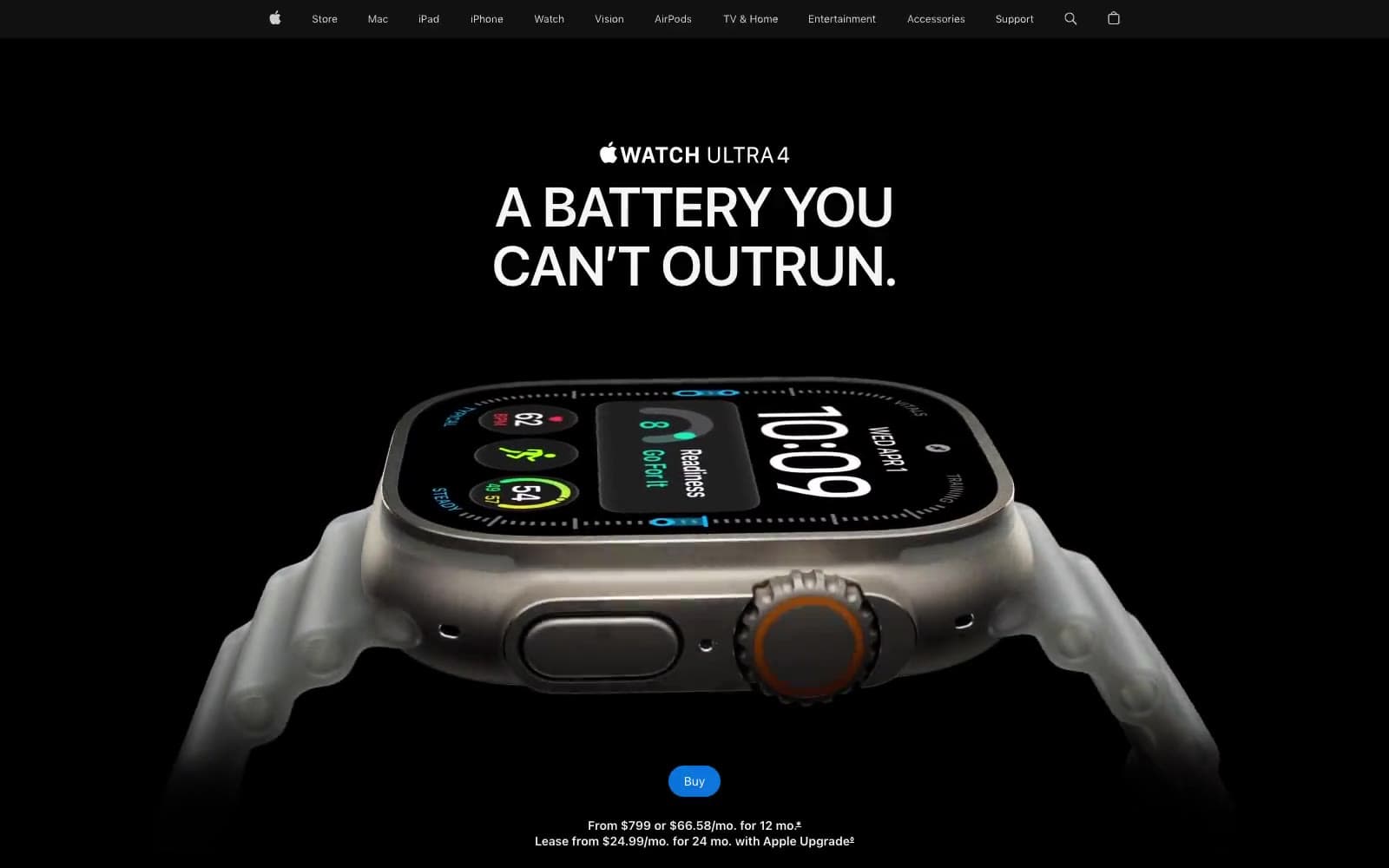
Apple Watch Ultra 4
Commerce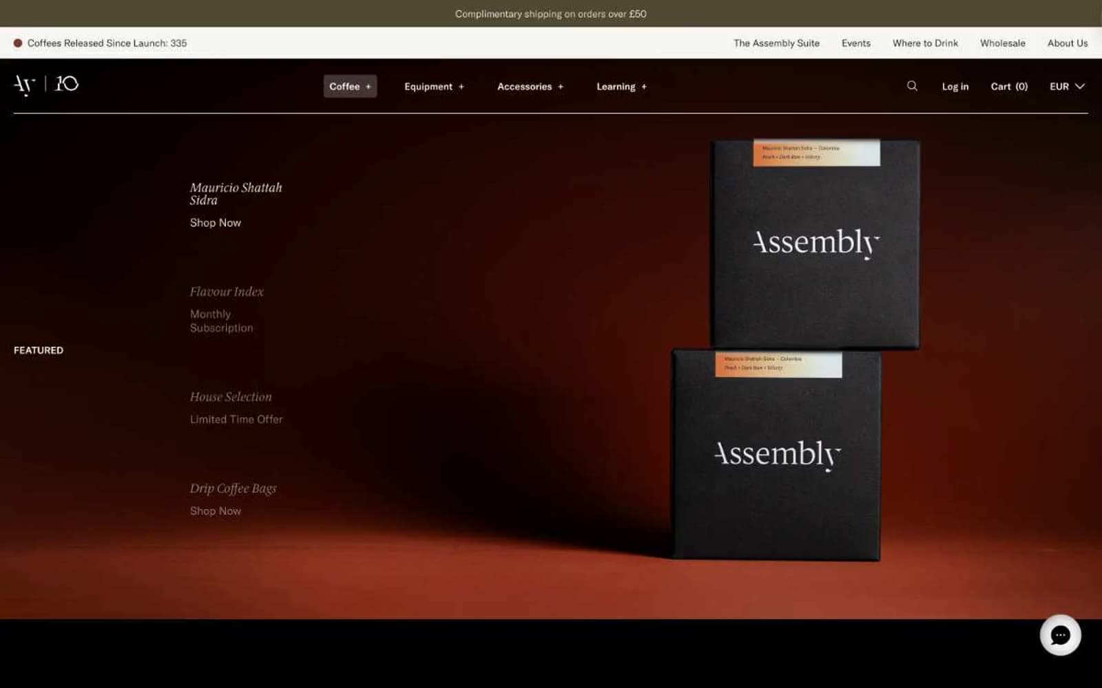
Assembly Coffee London
Commerce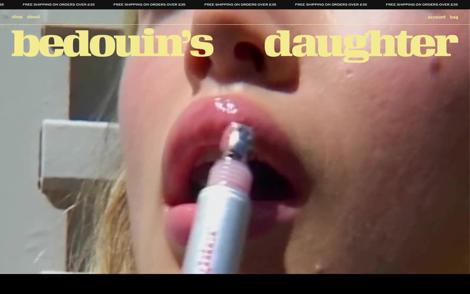
Bedouin's Daughter
Commerce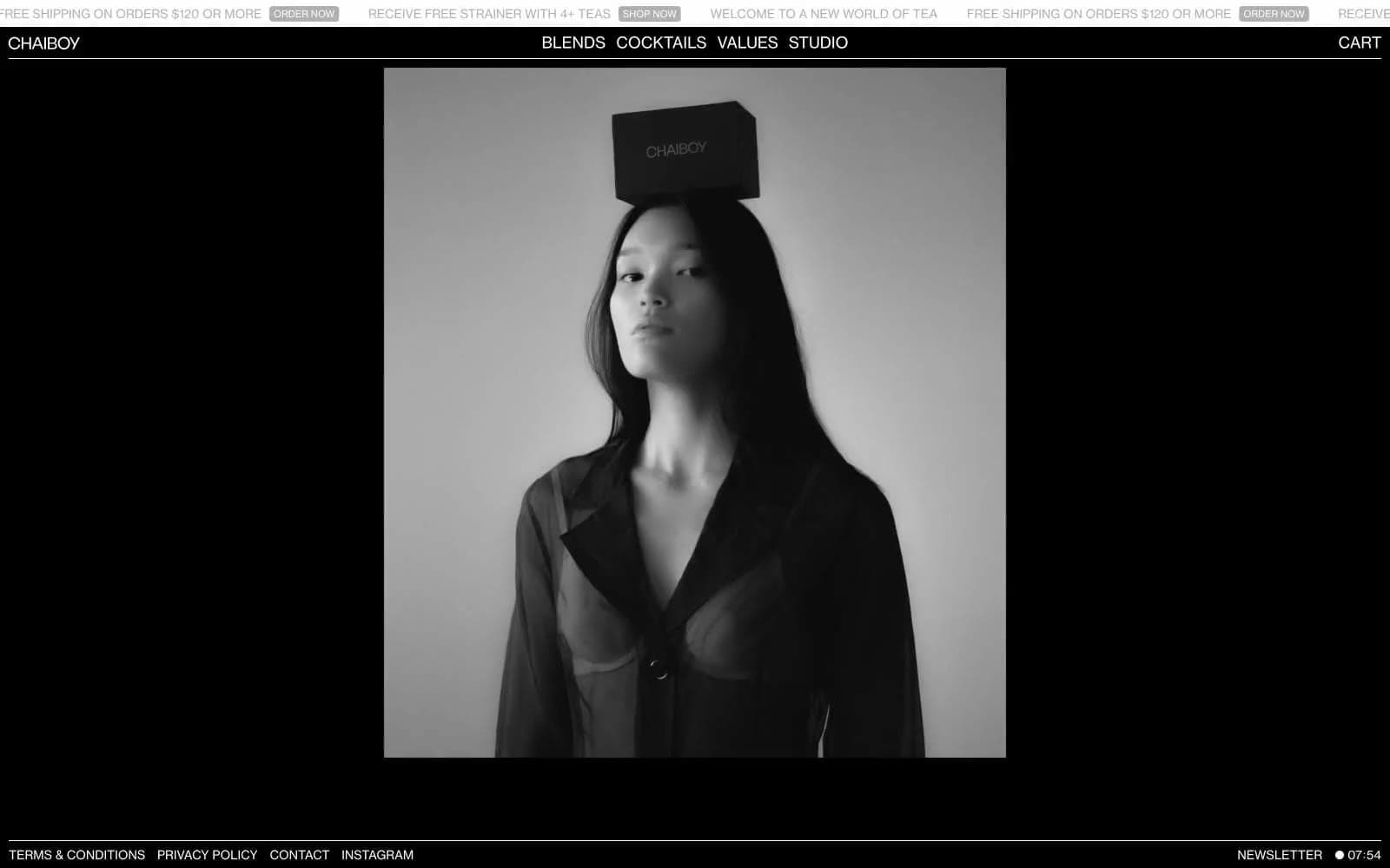
CHAIBOY
Commerce
Dollar Shave Club
Commerce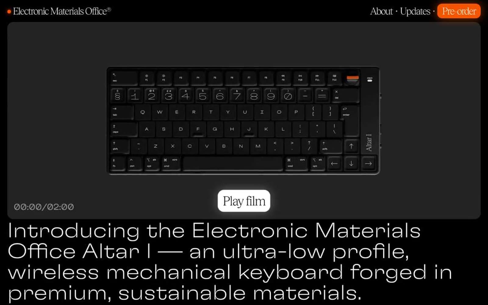
Electronic Materials Office®
Commerce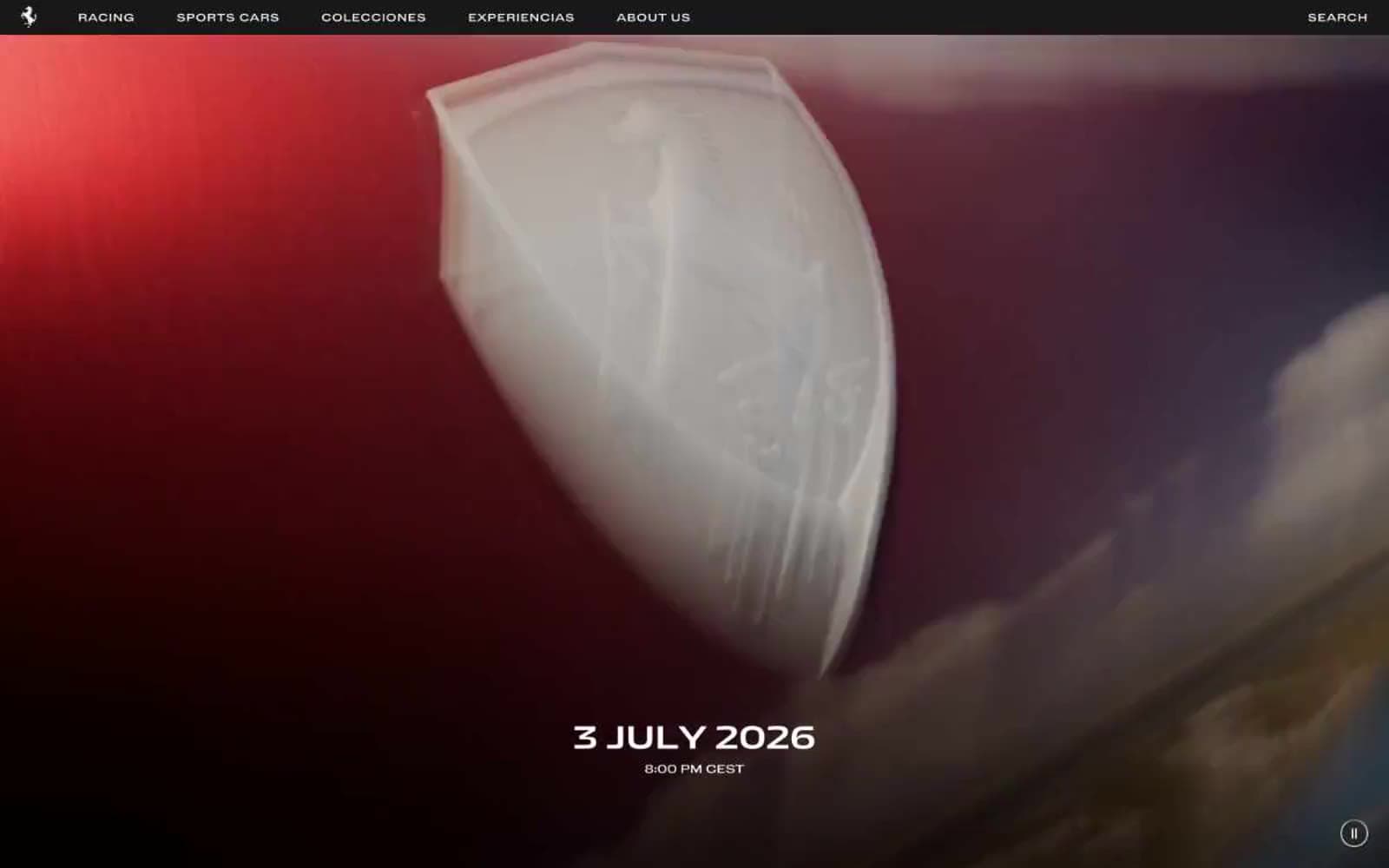
Ferrari
Commerce
Holiday 100
Commerce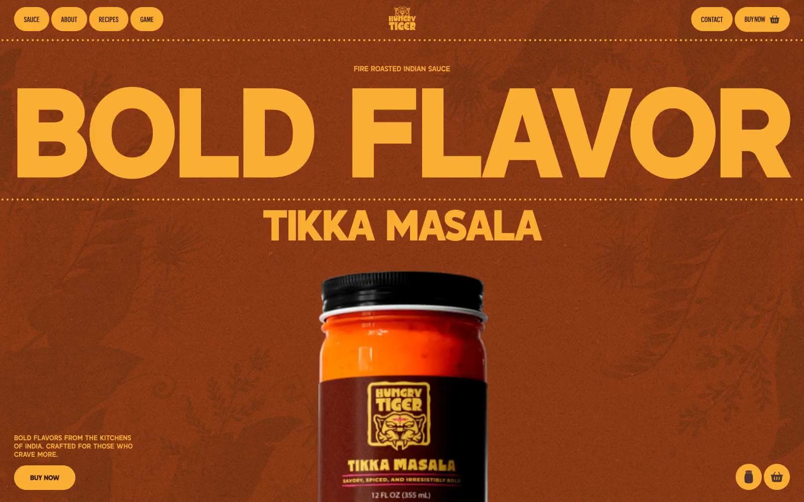
Hungry Tiger
Commerce


