
Dollar Shave Club. Navy warehouse with a single orange flare.
- Commerce
- Dark theme
- 12 colors
- 4 typefaces
Dollar Shave Club is a saturated dark-mode commerce system built on a deep royal-navy canvas with one loud orange action color and a deep burgundy secondary. Typography is heavy and condensed through the custom DSC Specter display family, always uppercase for navigation and product names, giving the surface a bold, masculine-utility feel. Decorative shapes — flower blobs, wavy gold borders, orange line-art icons — soften the hard navy structure and keep the brand playful rather than clinical. Content is organized in full-bleed horizontal bands: a split cream-and-photo hero, a dark product category grid, a burgundy promo band, and a dark-navy explainer with icon-led steps.

Dollar Shave Club design system

Brand5
Violet text accent for links, tags, and emphasized short phrases. Do not promote it to the primary CTA color
Filled CTA buttons, icon strokes, decorative accents — the single chromatic action color that commands every screen it touches
Secondary section background, hero display text, promotional bands — adds warmth and depth against the navy
Outlined/ghost button borders, dark text on light surfaces, deep button variant background
Pressed/secondary button fill — a near-black navy for dark button variants on the navy canvas
Accent2
Card surfaces and light-blue panel backgrounds within dark sections — breaks up the navy with breathing room
Hero left-panel background, soft warm neutral — used in only the highest-impact first-screen block
Neutrals5
Heavy-use border and text color on light sections, structural dividers
Input field borders, low-priority form chrome
Badge and pill borders on light surfaces
Subtle dividers, muted panel backgrounds
Primary text on dark surfaces, button borders, input fills, card text — the dominant foreground color
Try a pairing
Pick any two colors from the palette to check whether text stays readable on top.
Aa
Snow White on Midnight Navy
12.98 : 1 contrast
- Body textPasses AA 4.5
- Large textPasses AA 3
- StrictPasses AAA 7
More DESIGN.md files. Same web, different personalities.
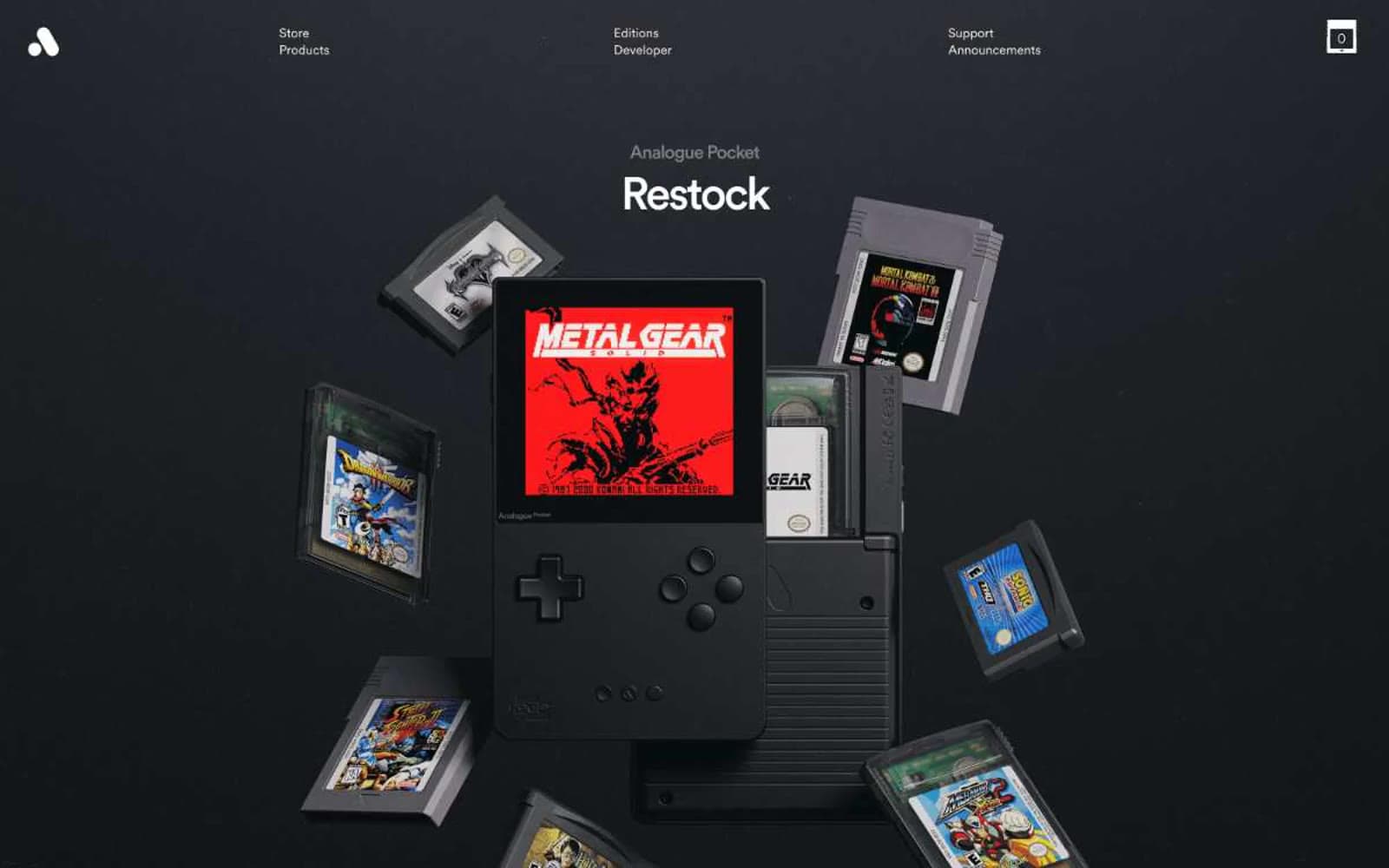
Analogue
Commerce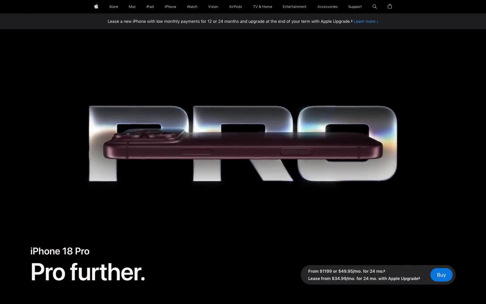
Apple iPhone 18 Pro
Commerce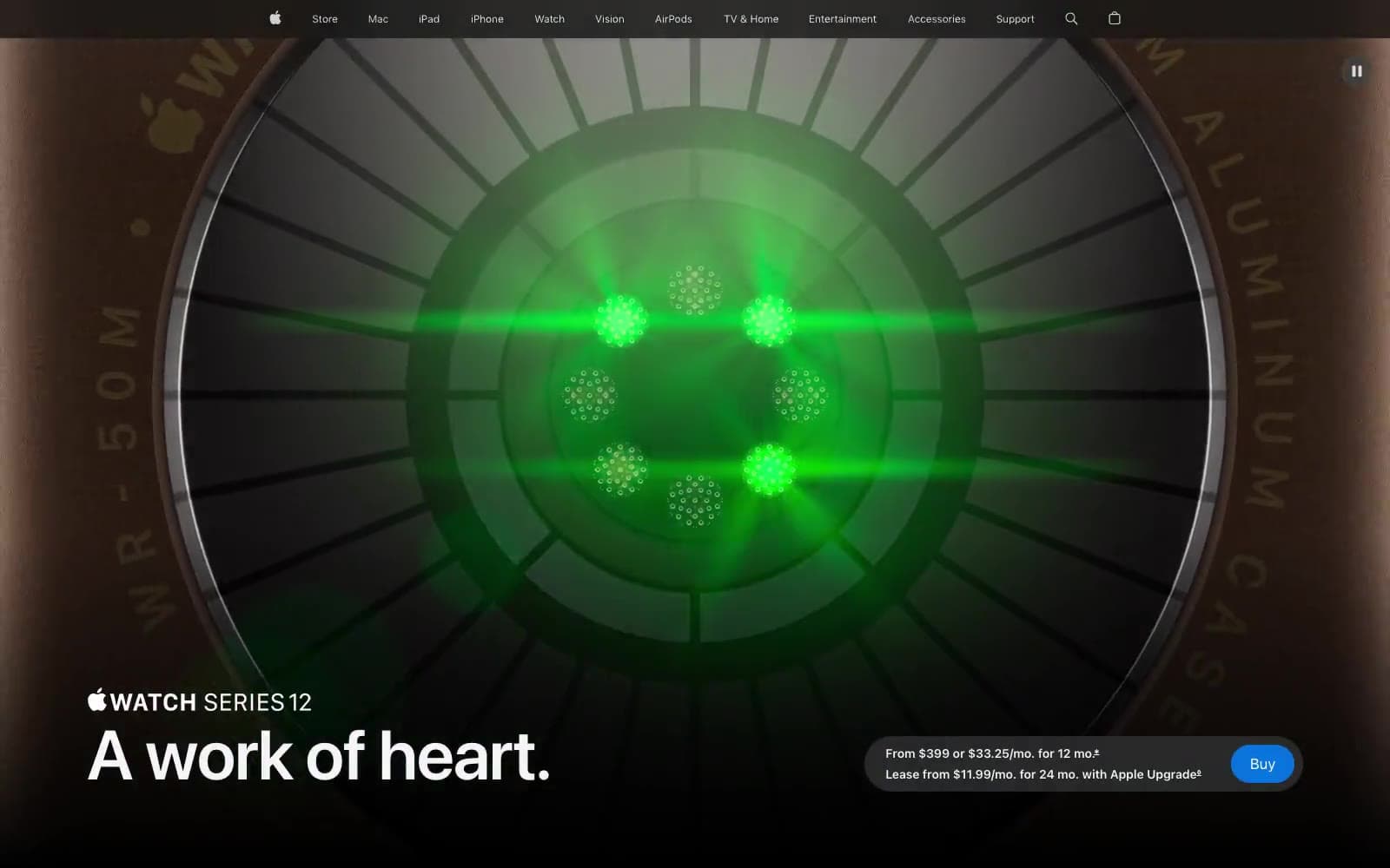
Apple Watch Series 12
Commerce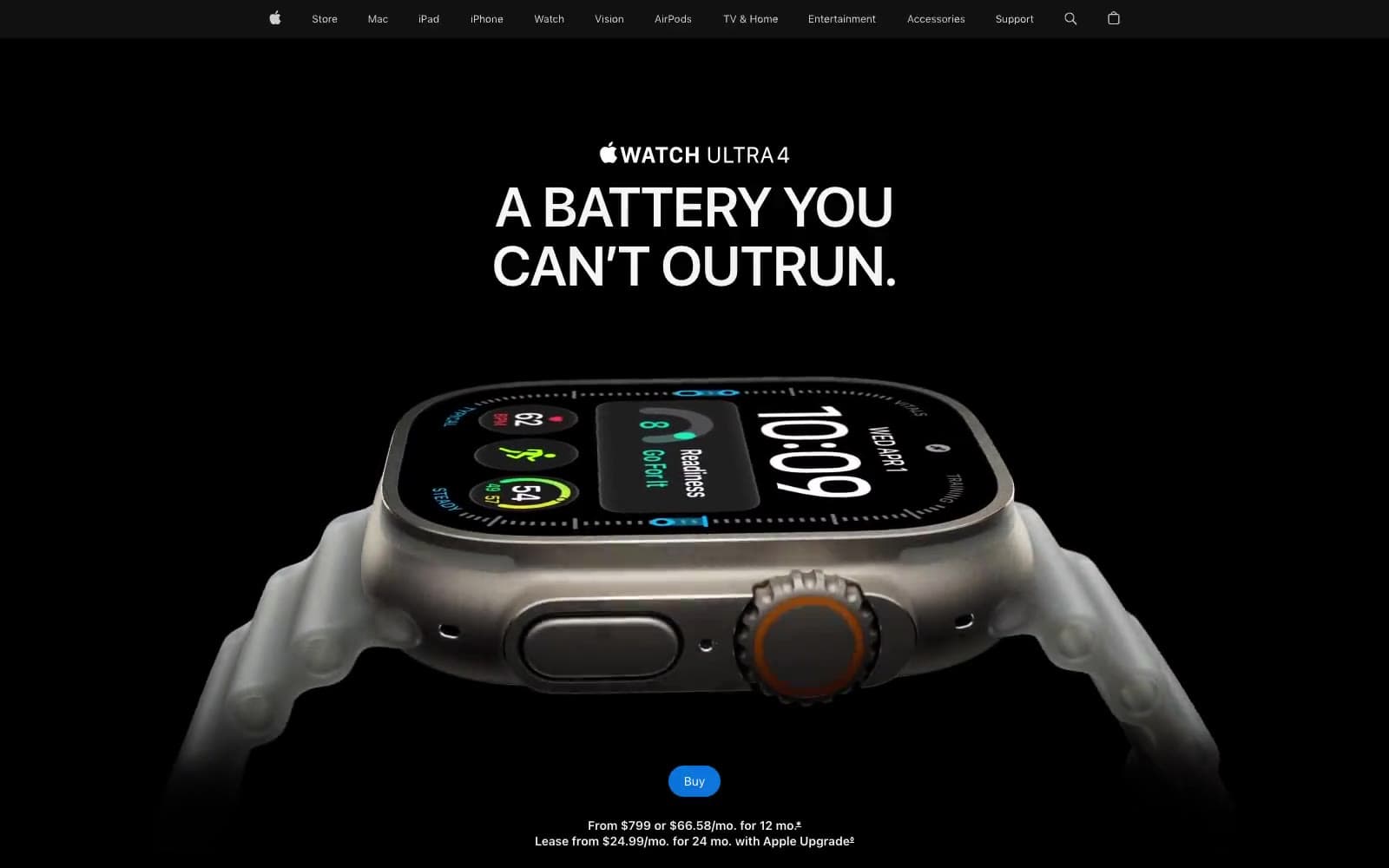
Apple Watch Ultra 4
Commerce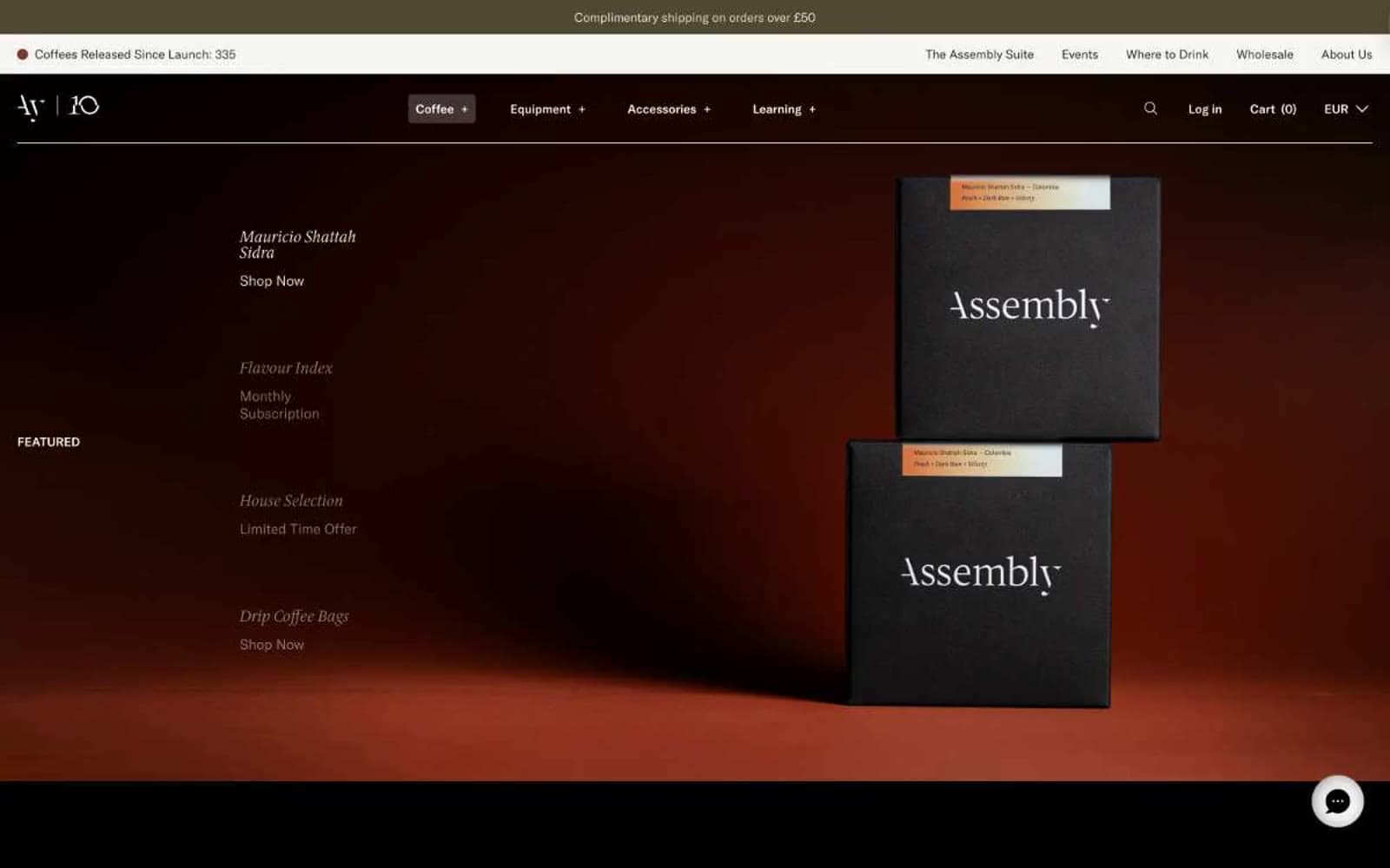
Assembly Coffee London
Commerce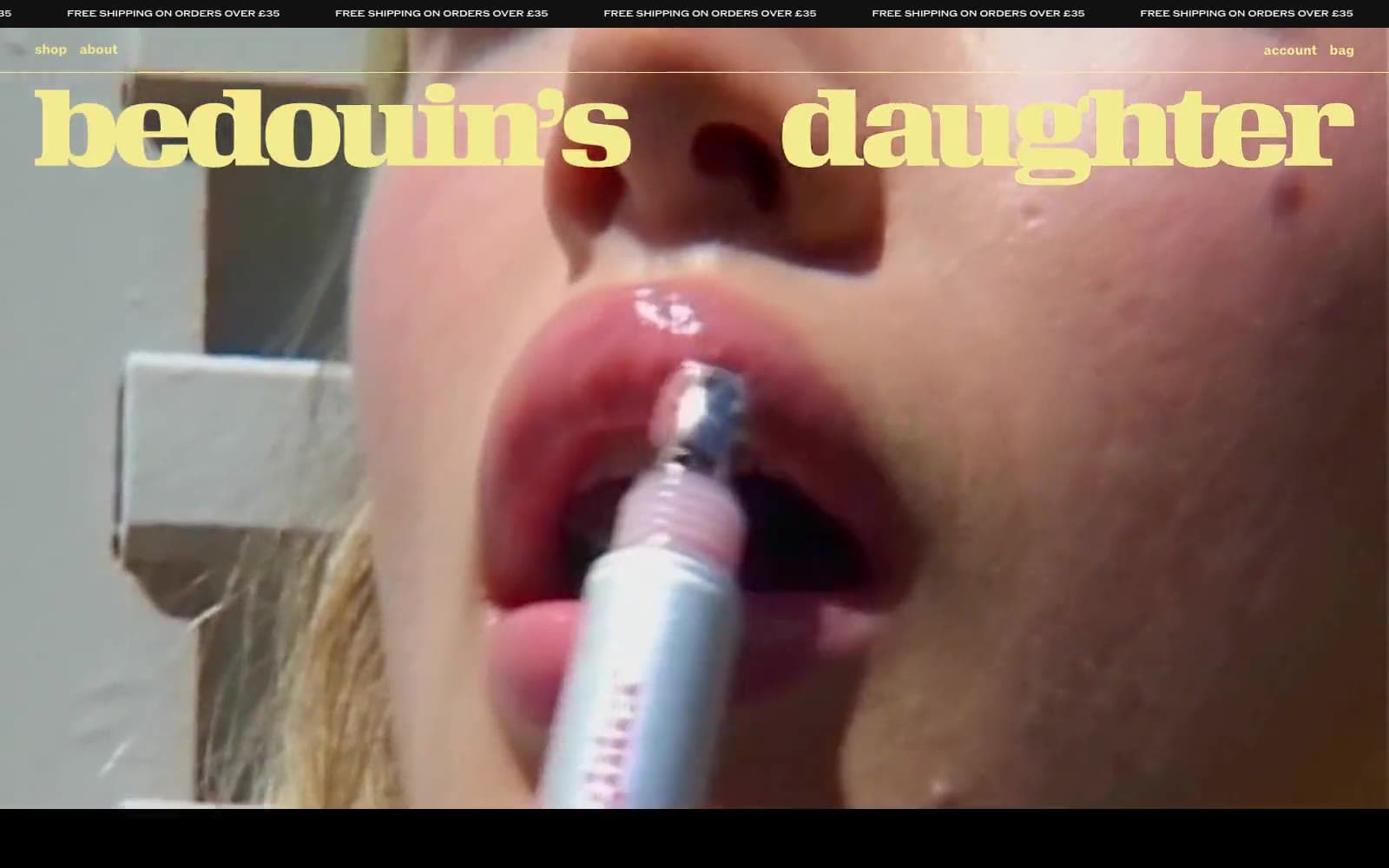
Bedouin's Daughter
Commerce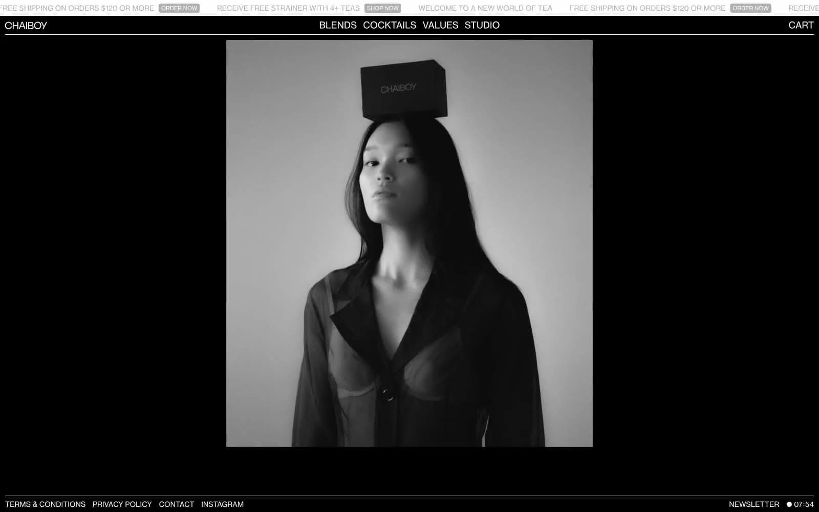
CHAIBOY
Commerce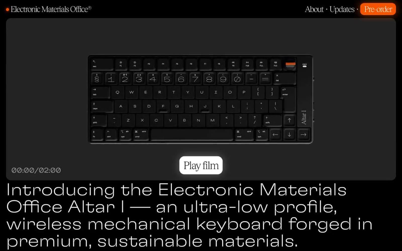
Electronic Materials Office®
Commerce
Elektron
Commerce
Ferrari
Commerce
Holiday 100
Commerce
Hungry Tiger
Commerce


