
Assembly Coffee London. Embers in a dark roastery.
- Commerce
- Dark theme
- 13 colors
- 4 typefaces
Assembly Coffee's visual system reads like an editorial magazine printed on black paper. The interface is overwhelmingly dark — near-black canvases carry everything — interrupted only by product photography lit against warm studio backdrops (ember-red, deep amber) and hairline typography in white. Two type families do all the work: a geometric sans (GT America) for UI scaffolding, navigation, and metadata, and a refined serif (ID00 Serif) for product names, section labels, and editorial copy, almost always in italic, which turns a functional nav list into a curated index. The palette is almost monochromatic: the chromatic vocabulary is rationed to badge fills (pale yellow, sage green, antique gold) and the occasional warm-tinted cream surface. Buttons are not loud — price chips and 'Shop Now' links live as small text or pill-shaped cream labels. Components are thin, sharp-cornered, and rely on borders and weight contrast rather than shadows or fills for separation.
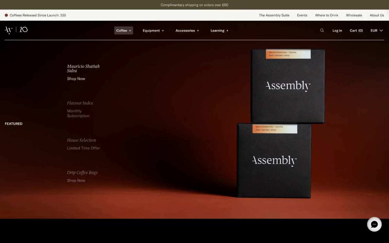
Assembly Coffee London design system

Accent1
Accent stroke and border for promotional or limited-availability badges. Reads as aged brass — never neon
Neutrals10
Deepest surface, borders, and type. Used for maximum-contrast outlines, product box photography backgrounds, and the darkest UI strokes
Primary canvas — page backgrounds, hero sections, card surfaces. The near-black with a faint green undertone makes white type glow without feeling sterile
Secondary surface and border tone — slightly lifted from black for subtle layering on nav, dividers, and outlined button edges
Mid-neutral for secondary text, input borders, and card outlines where pure black is too heavy
Dark olive link/announcement background — the deep green-brown of the top bar, grounded and earthy
Image placeholder and muted background tone — holds space where product photography is loading or absent
De-emphasized borders and helper text on light surfaces
Hairline borders, dividers, input outlines, and card edges on light surfaces.
Warm off-white surface for inverted sections, price pill backgrounds, and soft button fills. Sits between bone and the khaki family
Primary text on dark canvases, price-chip fills, inverted button surfaces. The brightest accent in an otherwise low-key palette
semantic2
Green state accent for badges, validation surfaces, and short status labels.
Yellow state accent for badges, validation surfaces, and short status labels.
Try a pairing
Pick any two colors from the palette to check whether text stays readable on top.
Aa
Pure Black on Antique Gold
9.10 : 1 contrast
- Body textPasses AA 4.5
- Large textPasses AA 3
- StrictPasses AAA 7
More DESIGN.md files. Same web, different personalities.
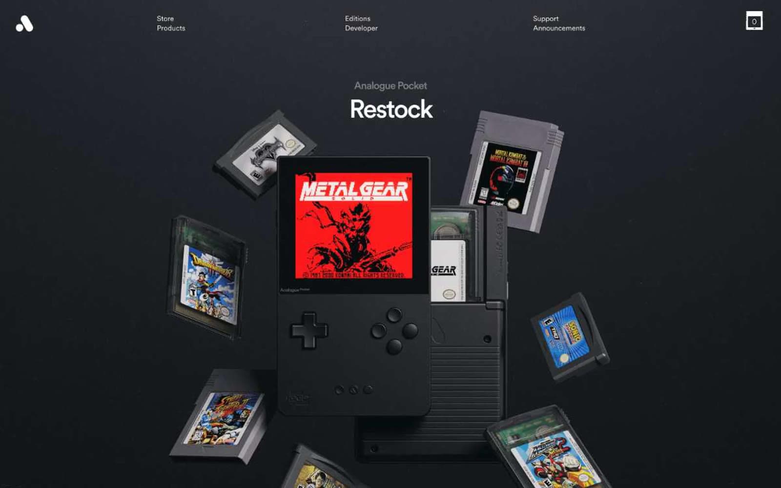
Analogue
Commerce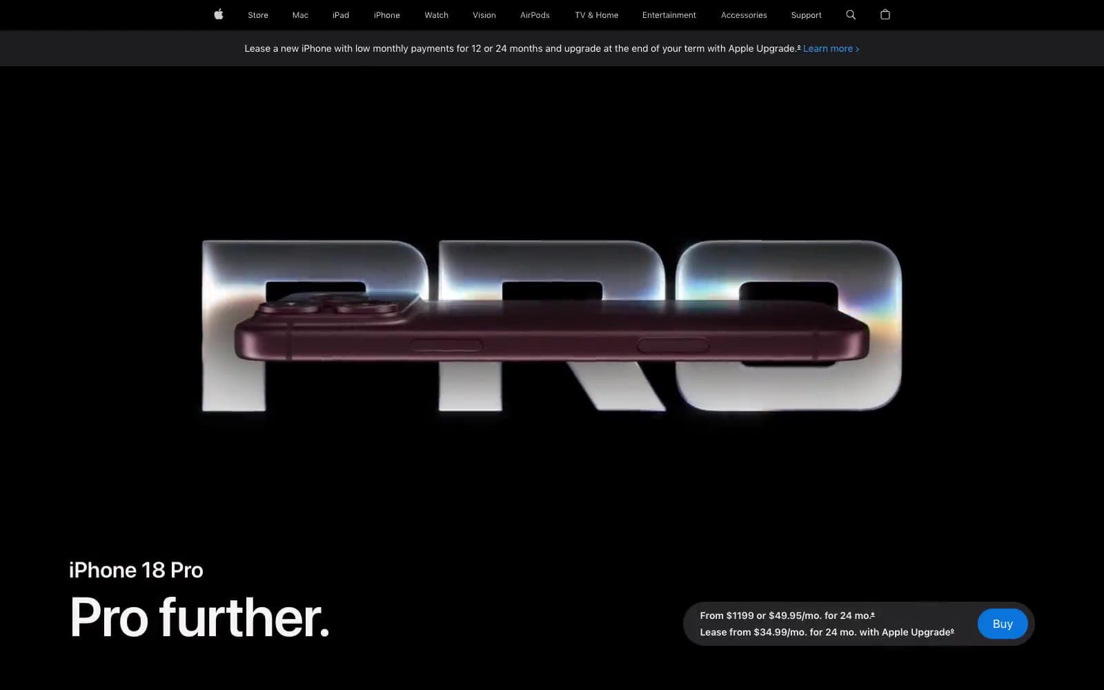
Apple iPhone 18 Pro
Commerce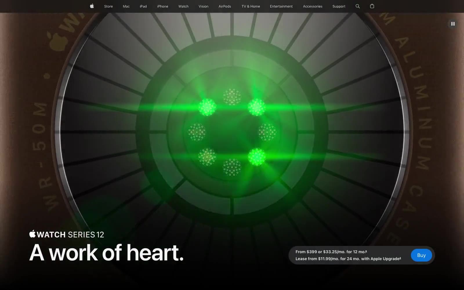
Apple Watch Series 12
Commerce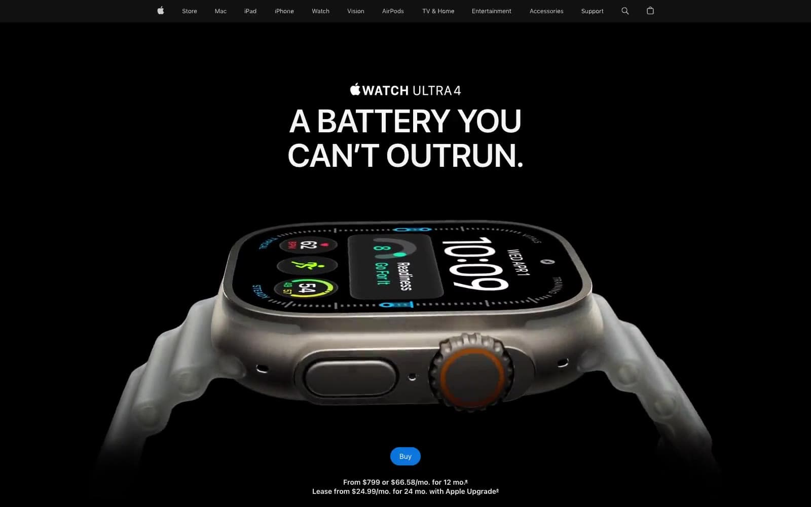
Apple Watch Ultra 4
Commerce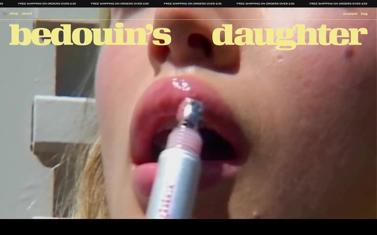
Bedouin's Daughter
Commerce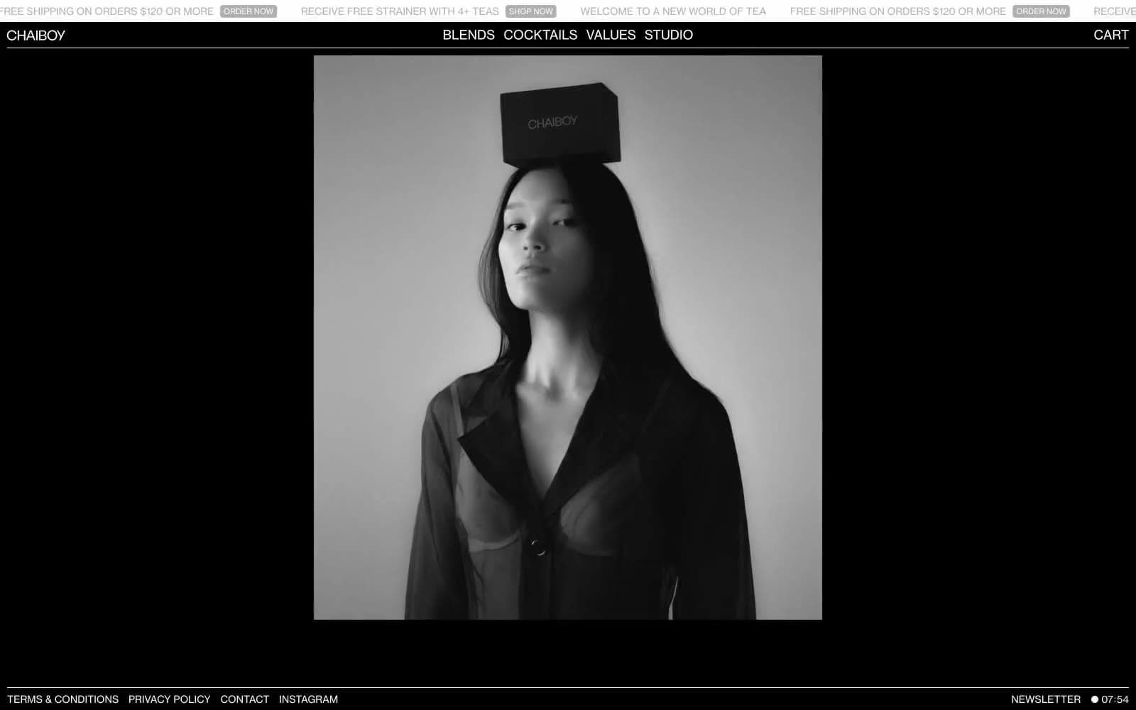
CHAIBOY
Commerce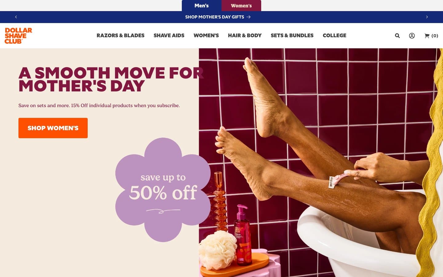
Dollar Shave Club
Commerce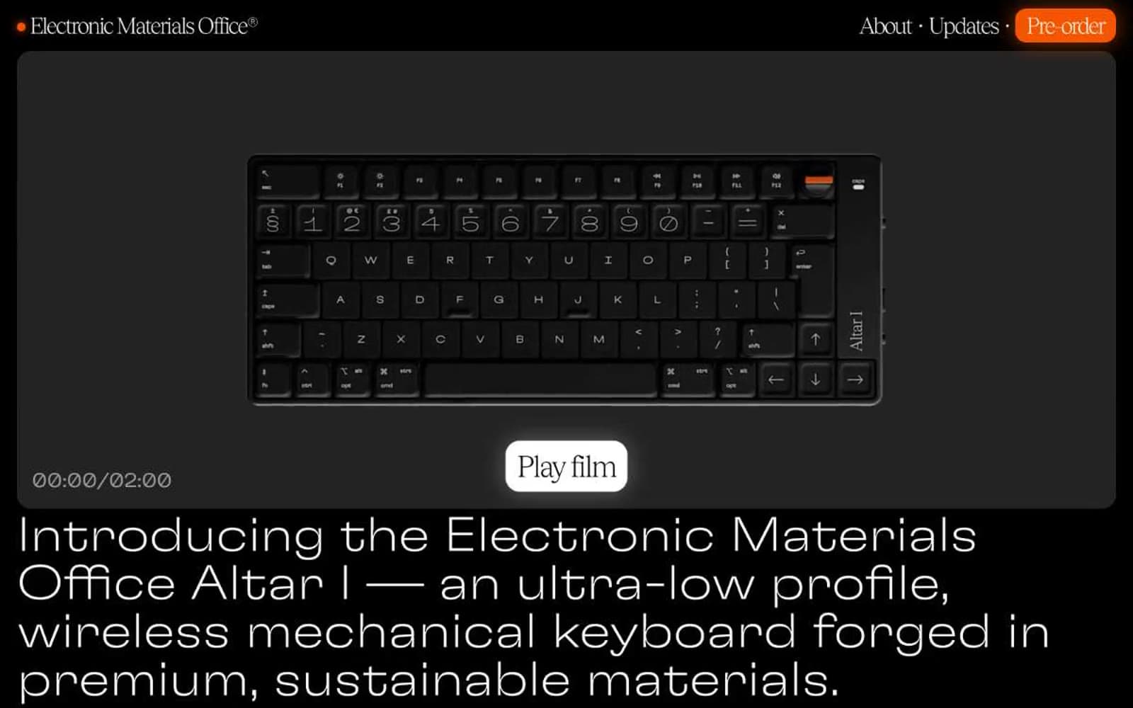
Electronic Materials Office®
Commerce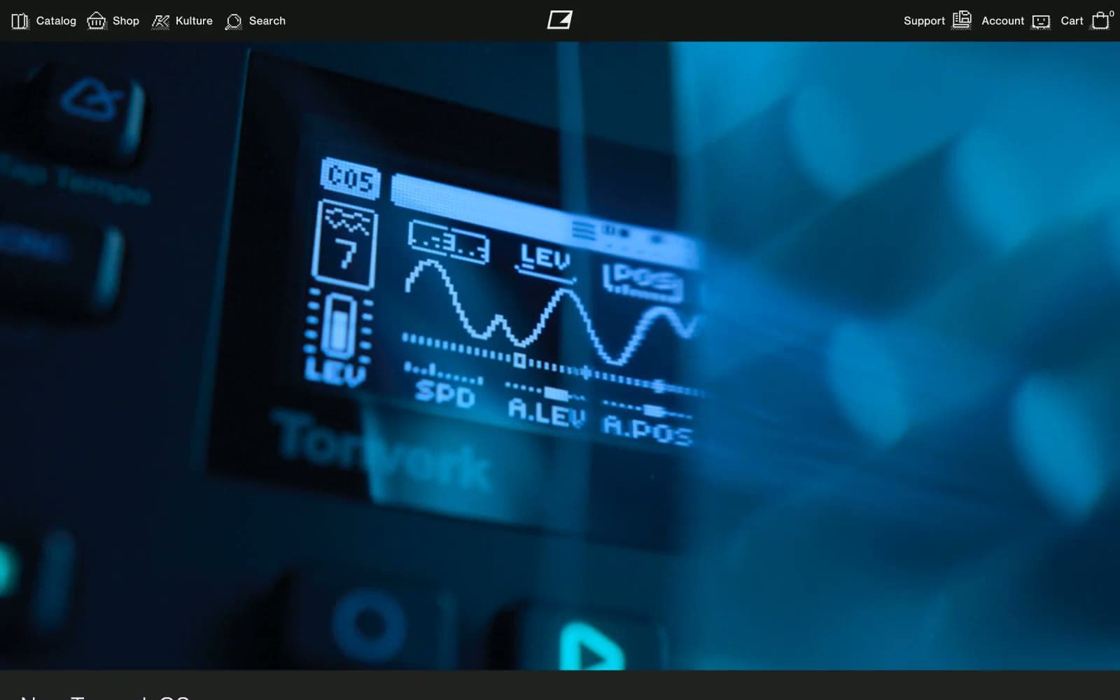
Elektron
Commerce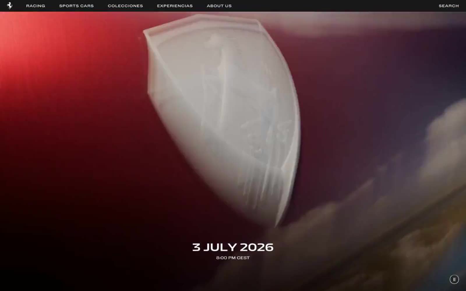
Ferrari
Commerce
Holiday 100
Commerce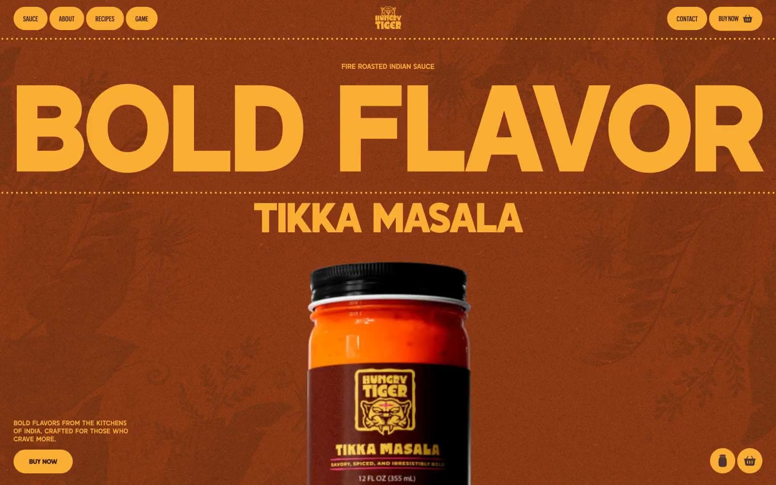
Hungry Tiger
Commerce


