
Holiday 100. The serif headline acts as the spotlight, the dark canvas is the velvet wall, and each product image hangs like a curated frame.
- Commerce
- Dark theme
- 15 colors
- 3 typefaces
Google's Holiday 100 is a dark-mode seasonal shopping showcase that reads like a midnight editorial spread rather than a product catalog. The defining move is pairing a dramatic display serif (Crimson Pro, used at up to 220px with -0.04em tracking) against Google Sans for UI, creating a magazine-cover gravity on what could otherwise be a utilitarian product grid. Saturated color blocks — crimson, royal blue, forest green, butter yellow, mint — serve as backgrounds for category tiles, each framing a single product photograph like a gallery spotlight against the near-black canvas (#333438). Surfaces stay flat and dark; the warmth comes from photography and accent color, not from elevation or gradients.

Holiday 100 design system

Accent9
Outlined accent borders and decorative strokes on links, images, and card frames — the cool chromatic signature that brands links and featured borders without filling them
Red outline accent for tags, dividers, and focused UI edges.
Category tile background for Electronics — a saturated mid-blue that gives gadgets a stage
Light blue category background for Accessories — a desaturated counterweight to the deeper Royal Blue
Category tile background for Toys & Games and Home & Garden — deep green anchors the more organic categories
Light green category background for Health & Wellness — the fresh, airy counterpart to Forest
Category tile background for Beauty — warm pale yellow that softens the cosmetic category
Lightest blue wash, used as a text/foreground pairing on dark accent backgrounds to guarantee AAA contrast
Rare accent — appears on a small number of links, probably AI-related or featured annotation links
Neutrals6
Hairline borders on inputs, icons, and button edges — barely visible, defines boundaries without breaking the dark atmosphere
Card and product tile surfaces — one step lifted from the canvas, used for product listings, trending panels, and secondary groupings
Page background — the primary dark surface that absorbs all surrounding chrome and lets photography and accent color carry visual weight
Subtle link borders and tertiary structural lines
Muted helper text, secondary icon strokes, and low-emphasis metadata
Hairline borders, dividers, input outlines, and card edges on light surfaces. Do not promote it to the primary CTA color
Try a pairing
Pick any two colors from the palette to check whether text stays readable on top.
Aa
Charcoal Border on Ice Blue
9.11 : 1 contrast
- Body textPasses AA 4.5
- Large textPasses AA 3
- StrictPasses AAA 7
More DESIGN.md files. Same web, different personalities.
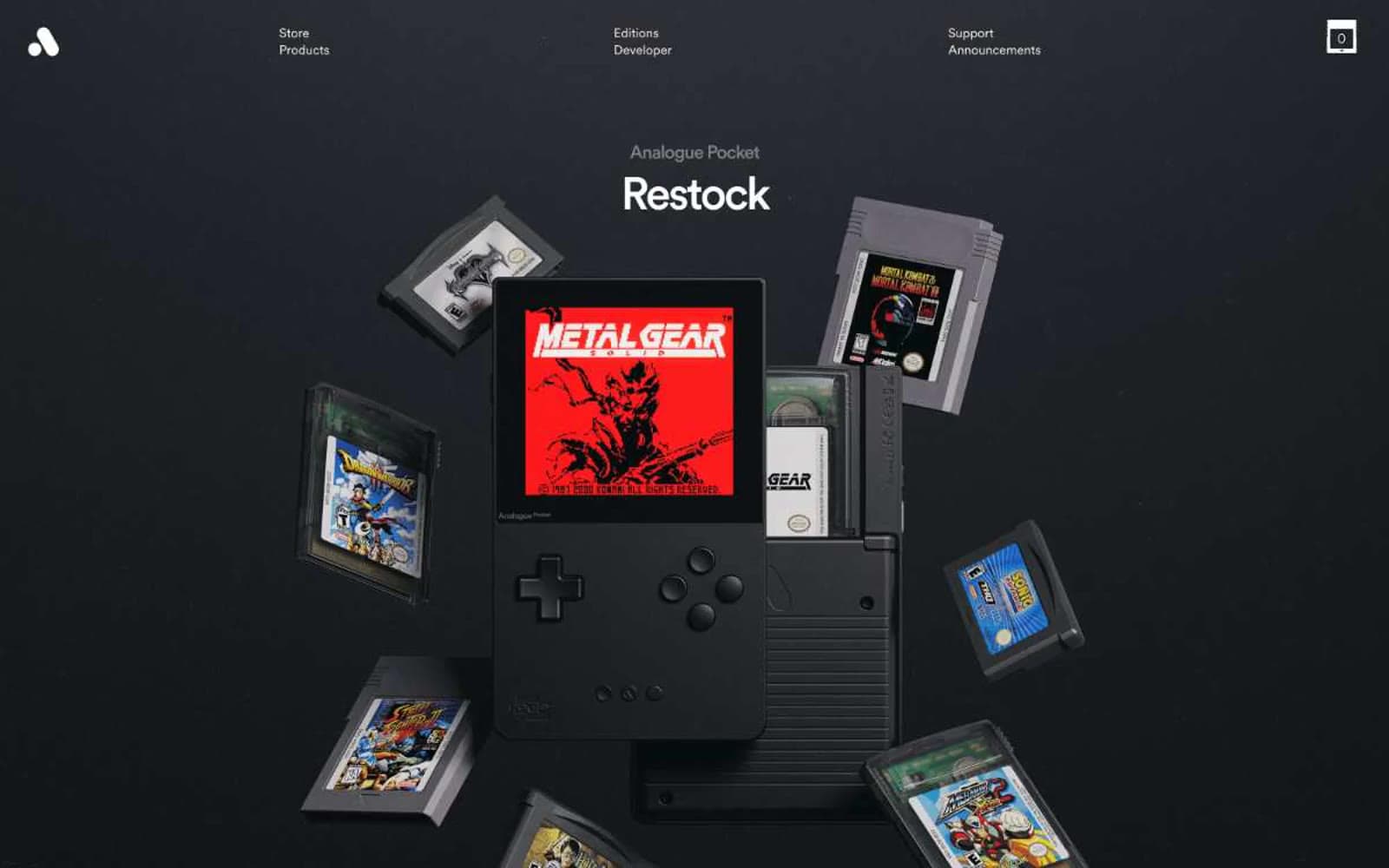
Analogue
Commerce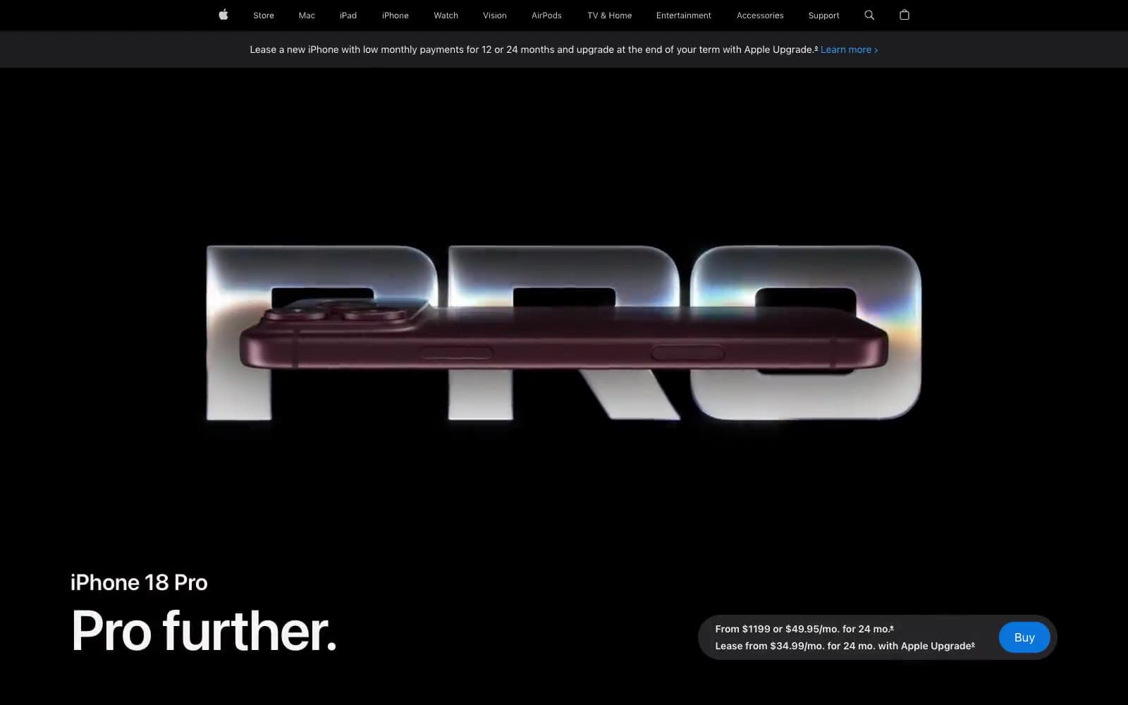
Apple iPhone 18 Pro
Commerce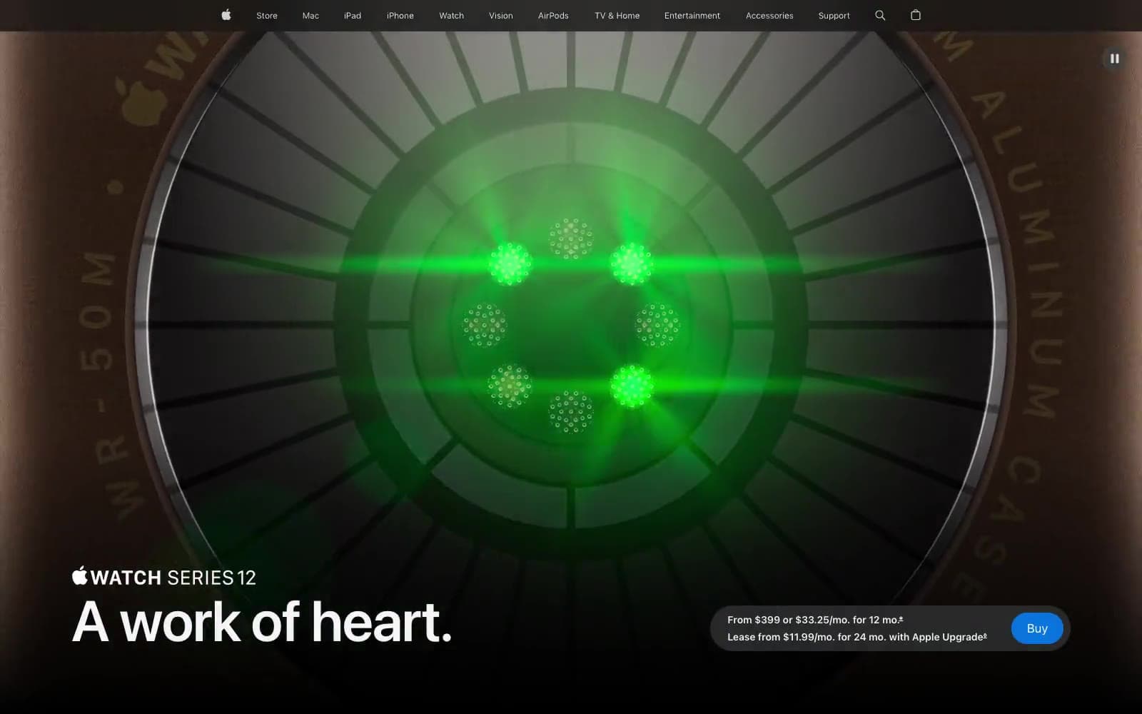
Apple Watch Series 12
Commerce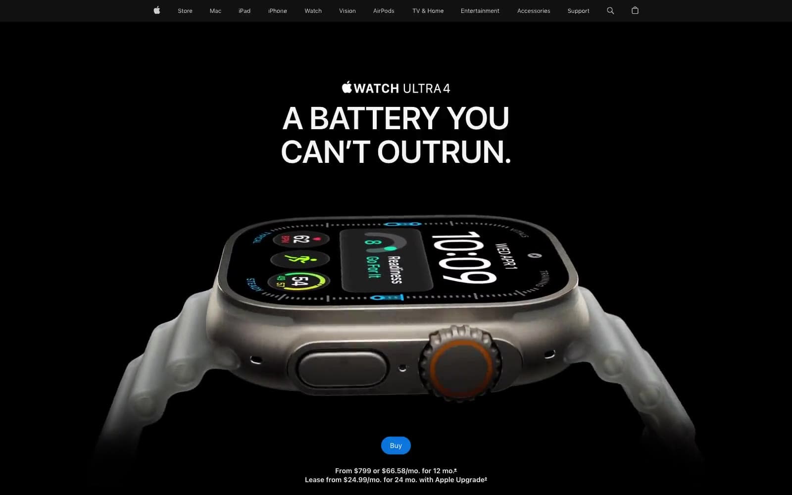
Apple Watch Ultra 4
Commerce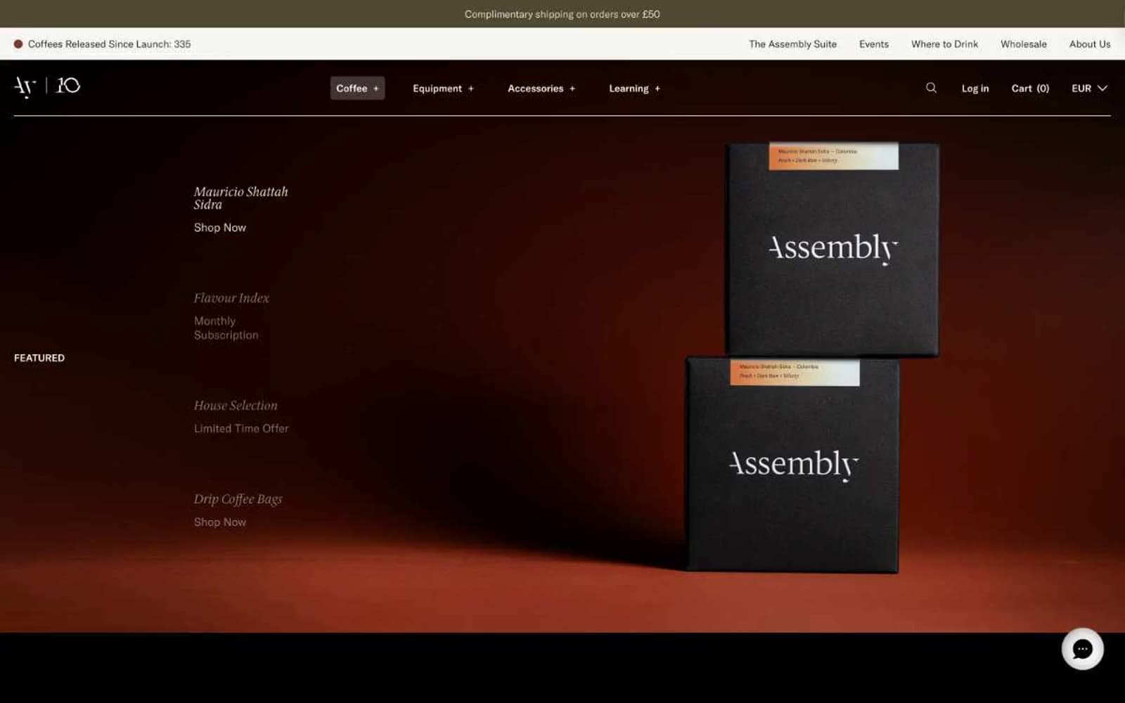
Assembly Coffee London
Commerce
Bedouin's Daughter
Commerce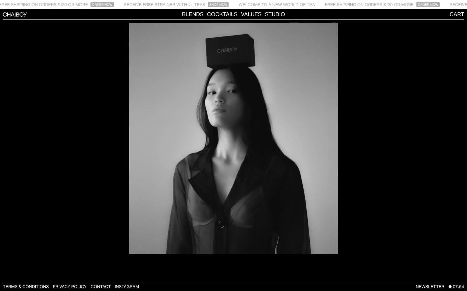
CHAIBOY
Commerce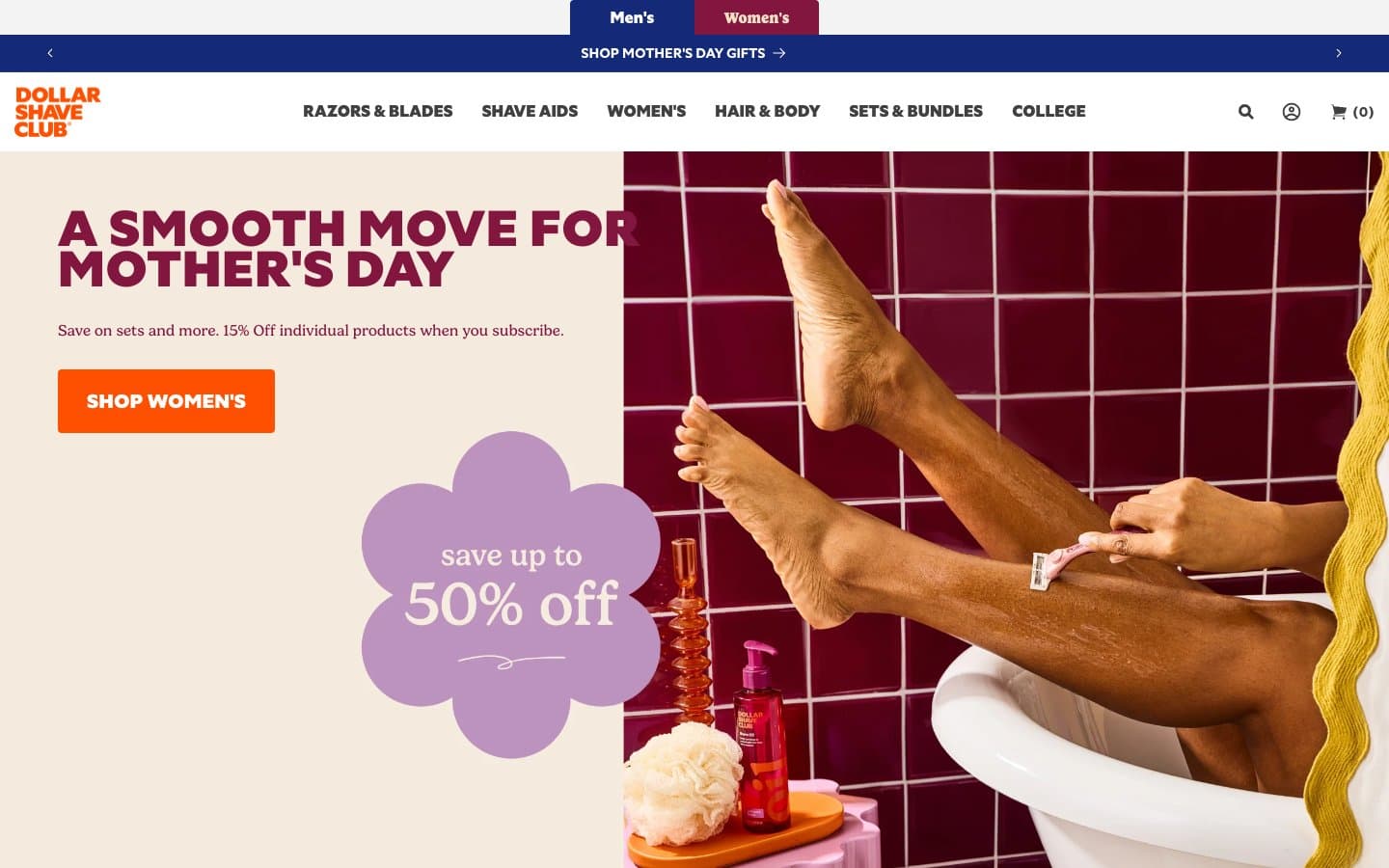
Dollar Shave Club
Commerce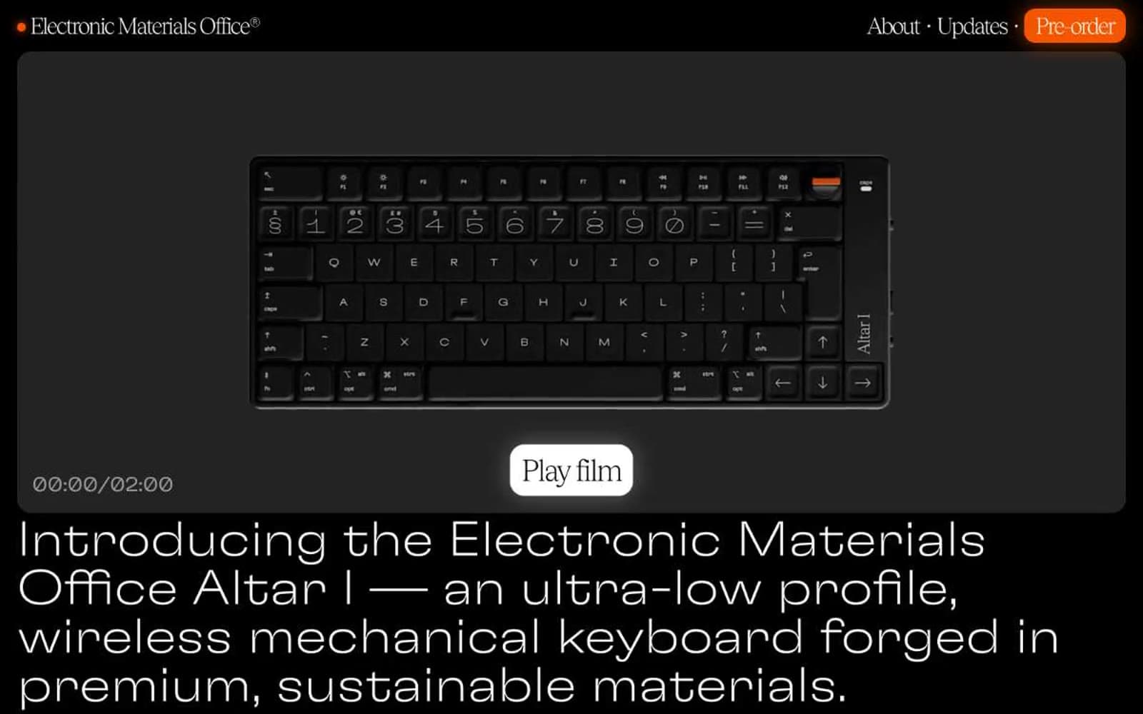
Electronic Materials Office®
Commerce
Elektron
Commerce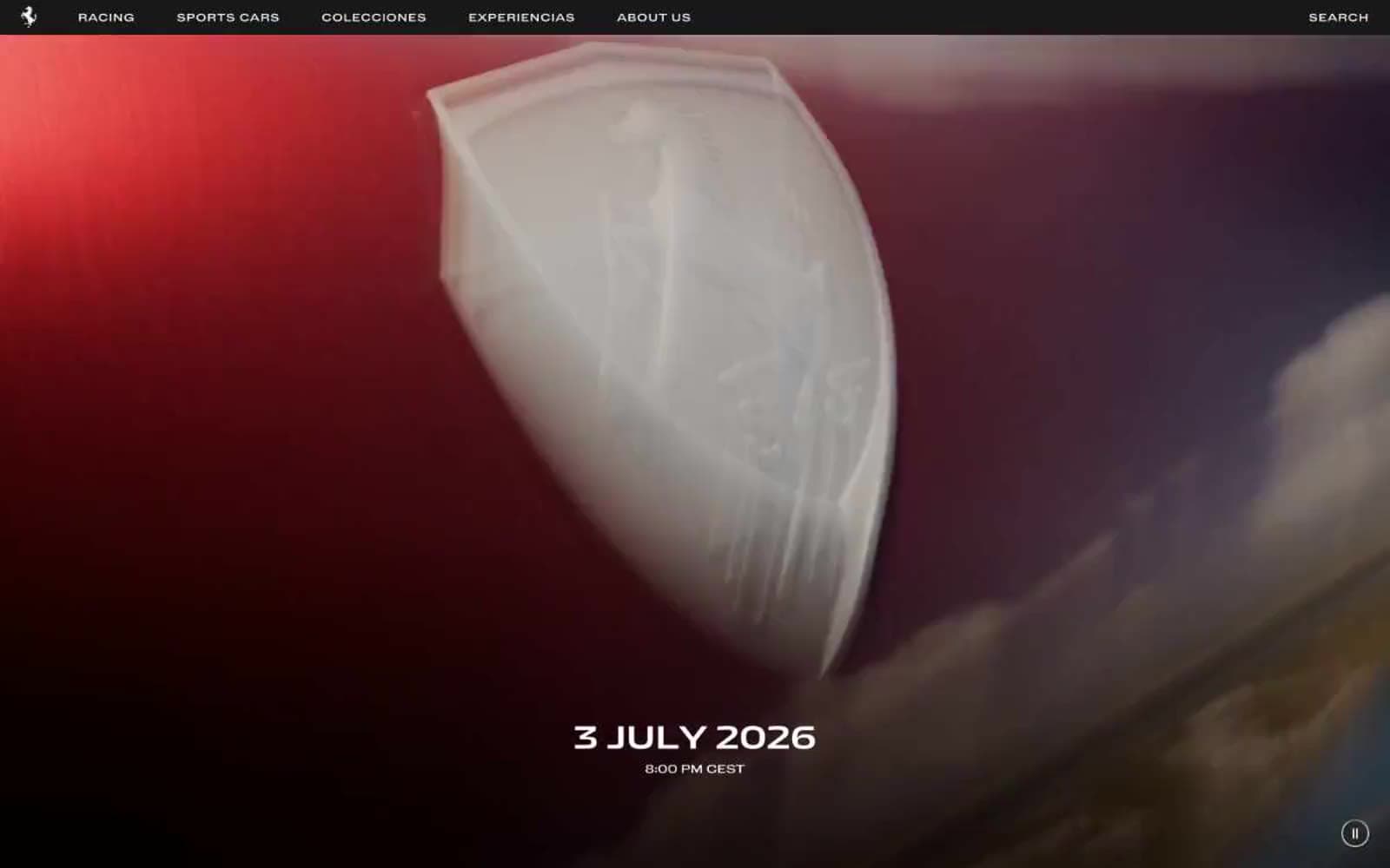
Ferrari
Commerce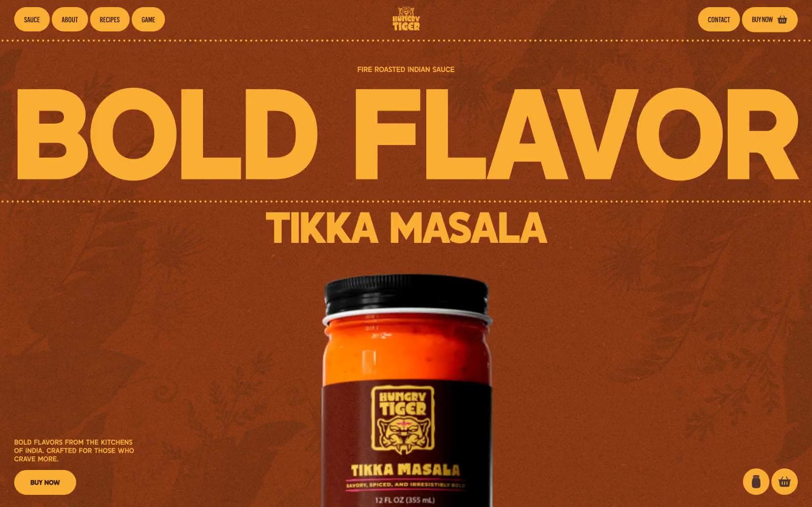
Hungry Tiger
Commerce


