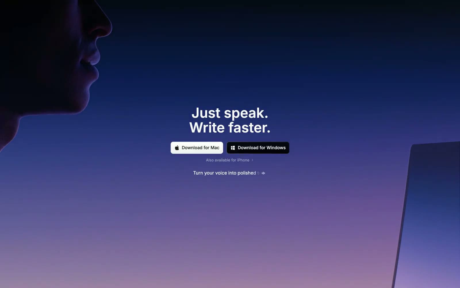
Superwhisper. Aurora dissolving over midnight glass.
- AI
- Dark theme
- 26 colors
- 4 typefaces
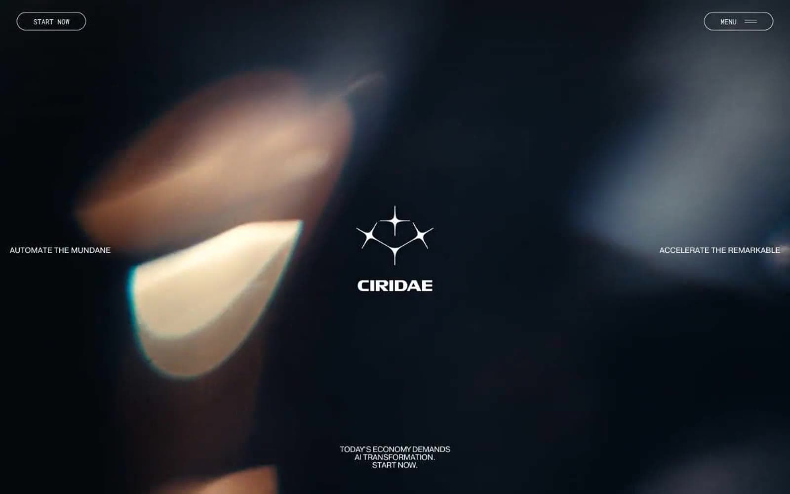
Superwhisper is a cinematic dark-mode product that earns its name through a hero aurora — a vertical gradient that bleeds from near-black through deep navy and violet into a dusty lavender-pink horizon, with only a shadowed silhouette of lips and a laptop edge to ground the abstraction. The whole page sits on a near-black canvas (#000000) with the hero card floating as a single rounded surface (24px radius), and every other surface is either a charcoal step up or a translucent black overlay. Inter is the only voice; display sizes use aggressive negative tracking (-3.4px at 60px) so large headlines feel compressed and confident rather than airy. Color is rationed: one electric blue (#0088ff) does the work of a traditional accent for icons, links, and small functional highlights, while white — not a chromatic color — is the primary action fill. The system is intentionally restrained, atmospheric, and product-focused, with most screens staying near-monochrome and letting the gradient hero do the emotional work.
Superwhisper design system

Brand5
Brand accent — icons, link text, small functional highlights, inline code accents
Brand signature — terminal color of the hero aurora gradient, decorative washes
Signature hero gradient: black 0.85% → deep blue → violet → lavender → dusty pink — the single defining atmosphere of the brand
Secondary gradient pair for call-out strips and inline emphasis bars
Subtle blue-to-violet wash used for low-opacity decorative bands
Accent7
Accent — subdued link blue for secondary text-level links
Accent — warm decorative token used sparingly in illustration/code contexts
Accent — warm decorative token, secondary highlight
Accent — high-energy punctuation for icons and inline emphasis
Green supporting accent for decorative details and low-frequency emphasis
Accent — saturated green for badges and inline highlights
Accent — chromatic pink for decorative highlights and illustration
Neutrals14
Page canvas, deepest gradient stop, true black borders
Blue-black card surface — second surface level above the canvas
Primary card surface — the floating canvas around the hero card
Dark blue-tinted surface for feature cards and section backgrounds
Elevated surface — input fields, nested cards, nav pill background
Mid-dark surface — button rest states, shadow base color
Mid neutral — secondary borders, disabled controls
Muted body text, secondary metadata
Tertiary text, button labels on dark surfaces
Muted helper text, icon strokes at rest
Subtle text on tinted surfaces
Secondary text, high-contrast metadata on dark
Hairline borders, dividers — the most-used neutral in the system
Light supporting surface for subtle backgrounds and section separation. Do not promote it to the primary CTA color
Try a pairing
Pick any two colors from the palette to check whether text stays readable on top.
Aa
Midnight on Electric Signal
5.97 : 1 contrast
- Body textPasses AA 4.5
- Large textPasses AA 3
- StrictFails AAA 7