
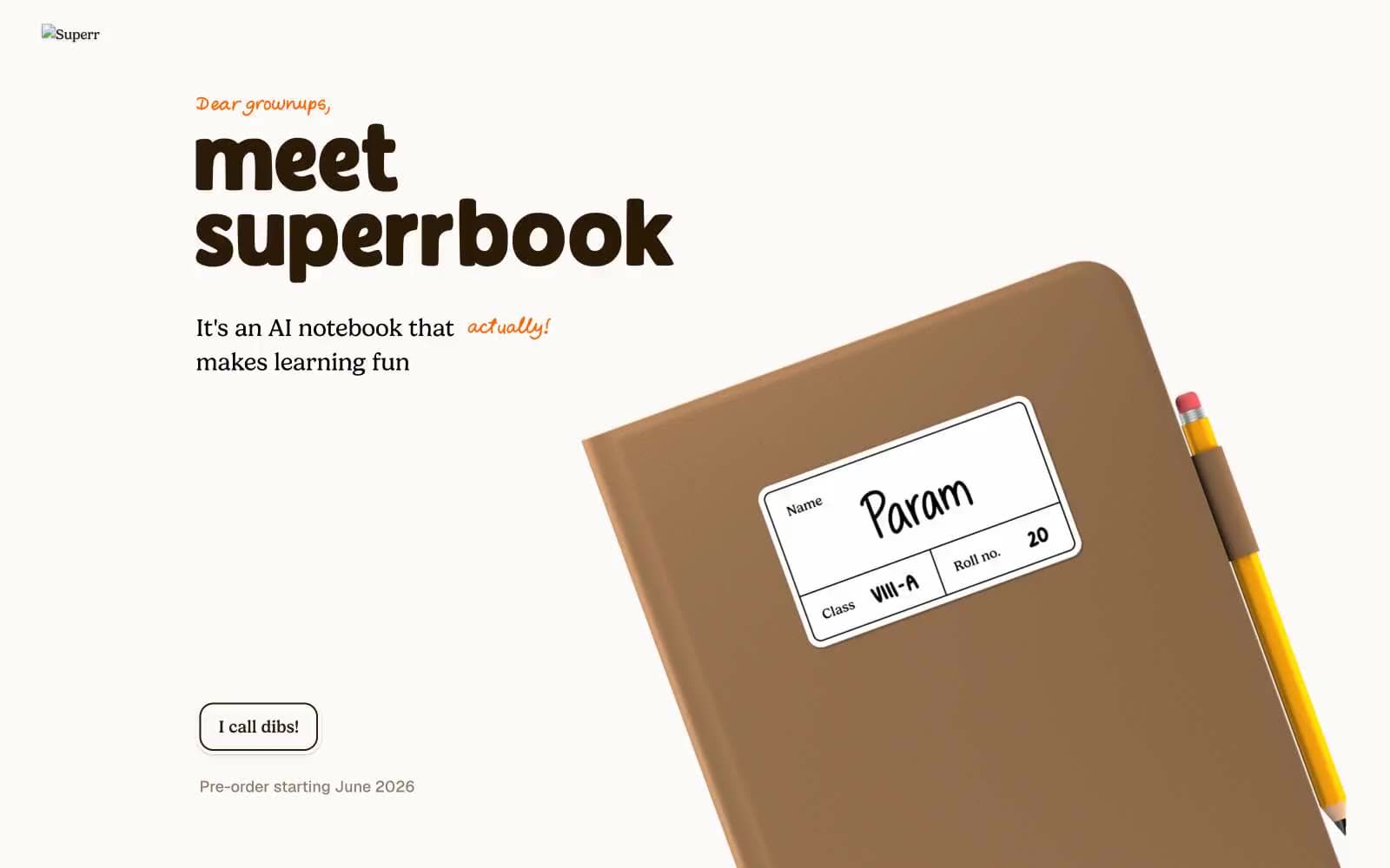
Superr. Warm schoolyard notebook in soft afternoon light.
- Brand
- Light theme
- 11 colors
- 2 typefaces
Superr is a warm schoolyard aesthetic rendered in digital form: a cream-paper canvas, hand-marker orange as the only chromatic accent, and chunky lowercase display type that reads like a child's notebook scrawled at full volume. The product itself is photographed like a real object — leather-bound notebooks, colored pencils, sticker-laminated name labels — and these objects, not abstract UI illustrations, do the visual work. Playful illustrated stickers (lightning bolts, bears, hearts, ghosts) scatter across the layout as little bursts of personality, but they are decorative punctuation, not system icons. Every surface stays matte and soft: thin dark borders instead of fills, minimal shadows, generous breathing room, and rounded corners that stop at 20px before going full-pill. The result is a site that feels like opening a fresh parchi on the first day of school — unhurried, tactile, and slightly mischievous.
Superr design system

Brand2
Signature accent for handwritten captions, script annotations, the footer brand band, and the highlight underline beneath emphasis words — the uncapped-marker energy of the brand
Darker orange shade used for body-color and border accents when the marker orange needs more weight against cream
Accent3
Decorative illustration accent — appears in sticker characters, sparkle marks, and notebook cover patterns. Not a UI token; do not use for buttons or links
Decorative illustration accent — used exclusively on sticker characters and pink notebook covers. Do not promote to functional UI
Green outline accent for tags, dividers, and focused UI edges
Neutrals6
Reserved for highest-emphasis headline moments and strict edge cases where charcoal feels too soft
Dark borders and separators for elevated surfaces and inverted UI.
Headline color, decorative borders — a warmer dark that headlines and accent borders inherit from notebook-leather tones instead of pure black
Shadow base color — the desaturated gray under-toning the card and button drop shadows
Secondary surface tint, the slightly warmer card layer that sits between the cream canvas and colored accents
Page canvas, card surfaces, button fills — the warm-white ground tone that makes dark borders and orange accents feel like ink and marker on paper
Try a pairing
Pick any two colors from the palette to check whether text stays readable on top.
Aa
True Black on Marker Orange
7.54 : 1 contrast
- Body textPasses AA 4.5
- Large textPasses AA 3
- StrictPasses AAA 7
More DESIGN.md files. Same web, different personalities.

Airbnb
Brand
Aker
Brand
Alison Roman
Brand
Alpine Bio
Brand
Alveos One
Brand
Amrit Palace
Brand
André Cândido
Brand
Anna Jóna
Brand
Apollo
Brand
Apple
Brand
Arva
Brand
Ashton Bespoke
Brand


