
Superpower. Bioluminescent health command center.
- Brand
- Light theme
- 9 colors
- 2 typefaces
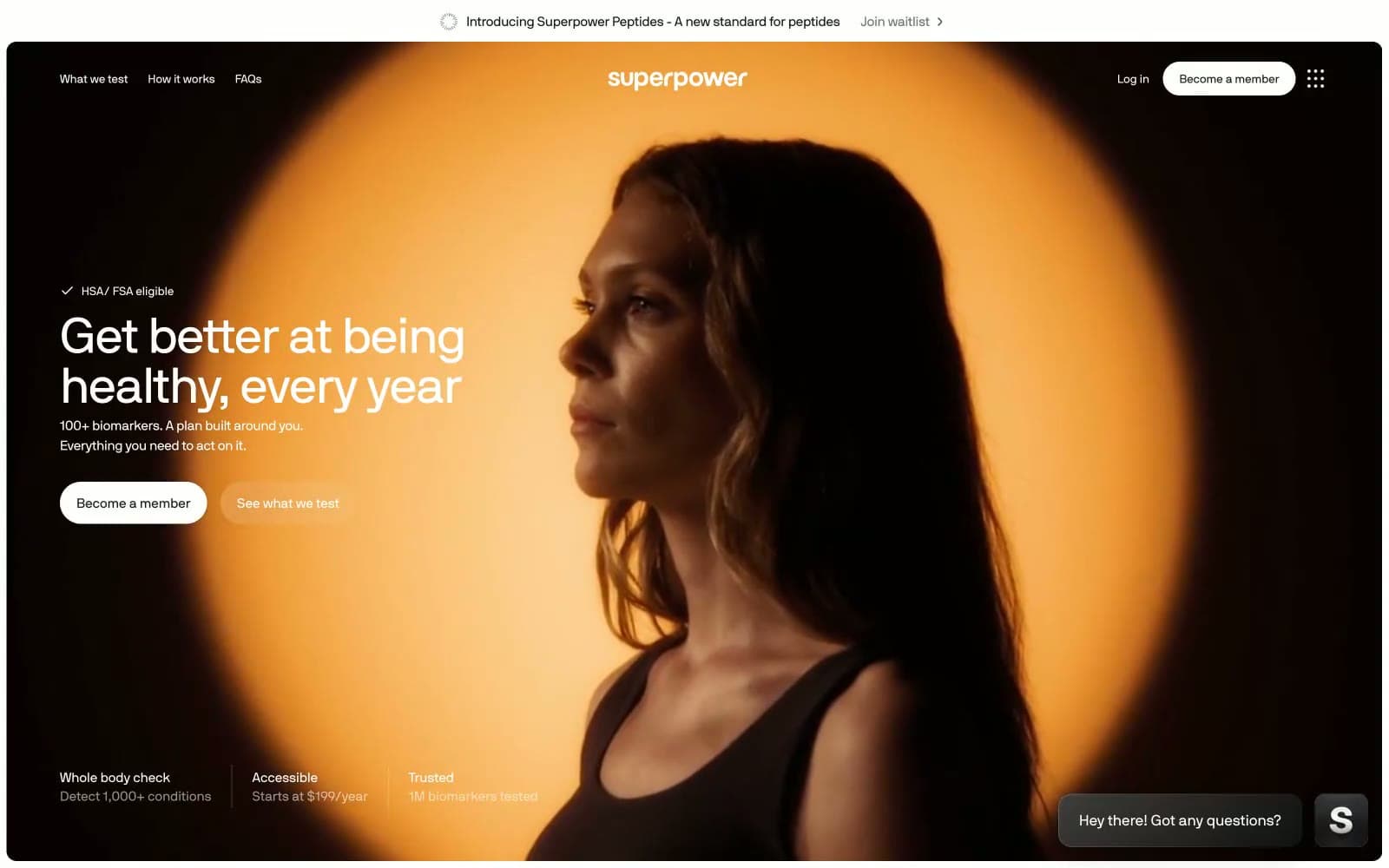
Superpower wraps a serious clinical promise in cinematic, atmospheric UI: full-bleed dark photography heroes transition into crisp white content surfaces, with one vivid sunrise-orange accent pulsing through the system. Typography carries the brand — a proprietary geometric sans at whisper-tight negative tracking, scaling from 11px metadata to 66px display with line-heights that compress as sizes grow (1.00 at display, 1.40–1.50 at body). A floating dark pill navigation bar hovers over imagery, and pill-shaped CTAs create a tension between clinical precision and warm vitality. Surfaces are mostly flat — the system relies on generous white space, hairline zinc dividers, and a single faint shadow pattern rather than heavy elevation. Color is rationed: nearly everything is black, white, or zinc-gray, and the orange appears only as functional punctuation on actions and brand marks.
Superpower design system

Brand2
Orange supporting accent for decorative details and low-frequency emphasis. Do not promote it to the primary CTA color
Gradient endpoint paired with Sunrise Coral for decorative membership card wash
Neutrals7
Logo wordmark, deep contrast borders
Primary text, floating navigation bar fill, headings, icon strokes
Body text, secondary descriptions, muted metadata, helper copy
Tertiary text, inactive borders, disabled states
Hairline borders, card outlines, divider lines, button borders
Subtle surface elevation, muted backgrounds, image overlay scrim base
Page background, card surfaces, text on dark images, button text
Try a pairing
Pick any two colors from the palette to check whether text stays readable on top.
Aa
Pure Black on Sunrise Coral
6.81 : 1 contrast
- Body textPasses AA 4.5
- Large textPasses AA 3
- StrictFails AAA 7
More DESIGN.md files. Same web, different personalities.

Airbnb
Brand
Aker
Brand
Alison Roman
Brand
Alpine Bio
Brand
Alveos One
Brand
Amrit Palace
Brand
André Cândido
Brand
Anna Jóna
Brand
Apollo
Brand
Apple
Brand
Arva
Brand
Ashton Bespoke
Brand


