
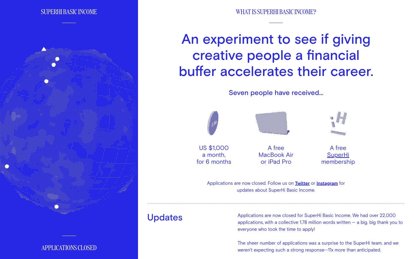
SuperHi Basic Income. Violet column beside white broadsheet.
- Brand
- Light theme
- 2 colors
- 2 typefaces
SuperHi Basic Income is a two-color editorial system: a permanent electric-violet column anchored to the left edge, a white broadsheet of generous typography scrolling to its right. The palette is ruthlessly binary — #2727e6 and #ffffff — with no shadows, gradients, or secondary surfaces to dilute the message. Typography carries all the personality: Basis (a geometric sans) handles every functional role, DDC (a more humanist display face) appears only where character is needed, and line heights breathe generously (1.46–1.67 for body text). Components are flat and shape-defined — pill tags at 50px radius, softly rounded buttons at 16px, a dotted globe illustration as the only graphic. The mood is campaign-poster confidence: one loud color, zero decoration, and text that does the heavy lifting.
SuperHi Basic Income design system

Brand1
Violet accent for outlined action borders, linked labels, and lightweight interactive emphasis. Do not promote it to the primary CTA color
Neutrals1
Right content canvas, card and elevated surfaces, sidebar text and illustration on the violet panel
Try a pairing
Pick any two colors from the palette to check whether text stays readable on top.
Aa
Paper White on Electric Iris
8.34 : 1 contrast
- Body textPasses AA 4.5
- Large textPasses AA 3
- StrictPasses AAA 7
More DESIGN.md files. Same web, different personalities.

Airbnb
Brand
Aker
Brand
Alison Roman
Brand
Alpine Bio
Brand
Alveos One
Brand
Amrit Palace
Brand
André Cândido
Brand
Anna Jóna
Brand
Apollo
Brand
Apple
Brand
Arva
Brand
Ashton Bespoke
Brand


