
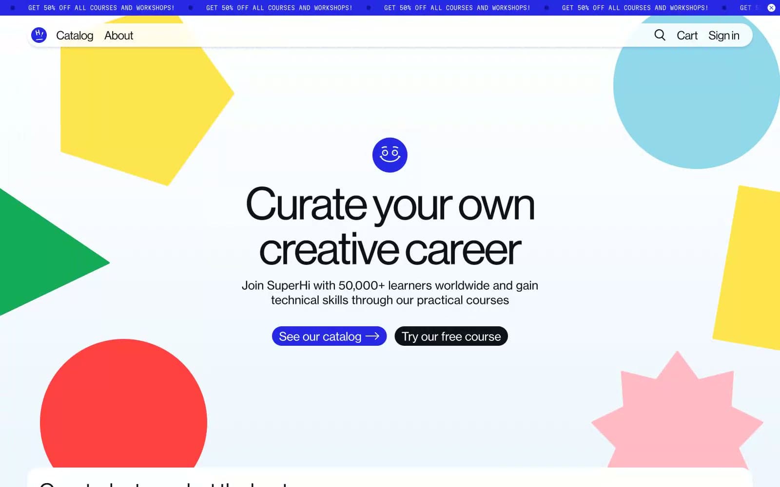
SuperHi. Paper-cut shapes scattered across a pale-blue classroom wall.
- Brand
- Light theme
- 12 colors
- 3 typefaces
SuperHi reads like a creative-school art room translated to screen: a near-white pale-blue canvas strewn with oversized flat paper-cut shapes in candy-bright primaries, wrapped around quietly confident typography that never competes with the playfulness. The palette is almost monochrome in interface chrome — deep ink text, white surfaces, one electric violet that powers every action — while the decorative layer is intentionally loud: yellow pentagons, red half-circles, green triangles, pink stars and powder-blue blobs float behind content like cutouts on a studio wall. Components are pill-soft (24–48px radii), buttons are chunky capsules with arrow glyphs, and the tone is friendly, confident, and unmistakably creative.
SuperHi design system

Brand1
Violet supporting accent for decorative details and low-frequency emphasis. Do not promote it to the primary CTA color
Accent6
Decorative shape fill — the large red semicircle, star bursts, and accent blobs scattered through the decorative layer
Decorative shape fill — the yellow pentagon and sunny accents in the cutout composition; also used as a section wash behind featured content
Decorative shape fill — soft powder-blue circles and cloud forms in the scattered cutout scene
Red supporting accent for decorative details and low-frequency emphasis.
Decorative shape fill — green triangle accents in the scattered cutout scene
Decorative shape fill — a slightly warmer yellow variant for layering against Hi-Yellow in the cutout composition
Neutrals5
Dark supporting neutral for text, icons, and strong contrast. Do not promote it to the primary CTA color
Primary text, dark secondary buttons, icon strokes, hairline borders — warmer than pure black, reads as ink rather than void
Secondary surface wash, input field backgrounds, footer tint — a step deeper than the canvas to create soft layering without shadows
Dominant page canvas — a barely-there blue tint that prevents the page from feeling clinical and ties the scattered blue shapes to the background
Card surfaces, elevated panels, button text on dark fills, page sections that need to lift off the pale-blue canvas
Try a pairing
Pick any two colors from the palette to check whether text stays readable on top.
Aa
Paper White on Electric Iris
8.34 : 1 contrast
- Body textPasses AA 4.5
- Large textPasses AA 3
- StrictPasses AAA 7
More DESIGN.md files. Same web, different personalities.

Airbnb
Brand
Aker
Brand
Alison Roman
Brand
Alpine Bio
Brand
Alveos One
Brand
Amrit Palace
Brand
André Cândido
Brand
Anna Jóna
Brand
Apollo
Brand
Apple
Brand
Arva
Brand
Ashton Bespoke
Brand


