
Supabase. A single chromatic pulse on a sea of charcoal.
- Developer tools
- Dark theme
- 12 colors
- 2 typefaces
Supabase is a midnight IDE with phosphor green punctuation: a near-black canvas, monochrome UI surfaces, and a single vivid green that marks emphasis, headings, and primary actions. The interface borrows its rhythm from code editors — hairline borders, pill controls, generous vertical breathing room, and tight geometric typography (Circular) that whispers in regular weight rather than shouting in bold. Color is rationed: the page is 99% grayscale, and every green pixel earns its place by being a CTA, a highlighted keyword, or a logo. Cards float one elevation level above the canvas using subtle border contrast rather than shadow. The overall feel is fast, terminal-native, and quietly confident — designed to disappear so the product and its developer audience can take the spotlight.
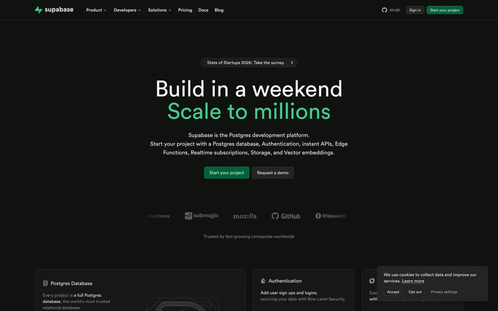
Supabase design system

Brand4
Green supporting accent for decorative details and low-frequency emphasis. Do not promote it to the primary CTA color
Link text and inline accent — a slightly cooler green variant for textual references that shouldn't compete with primary CTAs
Hover and pressed borders on green CTAs — keeps the button identifiable when the fill darkens on interaction
Deepest green surface — for low-key brand-tinted backgrounds, subtle section washes, and disabled-brand states
Neutrals8
Page canvas — the deep near-black foundation behind every section and card
Elevated surface tier for nested cards, hover states, and popover backgrounds
Card and component borders — the most-used border color, giving surfaces their defined edge without a visible shadow
Input borders, subtle dividers, hairline separators between nav and content
Icon outlines, low-emphasis borders, divider lines, and stroke color for illustrative line work
Tertiary text, captions, helper text, muted icon fills — the voice of metadata and annotations
Secondary headings, nav items, body emphasis — readable but never competing with Snow
Primary text, icon strokes, button labels — the dominant foreground across the entire interface
Try a pairing
Pick any two colors from the palette to check whether text stays readable on top.
Aa
Obsidian on Phosphor Green
9.39 : 1 contrast
- Body textPasses AA 4.5
- Large textPasses AA 3
- StrictPasses AAA 7
More DESIGN.md files. Same web, different personalities.

Railway
Developer tools
Nuxt
Developer tools
Astro
Developer tools
Authkit
Developer tools
Axiom
Developer tools
BaseHub
Developer tools
Better Stack
Developer tools
Bun
Developer tools
Checkly
Developer tools
ClickHouse
Developer tools
Depot
Developer tools
dope.security
Developer tools


