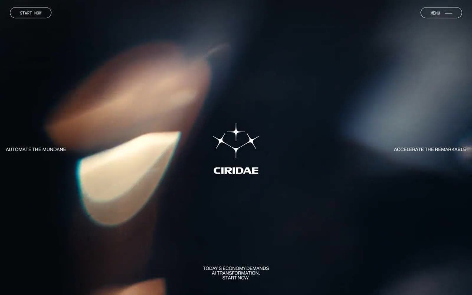
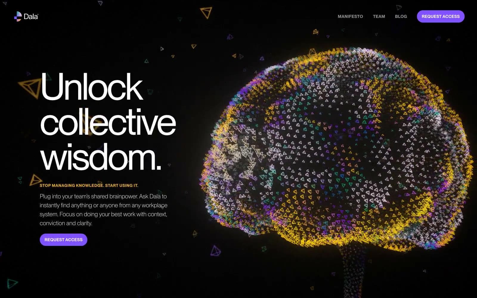
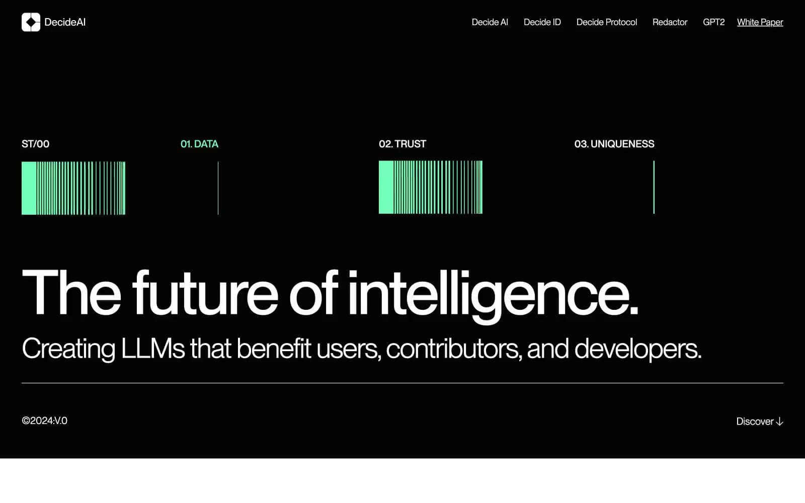
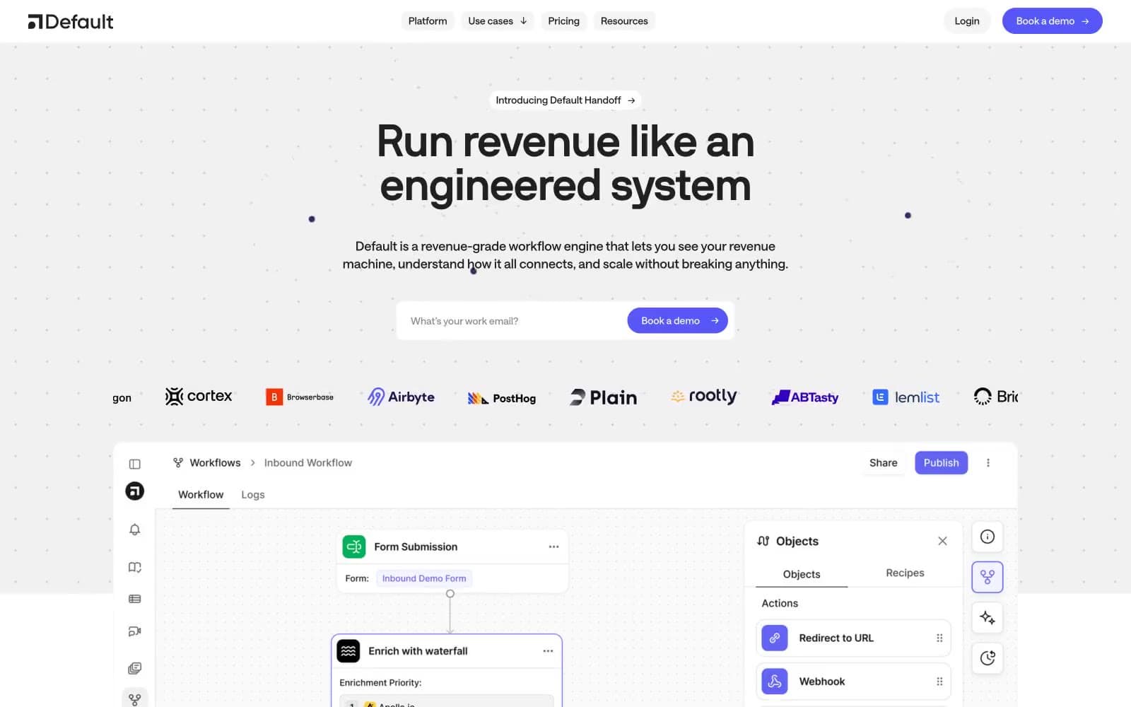
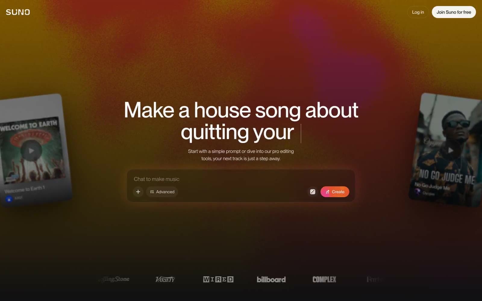
Suno. Afterglow on a mixing console.
- AI
- Dark theme
- 8 colors
- 2 typefaces
Suno operates in a warm nocturnal register: a near-black canvas (#101012) lit by a single dusk-gradient wash, with one cream-warm off-white (#f7f4ef) carrying all body and headline text. The whole product feels like a recording studio after midnight — quiet, matte, and slightly reflective, with color reserved as a single-function event (the coral Create button) that punctuates an otherwise monochromatic surface. Typography does the heavy lifting: Neue Montreal sets almost everything in compact 14–16px rows, while an Editorial New italic display voice breaks the dark with humanistic serifs at 72–140px, giving every screen one moment of warmth and scale. Components are low-elevation by default — soft cards, ghost controls, thin dividers — and the only true accent is the sunset gradient that bleeds behind the hero.
Suno design system

Brand1
Red supporting accent for decorative details and low-frequency emphasis. Do not promote it to the primary CTA color
Accent1
Hero background gradient — warm amber-to-burgundy atmospheric wash that bleeds behind the headline; sets the mood of the brand
Neutrals6
Dark supporting neutral for text, icons, and strong contrast. Do not promote it to the primary CTA color
Page canvas, default surface — the dominant background behind every screen
Elevated surface — cards, input wells, modals layered above the canvas
Muted helper text, disabled labels, and low-emphasis captions
Primary text color and high-contrast foreground — the signature off-white that keeps the dark UI from feeling cold
Secondary text, icon strokes, and bright borders where maximum contrast is needed
Try a pairing
Pick any two colors from the palette to check whether text stays readable on top.
Aa
Pure Ink on Ember Coral
6.44 : 1 contrast
- Body textPasses AA 4.5
- Large textPasses AA 3
- StrictFails AAA 7