
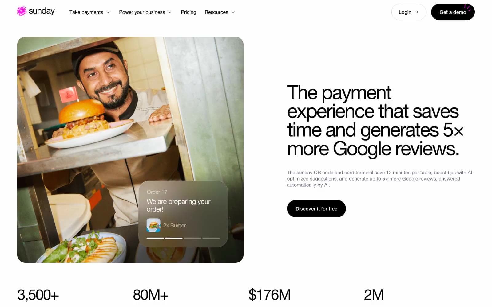
sunday. A clean Helvetica poster where one hot pink line cuts through the black-and-white calm.
- Finance
- Light theme
- 8 colors
- 1 typeface
Sunday is a white-canvas payment brand for hospitality with a single neon pink accent that acts as electric punctuation against an otherwise achromatic system. The visual logic is almost editorial: type does the heavy lifting, photography provides warmth, and color appears only where attention must land. Black is the structural default — text, borders, cards, primary buttons, even the feature section's background — while #ff17e9 is reserved for brand signals (logo, active nav, highlighted headings, badge borders). The type system is unified under one family (Helvetica Neue) but spans an extreme range from 12px captions to 200px stat numerals, with aggressive negative tracking at large sizes and positive tracking on small uppercase labels. Surfaces are flat — almost no shadows, reliance on hairline borders and contrast instead. Components lean rounded: 16px for cards and inputs, 64px pill for primary buttons, 100px for tags. The overall feel is confident minimalism warmed by real restaurant photography and one unmistakable neon pulse.
sunday design system

Brand1
Brand accent — logo mark, active nav underline, highlighted section labels, badge borders, decorative emphasis on key words — one vivid pink against the monochrome system
Neutrals7
Primary text, hairlines, filled primary buttons, dark section backgrounds, and card surfaces on dark bands — the structural default that carries the entire system
Body text on light surfaces, subtle borders, muted helper text — a near-gray that warms the neutral palette slightly
Inactive nav text, subtle metadata
Rare shadow tint and muted border accent
Placeholder text, inactive borders, secondary dividers
Hairline dividers, input borders, disabled states — the lightest structural line in the system
Page canvas, card surfaces, button text on dark fills, form input fills — the negative space that frames everything
Try a pairing
Pick any two colors from the palette to check whether text stays readable on top.
Aa
Carbon Black on Neon Pulse
6.55 : 1 contrast
- Body textPasses AA 4.5
- Large textPasses AA 3
- StrictFails AAA 7
More DESIGN.md files. Same web, different personalities.

Mollie
Finance
a16z speedrun
Finance
Acctual
Finance
Airtree
Finance
Ambrook
Finance
Angellist 2024
Finance
Apron
Finance
Baselayer
Finance
Basis Theory
Finance
BlueYard Capital
Finance
Brex
Finance
Coda
Finance


