
Studio Gruhl. Matte-black gallery manifesto.
- Studio
- Dark theme
- 6 colors
- 2 typefaces
Studio Gruhl runs on a dark, text-first portfolio language: massive GreedStandard type bleeds edge-to-edge while UI chrome recedes into matte black surfaces. The interface is essentially achromatic — white text, charcoal surfaces, and a muted ash gray — so that case-study video and imagery carry all the chromatic weight. Components are minimal and compact: pill-shaped navigation at 9999px, a 12px radius as the universal workhorse for cards and buttons, and almost no decorative chrome. The work IS the decoration; the framework simply provides a quiet, full-bleed stage.
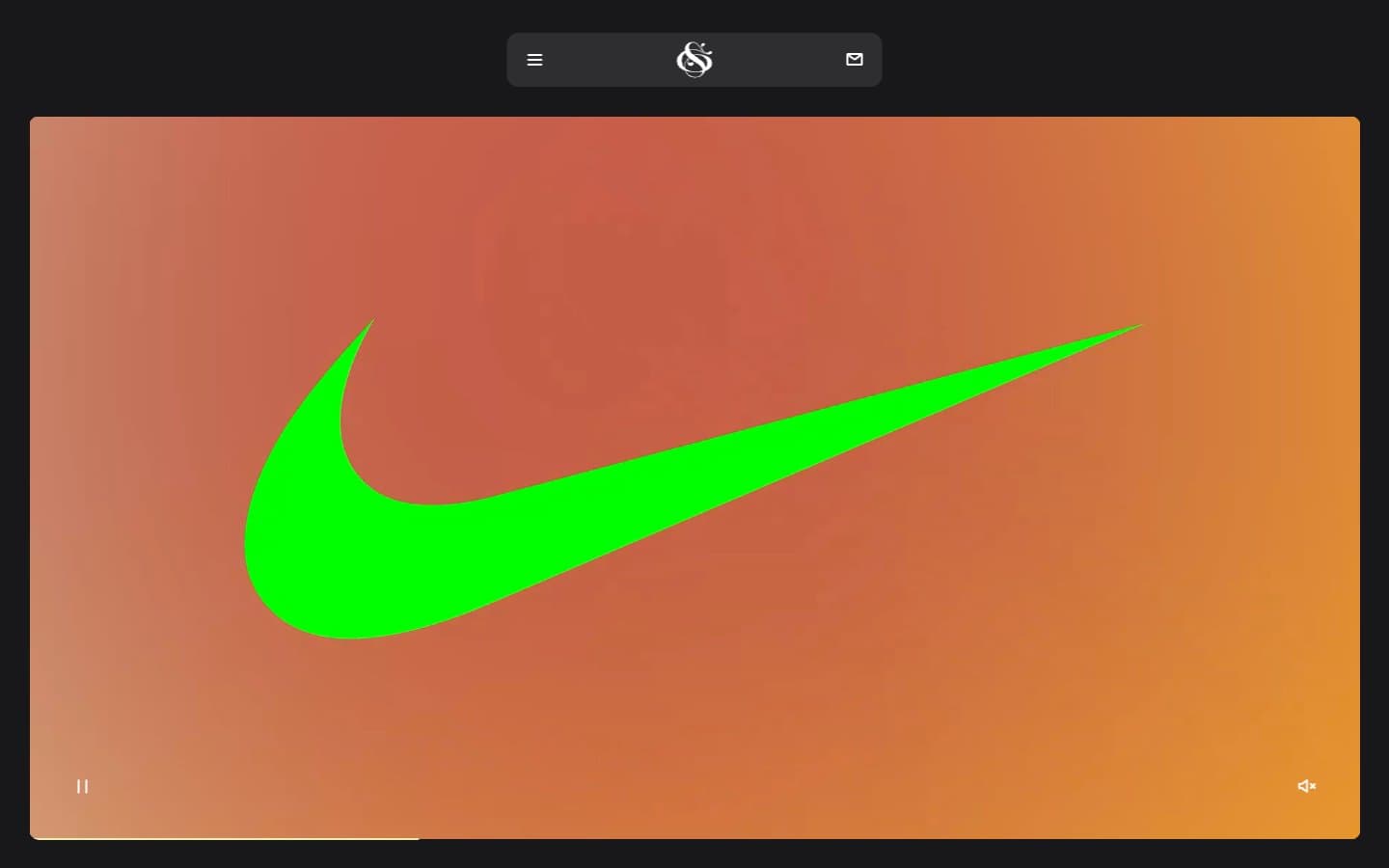
Studio Gruhl design system

Accent1
Yellow wash for highlight backgrounds, decorative bands, and soft emphasis behind content.
Neutrals5
Deep border accent on certain buttons and nav edges, used sparingly for a near-invisible structural line
Nav bar surface, deeper layered cards, footer base — sits one step below Carbon to create a subtle depth read
Page canvas, card surfaces, neutral filled button background — the dominant surface for the entire dark experience
Muted body text, caption copy, low-emphasis dividers — never used for headings, always for secondary information
Primary text, hairline borders, nav dividers, icon strokes — white doubles as the divider system in this monochrome dark UI
Try a pairing
Pick any two colors from the palette to check whether text stays readable on top.
Aa
Pure Black on Lime Cream
17.73 : 1 contrast
- Body textPasses AA 4.5
- Large textPasses AA 3
- StrictPasses AAA 7
More DESIGN.md files. Same web, different personalities.
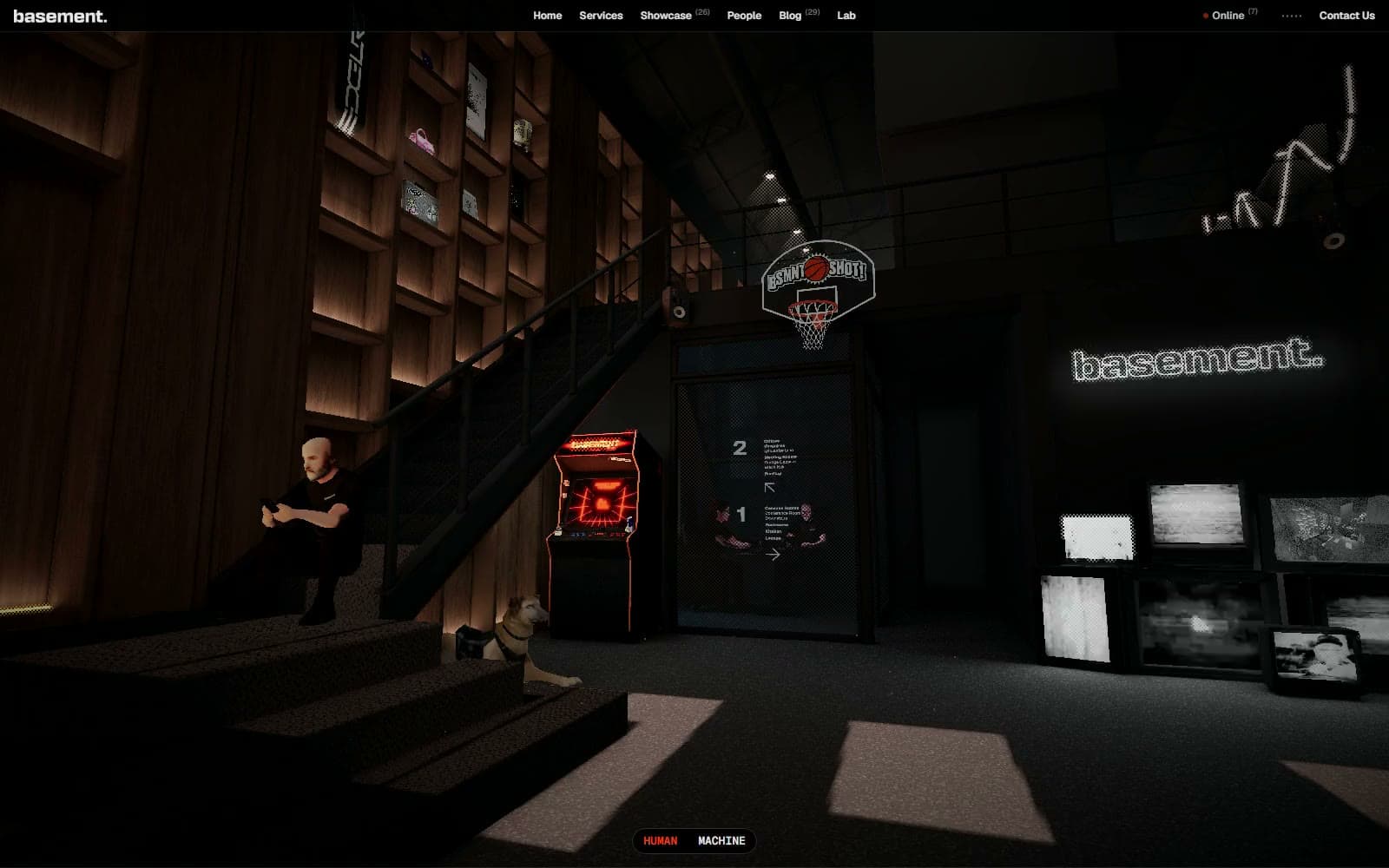
Basement Studio
Studio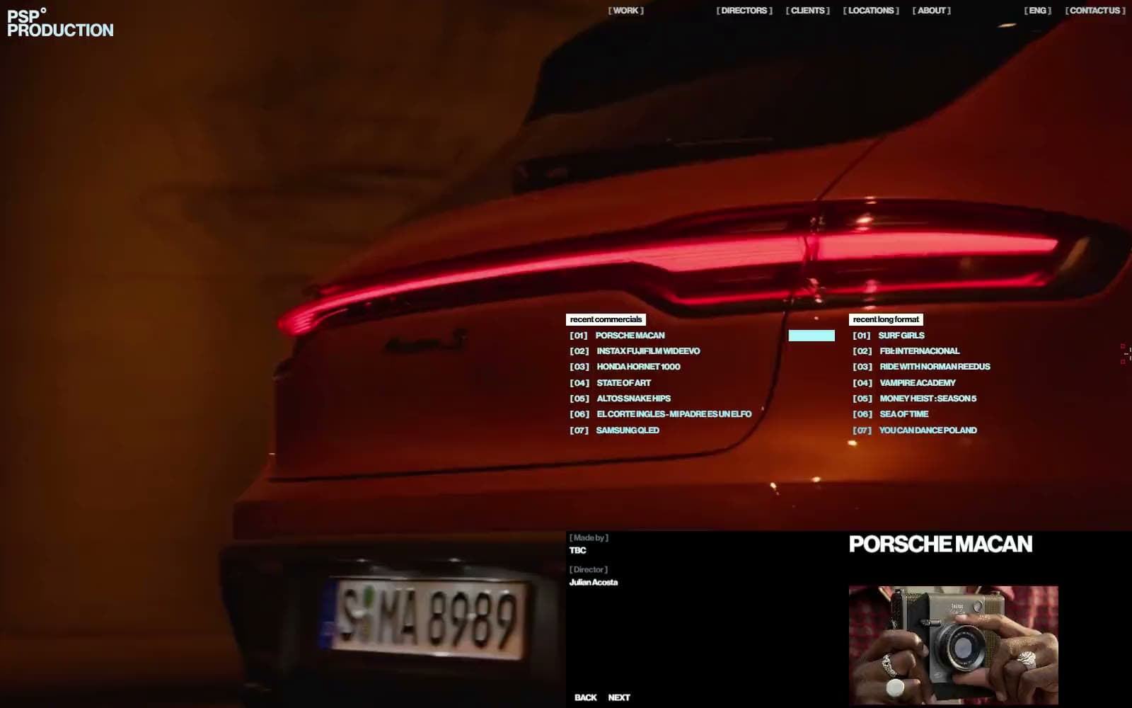
Production Portugal
Studio
Active Theory
Studio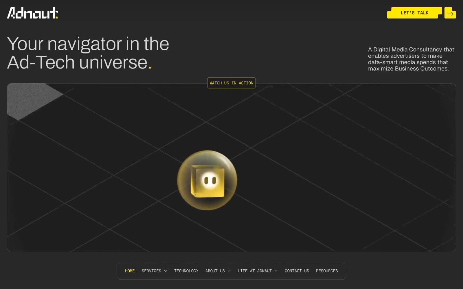
Adnaut
Studio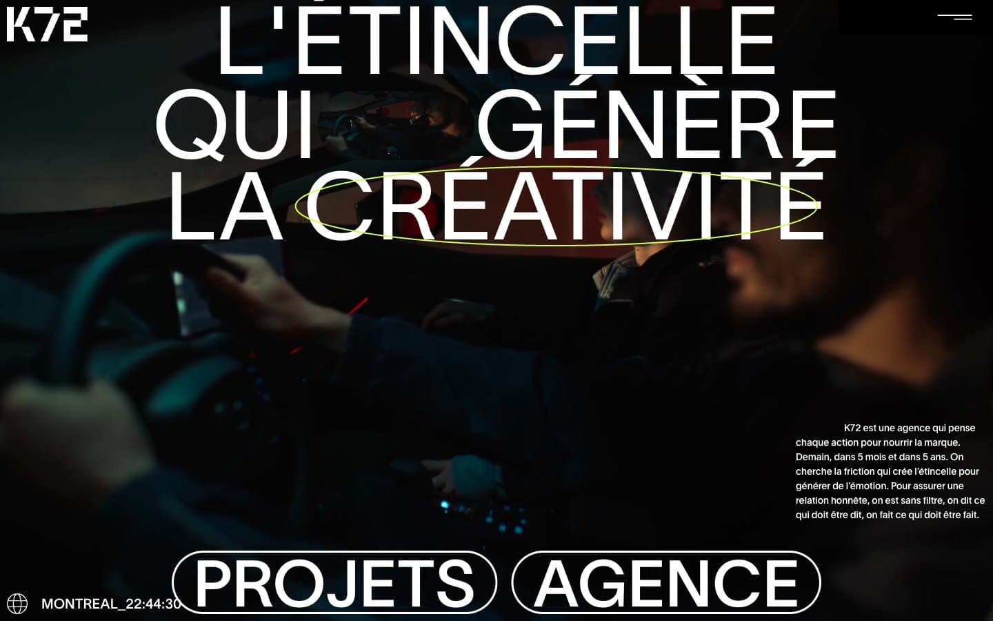
Agence K72
Studio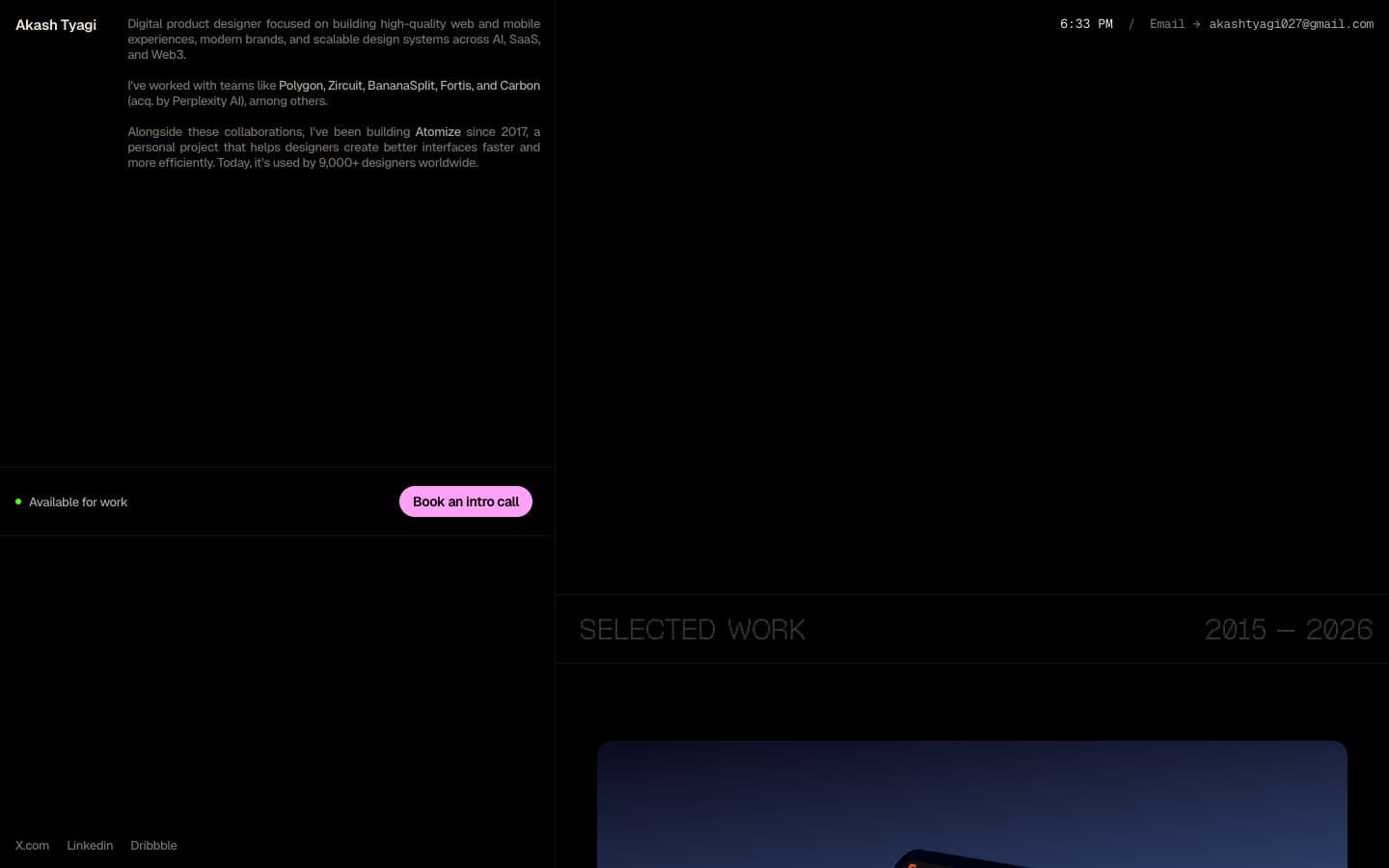
Akash Tyagi
Studio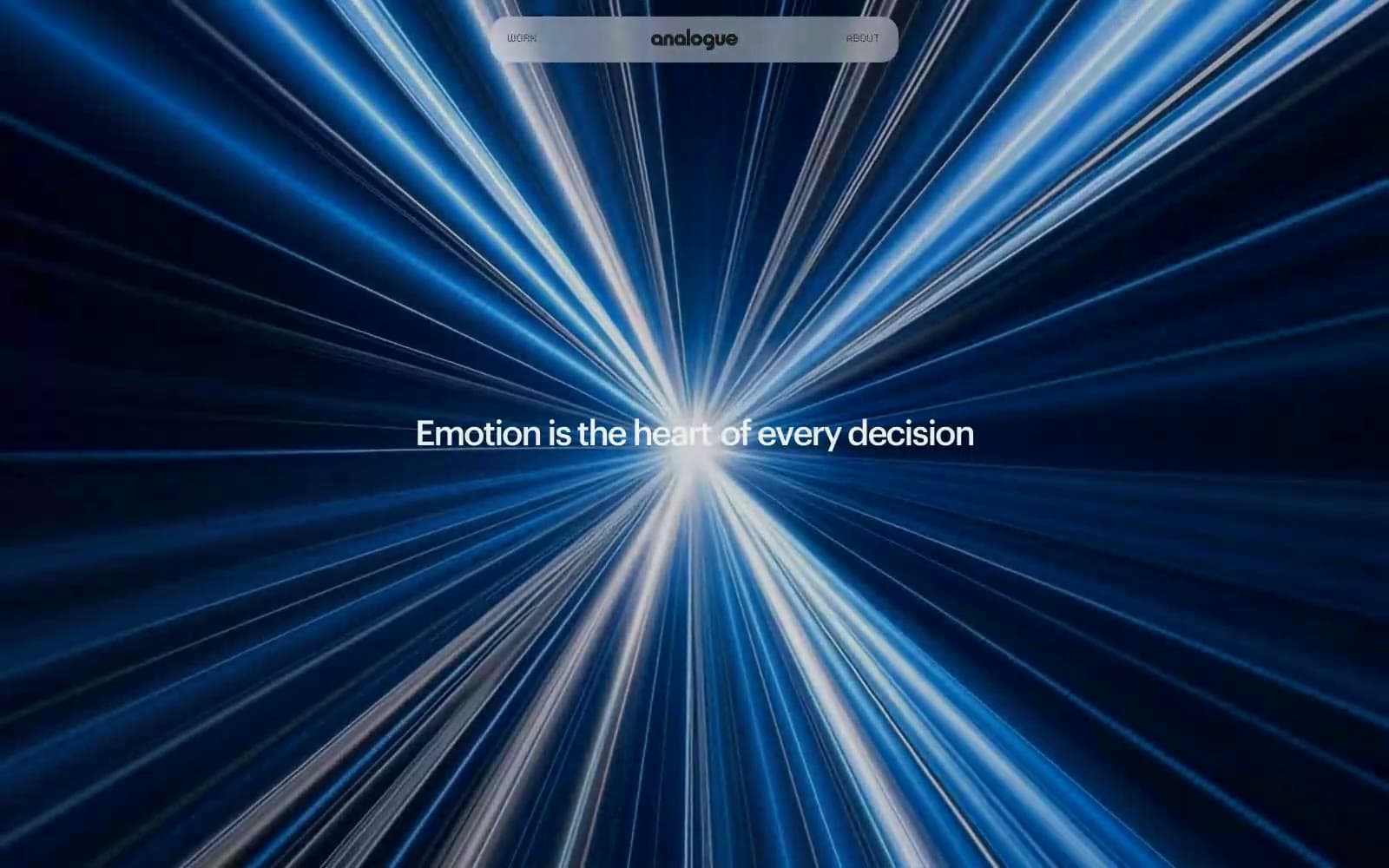
Analogue
Studio
Athletics
Studio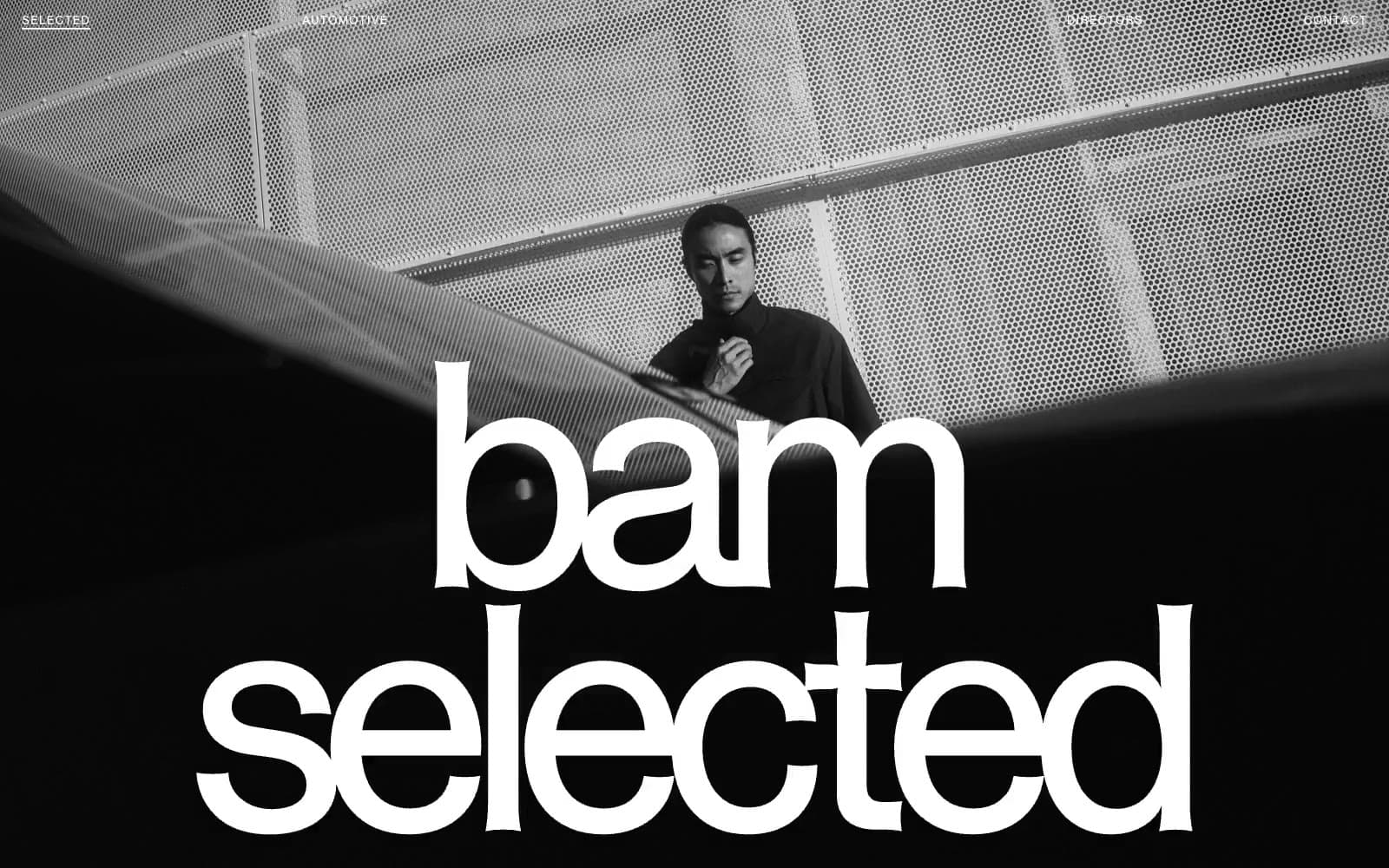
BAM Photographers
Studio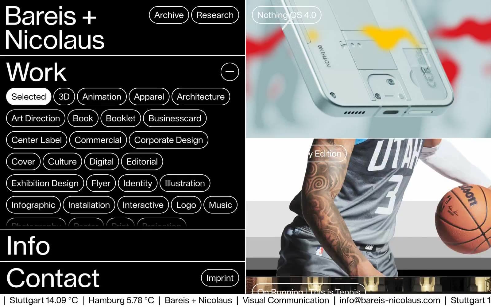
Bareis + Nicolaus
Studio
Becklyn
Studio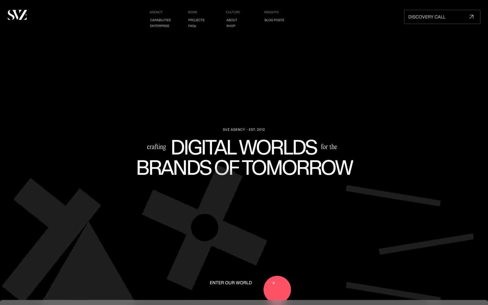
Branding
Studio


