
Studio Freight. Engraved crest over a contact sheet.
- Studio
- Mixed theme
- 6 colors
- 3 typefaces
Studio Freight is a no-scroll opening: a seven-by-seven grid of hard-cornered project stills scattered across Bone Paper #fefdfc, with holes left in it and one JJannon line, "Moving Missions Forward", at 49.33px in the centre. All colour comes from the client work; the interface itself is Freight Black #000000 on bone, flipping to black on the Aeon, Contact and darker case-study routes. Type is a deliberate clash of a 17th-century-feeling serif against Publico Text Mono, used at 14px for every label and at 157.33px, tightly leaded and uppercase, for the typewriter headline on Work. Nothing has a radius or a shadow; hover, view toggles and difference-blended chrome do all the work.
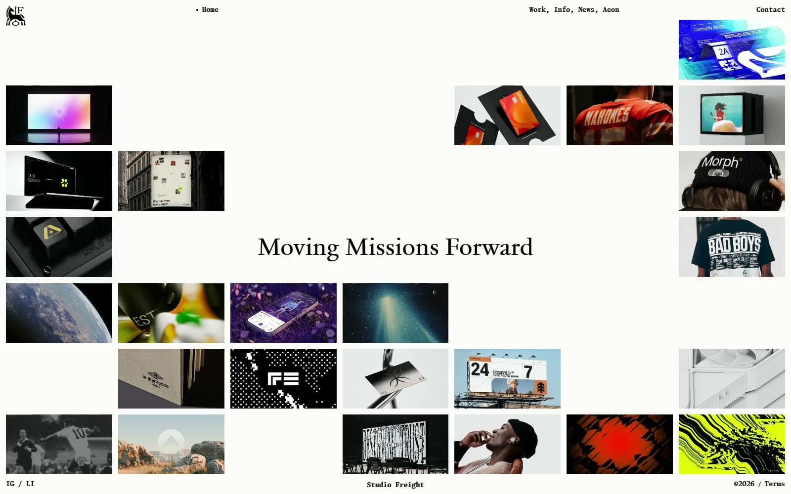
Studio Freight design system

Brand1
Mark, headlines, body and list text on light routes, and the full canvas on Aeon, Contact and dark case studies
Neutrals5
Canvas on light routes and all text on dark ones — the site's --white token, faintly warm rather than pure white
Placeholder fill behind each archive tile on the black Aeon route, visible while experiments load in
Composited 10% bone hairline under each Contact field and FAQ row on the black route
Dimmed List-view rows while another row is hovered, and quiet dates on the News page
Composited 10% black rule on Info and News, and the placeholder behind News images
Try a pairing
Pick any two colors from the palette to check whether text stays readable on top.
Aa
Bone Paper on Freight Black
20.67 : 1 contrast
- Body textPasses AA 4.5
- Large textPasses AA 3
- StrictPasses AAA 7
More DESIGN.md files. Same web, different personalities.
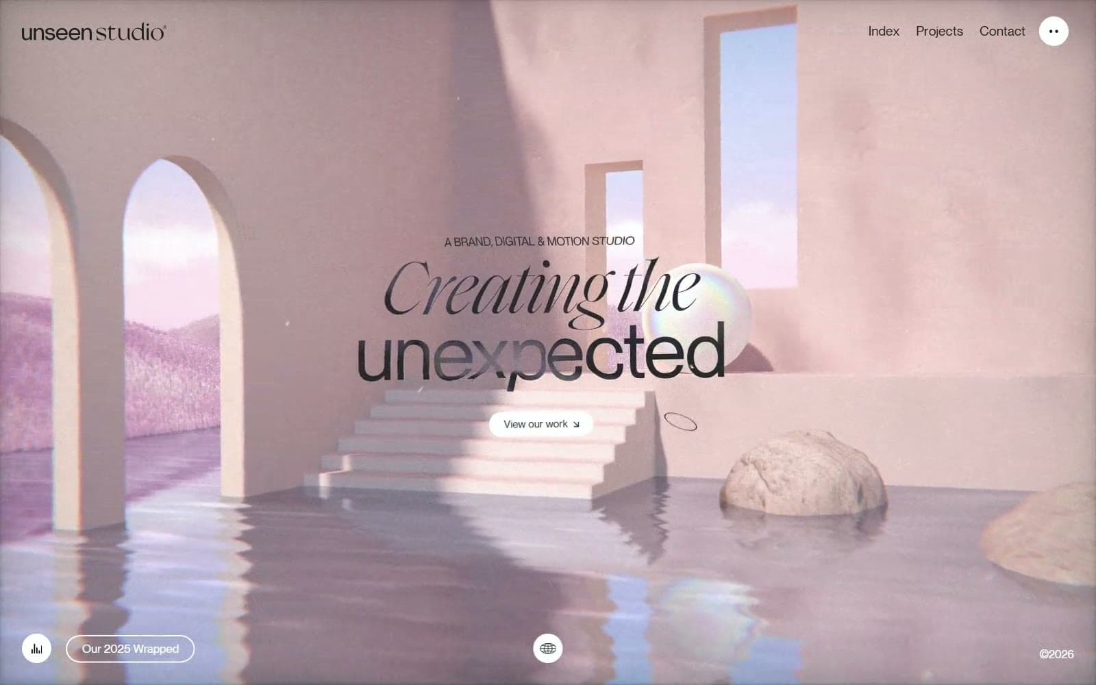
Unseen Studio
Studio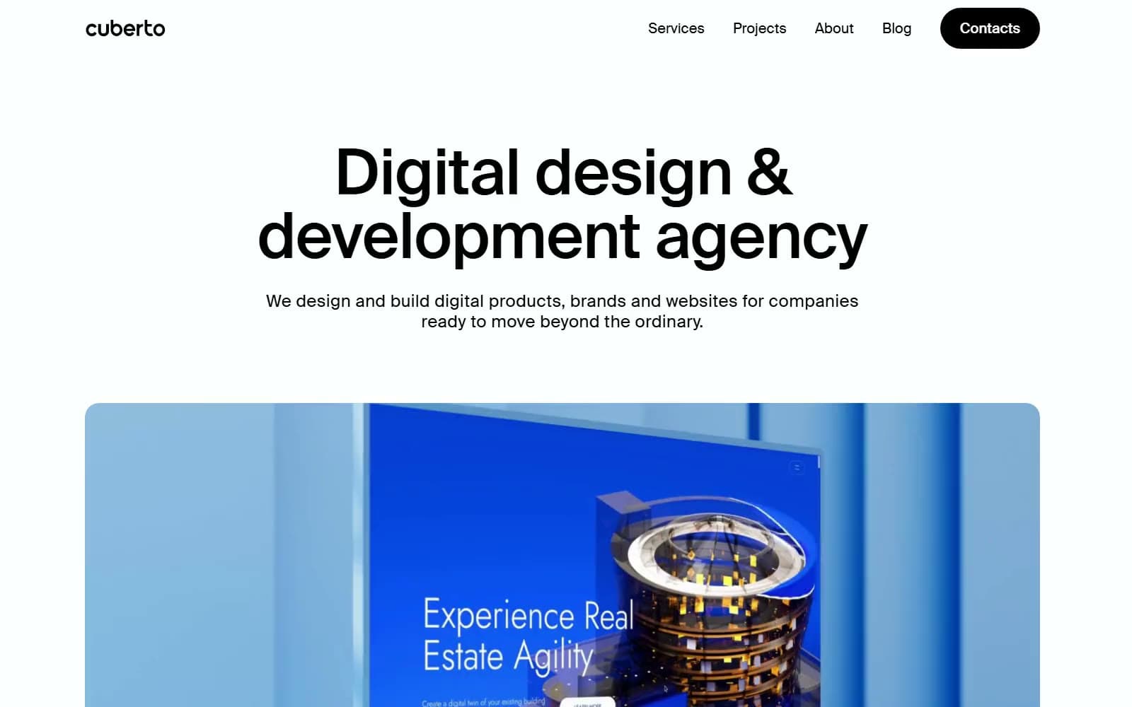
Cuberto
Studio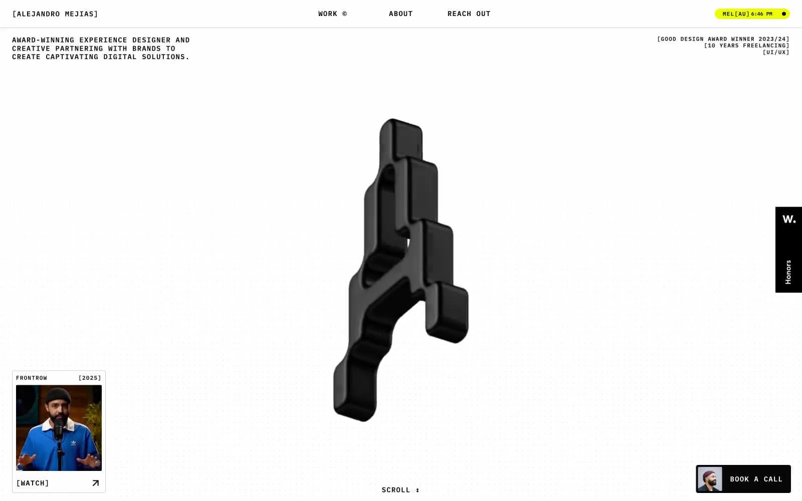
Alejandro Mejias
Studio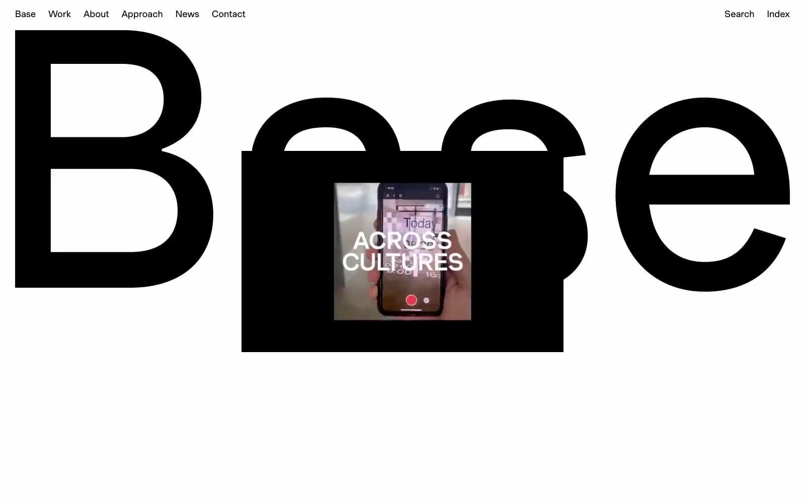
Base Design
Studio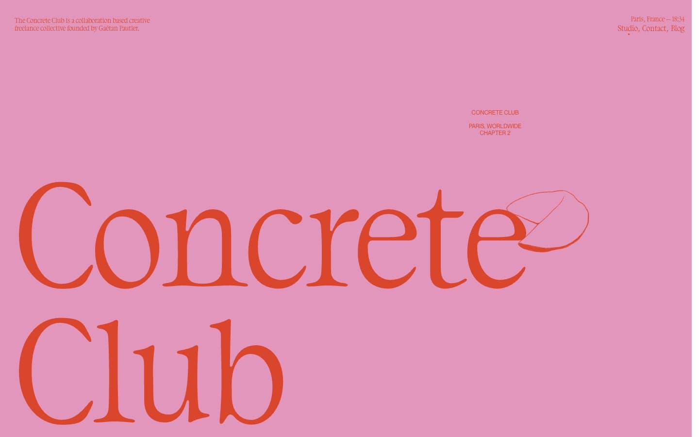
Concrete Club Studio
Studio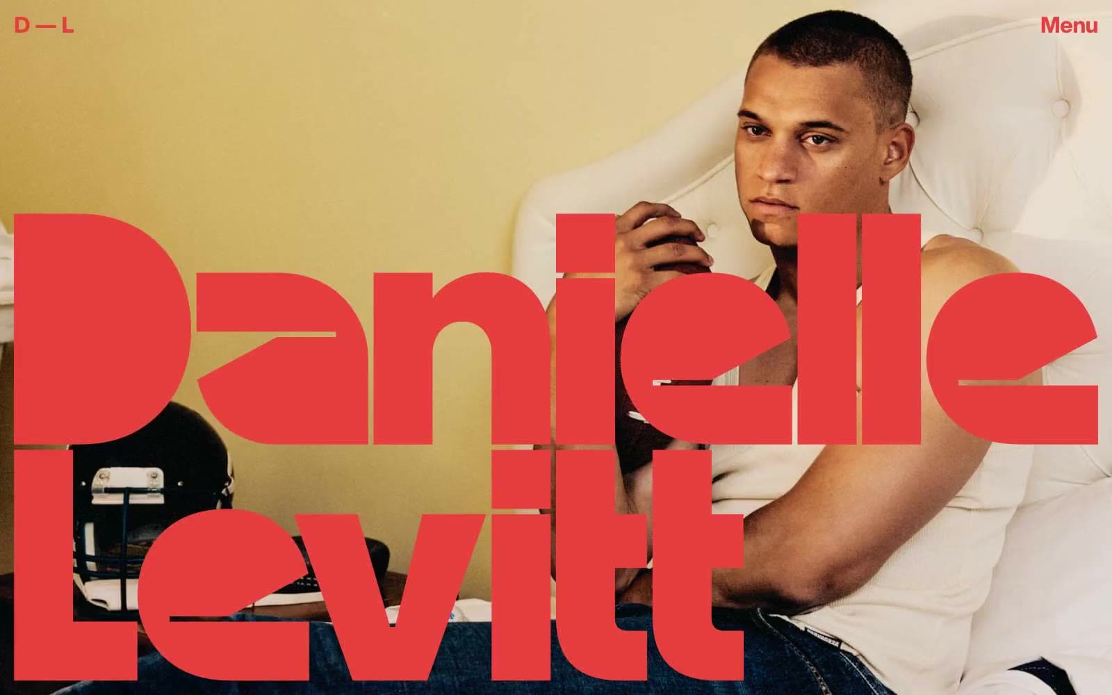
Daniellelevitt
Studio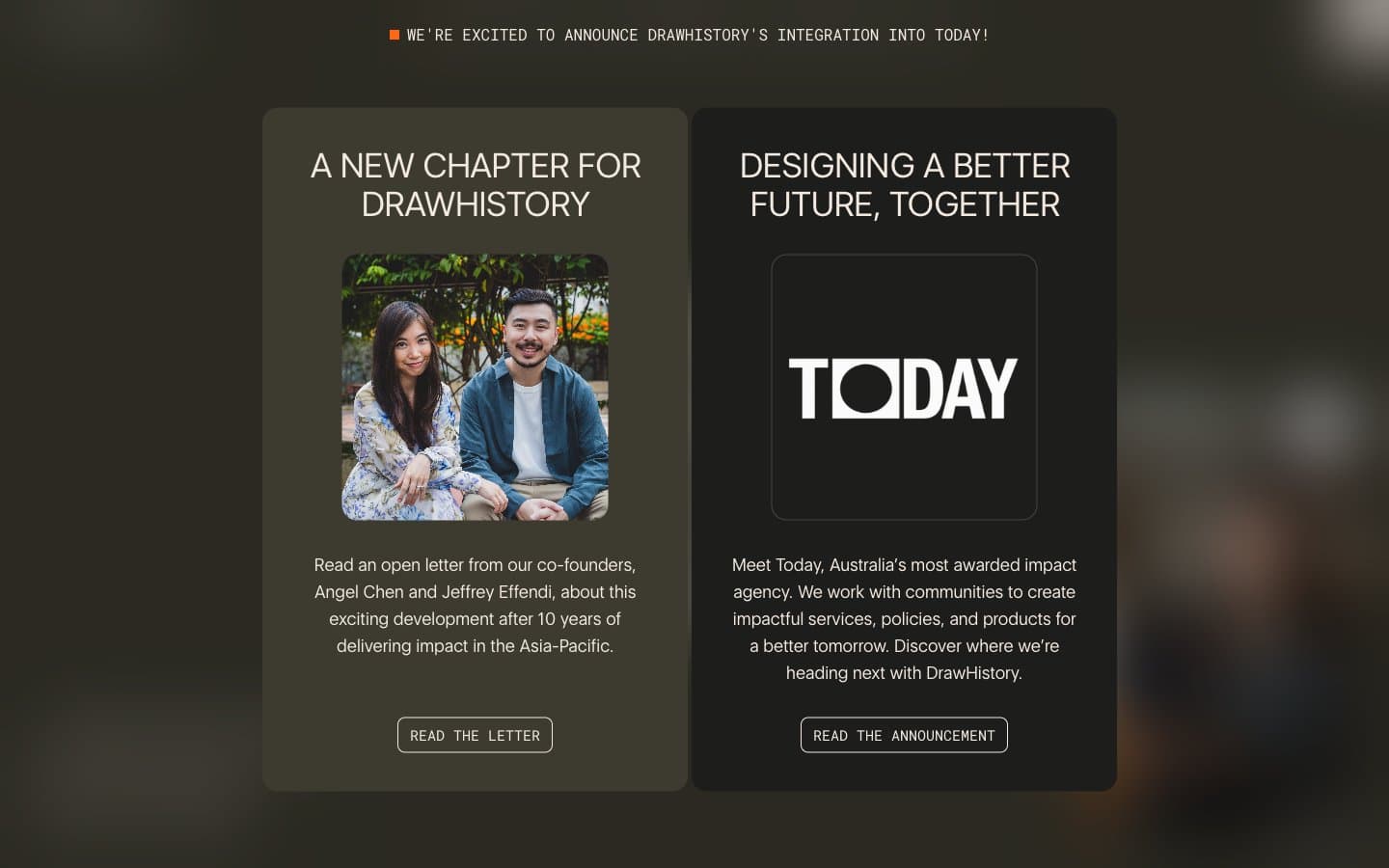
DrawHistory
Studio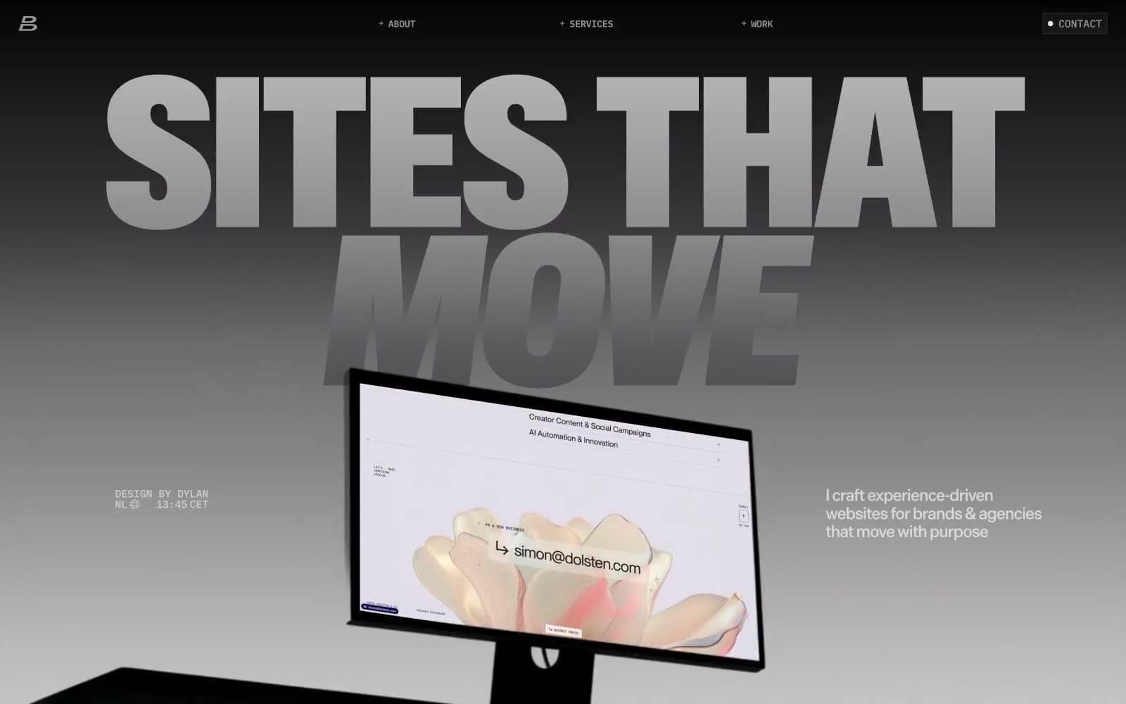
Dylanbrouwer
Studio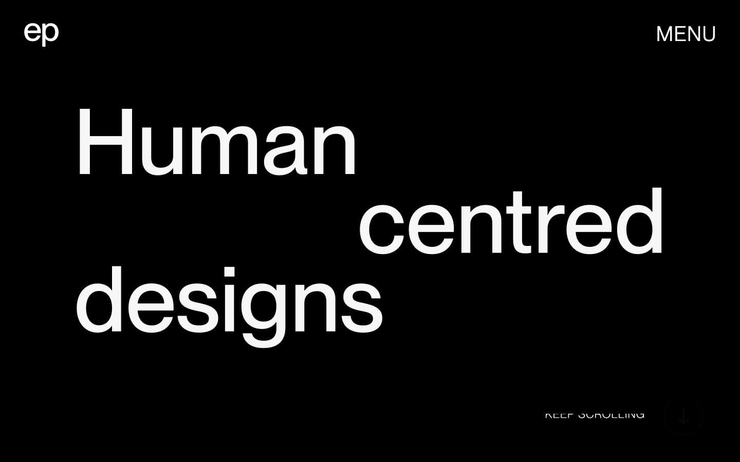
Elvina Prasad
Studio
Freytag Anderson
Studio
Henry
Studio
Hyper Tria
Studio


