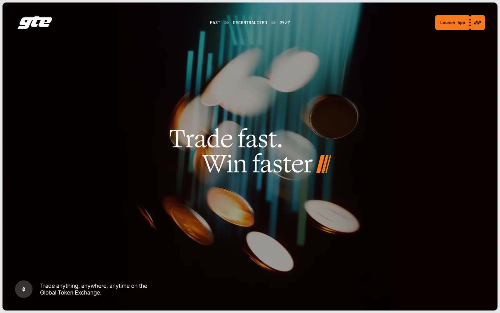
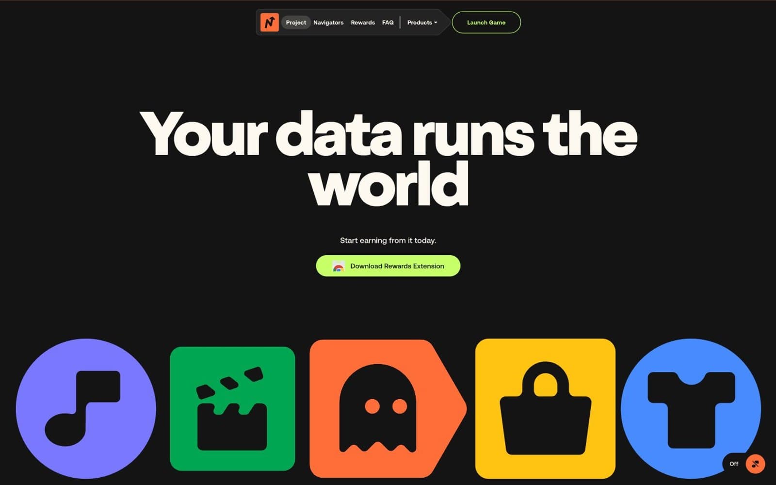
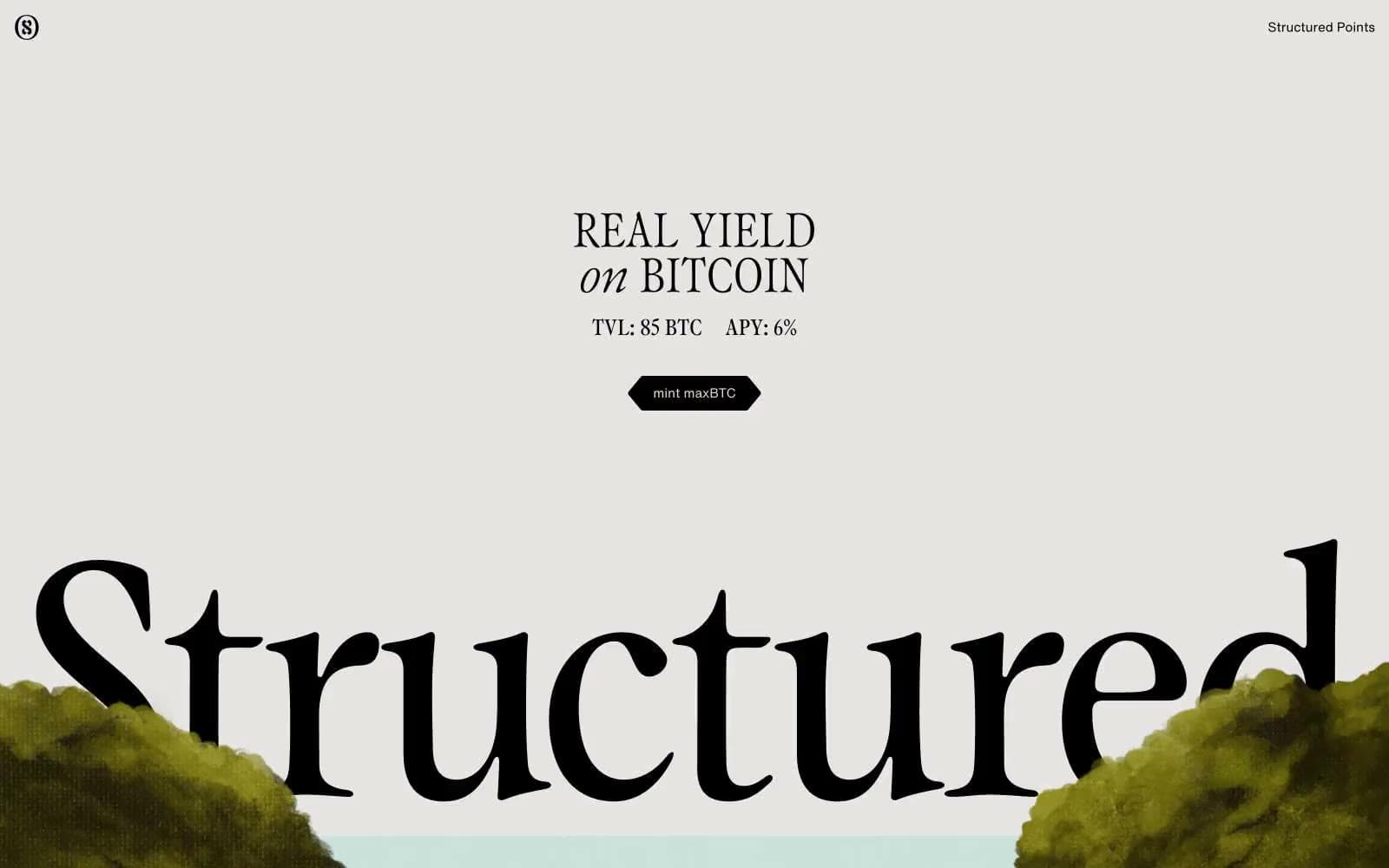
Structured. Renaissance gallery on putty paper.
- Crypto
- Mixed theme
- 8 colors
- 2 typefaces
Structured treats finance as a gallery exhibition: a warm putty-beige canvas, stark black accents, and classical oil-painting imagery that reframes Bitcoin yield as high art. Typography is the protagonist — a custom serif at display sizes up to 374px carries the brand voice with dramatic negative tracking, while a neutral grotesk handles utility. Sections alternate between light editorial spreads and pitch-black rooms, with no gradients, no shadows, and almost no color. Every surface is flat, every border is hairline, and the only accent is the warm cream/black contrast that runs through everything. The aesthetic borrows from museum wall labels and Renaissance folios: restrained, authoritative, slightly precious.
Structured design system
Neutrals8
Dark borders and separators for elevated surfaces and inverted UI. Do not promote it to the primary CTA color
Muted secondary text fills and subtle image backgrounds. The darkest warm gray — used where pure black would be too severe
Image placeholder backgrounds and mid-neutral surfaces. The only truly cool gray in the system, reserved for image containers
Dominant page canvas — the warm gray-beige that fills hero and most light sections. The single most-used color in the system; sets the gallery-wall tone
Hairline borders on body and icon elements. A mid-tone warm gray that reads as a printed page edge, not a UI divider
Elevated card surfaces and secondary canvas in light sections. Sits one step above Putty for subtle layering without breaking the monochrome warmth
Footers and lightest surface tier. The coolest neutral — used sparingly at section bases to signal a different page zone
Text on dark sections, white icon strokes, and the rare pure-white element. Used only as reverse type or accent fill, never as a large surface
Try a pairing
Pick any two colors from the palette to check whether text stays readable on top.
Aa
Paper on Ink
21.00 : 1 contrast
- Body textPasses AA 4.5
- Large textPasses AA 3
- StrictPasses AAA 7