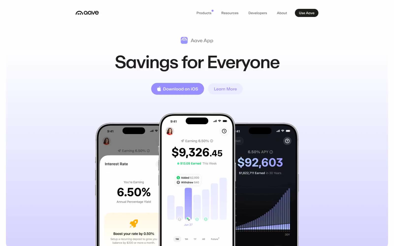
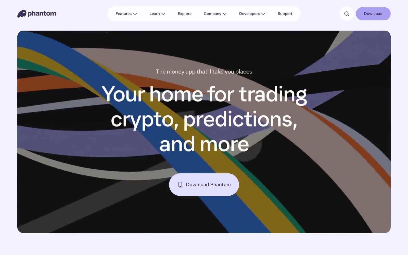
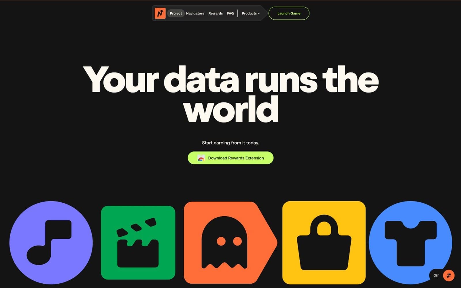
Navigate. Chunky grotesque type, pill-everything, and five candy-colored icon tiles repeated like a logo lockup.
- Crypto
- Mixed theme
- 11 colors
- 2 typefaces
Navigate runs on a max-volume, anti-corporate visual language: ultra-bold grotesque display type at 80–165px slams against pitch-black canvases, warm cream, and full-bleed orange section walls. The interface is deliberately sparse — one floating pill nav at the top, one lime-green accent repeated as the only CTA color, and a set of five chunky colored icon tiles acting as the brand's visual anchor across every section. Body type stays compact and neutral (Aeonik 400–700) so the chunky display face can dominate without competition; spacing is generous but tightly ruled by 1000px pill radii that govern every interactive surface. Sections alternate as full-bleed color bands rather than cards on a canvas, making the page feel like printed posters stacked vertically.
Navigate design system

Brand2
Sole primary action color — filled CTA backgrounds, outlined CTA borders, active nav highlights. The single chromatic button in the system against black/cream creates instant focus
Full-bleed section background (FAQ wall), brand icon tile fill, the loudest brand color used to break visual rhythm between dark and cream bands
Accent5
Brand icon tile (music/note), card background accent — soft cool counterweight to the warm orange and lime
Green wash for highlight backgrounds, decorative bands, and soft emphasis behind content. Do not promote it to the primary CTA color
Brand icon tile (t-shirt) — the cool blue anchor in the icon quintet, prevents the warm colors from overwhelming
Brand icon tile (weight/lock) — high-saturation yellow that sits between the cream and orange for tonal continuity
Soft decorative card background, pale violet wash for muted content panels
Neutrals4
Page canvas for dark sections, dark text on cream sections, FAQ pill backgrounds, navigation shell
Secondary dark surface, subtle elevation above #141414, heavier heading text
Hairline dividers on cream, low-contrast borders, muted separators
Hairline borders, dividers, input outlines, and card edges on light surfaces. Do not promote it to the primary CTA color
Try a pairing
Pick any two colors from the palette to check whether text stays readable on top.
Aa
Pitch Black on Acid Lime
15.73 : 1 contrast
- Body textPasses AA 4.5
- Large textPasses AA 3
- StrictPasses AAA 7